5 Most Common Interaction Design Mistakes on the Web
Designing an interaction has never been easy. It involves deep analysis of user behavior and meticulous planning. With new technologies and interaction design patterns emerging, things are not getting easier.
Users are harder to impress with glossy images, smooth hover effects and unexpected animations, but the dilemma remains the same — how can you create a delightful user experience that generates conversions along with users’ smiles? If you’re aware of common design pitfalls, you’re far less likely to make them.
To make it easier for you — and perhaps to let you know that you’re not alone — here is a roundup of the most common interaction design misconceptions.
1. Overwhelmed with Innovation
Web designers are a creative lot. We want to express ourselves through our work. We’re always looking for innovative ways to make designs stand out. However, when it comes to IxD, innovation doesn’t always work for good. It might even be bad for your site. Users crave familiarity and often they are tuned in to certain ways of operation.
Randy J. Hunt, Etsy’s Creative Director and author of Product Design for the Web, put it clearly: “Hey, designers: stop trying to be so damned clever.” In this article, he explains in greater detail why you should not go overboard with innovation in designing for the web.
Take the Iotorama website,for example. It looks beautiful, the music is soulful, but with with all those balls moving, the user is left wondering what to do. Don’t get me wrong, the project is fantastic and super-creative! I liked the gamification idea, but it’s far from intuitive.
With Postcards Email Builder you can create and edit email templates online without any coding skills! Includes more than 100 components to help you create custom emails templates faster than ever before.
Free Email BuilderFree Email Templates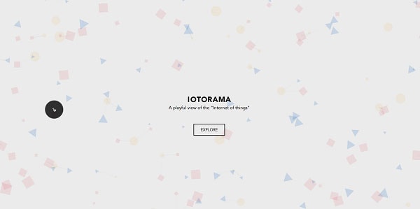
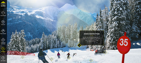
Here’s another example. The guys behind the Safety on the Slopes project came up with a neat interactive webgraphic that informs users about the dangers of winter sports. It’s innovative and at the same time intuitive, immersive and fun.
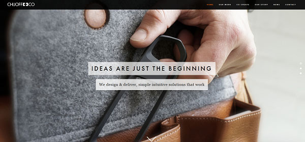
The “don’t be too clever” rule spills over to navigation as well. Some designers attempt to be original by experimenting with eclectic names for pages. For example, the Chijoff website leaves users wondering what exactly they deliver and how to hire them. It takes a bit of browsing to figure that the “Co-Create” page is supposed to be the equivalent of “Services.” And even then, after reading through the whole page, the user is still left wondering what to do … the end of the page has a small form to sign up for the latest industry news and tips! There is no form on the “Contact” page either, only postal and email addresses. They just do not make it easy for people to get in touch with them, or hire them.
Can you guess what “Universe” is for on the Maison Margiela website? It actually links to their Facebook page. Who would have thought?
In contrast, check out the legworkstudio’s website. It’s strikingly creative and unusual. The navigation is clear and unambiguous. There’s no chance a user will get lost.
With Startup App and Slides App you can build unlimited websites using the online website editor which includes ready-made designed and coded elements, templates and themes.
Try Startup App Try Slides AppOther Products3. Clutter
There was a time when websites tried to put everything they possibly could above the fold. Those days are gone, yet many sites still make this mistake. Take this online store:
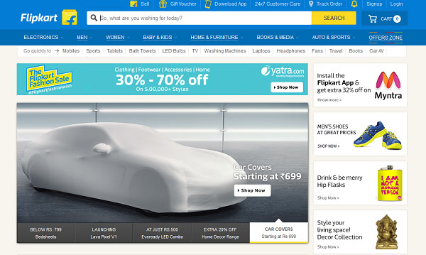
The designer tried to stick to a simple color scheme, but the sheer number of boxes, logos and fonts in different colors on this page are enough to leave a user reeling. The search bar has catchy “So, what are you wishing for today?” text, but the overall look and feel of the layout is rather outdated.
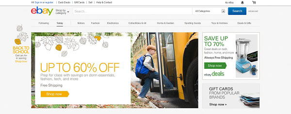
EBay is the one major online retailer that gets this right. Instead of cramming their website with product images, promotions and multiple calls to action, eBay has kept it clean and simple, highlighting exactly what they want the user to see first, with clear prompts on what to do next.
4. Contrast, Baby!
Contrast is one of the most important means of establishing visual hierarchy and drawing user attention to certain elements. In web design, contrast doesn’t imply only color usage, but also size, shape and positioning.
The most simple and vivid example is this site. They guys succeeded in consistency, but the general look of the background and buttons are not inviting when it comes to placing an order.
Compare to this. The color choice is close, but the result is radically different. Plus, the creative scrolling effect smoothly introduces the new amazing product feature — reflective material. Cool, huh?

5. Neglecting Form Styling
Form design is one of the fundamental parts of user experience. Each website has a goal — whether it is to generate leads, directly sell products or provide information. Unfortunately, there are many websites with glossy homepages that prefer to bore users to death with long forms and complicated CAPTCHAs. Unless the users has strong prior motivation, they’ll just leave.
With effective cross-browser solutions like JCF, it’s time to forget about ugly default form elements and move toward a more immersive user experience.
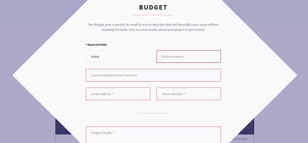
Another irritating thing is when the form is too demanding or not well tested. For example, the sketchybusiness.io form highlights all blank fields, even if they are not required.
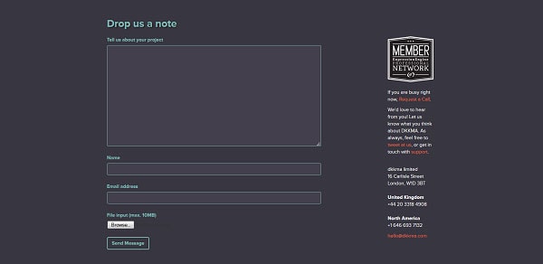
If you look at the mostlyserious.io form, you’ll definitely like the hover and active button states. Plus, the “Don’t be shy” note adds a sweet, humorous touch.
Finally…
Don’t be too lazy to test! What matters to you might be different from what matters to customers. Where do they encounter problems and get stuck? Is it the navigation, fancy parallax effect or long-loading video? One of the biggest benefits of user testing is that you can step into the shoes of users, focus on their needs and make improvements. Don’t try to restrain your creativity. Just keep in mind that site visitors might get confused and frustrated.
What are the worst IxD mistakes you’ve seen? Share your thoughts and stories in the comments.