Making it Work: Flat Design and Color Trends
We’ve talked a lot here about the flat design trend here at Designmodo.
We’ve raved about it, showed you plenty of cool examples and even developed a free user interface kit for you to download and use for projects.
But what if you want to do it yourself? One of the most important parts of the trend is color.
Flat Design Refresher
With Postcards Email Builder you can create and edit email templates online without any coding skills! Includes more than 100 components to help you create custom emails templates faster than ever before.
Free Email BuilderFree Email Templates
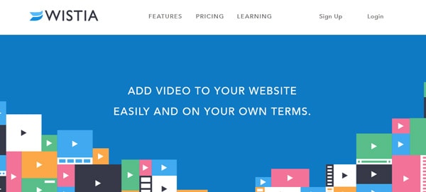
Flat design is a technique that uses simple effects – or lack thereof – to create a design scheme that does not include three-dimensional attributes. Effects such as drop shadows, bevels, embossing and gradients are not used in flat design projects.
Some call the look of flat design simple, although it can be quite complex. The look itself is simple, direct and user-friendly, making it an increasingly popular option for mobile user interfaces as well as trendy web design.
Learn more about the flat design trend in a previous Designmodo article.
Defining a Color Palette
When it comes to color, flat design works with a variety of colors, but most commonly designers are choosing to go bold and bright.
The other thing that makes flat design different in terms of color? Designers are expanding palettes from just a shade or two to three, four or more colors. Most of these choices are bright, fully saturated hues that are sometimes countered with grays or blacks.
When it comes to color and flat design, many of the traditional rules about color pairing and matching are thrown out of the window in favor of palettes that span the rainbow with lots of pop.
What we are seeing more of with flat design and color though is the matching of tone and saturation. While designers may choose to use quite a few shades, they will often mirror each other in how deep the color is, whether it is a more primary or secondary color combination or from another part of the color wheel and whether colors contain more black or white mixes.
With Pulsetic you’ll be instantly notified the moment your website, API, or server becomes unavailable. Monitor uptime from multiple global locations and respond to incidents before your users are affected.
Create beautiful status pages in minutes to keep customers informed during outages and build trust with transparent communication.
Start Monitoring for FreeWhen it comes to color, flat design schemes often trend as super-saturated and bright, more retro or monotone. That’s not to say these are the only options, but as the trend has evolved they are the most popular.
Bright Colors
Bright color is often a characteristic associated with flat design because it creates a distinct feel. Bright colors typically work well against both light and dark backgrounds, creating contrast and engaging users. It is the most popular color trend out there in relation to flat design.
So where do you start?
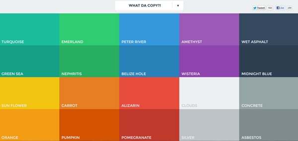
FlatUIColors.com has a great starter list of some of the most popular hues in flat design. From bright blues and greens to yellows and oranges, these colors epitomize what we are seeing in terms of color and trend. The site is a great starting point because you can choose a color and download the color values at no charge. (Personally, I am a fan of the gray tones for something a little different.)
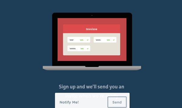
Designmodo has taken this bright design outline a step further in the recently released Flat UI Free kit, with these same bright hues as the outlines for a great and easy-to-use interface kit. The flat-designed, stylish icons work in a variety of projects and come with the color swatches included (a great option if you are new to mixing color).
One thing you don’t see often with bright flat design color palettes is the use of strictly primary colors – pure red, blue and yellow are often overlooked in favor of richer, mixed colors.
If you want to pair your own bright colors in a flat design scheme, opt for simplicity. Choose colors that have similar color tones and saturation. Plus we’ve given you a few color swatches with values to get started.
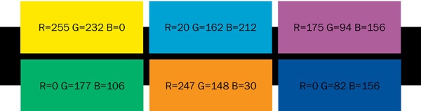
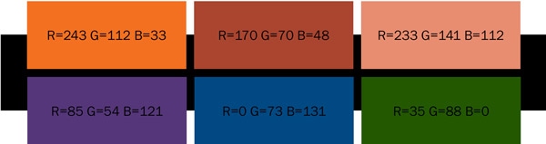
Bright swatches: Try these color combinations together or mixed in groups to create a great flat color palette. Each of these colors will pop against a white or black background for maximum impact.
Popular colors: Blues, greens and purples
Retro Colors
Retro color schemes are also a popular choice when working with flat design projects.
These less saturated, but hues build on the idea of bright colors but with the addition of white to make them more muted. The look is not that of a pastel but distinctly old-school. Retro color schemes often contain a lot of orange and yellow and sometimes red or blue.
It is more common to see primary and secondary colors used in retro color schemes when working with flat design, because of the toning down of the color.
Retro swatches: Retro colors work best when they stand along as a dominant color element. Pair them with images or muted colors for the best results.
Popular colors: Oranges, peach or plum tones and dark blues
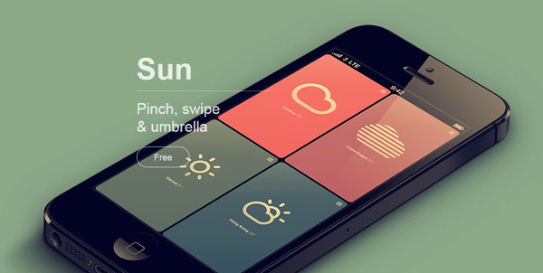
Monotone Colors
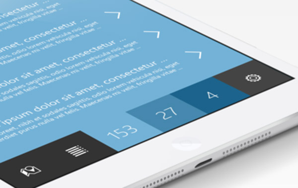
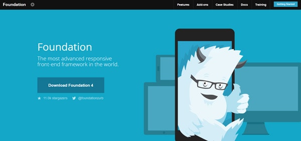
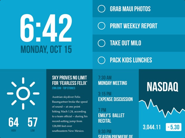
Monotone color schemes paired with flat design techniques are gaining popularity at a rapid pace. These color palettes rely on a single color with black and white to create a bright, but distinct palette.
Most monotone color schemes use a base color and two or three tints for effect. The most popular color choice seems to be blue, but many designers are opting for a monotone color scheme based on black (grays as well) with a pop of color such as red for buttons or calls to action.
Another option is to create a monotone effect using slight variances in color. If you start with blue, for example, add tints of green to create a scheme of blue-green color.
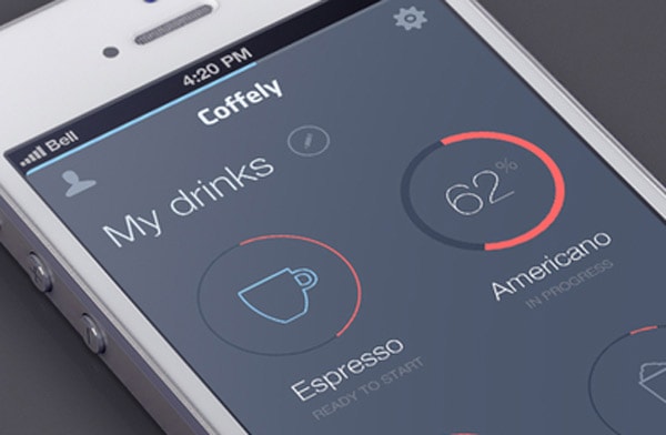
Monotone color techniques are especially popular for mobile and app design.
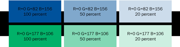
Monotone swatches: Just like with other color palettes, monotone schemes also need to include contrast. Mix tints to that each different “color” is distinct from the parent color. Start with a full color (100 percent) and tints of 50 percent, 20 percent and 8 percent.
Popular colors: Blues, grays and greens
Conclusion
One thing that really makes the flat design trend work is that it is new and fun. Your projects should reflect that.
Create a color palette that matches the tone of your project, instructs users how to use your site and is visually interesting and fun. Think beyond some traditional color matching rules and step outside of your comfort level when creating a flat color scheme.
And feel free to download Flat UI Free as a starting point or use some of our color swatch suggestions.


