Flat Design vs. Material Design: How Are They Different?
Two similar design styles, one based on the other. One the “hot new thing,” one — some speculate — on its way toward becoming a passing fad. One a spontaneously-adapted design trend, the other a purpose-built set of guidelines. You’re probably familiar with the conflict between flat and material design by now.
But what are the differences between the two, really? Is one inherently better than another? Better for certain uses? In fact, some people wonder how much difference there is between them in the first place. Let’s start with the basics: it lies in the amount of skeuomorphism present in each one.
Skeuomorphism
Skeuomorphism, in this context, is design that’s meant to imitate the physical world. Usually, this takes the form of online tools being made to look like their real world variants, like synthesizer programs made to look like keyboards, for example. And it’s dominated web and interface design for the majority of the time they’ve existed.
The problem is that it often isn’t based in digital usability, or how well all its knobs and buttons can be operated by mouse or touchscreen – it simply refers to the imitation of the way things used to look.
Eventually, the design world came to the conclusion that something else was needed, something that would take away all the retro decorative elements and leave them with something that would put usability first, speeding up loading times and putting the focus on getting visitors through the content efficiently. So they removed all traces of skeuomorphism from the digital interface to create flat design.
With Postcards Email Builder you can create and edit email templates online without any coding skills! Includes more than 100 components to help you create custom emails templates faster than ever before.
Free Email BuilderFree Email TemplatesFlat Design
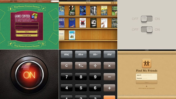
Flat design, in many ways, is design stripped down to the basics. It removes any stylistic choices that give it the illusion of three-dimensionality, like drop shadows, gradients, and textures. It’s focused purely on the interplay of icons, typography, and color.
It’s one of the first coherent styles purpose-built for digital media – one that takes advantage of the internet’s unique properties and its users’ needs with simple buttons geared toward efficient finding, straightforward color schemes made for fast identification of elements, and simple icons.
Appearance is secondary in flat design: its focus is on raw functionality. The simplicity of its iconography can even remove the need for some of a website’s copy as viewers are intuitively guided through the process of using it based by the colors and pictures alone. In addition, it speeds up load times and looks just as good on high or low resolution screens, resulting in a more reliable user experience. As such, it makes things much easier on both designers and users.
Pros
- It embraces the limits of the screen and works with them instead of trying to be something else.
- It streamlines designs and gets rid of unnecessary graphical and animated elements, decreasing loading time.
- The lack of skeuomorphic elements can also speed readers’ progression through your content.
- Removes all unnecessary design choices as well, facilitating faster site design.
- Flat design’s simplified sites are endlessly adaptable and extremely easy to make responsive.
Cons
- Flat design can be limiting, constraining you to simple colors, shapes, and iconography.
- If taken too far, it’s easy to accidentally create a very featureless and generic-looking site.
- Some sites, or apps, require complex visual cues to guide the user through the process, which is one of flat design’s major failing points. One common complaint is that its lack of drop shadows and raised edges can make it hard to tell clickable buttons apart from static vector graphics.
- Its ubiquity can make it hard to create an original-looking flat site or app.
- On a related note, it’s a distinctively mid-2010s aesthetic, and it’ll date your site if you don’t plan on redesigning it again relatively soon.
Material Design
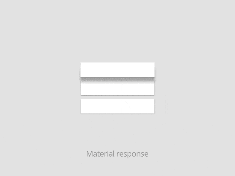
Critics of flat design argue that it’s gone too far; that it was too radical in removing all skeumorphs, even the useful ones. Enter material design. Borrowing the layers concept from countless image editors—and separating them by drop shadows, bevels, and animations—it taps into our natural ability to correlate depth with importance.
Material design, for the few uninitiated, is a set of design standards developed by Google and laid out in this document. It has countless unique and interesting features, but perhaps the most defining is its use of the Z-axis. Basically, it adds a little skeuomorphism back into flat design, creating the impression of a bunch of two-dimensional planes floating over each other at designated elevations.
With Pulsetic you’ll be instantly notified the moment your website, API, or server becomes unavailable. Monitor uptime from multiple global locations and respond to incidents before your users are affected.
Create beautiful status pages in minutes to keep customers informed during outages and build trust with transparent communication.
Start Monitoring for FreeImagine a piece of paper, but one that can expand and contract at will, reshape itself, fuse and divide. Now stack a few of these on top of each other (they can levitate, too), and draw a site element on each one. That’s the concept in a nutshell.
What it is not, however, all that design document’s specificity, however, it’s not a written-in-stone set of rules. Think of it as more of a framework for physics and a template for future designs. It’s also designed to be universally adaptable, responsive to screens of all sizes, and even of different shapes, like the Android Wear watch. They’re also promoting its use among other app developers.
It’s the standard for Android app design, as its use with the Wear alludes to. Whether or not it should be used on iOS is the source of an ongoing debate, with some arguing it’s necessary to preserve Google’s look, and others arguing it clashes with the rest of the operating system. it’s your decision.
Pros
- The three-dimensional arrangement makes programs easier to interact with: for example, drop shadows are used to indicate layer arrangement.
- Unlike flat design, material comes with a very detailed and specific set of guidelines, leaving nothing to guesswork.
- If you’re planning to develop things for multiple platforms, like a website and an Android app, material will provide a unified experience across all devices, which will aid user-friendliness and subtly help your branding.
- If you’re interested in having animations, material’s the way to go, as it comes in with built-in ones of the type that would have to be done manually otherwise.
Cons
- Like it or not, Material Design is inextricably tied to Google. If if you want to distance yourself from that, and create a unique identity for your site or app, it’ll be that much harder if you use Google’s guidelines to make it.
- Not all systems will be able to pull off the intended framerates. And it can be hard to know what, if anything, you can do to improve usability for those who can’t.
- The animations drain mobile users’ batteries.
- Forcing developers to adhere to rendering guidelines may further stifle individual creativity and slow the development of more animations and decorative features.
Conclusion
Material design really isn’t that big a departure from flat design: both use the same clean and minimal aesthetic. You can basically think of material interfaces as flat interfaces cut apart. And while material design’s animations have been widely praised, when you boil it down, they just serve to make things more user-friendly. In fact, there’s nothing that says that you can’t combine the aesthetics of the two, using material to give some extra pop to a flat site that remains otherwise unchanged.
In my opinion, flat websites are practical. They load faster than websites full of animation and complex graphics. If you’re designing a site that has to be simple, is aimed at a wide variety of users on all devices and with all levels of technical experience, or just place a lot more focus on user-friendliness over form, flat design might be for you. If you’re not interested in having any animations or motion graphics on your site, and are primarily interested in raw simplicity and usability, I’d definitely suggest you opt for flat design. However, If you want to build a more fancy site with animations, definitely opt for material design.
Questions? Comments? Input on your favorite type of design? Leave us a comment.


