What is Invisible Design?
Design is not always an in-your-face art. It is subtle, usable and often undefinable. Quite simply, good design is often invisible.
And just to be clear – invisible design is not about adding layers or transparencies or hidden meanings to projects. It is about creating great user-oriented projects that work functionally and visually.
It’s something I heard over and over again when I was starting out as a young designer. If you have to “decorate” the canvas, you are over-designing it. The best design – the design that really makes a project work – is invisible.
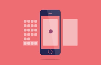
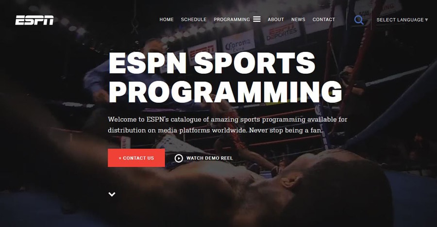
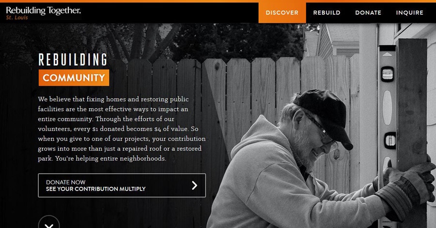
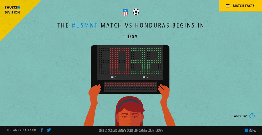
But how to you achieve that invisible design? Especially when web design is a quite visual tool. (As a bonus, a few websites that exemplify the idea of invisible design are featured throughout this post.)
Thinking About Invisibility in Design
With Postcards Email Builder you can create and edit email templates online without any coding skills! Includes more than 100 components to help you create custom emails templates faster than ever before.
Free Email BuilderFree Email TemplatesSo before we get too far along, design is visible. There’s no argument about that at all. But the techniques and tools you use, should not be glaringly obvious to the common user.
Much of design is about “feeling right.” Users want to engage and interact with something. They don’t necessarily understand why. That’s invisible design.
Though the concept had been pounded into my brain long before I heard him say it, Oliver Reichenstein, founder and director of Information Architects, is quite famously known for emphasizing this invisible design concept.
Here’s a brief bit from an interview with The Verge.
“Good design is invisible. Good screen design happens in the subatomic level of microtypography (the exact definition of a typeface), the invisible grid of macrotypography (how the typeface is used), and the invisible world of interaction design and information architecture. Minimum input, maximum output, with minimal conscious thought is what screen designers focus on. And just as type designers and engineers we do not try to find the perfect solution but the best compromise.”
Invisible Communication


When you create a webpage or mobile app or even interactions for a smartwatch, you are designing some type of communication. The design needs to support the message and not get in the way of it.
With Pulsetic you’ll be instantly notified the moment your website, API, or server becomes unavailable. Monitor uptime from multiple global locations and respond to incidents before your users are affected.
Create beautiful status pages in minutes to keep customers informed during outages and build trust with transparent communication.
Start Monitoring for FreeYou will create an experience with all the design tools at your disposal. The end design is not for you, and not even for other designers, it’s for a wider audience that does not understand (or care to think about) color theory or spacing or typography. They only know if these things come together in a way that feels cohesive, usable and interesting.
That’s why it is important to think about design as an invisible tool.
Different Types of Invisibility

When we talk about invisible design, a few different things come to mind. Each type of invisible design is important and likely impacts your work in a variety of ways.
- Invisible products and placements, such as brands or advertising that you might not even notice. (This is important for app and game designers that often have to think about where placements appear in their design.)
- Invisible interactions and notifications that happen so seamlessly that you perform an action or task without thinking about it. (Such as alarm or alert on your phone.)
- Invisible aesthetics that create an emotional connection and bond with users, making people desire engagement. (That’s what we will focus on.)
Design Techniques

Invisible aesthetics are rooted in the basics of design theory. It’s not a trend or application of a cool new UX feature. It’s using text, color, typography, images, icons and techniques to share a message. So let’s go back to some of the basics and how they can work for you.
- Text and language: The words you use convey a tone and emotional response from users. Use language that communicates the way you want people to feel when they interact with the design. Is it formal, lighthearted, comical? Should it make you feel passion or want to act in some way? Also think about the rhythm of the words; how do they sound when you read them out loud?
- Color: Every color or color combination has a feel to it. With emotional and cultural considerations to think about, color choice can take a lot of time. Take care with the color palette to select colors that help users perform specific actions as well as create the right feel, harmony and balance.
- Typography: Typefaces can have meanings of their own as well. From clean sans serifs that take on the meanings of their surroundings (Helvetica) to complex blackletter styles (Baroque Text) with a feeling of formality, the type of letterform you select will convey a specific feel. When in doubt, stick to sans serifs or simple serifs with uniform stroke widths in a regular weight.
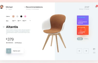
- Images: What is happening in the images you use? This includes photos, animations and videos. Are the people happy and smiling? (Are there people at all?) Are the colors warm or cool? Is the action fast or slow? Proper pacing and flow — think of it as a walking speed – can create a certain comfort level for users. Action that is too fast or slow, can start to bring attention to that fact and users will focus on it more than the image itself.
- Icons and UI elements: A consistent set of icons and user interface elements works wonders on the path to invisibility. A set tells users how a site works and how to interact with it with a standard display even though the action or specific look in each icon might be different. The invisibility happens when the user does not have to think about how it works. Think of the shopping cart icon that almost every retailer uses as an identifier to check out or view items. Users don’t have to think about how to navigate to the final step or make a purchase; this element directs them to the appropriate action.
- Other techniques: There’s a whole toolkit of design techniques out there than can work with or against your design — drop shadows, text effects such as bevels, strokes and frames, spacing, underlines and the list goes on. They key with any of these techniques is use. If you are opening the tool in editing software and clicking “apply” while using the default settings, you are probably doing it wrong and will end up with a garish effect. These effects should be used in such a way that the user does not look at an image and comment that it includes a great shadow (although a trained design eye might notice it). The design effects should only contribute to the overall message and goal of visuals.
Conclusion
Now think back to what Oliver Reichenstein said for a moment. He emphasized both “micro” and “macro” elements. This is key. To be completely invisible, the design needs to be perfected down to each detail.
Design simply and with purpose. Don’t over embellish or add in trendy elements just because you want to use a technique. Design the little pieces so that they work seamlessly and design the big picture so that it paints a complete image of what your project is supposed to portray. Don’t overthink it: Sometimes a simple solution is the correct solution. (Maybe this whole idea of invisible design is what helped flat design take off, and why it has remained so popular.)
Have you stumbled across website designs that you think work beautifully and invisibly? Share them with us in the comments.