Design Trend: Parallax Twist Effect and Websites Examples
The newest trend in web design has inklings of parallax, but it’s not quite parallax.
It involves moving elements, but it’s not really animation.
It includes plenty of great color and physical elements, but it’s not material.
This background trend includes elements of plenty of other trends for truly engaging moving elements that draw users in and keep them on the site with great scrolling actions. This new parallax with a twist is the latest craze to fascinate website designers.
Note: You should visit the links for each of the examples in this post to really get a feel for how these sites work and what the interactions feel like.
Identifying the Trend
With Postcards Email Builder you can create and edit email templates online without any coding skills! Includes more than 100 components to help you create custom emails templates faster than ever before.
Free Email BuilderFree Email Templates
Parallax with a twist is different because it is so much more seamless than what we’ve seen with moving background trends in the past. It is identifiable by a moving background that is activated with scroll, very much like parallax scrolling effects.
The key difference is in the lack of “screens.” The scroll creates a continuous and moving dynamic flow where the background changes color, includes moving animations and elements that move with the screen and other elements move in to and out of the focus area.
It’s different from the parallax scrolling trends we’ve seen in the past because the elements move so seamlessly and smoothly that you don’t see the layers interacting. In contrast with parallax of the past, users often saw the layers of elements interacting with each other. So you might have a background that moved over a photo or a layer that “snapped” into place as the scroll came into a specific location.
Common Elements
Many of these parallax with a twist designs have a few common elements. In addition to scrolling effects there are a handful of other commonalities that designers are using, although these elements aren’t truly required to make the effect work.
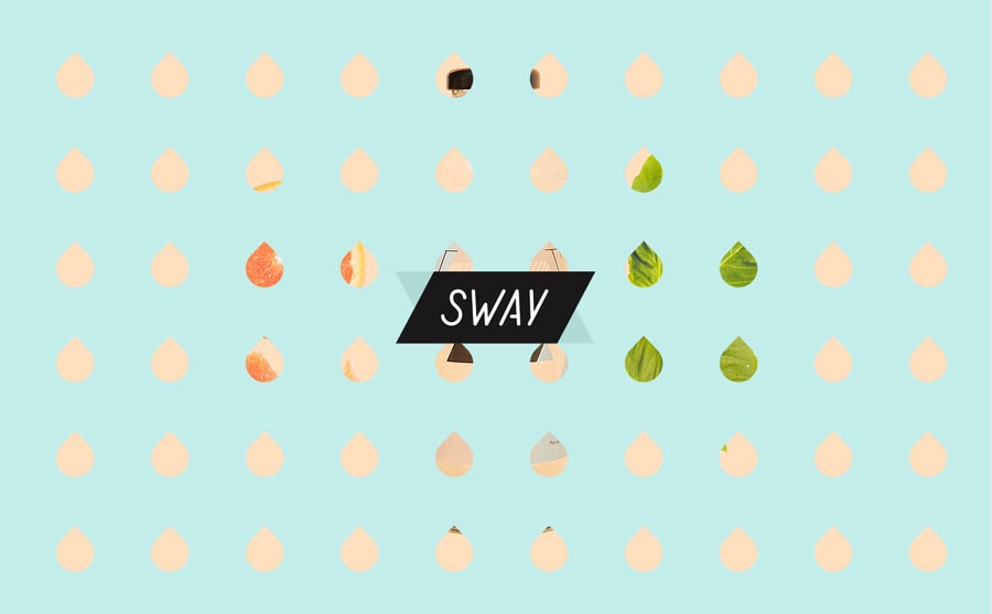
- One-page design: To maximize the impact of this technique, these websites often feature a one-page design. Some use the effect on a long-scrolling homepage with navigation to interior pages with a more standard format.
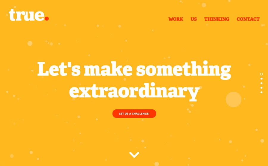
- Bold typography: Big lettering with interesting typeface choices are a common factor. Designers are mixing thick stroke serifs with novelty typeface options for maximum impact and ease of readability.
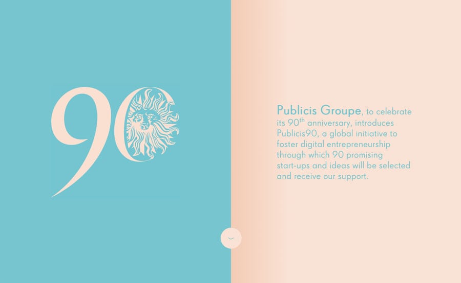
- Bright color: Colors from flat and material design are a common factor. Big, bright, bold options are common. The palettes are pretty simple, but often include more color options that you would commonly see to facilitate background hue changes.
- Changing content types: The content on the page often changes with the scroll, so that the user might first get a hero image, then a “page” of text, then more images and then a form or call to action. This moving content pairs well with the interactivity of the movement in the scroll and with the background.
- Continuous story: While the content types may change throughout the design, a single story is the element that ties it all together. This continuous story is a two-fold design element. The content story must have a flow from chapter (page) to chapter (page). But the visual story must include a common thread as well. With so many changing visuals, it is important that they feel like they belong together.
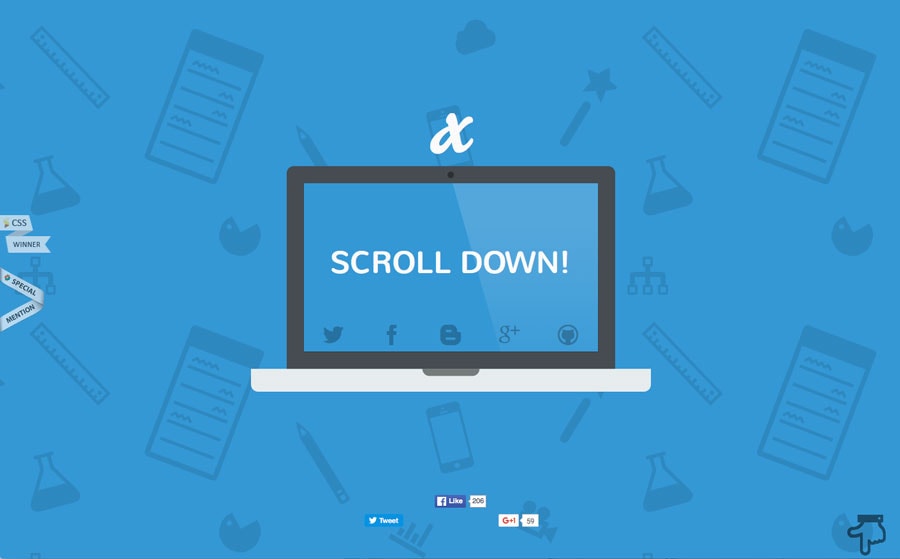
- Big images: Whether designers use illustrations or photos, the images – particularly on the home page – are oversized and impactful. Most of these websites start with a hero header-style image with a cue to scroll.
- Scroll instructions: With anything new, users often need a cue as to how to proceed or interact with the design, and these sites do just that. Most have a simple instruction to scroll or icon (often with a simple animation to grab the attention of the user) that tells users what to do and how to engage.
- Simple language: Because the framework behind this moving background is complex, everything around it tends to be simple, including the language on the site itself. This contrast is complexity and simplicity keeps the site easy for the user to understand and interesting enough to encourage engagement.
Designing the Right Kind of Movement
With Pulsetic you’ll be instantly notified the moment your website, API, or server becomes unavailable. Monitor uptime from multiple global locations and respond to incidents before your users are affected.
Create beautiful status pages in minutes to keep customers informed during outages and build trust with transparent communication.
Start Monitoring for FreeThe big design effect with this parallax with a twist style is movement. Designers have to create a delicate balance between animated and moving effects within scroll actions and other movement on the screen.
Too much movement can be overwhelming and give users a feeling that is akin to motion sickness. The true balance is in the ability to use animated effects and background movement in concert with one another.
Here’s the trick: Only one thing should be moving at any given time. Sounds pretty simple, right?
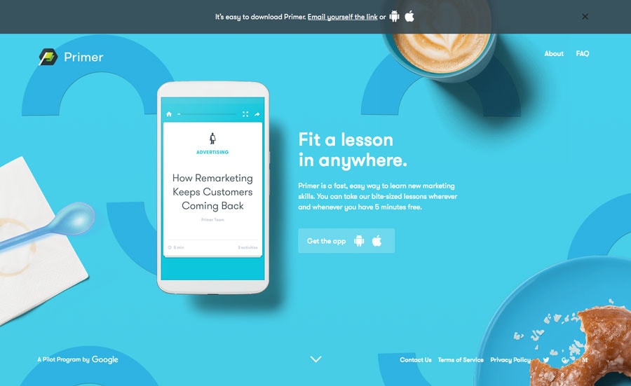
So what you need to do is stop all other moving parts during the scroll. Think about the little bouncing scroll icon (a pointing hand) in the bottom right corner and moving type used in website above. (Go to the site to see it in action.)
Now start scrolling. Scroll a little and stop. All of the movement stops as the scroll is happening. (Aside from the scroll instruction.) The movements are simple and happen in an almost singular action. But the user feels in complete control of the movement, helping to avoid that motion sickness feeling that sometimes happens with too many animated elements.
Why it Works
Why is parallax with a twist starting to take off?
It’s a natural evolution that puts together a handful of trends. It’s a HTML5 technique that allows designers to keep designing in whatever style they like while adding something new. It works with flat design; it follows many of the concepts of material design; you can use it in a minimal framework. The opportunities are limitless.
That’s why we are likely to see even more websites using parallax with a twist and moving backgrounds in the future. The most timeless trends and techniques are the ones that you can mix and match for a variety of uses.
Conclusion
What do you think of this trend? Is it something you could see yourself building into website projects? Share your ideas with us in the comments and any projects in this style that you might be working on.


