Redesigning Yelp: Design Methods Driven By Usability
Before you start improving the UX, you must first understand the business. What problems does it solve, and how does it make money? Where has it been successful, and where could it improve?
As described in the Guide to UX Design Process & Documentation, this first step is the “Product Definition” phase since we dissect the business model, determine which UX improvements are necessary, and then define our hypotheses and testing plan.
We’ll explain how to deconstruct a business using a lean framework, determine the right user segment and questions, and decide the appropriate usability tests. We also explain our testing insights and show screenshots of how they influenced our exercise of redesigning Yelp.
Deconstructing the business
We chose the Lean Canvas for the first step of our Yelp redesign exercise because it’s a lightweight yet comprehensive visualization of how a business operates. For our purposes, the Lean Canvas was a great way of getting actionable insights with minimum paperwork.
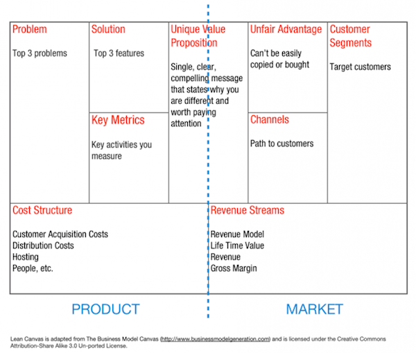
Invented by Cloudfire CEO Ash Maurya, the Lean Canvas dives straight into the heart of businesses by focusing on customer problems, proposed solutions, and success metrics. Because Lean Canvas is mostly used for startups to sketch out their business ideas, we adapted the canvas for a large successful business like Yelp. We won’t bore you with all the documentation, so let’s look at how you might complete this for UX purposes with Yelp as an example:
With Postcards Email Builder you can create and edit email templates online without any coding skills! Includes more than 100 components to help you create custom emails templates faster than ever before.
Free Email BuilderFree Email Templates- Top Problem — People in a certain town need to know the [best/fastest/cheapest/easiest] [food/service].
- Top 3 Features — User reviews, activity stream, search based on geography/category.
- Unique Value Proposition — Allow users to list businesses, add reviews, and see businesses recommended by friends and other users.
- Unfair Advantage — Network effects of having a large user base.
Business Insider concludes that one of Yelp’s defining success factors is its “network effect”. Users write reviews, which encourages more reviews and new users, creating a viral loop that leads to Yelp dominating the local business listings. At that point, Yelp has enough users to be financially attractive as an advertising platform. While its top three features all work together to help reach that critical mass, we decided the most critical features are the search function and the information architecture. If people can’t find what’s relevant, they won’t write reviews, which of course won’t encourage others to contribute. Our redesign would need to better organize and direct people to the information they wanted.
Turning Business Insights Into User Testing Objectives
Now that we knew the desired outcome of the redesign, we needed to determine which users should benefit. Was it new users? Power users? Or people who used it once in a while? To find the answer, we examined who could have the most business impact.
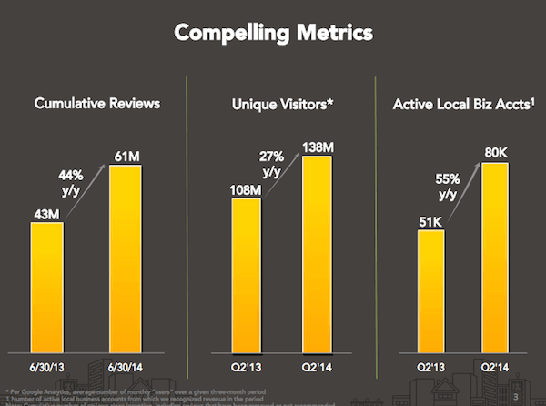
Source: Yelp Q2 2014
Looking at Yelp’s numbers published on its website, we see that acquisition isn’t much of an issue with over 138 million monthly unique visitors and 61 million local reviews as of Q2 2014. More importantly, Yelp is finally profitable and growing at an impressive rate with reviews increasing 44% year-over-year and unique monthly visitors increasing 27%.
Because the business already enjoys a massively growing user base, we decided that frequency of use and user retention would be a more interesting area to explore. Our target segment, therefore, would be semi-frequent users. Neil Patel, CEO of QuickSprout, advises that the key to user retention is the “Speed to Aha” — the speed at which new users decide to become power users because they feel the truth of your promises. For him, adding or subtracting features can add to product value. With that in mind, we decided the right questions to ask were:
- What features do people use when choosing a restaurant? (e.g. photos, ratings, etc)
- Can users choose a restaurant based on several specific criteria?
- Do users know how to save and retrieve items?
- Can users find out if a specific location is open at a given time?
By exploring the above questions, we hoped to find the insights that might better convert infrequent users into power users.
Planning & Running the Right Usability Tests
Because our project was based on design sprints, we wanted to be comprehensive but also cost-efficient. We chose unmoderated remote testing, which included analyzing filmed card sorting, tree sorting, and a first-click test. These tests would allow us to learn how test participants use the product in their own lives, how they prioritize information, and what actions are most popular.
With Startup App and Slides App you can build unlimited websites using the online website editor which includes ready-made designed and coded elements, templates and themes.
Try Startup App Try Slides AppOther Products1. Video-Recorded User Testing
We chose this method because it was the perfect balance between cost versus benefits. Since we wanted to complete the project from kickoff to redesign in roughly 3 weeks, unmoderated user testing would let us recruit quickly, plan simply, and test our participants simultaneously.
You can click the image below and see the types of tasks and feedback we were able to record from users.
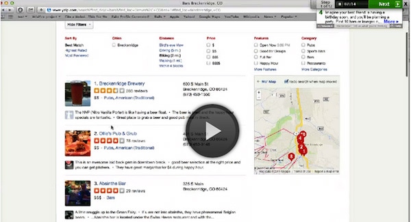
Click the “Play” button to hear user thoughts on the Bookmarks feature.
As discussed in the free e-book User Testing & Design, video-recorded user testing helps detect issues that may not surface during moderated testing. This is because while moderated testing allows for give-and-take feedback, there is no substitute for letting users interact with a product in its natural environment. Both methods are complementary — moderated testing helps you learn from users thinking out loud, while unmoderated testing lets you analyze how users interact with products in natural settings.
UserTesting recommends moderated testing early on in the development process, while unmoderated testing can be conducted at any time. Here are the top 3 insights that we learned from our unmoderated tests:
- The search function was the primary starting point for any task.
- Events weren’t very noticeable, so we needed to make them more visual.
- We need to make it easier to save businesses for later reference.
2. Card Sorting
Our card sorting exercises helped us understand how users organize content, which provides insight for navigation and labeling decisions.
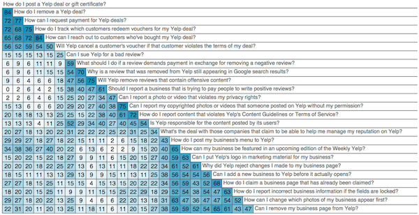
Source: Optimal Workshop Similarity Matrix
Donna Spencer, card sorting expert and Founder of Maadmob, believes that while card sorting might not provide a final structure, it does help answer questions about information architecture that are required for design. There are two types of card sorting:
- Open Card Sorting — Test participants are provided cards showing site content with no established groupings. They are then asked to organize the cards into groups that make sense for them, and to label those groups.
- Closed Card Sorting — Test participants are given cards showing site content, and are shown groups that already have labels. They are then asked to organize the cards into these groups.
For the sake of timing, we ran a closed card sort since it would be simpler to reorganize the existing IA. The closed card sort showed us how users might interact with Yelp’s 47 feature filters (such as “Allows Pets”). If timing and resources are favorable (especially if you’re creating a new site), it’s highly recommended that you also run an open card sort — that way you can restructure your IA from the ground up if needed.
These were our top learnings:
- The UI must prioritize popular filters like “Open Now” and “Accepts Credit Cards”
- We could declutter the Filter menu by hiding 7 filters that nobody used (like “Has a DJ”)
- People commented that the site felt cluttered, so our new layout would strive for a cleaner look
3. First-Click Test
A first-click test examines what a test participant would click first on an interface in order to complete their task. As explained in the Guide to Usability Testing, the first click is especially important when it comes to website navigation since users won’t give you a second chance to make a first impression.
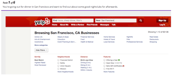
The importance of the first click is best understood by a test that Bob Bailey, Senior Innovator at Adobe, ran on the CDC.gov website in 2006. He found that when the user’s first click is on the right path, 87% will succeed at the task. When they click down the wrong path, only 46% succeed. Considering that the Yelp home page is teeming with options (cities in the top nav, popular events in the sidebar, etc.), this test would let us see which section was the most intuitive and where we could cut features.
Luckily, the first-click test confirmed the findings done in the two previous tests. We always recommend running different types of tests to serve as checks-and-balances.
Designing Based on Usability Insights
Once it was time to design, we followed an approach based on the last few steps of the Google Ventures design process. UXPin CEO Marcin Treder first started with many informal sketches before a team decision helped cull it down to the top 2-3 sketches. To prevent design by committee, Marcin had the final say regarding which sketches would progress into wireframing and prototyping with UXPin.
After moving into UXPin, we created a wireframe to incorporate most of the design changes, then added some interactions and animations to turn it into a low-fidelity prototype. Once the animations were smoothed out, we added detail in UXPin for a high-fidelity prototype. Screenshots from the process are shown below.
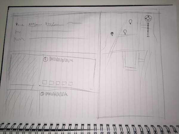
1. Sketches
Homepage:
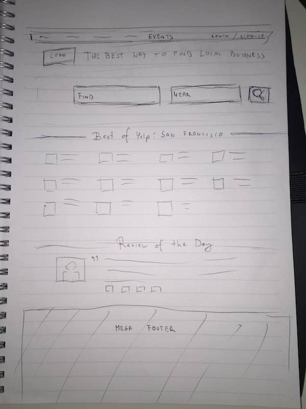
Search Results:
2. Low Fidelity Wireframes
Homepage:
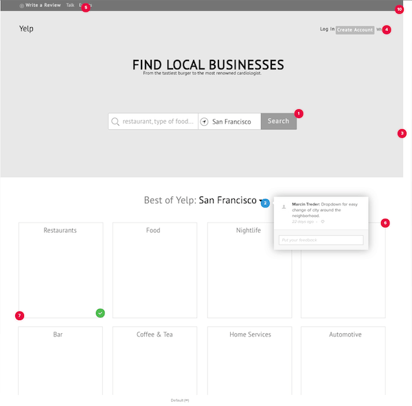
Source: UXPin Yelp Redesign
Search Results:
Source: UXPin Yelp Redesign
3. Low Fidelity Prototype
To click through a few interactions and browse the entire design, you can play around with this in the Live Preview.
Source: UXPin Low Fidelity Yelp Prototype
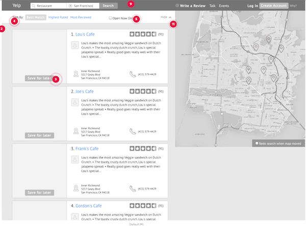
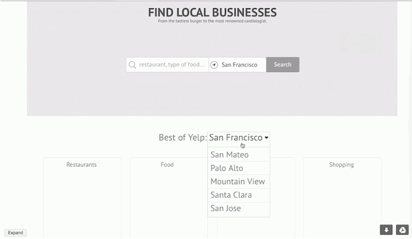
4. High Fidelity Prototype
To click through a few interactions and browse the entire design, you can play around with the high fidelity prototype in the Live Preview.
Homepage:
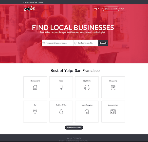
Source: UXPin High-Fidelity Prototype
Search Results:
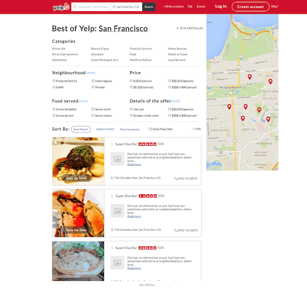
Source: UXPin High-Fidelity Prototype
Define, Plan, Test
The methods we’ve chosen here are designed for a fast-paced design process, but the principles are applicable to small companies and enterprises. Understand the business objectives, identify the right user group, and then plan the tests that work best for your budget and timeline.
Get that done and you’ll have completed one of the most important first steps for your design. The worst enemy in the design process, after all, is ambiguity.