Mobile Devices and Responsive Design Patterns for a Successful Experience
Responsive web design is no longer a subject for discussion when it comes to any kind of website development because it is a crucial step. As designers and developers, we have got to understand the importance of effective responsive design and its role in maintaining a great experience for end users.
We have passed the time when responsiveness was an option and there was a choice about having a responsive version of website as the web took the a turn to the mobile-web. Many of us failed to adopt to the trend mobile users started to take over, thus facing challenges and difficulties for a smooth experience on a mobile device.
We can admit that mobile has radically revolutionized the way we use the web. A 2013 survey showed that up to 73 percent of users browse the internet via a mobile device which makes it almost impossible to take the risk of not having a properly optimized, user-friendly responsive web design.
Responsive web design has become a usual phenomena and not a trend anymore, but there are still flaws that make this process more of a hassle than an enjoyable experience, which is why we will discuss several practices and trends that can help you achieve the much-demanded perfect experience.
Intuitiveness and Ease of Use
When using mobile devices, users are not willing to show much patience toward confusing experiences which are usually generated by messy, cluttered or just non-intuitive designs that lead to a poor mobile experience, making it sad for both parties. Designers and developers have got to keep in mind that momentum is one of the key factors in a mobile-web environment and long response times combined with with a cluttered interface and a not-so-powerful mobile device (undoubtable latest mobile devices are very powerful but having 10 games running in the background with some IM chat and a not-so-great internet connection) cannot be compared with a “regular” web experience, thus intuitivity has its very important role.
Intuitive never meant blank, ugly or messy, it just means that any type of design, be that a simplistic or more advanced one, has to be easy to use and clear in what it lets you do. Every interaction must have a purpose, it has to be straight to the point because any useless or action of low importance should not be given space or allowed in a proper responsive canvas.
With Postcards Email Builder you can create and edit email templates online without any coding skills! Includes more than 100 components to help you create custom emails templates faster than ever before.
Free Email BuilderFree Email TemplatesRegular vs. Responsive Experience
When coding for mobile devices, it is important to realize the crucial difference between a regular browsing experience and a mobile one. Websites optimized for mobile devices should be short introductions or summaries of bigger websites and do not have to contain any unimportant or “second degree” actions that unprioritizes the main use of your website. A great mobile experience shouldn’t give you the exact same website you would normally access, and should include adapted graphics. It should focus on a user’s thinking, why would (s)he use your website on a mobile device, and what a final action would be, thus being able to create a set of different scenarios set step-by-step in a logical order.
Efficient methods of data entry, graphics and browsing must be provided to the mobile users, considering special needs that the user might have on your website.
Analyze and Apply Data

When A/B testing services were introduced to masses, every site owner was given the opportunity to open a door for improvement, being able to understand the behaviour of users without having a direct interaction. Now we apply the same principles for the more mobile-focused web, various tools such as the Google Analytics Mobile Reports would come in handy. Website usability can be tested and be better understood by analyzing data provided by GA, which includes and is not limited to an exact breakdown of what devices visitors are using to access the website, going as further as showing you the screen resolution and the preferred browser of your audience. This free but useful feature of Google Analytics allows a way to better understand your typical user and act using the data.
Having any data makes it easier to create a smooth experience because you are not aiming at a general, more likely unknown audience, which gives you the ability to put emphasis on specifics, making it even easier to fit all the needs of your end-user.
Think Specifics
Having data to work with is not necessarily, but can be, a great help, allowing you to be highly specific when it comes to fitting the needs of your audience and create a nearly perfect experience for mobile users. There are various ways to target users but when we are targeting a specific kind of audience, we cannot really talk in general terms, because each niche has its own special needs and requirements.
E-commerce:
With Startup App and Slides App you can build unlimited websites using the online website editor which includes ready-made designed and coded elements, templates and themes.
Try Startup App Try Slides AppOther ProductsResponsive e-commerce websites are probably those that deserve the most attention and effort because they directly affect the revenue and success of the store. Undoubtedly, mobile e-commerce is an opportunity no store or retailer would like to miss, considering that users have spent as much as $14 billion in 2013.
There are several techniques which are highly specific to e-commerce responsive web design, as the mobile shopper is the different from the usual internet buyer. Here are a few things to consider:
- Impact purchases are specific to mobile e-commerce, given the nature of the process. Purchases out of impulse are more likely to occur on a small screen than a traditional desktop which is a way for sellers to profit and users to feel happy about their purchases.
- Casual Shopping is no more casual when it comes to mobiles. A smooth and easy-to-use platform allows the user to checkout an item with a few clicks while enjoying a relaxing activity implies that there is no more casual strolling around various shops and is more likely to lead in an increase of sales. There is no place or time for comparing items or prices when you are about to buy from a 5-inch screen.
- User decisions is what you breathe. You may implement the best marketing plans, apply great psychological tricks that would induce your buyer into purchasing items but keep in mind that all you do is breathe and live with your user’s decisions. You analyze, you decide, you implement but you never forget that all decisions should be taken with user’s experience and behavior in mind.
Responsive Patterns
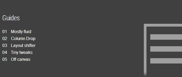
Due the nature of responsive design, these websites are usually built on a grid system or follow a pattern that reassembles content on a canvas. They vary from website to website because specific needs have to be taken when deciding to use one or not, but most of the times you would probably stick to various patterns that can be categorized as follows: Mostly fluid, column drop, layout shifter, tiny tweaks and off canvas. These are main categories that canvas design fall into but there are several tweaked modules that could be used in your designs.
Forms, images, videos and similar media files should be taken care of in a specific way due to how mobile devices react to these files or forms on a responsive layout. There are several resources that would let you take care of this without much of a hassle.
Tools and Utilities:
Apptimize (Mobile A/B Testing)

Apptimize offers powerful analytics which is a great solution for a complete mobile A/B testing, it allows to perform tests on both iOS and Android platforms starting with a free demo plan which you can take advantage of.
Responsive Canvas Mock-Ups:
Below are several online tools that create mockups of your website’s canvas in different screen sizes. These mock-ups may come in handy but be careful to not rely solely on them because they do not represent an exact picture of how devices react.
Responsinator
Responsive Design Testing:
Responsive Test
Responsive Website Builders:
These are slightly different tools because website builders are meant to convert Photoshop designs to fully working, responsive web templates. Start responsive designs faster and create high-fidelity prototypes through media query breakpoints and precise CSS layouts by using one of the following products.
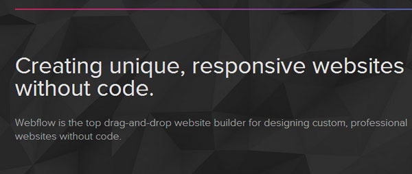
Webflow
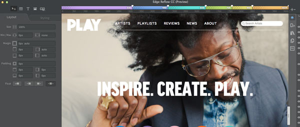
Adobe Reflow
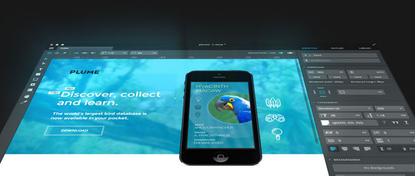
Macaw


 siter.io
 pulsetic.com
 static.app
 mailpost.io