Responsive Typography in Web Design: Understanding and Using
Responsive web design, also abbreviated as RWD, is a well-known concept on the internet nowadays. It is very popular and was introduced about 4-5 years ago to the masses. Since then, everybody talks about it and website owners without a responsive layout look on how to change that.
RWD is important because the internet nowadays is mobile, not static. We do not only browse from our desktop machines anymore, we use tablets and smartphones. RWD has different components. Few months ago I wrote a piece on Responsive Images Tools. Another component is Responsive Typography, it is quite recently introduced, and is the one we will discuss in today’s article.
Why consider typography?
The content is the most important element of a website, we all know this by know. While people focus a lot on responsive grids and responsive images, they often forget how important the typography is, especially when content is such a central figure of any website.
Typography is already introduced in Responsive Web Design to some extent (column width, type size or line height, for example), but this article will help you take beyond the default settings of RWD.
What’s important
There are three basic principles you need to keep in mind. The first one is resizable type, which means that the text should not only be resizable based on the screen size, but should also be resizable by the user. The second principle is about optimizing line lengths in order to improve readability at a smaller scale and the third one is contrast.
But before looking at these, the choice usually is down to serif or sans serif fonts. It is difficult to say which is better, and I personally like both, but I need to say that sans serif might be better for smaller screens. Design gurus say serif should be used for headings and sans serifs for content – and this is for desktop. Their reasoning is simple: the semi-structural endings of the letters might merge with each other on screens, therefore serif fonts should only be used in big sizes. If this applies on big, desktop screens, then it probably applies on smaller screens as well. If I were you, I would start testing with sans serif fonts – especially if the font size is smaller than 12px.
With Postcards Email Builder you can create and edit email templates online without any coding skills! Includes more than 100 components to help you create custom emails templates faster than ever before.
Free Email BuilderFree Email TemplatesThe font size should be specified in the stylesheet according to different screen sizes. Basically, nothing is different yet compared to how you would normally style a responsive layout. What you need to think of now is if you will use pixels or ems. Ems seem like a better option, but they are relative to the parent element, so this will make them more complicated to use in a responsive layout than pixels. If you decide on using pixels, then you need to keep track of the different sizes and styles according to different screen sizes.
While changing the size type is a quite easy concept to understand and apply, maintaining a optimal line length gets a bit more difficult, because there is no optimal line length. Some studies say the optimal line length lies somewhere between 50 and 75 characters, but that’s just statistics. What is good for some people might not be good at all for others.
What you need to start with is looking at the different screen sizes you design for and figure out what font size you should use to get approximately 50 characters on a line. In case you work with smaller screens, you can also go below 50 characters. Some say it is important to also set maximum widths for content areas filled with text. Consider the font size you use, then determine the content container width when you have approximately 75 characters per line. Again, in case you work with smaller screens, you might get away with no container width and with letting the text spread across the whole screen width.
Now in case you work with larger screens, for example an iPad on landscape, with a width of 2048 pixels, things are quite different. I recommend you to use multiple columns and spread the content around those, to make it easier to read. Two or three columns, depending on the font size, should work just fine. It is, again, up to you, but don’t spread the text across only one column. It will be way too wide and the eyes will get tired much faster.
Contrast is the third basic principle and is really easy to notice how well Amazon worked with it in their Kindle products. In their ebook readers, users are able not to only change the typeface, the font size and the line height (not width, though), but also the background color, which makes the contrast more powerful or weaker. This is quite difficult to control and have as a feature in a website, but testing different contrasts (background colors) and deciding on the one that looks best is a very good idea.
Remember that whenever you modify one of the above settings, you need to adjust the others as well. For instance, most of the time a bigger font size brings the necessity of a higher line. Do not forget how important testing is in creating the perfect responsive typography layout. Borrow as many devices as you can (or go in smartphone shops and browse from there) and make sure your solution looks great on most (if not all) of them.
Use alternatives
What people tend to forget is that while some fonts do, some others (the majority, unfortunately, don’t work very well in all screen sizes). But media queries and responsive web design allow us to change fonts at different screen sizes. Do not stick with the same font throughout all your screen sizes, if you think it doesn’t look good all over the place. In this case, just switch to another font.
With Startup App and Slides App you can build unlimited websites using the online website editor which includes ready-made designed and coded elements, templates and themes.
Try Startup App Try Slides AppOther ProductsGood examples are the majority of display fonts, which look very good in big sizes, but are difficult or impossible to read in small sizes. In this case keep them on large screens, but replace them with something more visible on smaller devices.
Still media queries…
To put responsive typography in use is quite easy if you have prior experience with responsive web design. You basically use media queries in the stylesheet to decide which properties you use on which screens. In case you are not able to code a responsive layout, you should not try to jump straight into responsive typography. Responsive typography is just a part of the whole RWD concept, therefore you need to go to the roots of the responsive concept in order to be able to put responsive typography into practice.
This is how a simple switch of fonts looks like in CSS:
@media (min-width: 960px) {h1 {font-family: “Georgia”,}}
@media (max-width: 960px) {h1 {font-family: “Droid Sans”,}}
Understanding REM
We talked earlier about pixels versus ems. You decide yourself what you want to use, there are no regulations for this. However, with this article I want to also introduce a new concept for you, the REM concept.
REM is a new unit introduced in CSS3, which stands for “root em”. This means the rem unit is relative to the font size of the html document. This makes it easy for developers to define a single font size on the html document and then define all rem units to be a percentage of that.
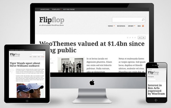
When working with responsive layouts and responsive typography especially, using rem instead of em or pixels might help you get to the finish line faster and with less frustrations down the road.
Holding the devices
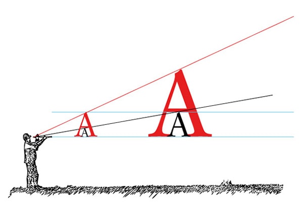
When working with typography is also important to keep in mind how do we actually hold the devices we use. This is why responsive typography is very tricky. You will notice sometimes we hold the devices in our hands farther away than some other times. We also tend to hold tablets farther away than we hold smartphones. This makes a huge change and should make us think what font size and line height/width we should use for which screen size. Responsive typography might just be the most challenging concept of Responsive Web Design, therefore the most complex.
Responsive Typography Examples
Oxide Interactive

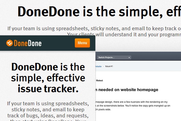
DoneDone
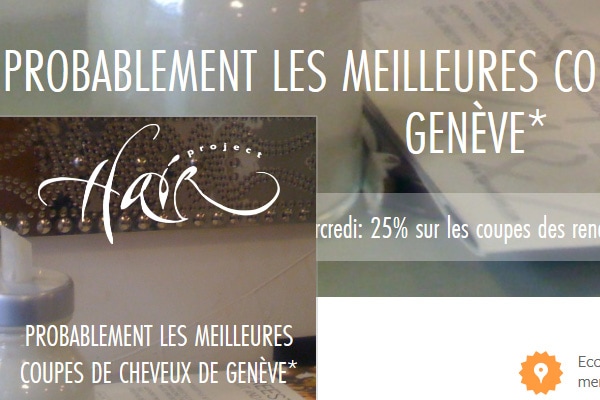
Hair Project
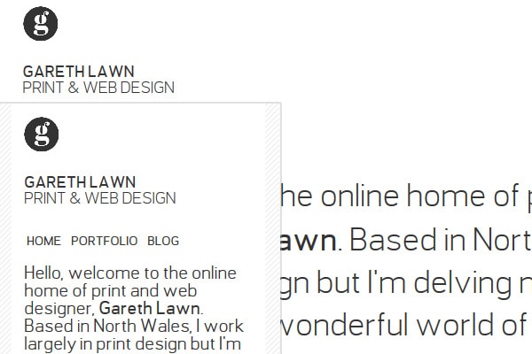
Gareth Lawn
Siyelo

Coop

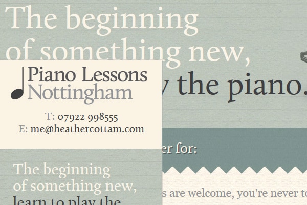
Piano Lessons
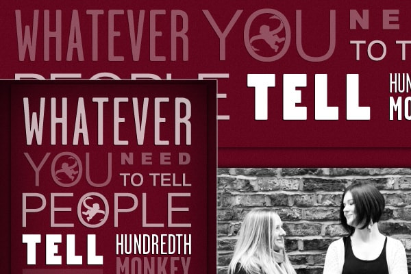
Hundredth Monkey
Dress Responsively
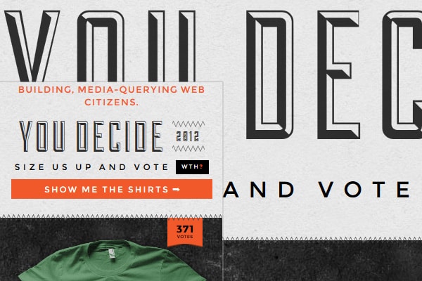
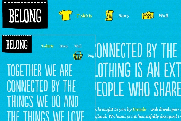
Belong
Conclusion
Responsive typography is something quite new, so not many people know about it. The techniques used are still in development and you can’t find much about it on the internet. However, putting it into practice is not so difficult. You basically only need to know how to use media queries and to have a bunchload of devices with different screen sizes to test on. And if you have that, then you only need to go out there and try responsive typography on your own.
Another impressive guide about responsive typography can be found here. Tim Brown did a very good job in gathering all the possible sources and I am sure more will come, but in case you are a beginner, that page is one of the places you can start from.
Until next time, what is your view on responsive typography? Do you think its popularity will go straight through the roof, like the whole RWD concept did (and still does, for that matter)? Or do you think responsive typography is not something we need to care about right now?
