Designing Website Text for Readability
Text can be beautiful, simple, wild, engaging, exciting and a wide number of other things. It can stir emotion and helps users understand your message. Type can be a wide number of things but one thing is common – it must be readable.
That is a factor that is sometimes forgotten. Designers work to get too much information into too small of a space or opt for something that looks better than it reads. But the essential point is this: If your type is not readable, your design will not be wholly effective.
Readability: “the state or quality of being readable; the property of type that affects the ease with which printed matter can be read for a sustained period.” – dictionary.com
While that’s a bold statement it applies to almost everything. “What about type as an art element” you ask? Less-than-readable type can work in this type of design but only – and only – if it is paired with type of a readable nature.
Readability in a Nutshell

With Postcards Email Builder you can create and edit email templates online without any coding skills! Includes more than 100 components to help you create custom emails templates faster than ever before.
Free Email BuilderFree Email Templates
So what makes type readable? It’s actually a combination of a number of factors including line length, leading, typeface style, margins and padding, and color and contrast.
Each individual element contributes to how easy, or hard, something is to read on the screen. And every one of these elements is something the designer can control. Note that when we discuss these elements throughout this post, we are referencing the main body text of a website, where readability is arguably the biggest concern. (Many of these guidelines are a lot looser for other text elements as long as the main body is highly readable.)
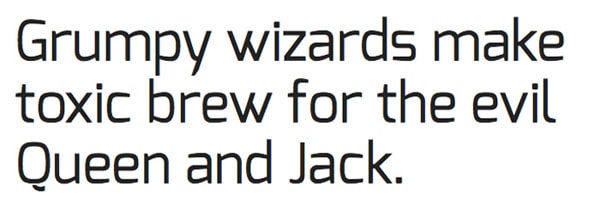
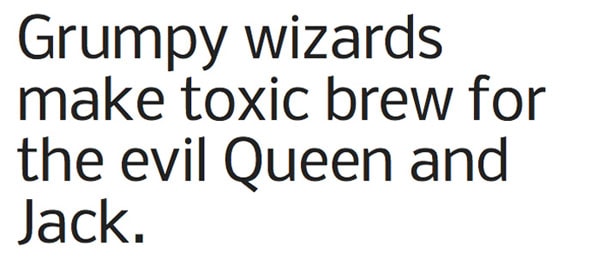
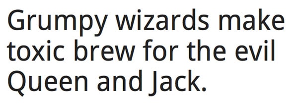
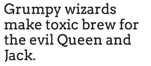
- Line Length: The number of characters in a line of text contribute to overall readability in a major way. If text is extremely wide, it can be intimidating and hard to read. The same is true of lines of text that are too short, which can stress the eyes of readers and cause confusion.
- Leading: The amount of space between lines of text is equally important. Consider this article, if each line of type touched the lines above and below it, you would not be able to comprehend the words.
- Typeface Style: The style of typeface can impact readability as well. Simple serif and sans serif fonts are the most readable and scannable, while ornate styles, scripts and novelty typefaces are the most difficult to decipher.
- Margins and Padding: As with leading, the amount of space around and between objects impacts how well a user can read the actual words.
- Color and Contrast: The color of text against the corresponding background is significant as well. If you place green type on a green background it can be difficult to read. There is a reason most designers opt for light text on a dark background on dark type on a light background. The contrast makes lettering easy to read.
Readability on Different Screens

So how can you create the most readable type? When it comes to body text there are some basic guidelines for the number of characters per line – and per device type – that contribute for optimum readability.
So how do you know where to start? Optimum line lengths can help you determine text size. Here’s how: Determine the width of your body text frame – you can generally assume it as desktop, table or mobile size. And adjust type size to fall within a range of ideal character count.
With Pulsetic you’ll be instantly notified the moment your website, API, or server becomes unavailable. Monitor uptime from multiple global locations and respond to incidents before your users are affected.
Create beautiful status pages in minutes to keep customers informed during outages and build trust with transparent communication.
Start Monitoring for FreeWhile there are other factors that do come into play, these guidelines are a good place to start.
- Desktops: 55 to 75 characters per line, including spaces; ideal is closer to 65 characters per line
- Mobile Devices: 35 to 50 characters per line
Combine an optimum number of characters per line with great line spacing (or leading) to increase readability. Leading is often best defined as a percentage of the body text size and can be defined as a hard number or by using ems.
- Desktops: 1.5 times the size of type
- Mobile Devices: 1.75 to 2 times the size of type
If you are looking for a great tool to help make all of this math easier, try the Golden Ratio Typography Calculator.
Other Tips for Readability
Creating a readable typeset can have a lot to do with type that is not the main body text as well. Using headers, bullet lists, extra spacing between paragraphs and color can add to the overall readability (and reader’s ability to scan a site) as well.
Think about adding text hierarchy using these elements as well to create a more complete – and readable – website design. And remember to “style” each of these elements with a specific typeface, size and color of their own that works in harmony with the main body text.
- Headers
- Links
- Bold or italics in the text
- Bullet or numbered lists
- Graphic elements such as photos
- Captions
- Pull quotes
- Mix serif and sans serif typefaces for elements
10 Easy to Read Typefaces
No article about readability would be complete without some type suggestions. So here are 10 highly readable – and rather popular – typeface options for building websites.
Sans Serifs
Open Sans
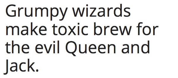
Lato

Exo
Nobile
Droid Sans
Serifs
Arvo
Old Standard TT

Abril Fatface

Vollkorn

Josefin Slab

Readability Checklist


![]()
Now that you think you have a pretty good idea of what typeface and style you want to use for your next design project are you sure you have put everything together in a way that is completely readable? Here’s a quick checklist to help you plan the type design.
- Is the main body type big enough? Does it fall in the range of optimum line length for each device size?
- Is there enough spacing between each line of text?
- Is there enough room between text and the edge of the page and other design elements?
- Is there enough contrast between the background and main body text?
- Is there extra space between each new paragraph?
- Are headers and other text elements different from the main body text?
- Did you use other elements (bullet lists, bold, etc.) to break up large blocks of text?
- Did you use readable typefaces for the main body (preferably a simple serif or sans serif)?
Conclusion
Readability is an essential part of design. If you can’t read and understand what’s on the page, it will never be relevant and important to users.
How do you plan for readability in design projects? Do you have additional tips for success? Share them with us in the comments.


