Block Reveal Effect, a New Design Trend for Entrances and Exits
For all those who adore the beauty of simplicity obtained by regular geometric shapes and modular layouts, there is an excellent solution. It is the block reveal effect and it is pretty trendy. It ideally refines interfaces as well as adds a subtle dose of interactivity.
Being blocky, a bit rigid and in some way bold, it also owns characterstics of minimalism, elegance and neatness. It is a good and fresh alternative to the hackneyed and trite fade effect, which increasingly overpopulates websites. The main application is to intensify entrances of various blocks in the design. It works well with headings, chunks of text, images and even sliders.
This compilation demonstrates 12 wonderful examples of the block reveal effect.
Boxy Vibe
We start our compilation with La peau de lours.
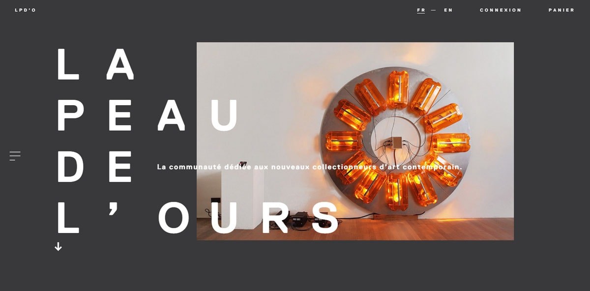
The team behind the project goes for a popular usage of block reveal effect. It is used to enrich the transitions between slides in the homepage carousel, making the component look trendy, interactive and engaging. It also completes the tone and attitude of the main line of design, contributing to the prevailing blockish aura.
With Postcards Email Builder you can create and edit email templates online without any coding skills! Includes more than 100 components to help you create custom emails templates faster than ever before.
Free Email BuilderFree Email TemplatesAs a follow-up to the boxy aesthetics, the website of Baugeld Spezialisten can be considered to be the king in this sphere.
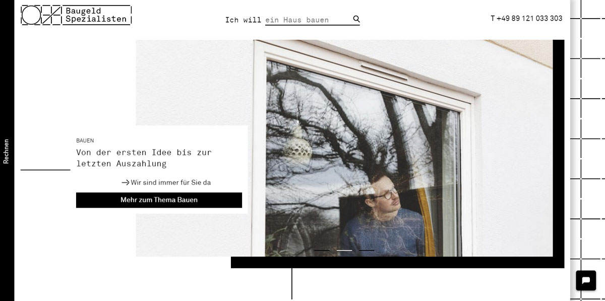
The design screams with an overpowering geometric feeling that lies at the core of every detail of the interface. Here, the block reveal effect fits like a glove. Although, it is used only in combination with visual elements, beautifully opening images and enriching hover states of buttons; yet still that is sufficient to feel its charismatic presence.
Go Massive
Unlike previous examples, where the block reveal effect was chosen to improve only one item of the composition, in VR Arles Festival it affects and benefits all main aspects of the design.
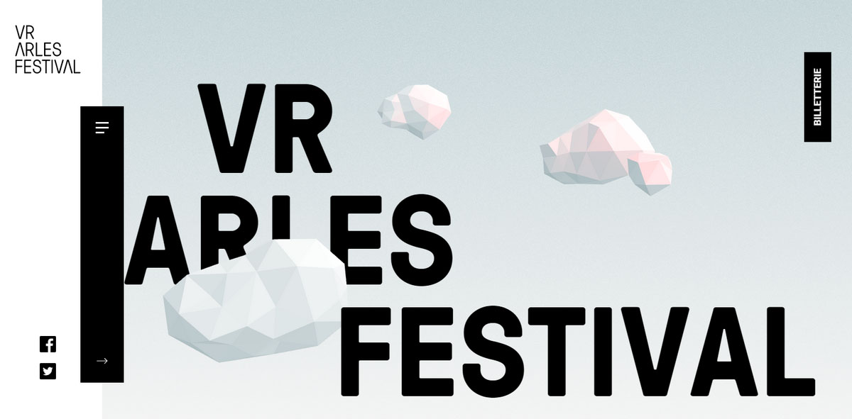
It lies in the heart of all the interactive features:
- It beautifies entrances of all the major content blocks
- It acts as a hover effect
- It underlies opening of the sliding menu
- It embellishes the aesthetics with tiny dynamic decorative details
Surprisingly, despite being almost everywhere, it does not overwhelm nor irritate users; on the contrary, it maintains and fosters the harmony.
The DSA Clinic website is another example of dominant use of block reveal effect without driving online visitors up the wall. It is used as an entrance effect for buttons, captions and main website sections.
With Pulsetic you’ll be instantly notified the moment your website, API, or server becomes unavailable. Monitor uptime from multiple global locations and respond to incidents before your users are affected.
Create beautiful status pages in minutes to keep customers informed during outages and build trust with transparent communication.
Start Monitoring for Free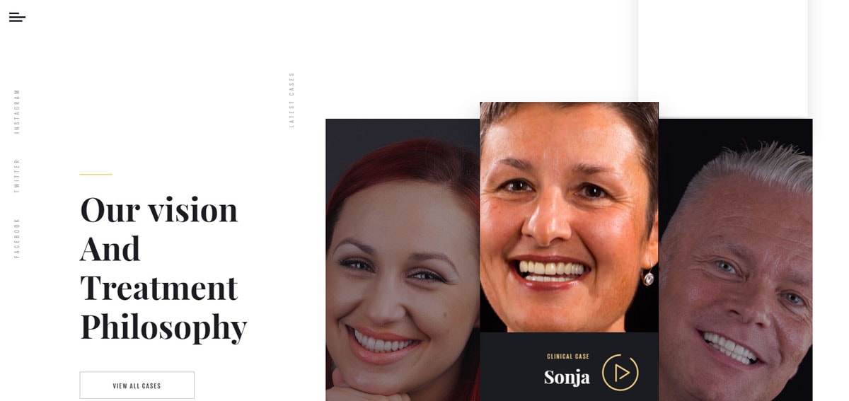
With all that, it does not upset a delicate balance of details and interactive features. Not only does it help to withstand one style but also strengthens the feeling of neatness, tidiness and openness.
Interactive features also rule the roost in Sequence.
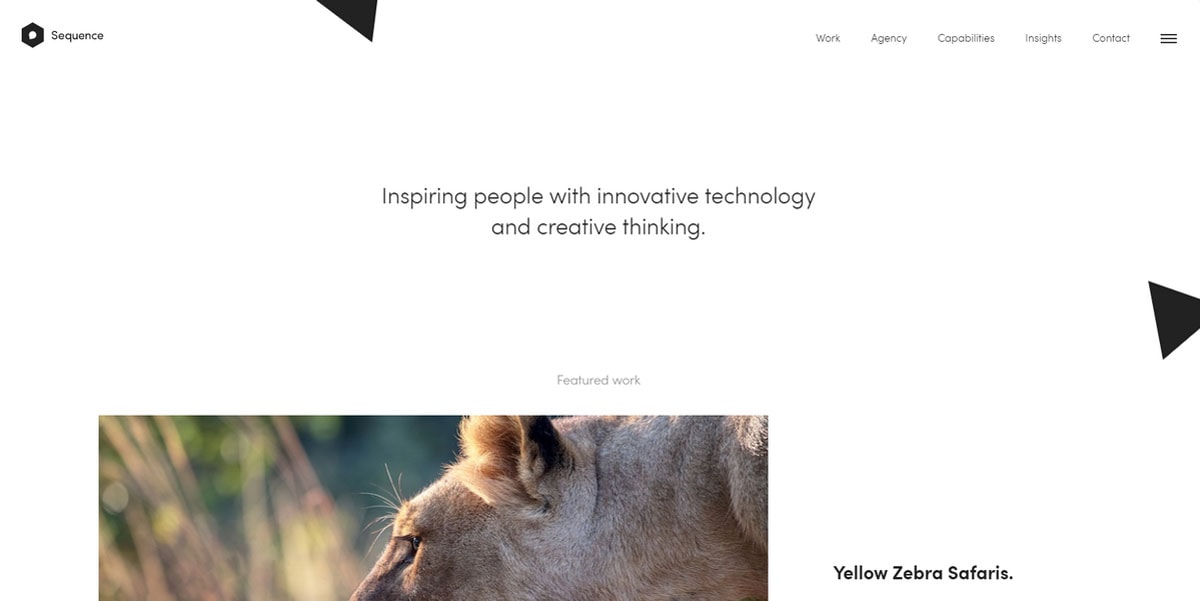
While the text is traditionally showcased with the help of fade effect, all the images are brought to life by means of the block reveal effect in an inviting and enticing fashion. It can be seen through all the pages, enhancing the user experience in every corner of the project.
Smart Introduction
Here in the Forh website, the effect works as an effective and enjoyable introduction for the content blocks.
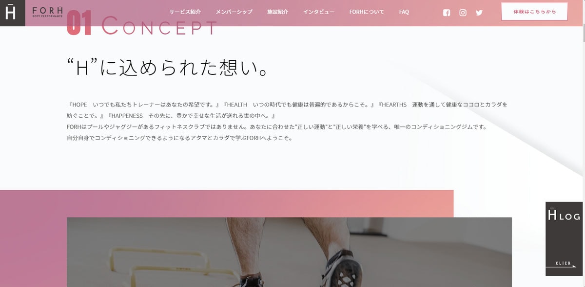
It is triggered by the scroll in order to make the exploration of the website inviting and catching. It cultivates a clean aesthetic, supports the magnificent boxy atmosphere and unobtrusively drives attention to important points.
Another representative example is Carv. It has an incredible long landing page where the block reveal effect plays a leading role in producing the fantastic user experience. It serves as some kind of a dramatic entrance for every section in the design. It skillfully uncovers multiple elements, including:
- Headings
- Portions of text
- Images
- Video blocks
- Call-to-action buttons

Although it is slightly overused; the team managed to not to lose equilibrium.
One-screen Websites
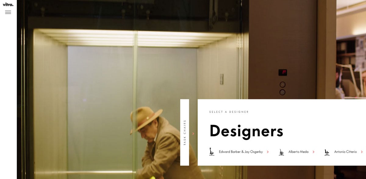
The block reveal effect is an ideal partner for one-screen websites that are based on full-screen sliders. Together they form a symbiosis with an experience that draws users in. In Vitra’s case, the team combines it with the drag technique making transitions not only controllable but also intuitive. Also, much like in the previous examples, it matches the rigid and block-ish philosophy of the interface.
Conservative Use
The teams behind B&O Play and Prigipo take baby steps with this trendy effect.
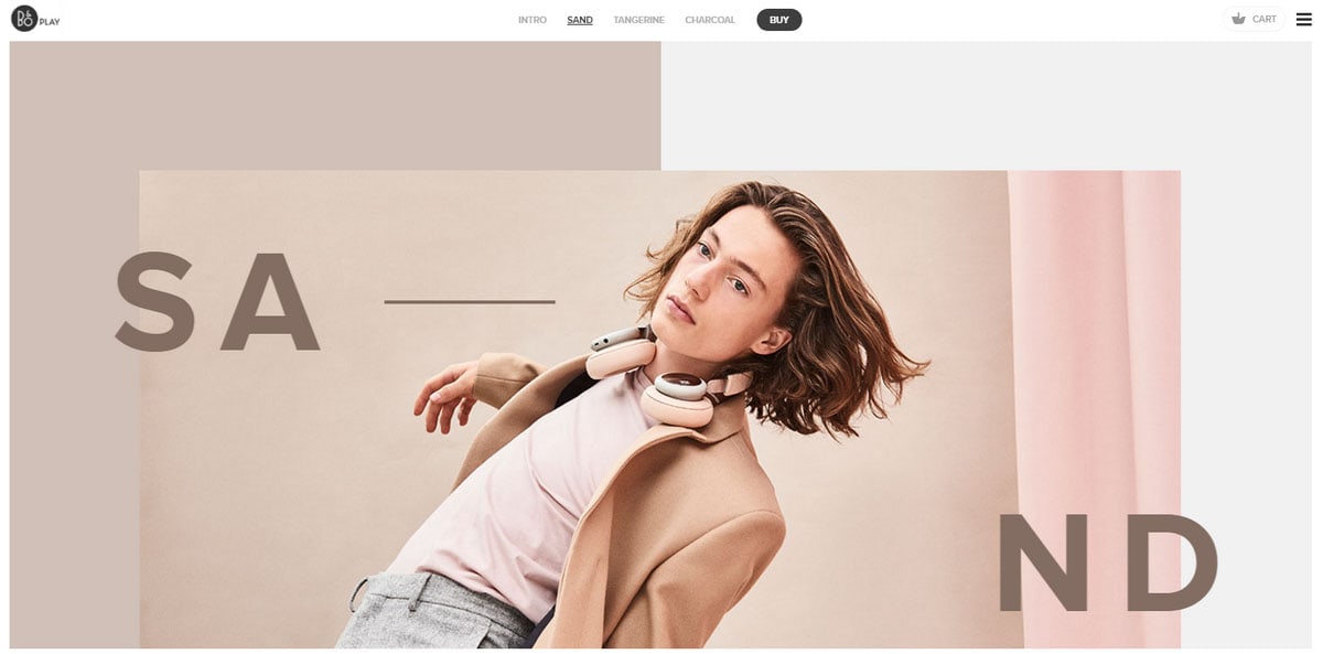
In B&O Play’s website, only images are affected by it. However, the team does not stop only on one standard realization that reveals content from left to right in a strict horizontal direction; they have come up with interesting solutions that demonstrate how to make the most out of a bunch of squares and rectangles.
The team behind Prigipo has set their eyes only on the front page slider.
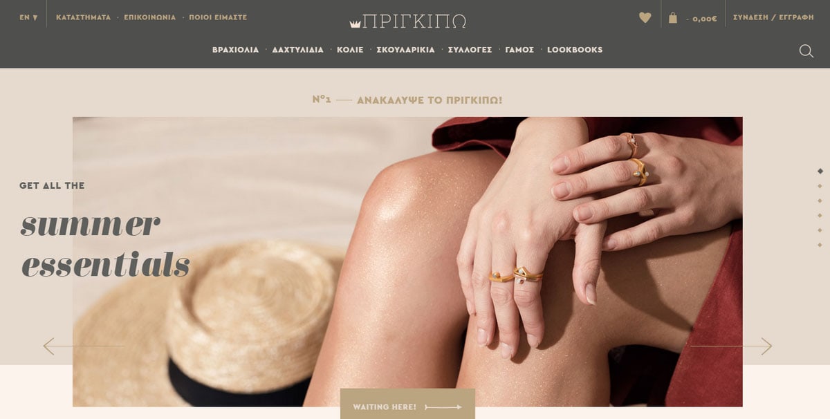
Much like in the first example in our list, the block reveal effect enriches transitions between slides. Since the carousel gets its beauty mainly from the bulk of carefully assembled rectangle shapes, use of such kind of animation is only logical. By the way, it also nicely echoes with a hover effect attached to buttons.
Striped Layout and Effect
Fotonaut’s website aesthetic heavily relies on a vertical striped layout that is taken to the next level. Here the block reveal effect with its authentic boxy feeling serves as a perfect finishing touch that glues everything together.
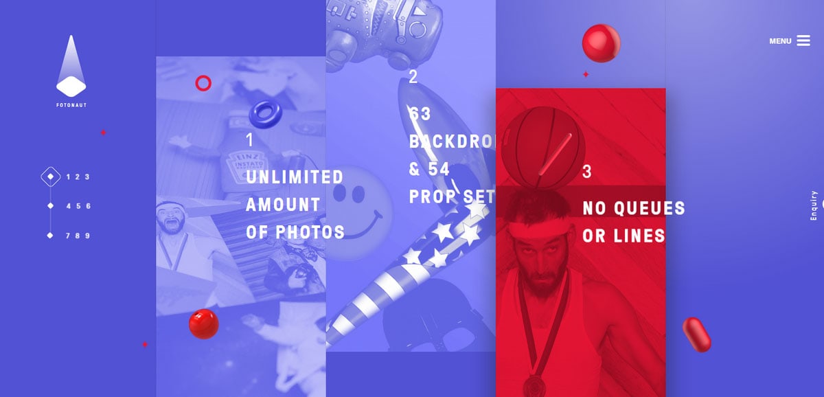
Enhancing entrances and transitions of several chief components of the interface such as slider and menu, its use is rather common. Nevertheless, it assists in maintaining the consistency throughout the website as well as adding a playful tone that lightens the general atmosphere.
Minimalist Take
While the effect is usually associated with the huge wide stripe that precedes the appearance of a text block, nothing prevents you from reducing the size to the minimum.
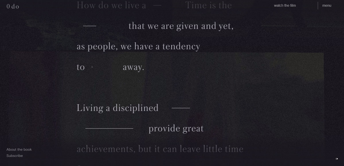
The team behind Zero Days Off did namely that. They replaced “fat” lines with relatively thin ones in order to adapt this effect to the welcome message. It allows showing missing words in the opening speech in an attractive manner. What’s more, the solution also gives extra subtlety and elegance to the interface.
Conclusion
All the aforementioned examples have one thing in common (in addition to block reveal effect, of course) – they have unmistakable and powerful boxy vibes. Lines, triangles, rectangles and squares dominate. Also, a modular underlies all the interfaces. That is not an accident. The block reveal effect speaks for itself: it has a rigid four-sided shape that ideally blends into such environment. It corresponds with the overall aesthetics for creative diversity.


