Bootstrap 4 Tutorial: Working with npm, Grunt.js and Sass (Part 2)
Firstly read the Bootstrap 4 Tutorial: Working with npm, Grunt.js and Sass (Part 1).
Bootstrap 4 comes with an official Sass port for the framework. If you are not familiar with Sass, implementing it via Bootstrap can be a little tricky.

In the previous article, we installed, configured and customized npm and Grunt.js setups for faster development. In this article, were going to deal with Compass and Sass as well as implement a watch task to watch for changes and run the tasks it needs to. At the end of this tutorial, were going to come up with Bootstrap 4 theme that is built with Sass.
Looking for a Bootstrap online builder?
- 👉 Try our Bootstrap Builder and create unlimited projects for unlimited clients.
- 👉 Start to build a website using our Bootstrap Templates.
Resources you need for this tutorial:
- min.js
- easings.min.js
- velocity
- mousewheel.js
- mCustomScrollbar.js
- js
- slide images
- scss
- npm and Grunt.js
HTML
Before we work with the Sass and Grunt.js tasks, we’ll need to set up our markup along with respective JavaScript code. You can copy the code on your index.html file.
With Postcards Email Builder you can create and edit email templates online without any coding skills! Includes more than 100 components to help you create custom emails templates faster than ever before.
Free Email BuilderFree Email TemplatesNote: All of the JavaScript code will be placed in the JS folder.
<!DOCTYPE html> <html> <head> <meta charset="utf-8"> <title>Bootstrap 4 Sass</title> <meta content="Bootstrap 4 with Sass" name="description"> <meta content="width=device-width, initial-scale=1.0" name="viewport"> <link href="css/style.css" rel="stylesheet"> </head> <body> <!-- Banner --> <div class="header-overlay"> <div class="overlay morp"></div> </div> <section id="header-content"> <div class="content"> <h1>Bootstrap 4</h1> <h2 class="text-intro opacity-0">The most popular HTML, CSS, and JS framework</h2> <p class="text-intro opacity-0">Bootstrap makes front-end web development faster and easier. It's made for folks of all skill levels, devices of all shapes, and projects of all sizes.</p><a class= "text-intro opacity-0 btn btn-primary" data-target="main-content" href="#" id="open-more-info">READ MORE →</a> </div> </section><!-- Banner --><!-- Main Content --> <section class="main-hide" id="main-content"> <div class="content"> <h1>Designed for everyone, everywhere.</h1><br> <p>Bootstrap makes front-end web development faster and easier. It's made for folks of all skill levels, devices of all shapes, and projects of all sizes.</p><br> <p>Quickly include Bootstrap's CSS and JS into any project. Use your favorite package manager, download the source, or use the Bootstrap CDN.</p> <hr> <div class="col-xs-12 col-md-6 col-xl-6"> <div class="card"> <img alt="Card image cap" class="card-img-top" src="img/card-img.jpg"> <div class="card-block"> <h4 class="card-title">Custom</h4> <p class="card-text">A card is a flexible and extensible content container.</p><a class="btn btn-primary" href="#">More →</a> </div> </div> </div> <div class="col-xs-12 col-md-6 col-xl-6"> <div class="card"> <img alt="Card image cap" class="card-img-top" src="img/card-img.jpg"> <div class="card-block"> <h4 class="card-title">Great</h4> <p class="card-text">A card is a flexible and extensible content container.</p><a class="btn btn-primary" href="#">More →</a> </div> </div> </div> <div class="col-xs-12 col-md-6 col-xl-6"> <div class="card"> <img alt="Card image cap" class="card-img-top" src="img/card-img.jpg"> <div class="card-block"> <h4 class="card-title">Flexible</h4> <p class="card-text">A card is a flexible and extensible content container.</p><a class="btn btn-primary" href="#">More →</a> </div> </div> </div> <div class="col-xs-12 col-md-6 col-xl-6"> <div class="card"> <img alt="Card image cap" class="card-img-top" src="img/card-img.jpg"> <div class="card-block"> <h4 class="card-title">Easy</h4> <p class="card-text">A card is a flexible and extensible content container.</p><a class="btn btn-primary" href="#">More →</a> </div> </div> </div> <hr> <br> <br> <h3>Connect</h3> <p>Quickly get a project started with any of our examples ranging from using parts of the framework to custom components and layouts.</p> <form id="contact-form" name="contact-form"> <div class="row"> <div class="col-xs-12 col-sm-6 col-lg-6"> <fieldset class="form-group"> <input class="form form-control" data-name="Name" id="name" name="name" placeholder="Your Name.." required="" type="text"> </fieldset> </div> <div class="col-xs-12 col-sm-6 col-lg-6"> <fieldset class="form-group"> <input class="form form-control" data-name="Email Address" id="email" name="email-address" placeholder="Your Email.." required="" type= "email"> </fieldset> </div> <div class="col-xs-12 col-sm-12 col-lg-12 no-padding"> <fieldset class="form-group"> <textarea class="form textarea form-control" data-name="Text Area" id= "text-area" name="message" placeholder="Your Message.." required= ""></textarea> </fieldset> </div> </div><button class="btn btn-block btn-primary" type= "submit">Submit</button> </form> </div><!-- Main Content --> <!-- Footer --> <footer> <p>Awesomeness - Geeky</p> </footer> </section><!-- Close Button--> <button class="hide-close" id="close-content"><i class= "fa fa-times"></i></button> <img src="data:image/gif;base64,R0lGODlhAQABAIAAAAAAAP///yH5BAEAAAAALAAAAAABAAEAAAIBRAA7" data-wp-preserve="%3Cscript%20src%3D%22js%2Fjquery.min.js%22%3E%0A%09%3C%2Fscript%3E" data-mce-resize="false" data-mce-placeholder="1" class="mce-object" width="20" height="20" alt="<script>" title="<script>" /> <img src="data:image/gif;base64,R0lGODlhAQABAIAAAAAAAP///yH5BAEAAAAALAAAAAABAAEAAAIBRAA7" data-wp-preserve="%3Cscript%20src%3D%22js%2Fjquery.easings.min.js%22%3E%0A%09%3C%2Fscript%3E" data-mce-resize="false" data-mce-placeholder="1" class="mce-object" width="20" height="20" alt="<script>" title="<script>" /> <img src="data:image/gif;base64,R0lGODlhAQABAIAAAAAAAP///yH5BAEAAAAALAAAAAABAAEAAAIBRAA7" data-wp-preserve="%3Cscript%20src%3D%22js%2Fbootstrap.min.js%22%3E%0A%09%3C%2Fscript%3E" data-mce-resize="false" data-mce-placeholder="1" class="mce-object" width="20" height="20" alt="<script>" title="<script>" /> <img src="data:image/gif;base64,R0lGODlhAQABAIAAAAAAAP///yH5BAEAAAAALAAAAAABAAEAAAIBRAA7" data-wp-preserve="%3Cscript%20src%3D%22js%2Fvelocity.min.js%22%3E%0A%09%3C%2Fscript%3E" data-mce-resize="false" data-mce-placeholder="1" class="mce-object" width="20" height="20" alt="<script>" title="<script>" /> <img src="data:image/gif;base64,R0lGODlhAQABAIAAAAAAAP///yH5BAEAAAAALAAAAAABAAEAAAIBRAA7" data-wp-preserve="%3Cscript%20src%3D%22js%2Fvegas.js%22%3E%0A%09%3C%2Fscript%3E" data-mce-resize="false" data-mce-placeholder="1" class="mce-object" width="20" height="20" alt="<script>" title="<script>" /> <img src="data:image/gif;base64,R0lGODlhAQABAIAAAAAAAP///yH5BAEAAAAALAAAAAABAAEAAAIBRAA7" data-wp-preserve="%3Cscript%20src%3D%22js%2Fjquery.mousewheel.js%22%3E%0A%09%3C%2Fscript%3E" data-mce-resize="false" data-mce-placeholder="1" class="mce-object" width="20" height="20" alt="<script>" title="<script>" /> <img src="data:image/gif;base64,R0lGODlhAQABAIAAAAAAAP///yH5BAEAAAAALAAAAAABAAEAAAIBRAA7" data-wp-preserve="%3Cscript%20src%3D%22js%2Fjquery.mCustomScrollbar.js%22%3E%0A%09%3C%2Fscript%3E" data-mce-resize="false" data-mce-placeholder="1" class="mce-object" width="20" height="20" alt="<script>" title="<script>" /> <img src="data:image/gif;base64,R0lGODlhAQABAIAAAAAAAP///yH5BAEAAAAALAAAAAABAAEAAAIBRAA7" data-wp-preserve="%3Cscript%20src%3D%22js%2Fcustom.js%22%3E%0A%09%3C%2Fscript%3E" data-mce-resize="false" data-mce-placeholder="1" class="mce-object" width="20" height="20" alt="<script>" title="<script>" /> </body> </html>
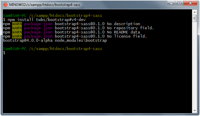
Install Bootstrap 4 via npm
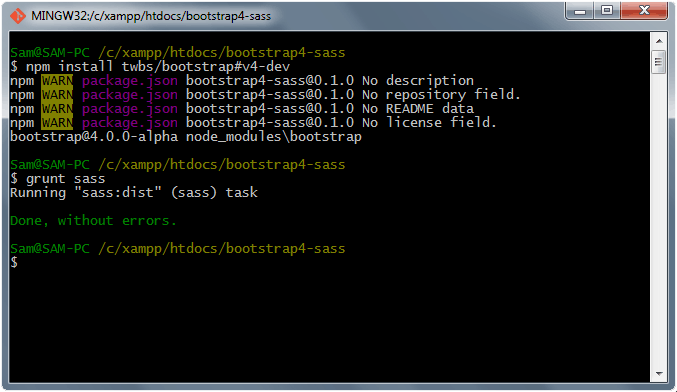
Download Bootstrap 4 alpha using the git branch v4-dev. Open your terminal or command prompt and inside the project directory type npm install twbs/bootstrap#v4-dev and the package is downloaded directly from GitHub to npm_modules folder.
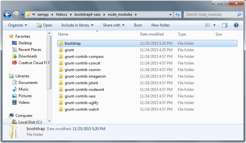
Bootstrap Folder
Working with Sass
Now that we have the Bootstrap 4 package, let’s move the scss folder inside the Bootstrap package to our sass folder so that we can have access to all of the main core files of Bootstrap Sass. If you want to simply import the compiled bootstrap CSS file –bootstrap.min.css or bootstrap.css to the custom .scss files that would also work.
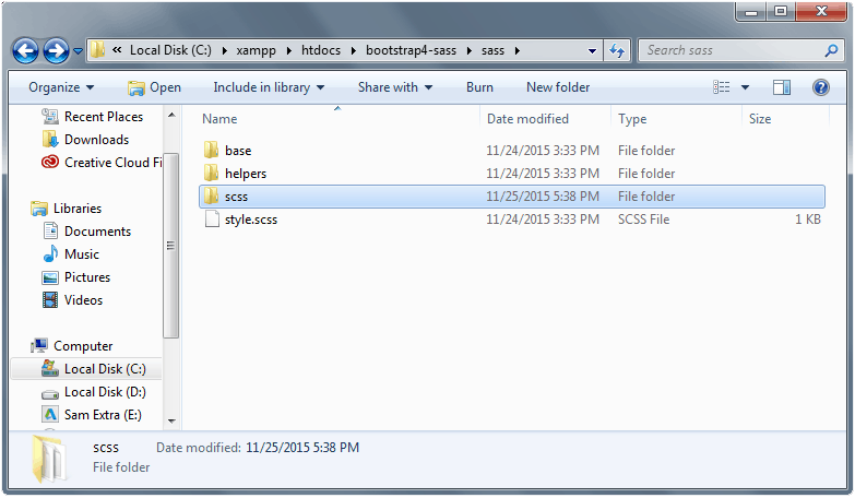
Next, start working on custom .scss files. Open the base folder and inside the _import.scss we will import the necessary CSS files that we need. Copy and paste the following code:
With Pulsetic you’ll be instantly notified the moment your website, API, or server becomes unavailable. Monitor uptime from multiple global locations and respond to incidents before your users are affected.
Create beautiful status pages in minutes to keep customers informed during outages and build trust with transparent communication.
Start Monitoring for Free/* IMPORTS */ @import url(font-awesome.min.css); @import url(animate.css); @import url(jquery.mCustomScrollbar.css); @import url(vegas.css);
Let’s also import the Google Fonts links that we need inside the _typography.scss file.
/* TYPOGRAPHY */
/* Google Fonts */
@import url("https://fonts.googleapis.com/css?family=Lato:400,300,300italic,400italic,700,700italic,900,900italic");
@import url("https://fonts.googleapis.com/css?family=Raleway:400,300,500,600,700,800,900");
Work on the variables for our Sass. Inside the _variables.scss file, copy the code below.
/* VARIABLES */

// colors
$color-white: #FFFFFF;
$color-turquoise: #00af94;

// backgrounds
$bg-white: #FFFFFF;
$bg-turquoise: #00c8aa;
$bg-black: #000000;

// font families
$font-lato: 'Lato', Arial, Verdana, sans-serif;
$font-raleway: 'Raleway', Arial, Verdana, sans-serif;
Then for mixins, let’s add the following code inside the _mixins.scss file (which is inside the helper folder).
/* MIXINS */
@mixin transition-cubic-bezier ($time) {
	-webkit-transition: all $time cubic-bezier(0.42, 0, 0.58, 1);
	-moz-transition: all $time cubic-bezier(0.42, 0, 0.58, 1);
	-ms-transition: all $time cubic-bezier(0.42, 0, 0.58, 1);
	-o-transition: all $time cubic-bezier(0.42, 0, 0.58, 1);
	transition: all $time cubic-bezier(0.42, 0, 0.58, 1);
}
Finally, we’ll work on our main file which is the style.scss. We will start by importing our support .scss files along with the regular CSS via Sass variables.
/*
Theme Name: Bootstrap 4 Sass
Description: Bootstrap 4 with Sass
*/
//bootstrap
@import "scss/bootstrap";
// typography
@import "base/typography";

// compass
@import "compass";

// import files
@import "base/import";

// mixins
@import "helpers/mixins";

// variables
@import "helpers/variables";


/* GENERAL STYLES
-------------------------------------------------*/

body {
  background: $bg-white;
  font-family: $font-lato;
  font-weight: 400;
  font-size: 100%;
  line-height: 1.5em;
  position: absolute;
  height: 100%;
  color: $color-white;
  -webkit-font-smoothing: antialiased;
}

body, html {
  margin: 0;
  padding: 0;
  -webkit-tap-highlight-color: transparent;
  width: 100%;
}

body, input, select, textarea {
	@include transition(all, 0.2s,cubic-bezier(0.42, 0, 0.58, 1) );
}


.scroll-touch {
  overflow-y: auto;
  -webkit-overflow-scrolling: touch;
}

a {
  font-family: $font-lato;
    color: $color-white;
    cursor: pointer;
  text-decoration: none;
	@include transition(all, 0.2s,cubic-bezier(0.42, 0, 0.58, 1));
  &:hover {
    color: $color-turquoise;
    text-decoration: none !important;
    outline: none !important;
  }
  &:active, &:focus {
    outline: none !important;
    text-decoration: none !important;
    color: $color-white;
  }
}

.btn{
  margin-top: 27px;
}

strong, b {
  font-weight: 700;
}

em, i {
  font-style: italic;
}

p {
  font-family: $font-lato;
  margin: 0;
  font-size: 1em;
  line-height: 1.6em;
  color: $color-white;
  font-weight: 400;
}

h1, h2, h3, h4, h5, h6 {
  color: $color-white;
  font-weight: 400;
  line-height: 1.3em;
}

h1 {
  font-size: 44px;
  font-family: $font-raleway;
  font-weight: 700;
}

h2 {
  font-size: 22px;
  margin-top: 15px;
  margin-bottom: 30px;
}

h3 {
  font-size: 30px;
  margin-bottom: 25px;
}

h4 {
  font-size: 25px;
  margin-bottom: 25px;
}

h5 {
  font-size: 20px;
  margin-bottom: 25px;
}

h6 {
  font-size: 15px;
  margin-bottom: 25px;
}


.clear {
  clear: both;
}


/* ALIGNMENT
-------------------------------------------------*/

.align-left {
  text-align: left;
}

.align-center {
  text-align: center;
}

.align-right {
  text-align: right;
}

.no-margin-bottom {
  margin-bottom: 0;
}

.opacity-0 {
  opacity: 0 !important;
  visibility: hidden !important;
}


.opacity-1 {
  opacity: 1 !important;
  visibility: visible !important;
}

.index-999 {
  z-index: -999 !important;
}


/* CONTENT
-------------------------------------------------*/

.header-overlay {
  position: fixed;
  width: 100%;
  top: 0;
  left: -100vw;
  height: 100%;
  overflow: visible;
  opacity: 0;
}

.overlay {
  position: fixed;
  overflow: hidden;
  top: 0;
  left: -50%;
  background: rgba(7, 7, 7, 0.8);
  width: 100%;
  height: 100%;
  @include transition(all, 0.5s,cubic-bezier(0.7, 0, 0.3, 1));
  border-right: 1px solid #15171e;
  &.morp {
    -webkit-transform: skew(-25deg, 0deg);
    -moz-transform: skew(-25deg, 0deg);
    -ms-transform: skew(-25deg, 0deg);
    -o-transform: skew(-25deg, 0deg);
    transform: skew(-25deg, 0deg);
  }
}

#header-content {
  position: fixed;
  left: 0;
  top: 0;
  width: 50%;
  height: 100%;
  opacity: 0;
  @include transition(all,0.3s,cubic-bezier(0, 0, 0.58, 1));
  .content {
    position: absolute;
    z-index: 0;
    left: 0;
    padding: 0;
    top: 50vh;
    width: 100%;
    padding: 0 10%;
    @include transition(all, 0.3s, cubic-bezier(0, 0, 0.58, 1));
    @include translateY(-50%);
    text-align: left;
    -webkit-font-smoothing: antialiased;
    -moz-osx-font-smoothing: grayscale;
    opacity: 1;
    visibility: visible;
  }
}


#main-content {
  background:$bg-white;
  position: relative;
  overflow: auto;
  @include translate3d(100%, 0, 0);
  top: 0;
  width: 50%;
  @include transition(all, 0.5s, cubic-bezier(0.7, 0, 0.3, 1));
  &.main-hide {
  	@include translate3d(200%, 0, 0);
  }
  .content {
    width: 100%;
    padding: 8% 10% 0;
    text-align: left;
    -webkit-font-smoothing: antialiased;
    -moz-osx-font-smoothing: grayscale;
    opacity: 1;
    visibility: visible;
    h1, h2, h3, h4, h5, h6 {
      color: #757A86;
    }
    h3 {
      font-family: $font-raleway;
      text-transform: uppercase;
      font-weight: 700;
    }

    p {
      color: #747c83;
      font-family: $font-lato;
    }

      img {
        overflow: hidden;
        @include transition(all, 0.3s, cubic-bezier(0.42, 0, 0.58, 1));
        -webkit-backface-visibility: hidden;
        backface-visibility: hidden;
        @include scale(1);
        @include transition(all, 0.6s, cubic-bezier(0.215, 0.61, 0.355, 1));
      }

    }
  }


#close-content {
  position: fixed;
  background: transparent;
  border: none;
  top: 15px;
  right: 15px;
  color: #757A86;
  font-size: 2em;
  &:hover {
  	@include scale(1.2);;
  }
  &.hide-close {
    right: -40px;
  }
}

.mCSB_scrollTools {
  position: absolute;
  width: 5px;
  height: auto;
  left: auto;
  top: 0;
  right: -5px;
  bottom: 0;
  z-index: 1;
  @include transition(all, 0.5s, cubic-bezier(0.7, 0, 0.3, 1));
  .mCSB_draggerRail {
    width: 5px;
    height: 100%;
    margin: 0;
    @include border-radius(0);
    background-color: #757a86;
    filter: "alpha(opacity=40)";
    -ms-filter: "alpha(opacity=40)";
  }
  .mCSB_dragger .mCSB_dragger_bar {
    /* the dragger element */
    position: relative;
    width: 5px;
    height: 100%;
    margin: 0 auto;
    @include border-radius(0);
    text-align: center;
    background-color: #025aa5;
  }
}

.mCSB_scrollTools-left {
  right: 50% !important;
}

#contact-form {
  margin-top: 40px;
  .form-control {
    background: $color-white;
    border: 1px solid rgba(0, 0, 0, 0.1);
    @include border-radius(0);
    box-shadow: none;
    font-weight: 400;
    outline: medium none;
    height: 40px;
    width: 100%;
    color: $bg-black;
    @include transition(all, 0.3s, cubic-bezier(0, 0, 0.58, 1));
    text-align: left;
    &:hover, &:focus {
      box-shadow: none;
    }
    &::-webkit-input-placeholder, &::-moz-placeholder, &:-moz-placeholder, &:-ms-input-placeholder {
      color: #747c83 !important;
    }
  }
  textarea.form-control {
    min-height: 150px;
  }
  button#valid-form {
    font-weight: 400;
    padding: 1em 2em;
    font-size: 1em;
    display: block;
    margin: 0 auto 0;
    background: $bg-turquoise;
    color: $color-white;
    @include border-radius(0);
    font-weight: 700;
    width: 100%;
    line-height: 10px;
    &:hover {
      background: $color-turquoise;
      color: $color-white;
    }
  }
}

/* FOOTER
-------------------------------------------------*/

footer {
  padding: 10px 0;
  background: transparent;
  text-align: center;
  p {
    font-size: 11px;
    font-weight: 100;
    letter-spacing: 2px;
    text-transform: uppercase;
    color: #757A86;
  }
}


/* MEDIA QUERIES
-------------------------------------------------*/

@media only screen and (max-width: 1024px) {
  .overlay {
    width: 100%;
    height: 100%;
    left: 0;
    &.morp {
    	@include skew(0deg, 0deg); ;
    }
  }
  #header-content {
    position: relative;
    width: 100%;
    height: auto;
    padding: 100px 0 150px;
    .content {
      position: relative;
      left: 50%;
      @include translateX(-50%); ;
      top: auto;
      text-align: center;
    }
  }
  #main-content {
    position: relative;
    @include translate3d(0, 0, 0);;
    top: 0;
    width: 100%;
    &.main-hide {
    	@include translate3d(0, 0, 0); ;
    }
  }
  #close-content {
    display: none;
  }
  .mCSB_scrollTools {
    right: 0;
  }
  .mCSB_scrollTools-left {
    right: 0 !important;
  }
}

/* Small Devices, Tablets */
@media only screen and (max-width: 768px) {}

/* Extra Small Devices, Phones */
@media only screen and (max-width: 480px) {
  #header-content {
    padding: 50px 0 100px;
    .content {
      padding: 0 3%;
    }
    &.minimal-phone {
      height: 100vh;
    }
  }
  h1.text-intro {
    font-size: 30px;
  }
  h2.text-intro {
    font-size: 18px;
  }
}

@media screen and (max-device-width: 667px) and (orientation: landscape) {
  #header-content {
    padding: 50px 0 100px;
  }
  h1.text-intro {
    font-size: 30px;
  }
  h2.text-intro {
    font-size: 18px;
  }
}
Compiling Sass files via Grunt.js
Going back to our Gruntfile.js, we set up Compass and Sass using the following code below. These code will set the path linking to our style.scss file and style.css file and we enable Compass by setting up compass: true on the options of grunt sass.
compass: {
    dist: {
      options: {
        sassDir: 'sass',
        cssDir: 'css',
        environment: 'production'
      }
    },
    dev: {
      options: {
        sassDir: 'sass',
        cssDir: 'css'
      }
    }
  },

sass: {
    	dist: {
            options: {
                compass: true,
            },
    		files: {
    			'css/style.css' : 'sass/style.scss'
    		}
    	}
    },
The final thing we need to do is to create and set up a config.rb file for Compass inside the project directory. This file defines the relationship between files and their assets, how and where the CSS should be generated, and any dependencies for a project via Compass. Copy the code below inside the config.rb file.
require 'compass/import-once/activate'
cache = true
cache_path = 'C:/temp/sass/'
# Require any additional compass plugins here.

# Set this to the root of your project when deployed:
http_path = "/"
css_dir = "/"
sass_dir = "sass"
images_dir = "images"
javascripts_dir = "javascripts"

# You can select your preferred output style here (can be overridden via the command line):
# output_style = :expanded or :nested or :compact or :compressed

# To enable relative paths to assets via compass helper functions. Uncomment:
# relative_assets = true

# To disable debugging comments that display the original location of your selectors. Uncomment:
line_comments = false


# If you prefer the indented syntax, you might want to regenerate this
# project again passing --syntax sass, or you can uncomment this:
# preferred_syntax = :sass
# and then run:
# sass-convert -R --from scss --to sass sass scss && rm -rf sass && mv scss sass
Finally, compile .scss files to one CSS file, go to your terminal or command prompt and inside your project directory type grunt sass.
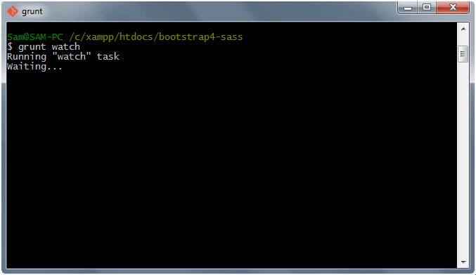
We can also ask Grunt to watch for changes and run the tasks it needs. The watch task will run every time a file is changed and saved. Since the configuration was already set up on our Sass files we just need to simply type grunt watch on command prompt or terminal.
Working with custom.js
As a final touch, let’s add up the following JavaScript codes inside our custom.js file to enable our animation for our Bootstrap theme. You can also create a minified version of this file by just typing grunt uglify.
/* JAVASCRIPT CODES */

$(window).load(function() {
  setTimeout(function() {
    $('.header-overlay').velocity({
      translateX: "100%",
      opacity: "1",
    }, {
      duration: 850,
      easing: [0.6, 0, 0.3, 1],
    })
  }, 850);


  setTimeout(function() {
    $('#header-content').velocity({
      opacity: "1",
      complete: function() {
        setTimeout(function() {
          $('.text-intro').each(function(i) {
            (function(self) {
              setTimeout(function() {
                $(self).addClass('animated-middle fadeInUp').removeClass('opacity-0');
              }, (i * 150) + 150);
            })(this);
          });
        }, 0);
      }
    }, {
      duration: 1000,
      easing: [0.7, 0, 0.3, 1],
    })
  }, 1600);
})


$(document).ready(function() {
  $('a#open-more-info').on("click", function() {
    $(".overlay").toggleClass("morp");
    $("#main-content").toggleClass("main-hide");
    $("#close-content").toggleClass("hide-close");
    $('.mCSB_scrollTools').toggleClass('mCSB_scrollTools-left');
    setTimeout(function() {
      $("#mcs_container").mCustomScrollbar("scrollTo", "#main-content", {
        scrollInertia: 500,
        callbacks: false
      });
    }, 350);
  });
  $('button#close-content').on("click", function() {
    $(".overlay").addClass("morp");
    $("#main-content").addClass("main-hide");
    $("#close-content").addClass("hide-close");
    $('.mCSB_scrollTools').removeClass('mCSB_scrollTools-left');
    setTimeout(function() {
      $("#mcs_container").mCustomScrollbar("scrollTo", "#main-content", {
        scrollInertia: 500,
        callbacks: false
      });
    }, 350);
  });


  $(function() {
    $('body').bind('mousewheel', function(event) {
      event.preventDefault();
      var scrollTop = this.scrollTop;
      this.scrollTop = (scrollTop + ((event.deltaY * event.deltaFactor) * -1));
    });
  });

  var ifTouchDevices = navigator.userAgent.match(/(iPhone|iPod|iPad|Android|BlackBerry|Windows Phone)/);

  function scrollbar() {
    if (ifTouchDevices) {
      $('body').addClass('scroll-touch');
      $('a#open-more-info').on("click", function() {
        event.preventDefault();
        var target = "#" + this.getAttribute('data-target');
        $('body').animate({
          scrollTop: $(target).offset().top
        }, 500);
      });
    } else {
      $('body').mCustomScrollbar({
        scrollInertia: 150,
        axis: "y"
      });
    }
  }
  scrollbar();
});
You can download the demo files.
Wrapping Up
Bootstrap is a great CSS framework that you can use to build a website, and using the SASS version lets you do almost anything you want.
Thankfully, task runner like Grunt.js makes the work much easier if you take time to learn the simple commands.
Hopefully this tutorial has helped you understand npm, Grunt.js and Sass and how it can speed up your Bootstrap development. If you have any questions or suggestions, drop a line in the comments.