Getting Started with Bootstrap 5, React, and Sass
There are several ways to build modern web applications using JavaScript and CSS. With lots of different tools and frameworks of choice, it’s really hard to choose at times which one is best for a specific project.
If you’ve been developing websites and applications for quite a while, it is very likely that you have used React JS and Bootstrap or at least are aware that they exist as coherent tools for modern web app development since they are both used for building fast and scalable user interfaces.
React JS is similar to the view in a typical MVC (Model-View-Controller) architecture but it is not an MVC framework in general since it handles mapping from input to state changes and renders components. Bootstrap is the most popular front-end framework used to build responsive user interfaces with HTML, CSS and JavaScript. When it comes to modern web applications, there is no doubt that Bootstrap and React JS continue to be the most prevalent choice.

You can also check the live demo here.
Startup: Free Bootstrap Builder
Looking for a Bootstrap Online Builder?
With Postcards Email Builder you can create and edit email templates online without any coding skills! Includes more than 100 components to help you create custom emails templates faster than ever before.
Free Email BuilderFree Email Templates- Try our Bootstrap Builder and create unlimited projects for unlimited clients.
- Start to build a website using our Bootstrap Templates.
React Bootstrap is used to create responsive web apps. It provides pre-made components that can be quickly changed and integrated into React applications and is built on top of Bootstrap, a well-known CSS framework.
A CSS preprocessor called Sass enables developers to create more effective and dependable CSS code. By incorporating elements like variables, nesting, and mixins, it expands the potential of CSS.
Bootstrap for React Sass is just the combination of Sass and React Bootstrap. Developers may quickly alter the appearance and feel of React Bootstrap components by utilizing Sass’ functionality to produce more modular and reusable CSS code.
Install the required dependencies and configure your development environment to use Sass before using React Bootstrap Sass. Following that, you can use the React Bootstrap Sass files in your React components by importing them.
An illustration of how to import and use the Sass files for a React Bootstrap component is given below:
import React from 'react';
import { Button } from 'react-bootstrap';

import 'bootstrap/scss/bootstrap.scss';

const MyButton = () => {
  return (
    <Button variant="primary">Click me!</Button>
  );
};

export default MyButton;
In this example, we’re importing the Bootstrap Sass file and the Button component from React Bootstrap. The Button component can then be used in our MyButton component, where Sass variables and mixins can be used to alter the component’s appearance.
Be aware that you must configure your development environment before you can convert Sass scripts to CSS files. For this, a variety of tools are available, such as webpack, gulp, and sass-loader.
React JS
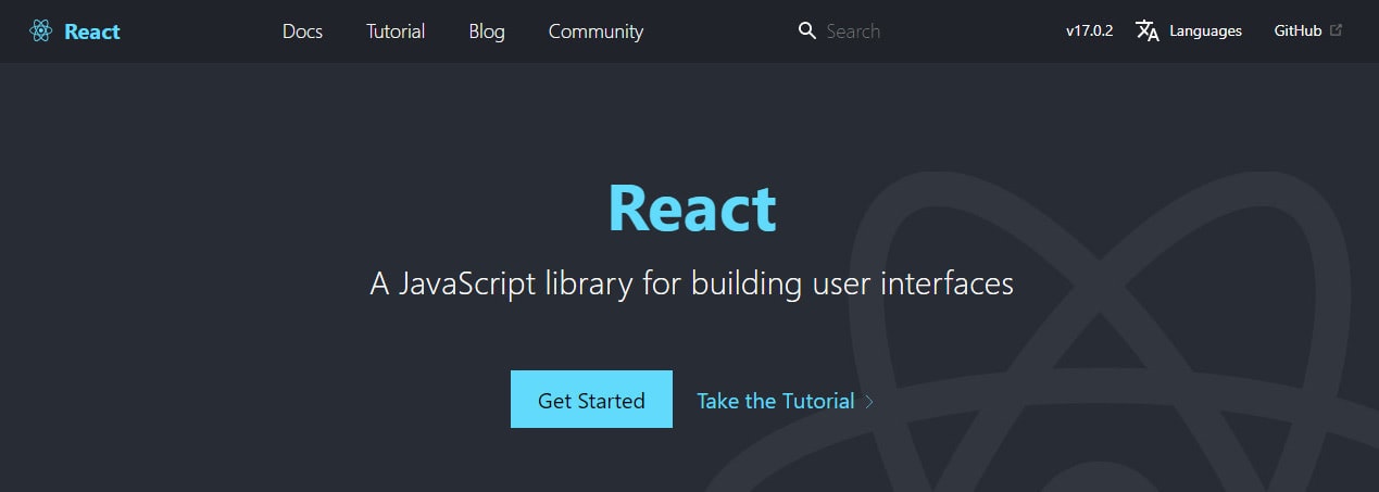
React also known as React.js or React JS is an open-source front-end JavaScript library developed by Facebook which produces a view for data rendered as HTML. Components are used to render React views that also contain other components identified as custom HTML tags which efficiently update and render the right components when your data changes. It provides a virtual DOM which makes it painless to create an interactive user interface through its powerful views, simplex data flow and explicit mutation.
With Pulsetic you’ll be instantly notified the moment your website, API, or server becomes unavailable. Monitor uptime from multiple global locations and respond to incidents before your users are affected.
Create beautiful status pages in minutes to keep customers informed during outages and build trust with transparent communication.
Start Monitoring for FreeBootstrap
With the advent and increase in efficiency of the mobile-first and responsive modern web design, web designers and developers have had to adapt themselves to handling new challenges, such as dealing with different layouts in different screen resolutions. This was the outline scenario when the bootstrap front-end framework came to the scene.
Bootstrap was founded at Twitter in mid-2010 by Mark Otto and Jacob Thornton. Prior to being an open-sourced front-end framework, Bootstrap was known as Twitter Bootstrap or Twitter Blueprint. Bootstrap framework is the most popular and widely known CSS framework to build responsive, mobile-first websites faster than ever before, which can get you started quickly by setting up the front-end work environment in the best possible and recommended way.
With the recent release of Bootstrap 5 Beta 3, there is a list of both major and minor changes on the new version such as the removal of jQuery which is a major lift for this version and the drop of Internet Explorer 10 and 11 support. If you want to learn more about the recent changes in Bootstrap 5, you can check my previous article about it.
React Bootstrap
React-Bootstrap is a JavaScript framework that is identical to Bootstrap rebuilt specifically for React. It’s technically a complete rewrite of the Bootstrap framework so most components are supported and can be used just like the usual Bootstrap CSS framework. Each component has been built from scratch as a real React component and has no dependency on any other framework, such as Bootstrap JS or jQuery. Using React-Bootstrap assures you that there won’t be any external JavaScript calls to render the component which might be in conflict with the ReactDOM.render.
The drawback
React-Bootstrap is indeed a great tool when it comes to incorporating Bootstrap with React JS. The only problem is that, at this time of this writing, React-Bootstrap only supports Bootstrap version 4.6 and has not added any official release with Bootstrap 5 yet.
Bootstrap 5 with React JS
While Bootstrap 4 relies heavily on jQuery for powering its user interface components, that’s not the case in Bootstrap 5. As stated above, Bootstrap 5 removes jQuery and is now free to use vanilla JavaScript to power up its user interface components. Since we can’t use React-Bootstrap to test how Bootstrap 5 works with React JS, we need to do it in a series of steps.
Here are a few ways to use Bootstrap 5 with React JS:
- Download the raw compiled code or source files and include it locally on your React JS app.
- Use Content Delivery Network (CDN) via jsDeliver cached version of Bootstrap’s compiled CSS and JS to your React JS app project. This is not a recommended way as it’s not customizable. Your website visitors or users might also experience different latencies when viewing your React JS app in production mode. If you decide to use a CDN for your React JS app, you have got to plan the strategy of using it.
- Install Bootstrap’s source files into your React JS app using some of the most popular package managers such as npm, yarn, RubyGems, Composer etc.
Our goal in this tutorial is not to use Bootstrap 5 and include it locally or use CDN. We want to have the flexibility to manage dependencies in our React JS app so we’re going to install Bootstrap 5 via npm along with create-react-app, a tool created by Facebook which provides an easy head start when building React JS apps to save us some time on the setup and configuration.
We will use some of the Bootstrap 5 components and utilities to create a simple lead capture app in React JS. We will also use the new Bootstrap 5 icons and Sass to customize the look and feel of our project. I am using Visual Studio Code as my code editor but feel free to use your favorite code editor to code along in this tutorial.
Note: This is not a tutorial for complete beginners. If you don’t have any previous experience with React JS or how npm and Node JS works, feel free to find some good resources on the internet to learn more.
Setting up the environment
Whenever we start to make an application with ReactJS, we need to install create-react-app itself first and give it our preferred name.
Let’s install create-react-app inside our preferred directory by running the command below on our terminal.
npx create-react-app lead-capture-app
This will create all of the necessary React JS files and configuration that we need right out of the box. After all of the set up, we need to go inside our lead-capture-app folder and then run the start script of our React JS app.
cd lead-capture-app
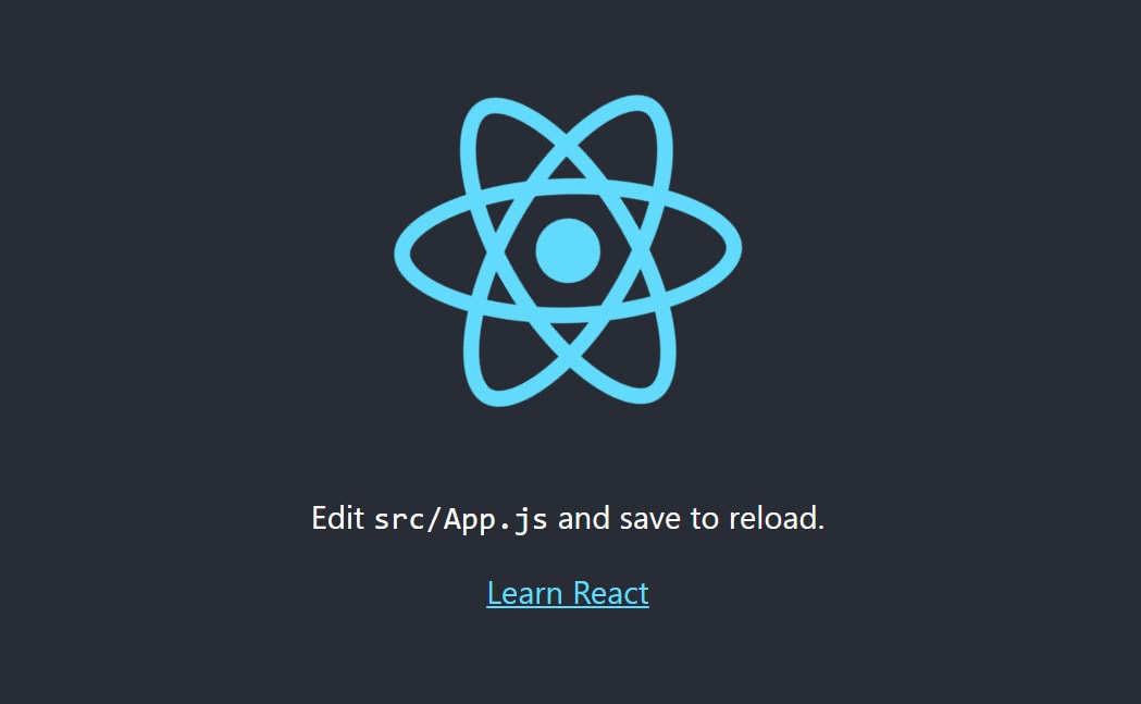
npm start
With the start script command above, this will open your default browser with localhost:3000 address. You will then see the React JS logo spinning on your screen just like the image below.
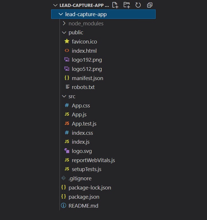
Before we move forward with the Bootstrap 5 installation, let’s clean up some unnecessary files first on our React JS startup configuration. I am going to open the lead-capture-app directory on my Visual Studio Code to do this.
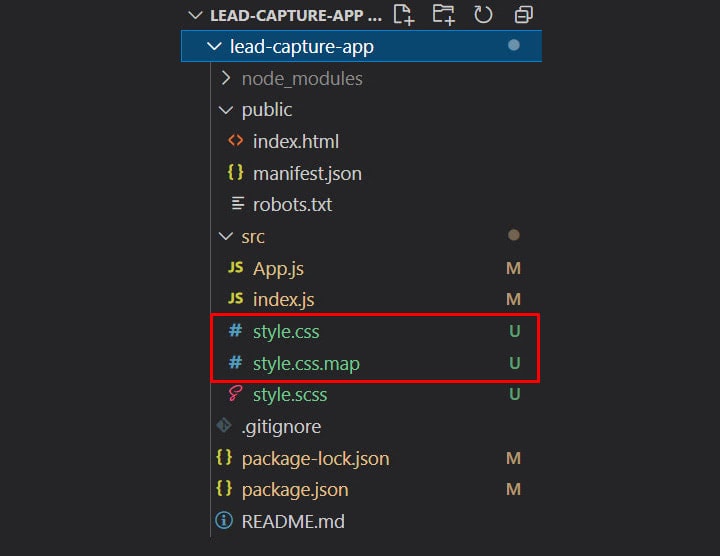
By default, we have a folder for our node_modules, a public folder and a src folder as seen on the image below.
Let’s start cleaning up the unnecessary files inside that we don’t need for this project inside the public folder first. Inside it, we’re going to delete the following files: favicon.ico, logo192.png, and logo512.png
Then, inside our src folder we’re going to delete the following files: App.css, App.test.js, index.css, logo.svg, reportWebVitals.js and setupTests.js.
If we run our app again this time using the npm start command on our terminal, it will throw us a module not found error just like what you see on the image below.
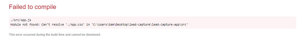
The reason for this is that we removed some files that are imported or included inside the other existing files such as the App.js and index.js file.
In order to fix this, we need to clean up both the App.js and index.js file and remove all of the import statements of the deleted files as well as remove some unnecessary codes that we don’t need.
After cleaning up and re-configuring the App.js file, you must have similar codes below:
import React from "react";
const App = () => {
	return ( <
		div >
		<
		h1 > Lead Capture App < /h1> <
		/div>
	);
};
export default App;
Then, on our index.js file:
import React from "react";
import ReactDOM from "react-dom";
import App from "./App";

ReactDOM.render( <
	React.StrictMode >
	<
	App / >
	<
	/React.StrictMode>,
	document.getElementById("root")
);
Note: The default create-react-app configuration or setup uses the regular functional component on the run but since we want to use ECMAScript 6, we’re going to change all of our component’s functions to arrow functions instead to make our code modern and more readable.
With these changes, when you run npm start again, your screen will look something like this:

Installing Bootstrap 5
To use Bootstrap 5 with React JS, we need to install it via npm by running the command below on our terminal.
npm i bootstrap@5.0.0-alpha3
This will install the Bootstrap 5 node module in our React JS app but we need to do one more thing in order to fully activate it on our app. Inside the src/index.js file, we need to include the following import statement.
import “bootstrap/dist/css/bootstrap.min.css”;
With this, we can now use any Bootstrap 5 classes with React JS code. However, this is not how we intended to use Bootstrap 5 in this tutorial. Instead, we’re going to use Syntactically Awesome Style Sheets (Sass) to seamlessly style our Bootstrap 5 lead capture app.
Workflow with Sass
To enable Sass within our React JS environment, we need to install the node-sass module via npm. Inside our terminal, we need to run the command below.
npm i node-sass
Before we move forward, we need to remove the previously added import “bootstrap/dist/css/bootstrap.min.css”; statement inside the src/index.js file since we’re going to use Bootstrap 5 Sass source file instead.
Next, let’s create a new file inside our src folder called “style.scss”. The .scss is one of the file extensions of Sass which will inform React JS that we’re using Sass scripting language instead of the regular CSS syntax.
Then, inside our src/style.scss file, we need to import Bootstrap 5 Sass source stylesheet in order to use Bootstrap 5 as Sass.
@import “../node_modules/bootstrap/scss/bootstrap.scss”;
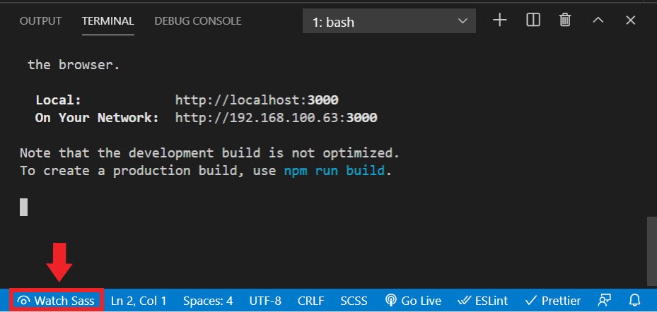
If you run the start script again via npm start on our integrated terminal, notice that there is a Watch Sass button at the lower left bottom of the terminal as seen on the image below. If we click on this, it will automatically compile our style.scss into CSS and create a CSS folder that has all your Bootstrap 5 packages inside it.
One final thing that we need to do, is to import our style.scss file inside of src/index.js file like this:
import “../src/style.scss”;
Images
We will need to import some images on our components which we’re going to discuss below. In order for us to be able to use them, we need to create an images folder inside the src folder and put the required images inside.
Installing Bootstrap 5 Icons
Bootstrap 5 offers 1,300 free, high-quality SVG / web font icons that you can use on your project.
We’re going to add a few icons on our lead capture app components just to see how these newly added icons work in Bootstrap 5.
In order to install this on our React JS app, we need to install it via npm using the following command on our terminal:
npm i bootstrap-icons
Note: There are some other ways to embed SVG on your Bootstrap 5 projects. However, there are a few known issues that you need to be aware about when using them. You can check this page to learn more.
Creating the components
React components are independent and reusable parts of the React ecosystem. Each component has an identical purpose as JavaScript functions, but work in isolation and return HTML via a render() function.
Our simple lead capture app will have three components, namely Banner, Form and Footer. We will use React Functional Components in the form of an Arrow Function Component to each of our components. This is the modern standard way when writing modern React applications.
Inside the src folder, let’s create a Banner.js file. Inside the created file, we’re going to create a React Functional Component with the name Banner and place the following markup with Bootstrap 5 classes.
import React from "react";
const Banner = () => {
	return ( <
		header >
		<
		div className = "banner" >
		<
		div className = "container" >
		<
		div className = "row" >
		<
		div className = "col-lg-9 offset-lg-3 mx-auto" >
		<
		div className = "caption-text text-center" >
		<
		h3 className = "brand" > {
			" "
		} <
		svg xmlns = "http://www.w3.org/2000/svg"
		width = "25"
		height = "25"
		fill = "currentColor"
		class = "bi bi-bullseye"
		viewBox = "0 0 16 16" >
		<
		path d = "M8 15A7 7 0 1 1 8 1a7 7 0 0 1 0 14zm0 1A8 8 0 1 0 8 0a8 8 0 0 0 0 16z" / >
		<
		path d = "M8 13A5 5 0 1 1 8 3a5 5 0 0 1 0 10zm0 1A6 6 0 1 0 8 2a6 6 0 0 0 0 12z" / >
		<
		path d = "M8 11a3 3 0 1 1 0-6 3 3 0 0 1 0 6zm0 1a4 4 0 1 0 0-8 4 4 0 0 0 0 8z" / >
		<
		path d = "M9.5 8a1.5 1.5 0 1 1-3 0 1.5 1.5 0 0 1 3 0z" / >
		<
		/svg>{" "}
		LEAD CAPTURE PAGE <
		/h3> <
		h4 > A great product that will solve all of your problems! < /h4> <
		/div> <
		/div> <
		/div> <
		/div> <
		/div> <
		/header>
	);
};
export default Banner;
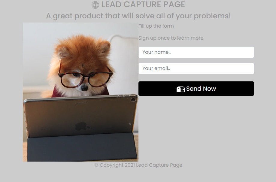
Our banner component is very straightforward. We have a header that holds an image background, title and description heading tags. Notice that we also added one Bootstrap 5 icon just right beside the title text.
Form Component
Just like what we did on the Banner component, inside the src folder, let’s create a Form.js file. Inside let’s create a React Functional Component with the name Form and place the following markup with Bootstrap 5 classes and some custom classes.
import dogForm from "./images/dog-computer.jpg";
const Form = () => {
  return (
	<section>
  	<div className="container">
    	<div className="row">
      	<div className="col-lg-7 offset-lg-2 g-0 mx-auto">
        	<div className="fill-form form-box">
          	<div className="row g-0">
            	<div className="col-xl-6 col-lg-12 d-md-none d-sm-none d-xs-none d-lg-block form-box__img">
              	<img alt="" src={dogForm} />
       	     </div>
            	<div className="col-xl-6 col-lg-12 col-md-12 form-box__content">
              	<div id="box-title">
                	<p className="main-form-text">Fill up the form</p>
                	<p>Sign up once to learn more</p>
              	</div>
              	<form>
                	<div className="mt-3">
                  	<input
                        className="form-control"
                    	id="name"
                    	name="name"
          	          placeholder="Your name.."
                    	type="text"
                  	/>
                	</div>
                	<div className="mt-3">
                  	<input
                        class="form-control"
           	         id="email"
                    	name="email"
                    	placeholder="Your email.."
                    	type="text"
                  	/>
                	</div>
                	<div className="d-grid mt-4">
                  	<button class="btn btn-primary btn-lg" type="submit" value="Send Now">
                    	<svg
                          xmlns="http://www.w3.org/2000/svg"
                      	width="27"
                      	height="27"
                          fill="currentColor"
                      	class="bi bi-mailbox2"
                      	viewBox="0 0 16 16"
                    	>
                      	<path d="M9 8.5h2.793l.853.854A.5.5 0 0 0 13 9.5h1a.5.5 0 0 0 .5-.5V8a.5.5 0 0 0-.5-.5H9v1z" />
                      	<path d="M12 3H4a4 4 0 0 0-4 4v6a1 1 0 0 0 1 1h14a1 1 0 0 0 1-1V7a4 4 0 0 0-4-4zM8 7a3.99 3.99 0 0 0-1.354-3H12a3 3 0 0 1 3 3v6H8V7zm-3.415.157C4.42 7.087 4.218 7 4 7c-.218 0-.42.086-.585.157C3.164 7.264 3 7.334 3 7a1 1 0 0 1 2 0c0 .334-.164.264-.415.157z" />
                    	</svg>{" "}
                    	Send Now
                  	</button>
                	</div>
                  </form>
            	</div>
          	</div>
        	</div>
      	</div>
    	</div>
  	</div>
	</section>
  );
};
export default Form;
Notice how we imported the dogForm image from the Form component and include it like a typical HTML image tag within the curly brackets. This is just one way of adding image in React JS.
Additionally, we also added another Bootstrap 5 icons on our button. Bootstrap 5 icons include a width and height of 1em by default to allow for easy resizing via font-size.
Finally, let’s create our Footer component containing our footer text inside the src folder. Create a Footer.js file and inside let’s add the following codes.
import React from "react";
const Footer = () => {
	return ( <
		footer className = "d-block" >
		<
		p className = "text-center" > ©Copyright 2021 Lead Capture Page < /p> <
		/footer>
	);
};
export default Footer;
Putting all components together
Now that we’re done creating our components, we need to include them together inside the App.js file in order to make them appear on the screen. When adding React components inside the App.js file, we need to import each component with variable names or labels and use them just like an ordinary HTML tag that has a closing tag on it.
Our App.js should look like this:
import React from "react";
import Banner from "./Banner";
import Form from "./Form";
import Footer from "./Footer";

const App = () => {
	return ( <
		>
		<
		Banner / >
		<
		Form / >
		<
		Footer / >
		<
		/>
	);
};
export default App;
Notice that instead of enclosing <div> tags, we used a short syntax version of fragments using <></> syntax to group our imported components. This is a collective pattern in React for a component to return and group a list of children without adding extra nodes to the DOM.
Our lead capture app at this point will not look so pretty at this moment. We need to add some styles in order to make them look nice and fancy.

Customizing default Bootstrap 5 styles with Sass
After combining all of our components, let’s start adding our styles inside our style.scss file.
Before we move any further with the other styles, let’s see how we can override some of the default Bootstrap 5 variables.
For this example, let’s override the $body-bg, $color, $font-family-sans-serif and $primary variable. Let’s add the following variable setup to our style.scss file.
/*********************************************/
/*         	CUSTOMIZED DEFAULTS       	*/
/*********************************************/

$body-bg: #cccccc;
$body-color: #999999;
$font-family-sans-serif: "Poppins",
sans-serif;
$primary: #000000;
@import "../node_modules/bootstrap/scss/bootstrap.scss";
@import url("https://fonts.googleapis.com/css2?family=Poppins:ital,wght@0,100;0,200;0,300;0,400;0,500;0,600;0,700;1,100;1,200;1,300;1,400;1,500;1,600&display=swap");
With these variables, we just modified the following default Bootstrap 5 variables and properties:
- $body-bg – using this variable, we modified the default background color from #fff to #cccccc.
- $body-color – using this variable, we modified the default body color from #212529 to #99999.
- $font-family-sans-serif – using this variable, we modified the default color from “system-ui, -apple-system, “Segoe UI”, Roboto, “Helvetica Neue”, Arial, “Noto Sans”, “Liberation Sans”, sans-serif, “Apple Color Emoji”, “Segoe UI Emoji”, “Segoe UI Symbol”, “Noto Color Emoji” to simply “Poppins”, sans-serif”.
- $primary: color – using this variable, we modified the default primary theme color from #0d6efd to #000000;
If you are going to check this on your browser, you’ll see a similar output like the image below.
Customizing Bootstrap 5 utilities with Sass
Bootstrap 5 utilities are produced with the utility API. These can be used to modify or extend the default set of utility classes via Sass.
To set an example, we’re going to add a custom utility using the existing Bootstrap 5 utility API.
In order to this, let’s add the following codes on our style.scss file:
/*********************************************/
/*     	MARGIN TOP CUSTOM UTILITY     	*/
/*********************************************/

$utilities: ( "custom-margin-top": ( property: margin-top, class: mt, values: ( 0: 0, 1: 0.4rem, 2: 0.8rem, 3: 1.2rem, 4: 1.6rem, 5: 2rem, ), ), );
Using the custom-margin-top utility, we specify our preferred margin-top property set-up for React JS app. Instead of having a measurement ranging from .25rem to 3rem on each level of margin-top property, we’ve customized it ranging from 0.4rem to 2rem.
If we will check our project again, you will see slight changes on the top margin of each input field and button.
Adding more styles
Right now our lead capture app doesn’t look good. We need to add more CSS styles on our style.scss in order to make it look nice and presentable.
General CSS
Let’s first start with the general CSS. These are CSS codes that will simply format our basic markup such as the font-size for each basic element as well as the positioning and width of the body element.
/*********************************************/
/*           	GENERAL CSS              	"/
/*********************************************/

body {
	width: 100%;
	position: relative;
}

p.main-form-text {
	font-size: 25px !important;
	font-weight: 500;
	color: #494949;
}

h3 {
	font-size: 40px;
	letter-spacing: 10px;
	font-weight: bold;
}

h4 {
	font-size: 16px;
}

img {
	width: 100%;
	height: 100%;
}

form {
	position: relative;
}
Utility CSS
Next, let’s add some other utility classes which basically customized some default styles on our lead-capture app such as the input and button styles.
/*********************************************/
/*            	UTILITY CSS            	*/
/*********************************************/

input,
input.form-control {
	color: #222;
	font-size: 12px;
	background: $white;
	padding: 0 15px;
	width: 100%;
	height: 45px;
	line-height: 46px;
	outline: none;
	border: 1px solid #e5e5e5;
	border-radius: 3px;
	box-shadow: none;
	transition: all 0.3s;
}

.btn-primary {
	font-weight: 600;
	font-size: 18px;
	cursor: pointer;
	display: inline-block;
	text-transform: uppercase;
	border: none;
	color: $white;
	border-radius: 3px;
	transition: all 0.3s;
	border-bottom: 4px solid #707070;
	letter-spacing: 3px;
}

.btn-primary:hover,
.btn-primary:focus {
	border-bottom: 4px solid #707070;
	background-color: #2b2b2b;
}
Note: Instead of putting the hexadecimal color #fff, we used the Bootstrap 5 $white Sass variable. We’re going to do this for the rest of our custom styles.
Next, let’s style our banner. We’ll have a background-image with a nice dark opaque overlay that will contain the title and description text. We will also give the title text with the class .brand a nice text-shadow effect.
/*********************************************/
/*            	BANNER CSS             	*/
/*********************************************/

.banner {
	background-image: url("./images/bg.jpg");
	min-height: 500px;
	padding: 40px 0px;
	position: relative;
	background-position: center center;
	background-size: cover;
	background-repeat: no-repeat;
}

.banner::before {
	content: "";
	width: 100%;
	height: 100%;
	opacity: 0.5;
	background-color: #000;
	position: absolute;
	top: 0;
}

.brand {
	text-shadow: 2px 4px 3px rgba(0, 0, 0, 0.3);
}

.caption-text {
	margin-top: 130px;
	color: $white;
	position: relative;
}
Form CSS
Next, let’s add our form CSS styles. These styles will cover the two box layout: image on the left and form on the right. We’ll style each form element and set a nice box shadow on the .fill-form box container.
/*********************************************/
/*            	BANNER CSS             	*/
/*********************************************/

.banner {
	background-image: url("./images/bg.jpg");
	min-height: 500px;
	padding: 40px 0px;
	position: relative;
	background-position: center center;
	background-size: cover;
	background-repeat: no-repeat;
}

.banner::before {
	content: "";
	width: 100%;
	height: 100%;
	opacity: 0.5;
	background-color: #000;
	position: absolute;
	top: 0;
}

.brand {
	text-shadow: 2px 4px 3px rgba(0, 0, 0, 0.3);
}

.caption-text {
	margin-top: 130px;
	color: $white;
	position: relative;
}


/*********************************************/
/*           	FORM CSS               	"/
/*********************************************/

.form-box #box-title {
	position: relative;
	padding: 30px;
	text-align: center;
}

.form-box #box-title p {
	margin-bottom: 0;
	font-size: 14px;
}

.fill-form {
	position: relative;
	margin: -210px auto 0px auto;
	box-shadow: 1px 12px 16px 1px rgba(153, 153, 153, 0.75);
	-webkit-box-shadow: 1px 12px 16px 1px rgba(153, 153, 153, 0.75);
	-moz-box-shadow: 1px 12px 16px 1px rgba(153, 153, 153, 0.75);
}

.fill-form .form-box__img {
	background-color: transparent;
}

.fill-form .form-box__content {
	padding: 50px;
	background-color: $white;
}
Now let’s add some simple CSS styles for our footer text. This is very straightforward as we want a cool nice clipped text effect at the bottom of our form container.
/*********************************************/
/*               FOOTER CSS                  "/
/*********************************************/

footer p {
	margin: 55px 0px 60px 0px;
	font-size: 17px;
	font-weight: 600;
	background-color: #565656;
	color: transparent;
	text-shadow: 2px 2px 3px rgba(255, 255, 255, 0.5);
	-webkit-background-clip: text;
	-moz-background-clip: text;
	background-clip: text;
}
Responsive CSS
Lastly, our CSS styles won’t be complete without our responsive CSS. We want to modify our lead capture app depending on a device’s general type. Using our media type with a specific number of media width expressions, we’re going to modify the padding, margin, font-size as well as the display property of some elements in order to build a complete responsive design.
/*********************************************/
/*           	MEDIA QUERIES CSS       	"/
/*********************************************/

@media only screen and (min-width: 994px) and (max-width: 1398px) and (-webkit-min-device-pixel-ratio: 1) {
	.form-box #box-title {
		padding: 5px 20px 20px 20px;
	}
}

@media only screen and (min-width: 767px) and (max-width: 1196px) and (-webkit-min-device-pixel-ratio: 1) {
	.form-box #box-title {
		padding: 0px;
	}
	.fill-form .form-box__content {
		padding: 50px 50px 60px 50px;
	}
}

@media only screen and (min-width: 500px) and (max-width: 766px) and (-webkit-min-device-pixel-ratio: 1) {
	.form-box #box-title {
		padding: 0px;
	}
	.fill-form .form-box__content {
		padding: 50px 50px 60px 50px;
	}
	h3.brand {
		font-size: 30px;
	}
	.caption-text h4 {
		font-size: 14px;
	}
	.caption-text {
		margin-top: 110px;
	}
	footer {
		margin-bottom: 30px;
	}
	.form-box__img {
		display: none;
	}
}

@media only screen and (min-width: 360px) and (max-width: 499px) and (-webkit-min-device-pixel-ratio: 1) {
	.caption-text {
		margin-top: 30px;
	}
	h3.brand {
		font-size: 19px;
	}
	.banner {
		min-height: 400px;
	}
	.form-box__img {
		display: none;
	}
	footer {
		margin-bottom: 10px;
	}
}

@media only screen and (max-width: 359px) {
	.caption-text {
		margin-top: 30px;
	}
	h3.brand {
		font-size: 17px;
	}
	.caption-text h4 {
		font-size: 12px;
	}
	.banner {
		min-height: 400px;
	}
	.form-box__img {
		display: none;
	}
	.form-box #box-title {
		padding: 0px 30px 30px;
	}
}
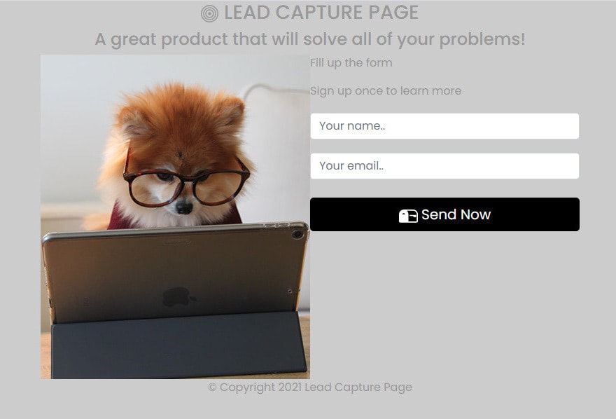
Now our project is complete and looks good. Our simple lead capture React JS app is ready with responsive behavior. You can check the responsive behavior by resizing the browser. Check out the image below:
You can also check the live demo here.
Conclusion
Our simple lead capture app is looking great and working exactly how it should, so let’s recap what we’ve learned in this tutorial.
First, we just saw how easy it is to get React JS and Bootstrap 5 installed and be integrated together using npm. We also learned how the React application is initialized and started building an application from which we have thoroughly discussed that demonstrates some of React’s basic features such as the ReactDOM, Render and Arrow Function Components.
Second, we introduced how Bootstrap 5 icons work and how you can embed them on your Bootstrap projects.
Lastly, with Bootstrap 5, we worked towards having a responsive grid system and components using Sass for different screen resolutions and applied the fundamental CSS styles for our HTML elements with the inclusion of a few custom classes and utilities.