Everything You Need to Know About Dark Patterns
They are everywhere. Little tricks on webpages, in apps and with popups and forms that “trick” you into completing an action online.
These so-called dark patterns have a negative impact on user experience, frustrate website visitors and should be avoided. (That little “benefit” you get from someone clicking the wrong thing isn’t actually good for you either.)
Here’s a look at what dark patterns are, with plenty of examples, so that you are aware of these design issues and keep them off of your websites.
What is a Dark Pattern?
While dark patterns appear in designs throughout the web, there’s not a lot of space devoted to talking about them. Some of the best information comes from darkpatterns.org. The website describes a dark pattern like this.
“When you use the web, you don’t read every word on every page – you skim read and make assumptions. If a company wants to trick you into doing something, they can take advantage of this by making a page look like it is saying one thing when it is in fact saying another.”
There’s a real ethical issue with using a design technique that intentionally tricks users into doing something they don’t want to do. This practice will also artificially pad your analytics with clicks or hits that users didn’t intent to make. (So your reporting becomes pretty skewed.)
With Postcards Email Builder you can create and edit email templates online without any coding skills! Includes more than 100 components to help you create custom emails templates faster than ever before.
Free Email BuilderFree Email TemplatesHoa Loranger, vice president of UX consulting firm Nielsen Norman Group said this about dark patterns in an article for Fast Company magazine: “Any short-term gains a company gets from a dark pattern is lost in the long term.”
Types of Dark Patterns
Generally, dark patterns can be boiled down into five categories of deceptive design tactics.
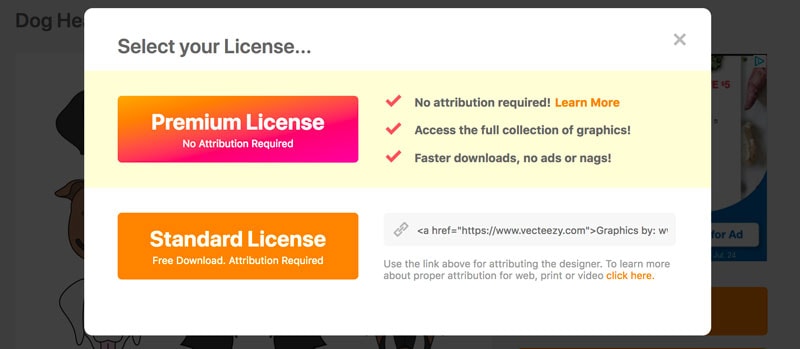
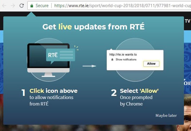
- Intentional misdirection: The design purposefully gets users to focus on one thing as a distraction from something else. Usually this happens in the form of giving up unintended information to a website. But the most common form of misdirection is in the form of a tricky design, a common “no” button switches to confirm or the design looks like there is only one “right” answer. This is a common technique with apps and games where the “buy more” credits option is a big button and the “no thanks” option is small and difficult to tap. (Note in the example above that the more engaging visual button, also the first option, is a payment button. This pop-up came after clicking a “free download” button. That’s a definite trick.)
- Hidden ads: When an ad appears to be content or navigation so that users click it.
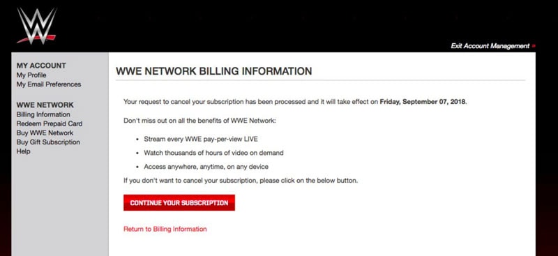
- Forced continuity: Read the small print; many free trials end with continuing charges. To avoid this dark pattern, don’t require payment for anything that’s free.
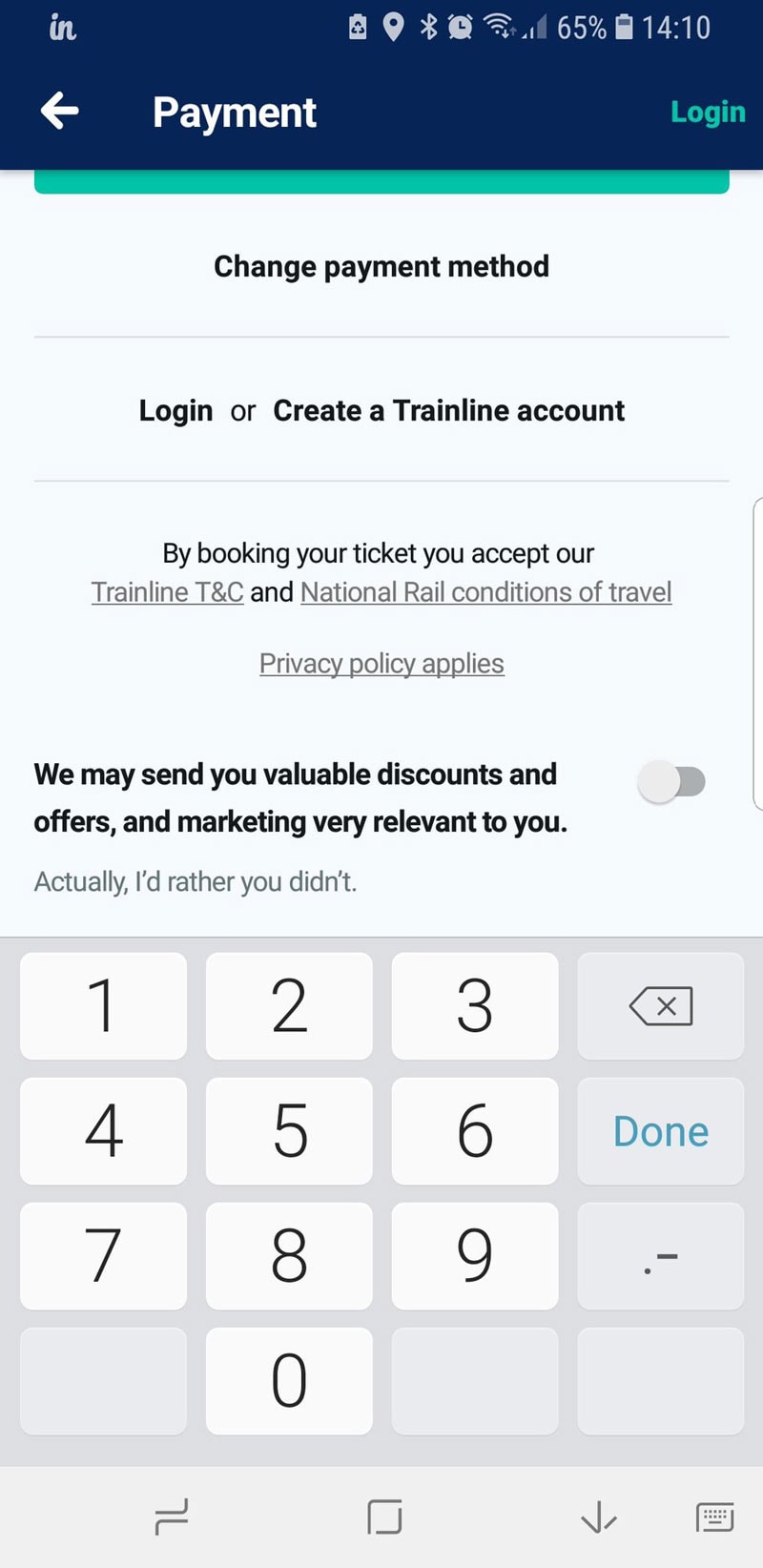
- Growth through spam: Connecting an email address or social media account to a website – so you can find a friend to play a game etc. – and then spamming them all with info is a definite dark pattern. This can provide a lot of immediate growth for the site deploying the dark pattern when it looks like you are actually sending spammy emails or messages to contacts.
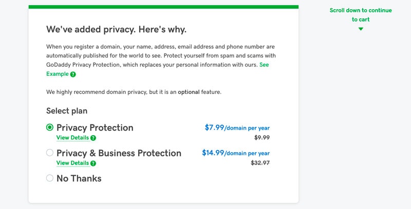
- Hidden costs: Extra items that appear in a cart or hidden charges that the end of a checkout funnel are a dark pattern that isn’t as common as it used to be, but it still happens. More commonly, websites try to prevent you from redeeming coupon or promo codes – they apply but then drop off at checkout or if you look at other items. (Look at the example from GoDaddy below. Add a domain to your cart, click to checkout and privacy protection is added automatically unless you opt out.)
Darkpatterns.org includes these types of dark patterns (some with catchier names) and more, but they all fall into these areas. You can find them here.
Ethical Considerations
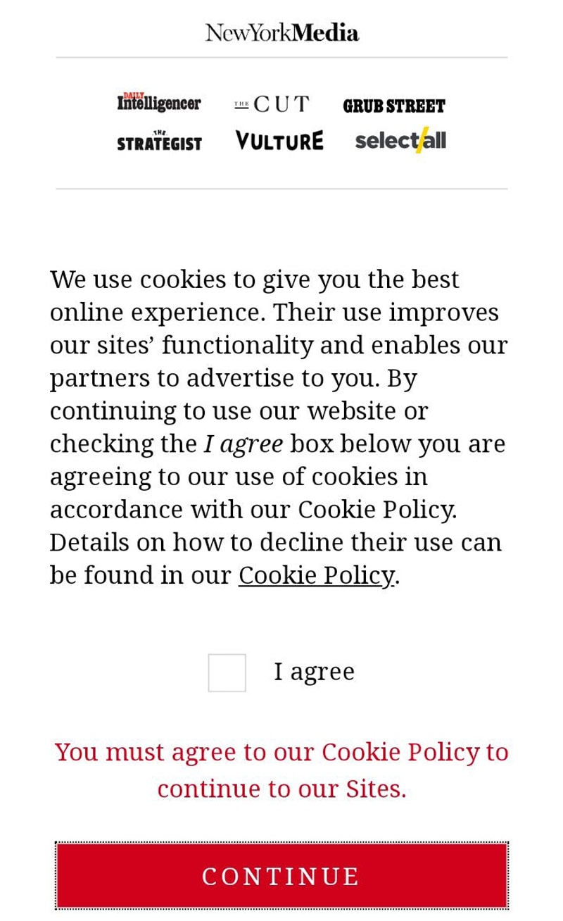
Knowing whether you should deploy a design tactic or not, comes with plenty of ethical questions. If you worry that something might be tricky, than it probably is.
Do you want your website or company to be known for that reason? Or would you rather be up front and create user loyalty with a trustworthy design that users like?
The answer might seem easy, but there are so many big companies that have used (and still use) dark patterns.
- Think about websites you visit all the time: How many times has the button you wanted to click been hard to find. (Such as the example above from the Confirmshaming Tumblr.)
- Think about email newsletters: Did you have to hunt for the unsubscribe button only to get “tricked” into a different subscription option?
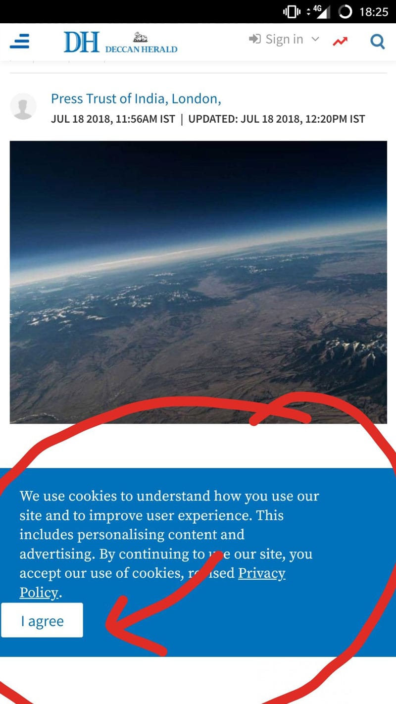
- Think about the “x” to close an ad or opt out on a pop up: How often are these options tiny or incredibly hard to tap or click to close? And how many times have you clicked through by mistake?
These patterns are everywhere.
Before deploying one of these patterns put it in an ethical context:
With Pulsetic you’ll be instantly notified the moment your website, API, or server becomes unavailable. Monitor uptime from multiple global locations and respond to incidents before your users are affected.
Create beautiful status pages in minutes to keep customers informed during outages and build trust with transparent communication.
Start Monitoring for Free- Is the technique necessary to get users to perform the desired action? (If so, it’s probably a dark pattern.)
- Are you tricking users into doing something they would not ordinarily do? (If so, it’s probably a dark pattern.)
- Will this design frustrate or anger users when they get to the next step? (If so, it’s probably a dark pattern.)
- Would I want people to know what’s behind my analytics or reporting? (If not, it’s probably a dark pattern.)
Following #darkpatterns
Users are great at finding dark patterns all over the web. And posting them for all to see. Here are some of the most egregious examples from the #darkpatterns on Twitter.
User-Friendly Alternatives
There’s no reason that a design has to use dark patterns. There’s always a user-friendly and more ethical solution.
Avoid misdirection by designing elements using common usability practices. Links should look like links. Buttons should look like buttons. Don’t mix and match buttons and text link buttons for equal actions for one element (such as yes and no). Don’t change the design of an element midway through the user journey; consistent design is more transparent.
Don’t hide ads or links. Every element should look like and follow generally accepted user patterns.
Forget all that small print. Be upfront about costs and terms. Don’t ask for payment for free trials – go back and request payment when the free period ends. Tricking users into using a service or product is not cool.
Some tools need to connect with user contacts to work in the way users expect. This is OK. But protect and value that data. Don’t use it in any other way.
Use upfront pricing for everything. If you don’t want or expect users to have discounts or promo codes, don’t offer them. Never add anything to the cart. It is allowable to ask users if they would like an add-on, but don’t force the issue.
Conclusion
While dark patterns are everywhere – we bet you’ll start to recognize more of them after reading this article – don’t get in the habit of using them. There’s no long-term benefit to your design for doing so.
To build a loyal and valuable user or customer base, design with trust and don’t trick users into doing anything they don’t want to.
You can join the dark patterns discussion on Twitter and mention ones that you see. Mention @darkpatterns, @designmodo and use #darkpattern.


