Duotone – Fresh Trend in Website Design
As Wiki states, a Duotone is a halftone reproduction of an image that brings out its middle tones and highlights. Blue, brown, red and yellow are considered to be the everyday choices. However when it comes to enthusiastic web designers, there is no such thing as common or dominant. As the past several months show, numerous vibrant shades from purple to green are implemented to achieve this incredible effect.
The creatives mix and match different tones even those that are barely conformable.
If you need an instant effect you can also use some helpful tools like
- jQuery Duotone;
- Duotone Colorschemes;
- Colofilter.
For now, we are going to browse excellent websites with duotone images and illustrations to get some spur from real life examples.
Adidas Football
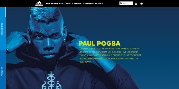
The campaign’s front page is personified by a series of incredible photo backgrounds that thanks to duotone effect look stylish and modern. They create an amazing atmosphere that meets the mood of the brand and strengthens a sports vibe.
With Postcards Email Builder you can create and edit email templates online without any coding skills! Includes more than 100 components to help you create custom emails templates faster than ever before.
Free Email BuilderFree Email TemplatesMirage Festival
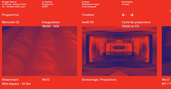
Mirage Festival has a slightly bizarre appearance, yet it certainly stands out from the crowd. The website’s aesthetics owes its unique appeal to an outrageous combination of red and blue that transform images into a duotone. The main content that is set in regular typeface and white tone easily draws the attention.
Fjord Trend
The homepage features several image backgrounds that are enhanced by duotone technique. The combination of colors is pretty modest and soft. Everything looks calm, serene and businesslike. The solution adheres to website’s philosophy and provides a sharp contrast to vital details.
Triple 9
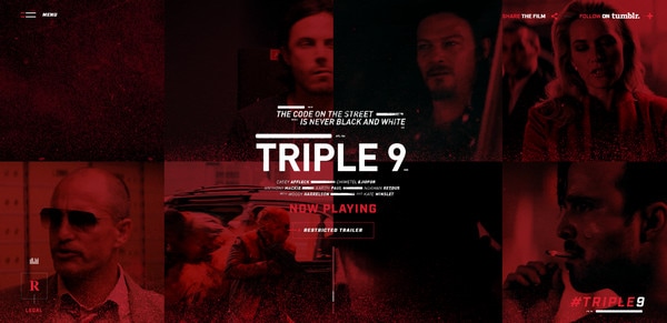
Red and black are used to compose a duotone. It enriches videos and images with some subtle emotions. It also adds a dramatic feeling to the website and helps to exude an aura of violence and brutality.
La Marine Nationale on Board Careers
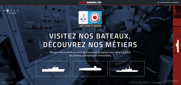
The homepage greets the online audience with a huge image slider. It depicts four duotone backgrounds, where the bluish versions are ones that meet the navy recruitment theme best. Together they complete the atmosphere as well as naturally direct the attention towards the foreground elements.
With Pulsetic you’ll be instantly notified the moment your website, API, or server becomes unavailable. Monitor uptime from multiple global locations and respond to incidents before your users are affected.
Create beautiful status pages in minutes to keep customers informed during outages and build trust with transparent communication.
Start Monitoring for FreeHeroes and History
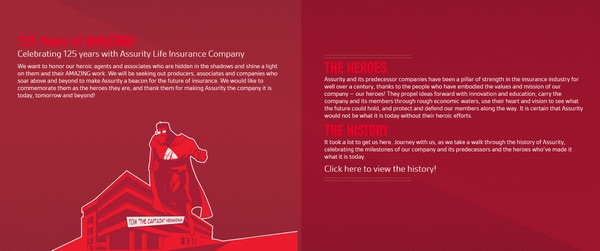
Heroes and History is marked by a lovely hero-themed illustration that is made in two primary colors. Secondary white is used for adding some accents. Although dominant red can be a bit aggressive yet, in this case, it does the trick.
Holm Marcher & Co
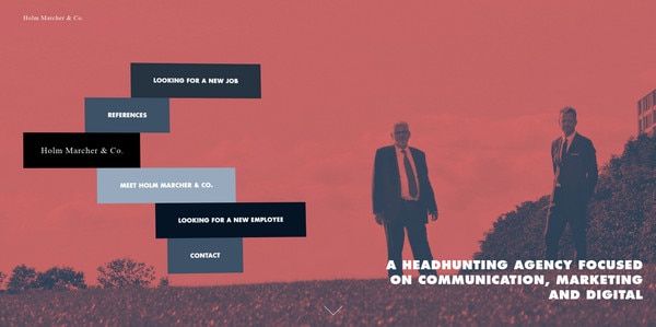
Here everything is penetrated with seriousness. Every detail tries to contribute to the businesslike atmosphere, and background images are no exception. Thanks to soft and casual duotone effect, they set the tone for the more professional one and reinforce a picture of authority.
MailChimp
MailChimp equips its review page with a splendid color transition, from hot red to cold blue that gently leads visitors from top to bottom. That’s not all; each tone is used to convert its corresponding backdrop into duotone image that enriches user experience.
Year in Review by Atomic.io
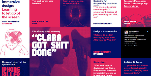
The team leverages duotone effect for both images and videos. The solution gives a strong visual impact and brightens up the modular layout. It is made from the primary colors thereby achieving consistency in style.
Finesse Design Atelier
The portal is packed with numerous gorgeous photos that characterize agency’s sphere of expertise. Some of the pictures are left in its original state while others are jazzed up with some nice touches. The screenshot below demonstrates an interesting take on duotone image.
jonkopingssodra
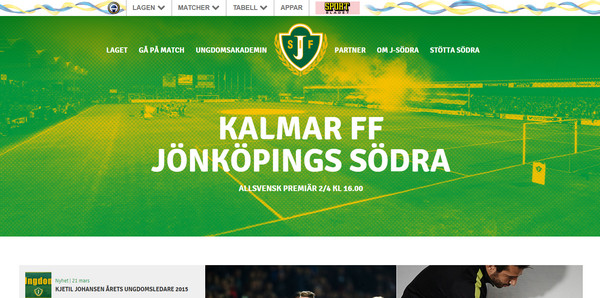
Green, yellow and halftone touch make the ‘welcome’ background look so outstanding. It is eye-catching and at the same time soft and robust, ideal for supporting the foreground content. The color choice is well-suited to the concept: it reflects the idea more effectively as well as captures its jovial spirit.
Year in Review by Tumblr
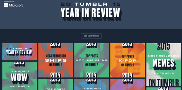
Year in Review by Tumblr ditches all the gorgeous pictures and videos and opts for dynamic abstract backgrounds, maintaining a clean aesthetics. Each story is defined by its duotone illustration. The page breaks away from the others with its strange yet engaging design.
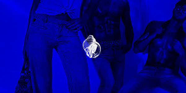
Campaign by Lois Jeans
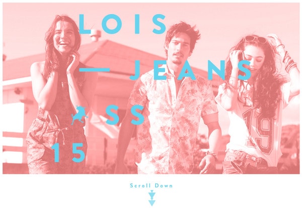
Campaign by Lois Jeans is charged with energy that is going to burst. Not only is sophisticated layering aesthetics responsible for delivering an overwhelming general impression, but also duotone effect that is applied to videos. Paired with the main light coral shade it ties everything together, achieving a harmonious environment.
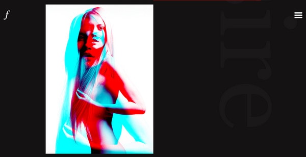
New Deal Design
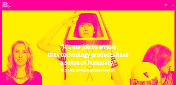
The website strikes the eye with its unbelievable coloring. Pink and yellow are what makes the project feel so unique and special. Duotone images are bright, dramatic and intensive. They steal the show and substantially contribute to the friendly air and positive mood.
Year in Music by Spotify
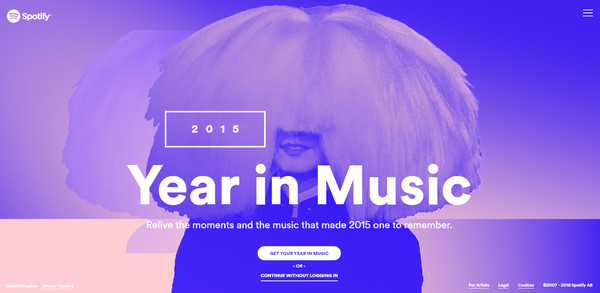
We could not help but mention Spotify. This year portal is the talk of the town. The brilliant interface took the Web by storm and set high standards for the rest. If you need a sheer inspiration for utilization of duotone, then you should give it a try. There is a range of highly intensive images that are worth a thousand words.
Majorette Events
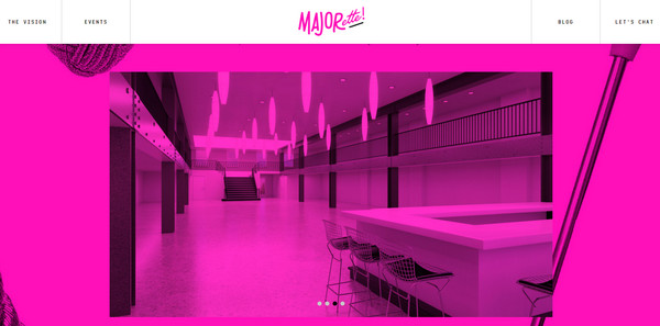
The front page expresses an excitement. Everything is in fuchsia: the tone occupies almost every pixel on the screen, obtaining an intriguing general feeling. Duotone images are used as backgrounds and demonstrative material.
The Art of Travel
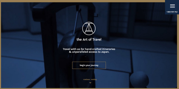
The website has a clean, properly-balanced look achieved by modest design and neutral coloring. Unlike the previous example, it has a more serious personality yet not devoid of charisma and artistic appeal. The bluish duotone image that marks the ‘welcome’ screen fits here like a glove.
Lois Jeans Campaign
This is another website by Lois Jeans in our collection. The campaign dedicated to spring/summer collection of 2016, and this time, it is more static and discreet. It features some cold duotone images. They are used as a loading screen that ties the design together and improves transitions between pages.
Wheels and Bearings
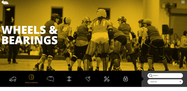
The portal radiates of a fabulous vintage feel thanks to a series of duotone images. Pastel colors in tandem with a sepia touch can be pretty powerful when it comes to evoking a nostalgic mood. Together they incorporate the character into backgrounds and reflect the spirit of 80s.
Standby
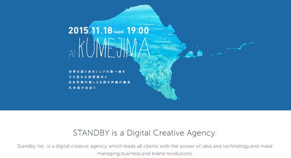
Standby has a minimal website with a tidy aesthetics and elegant structure. The clever duotone illustration of the island where the town is located is a perfect touch. It is made in a soft blue that plays nicely with quirky typeface thereby strengthening the theme.
Conclusion
Duotone can be dramatic, impressive and even serene. Either you go for a combo of bright contrasting colors, like Spotify or New Deal Design, or carefully choose matching tones, like Marcher & Co, you will give the visuals an edgy feel.
It also works as an excellent underlying base that livens up the content and at the same time preserves and gently spotlights the beauty of the picture.


