Exit Intent Modal Windows: Design Trends & Examples
It seems like exit intent modals are the norm with every major blog, SaaS product, and digital ecommerce shop or ecommerce email.
These exit intents are modal windows that appear on top of the page once your mouse cursor leaves the website. It’s used as a marketing technique to draw people back to the page, or to convert them into a sales funnel.
But these modal windows can be just plain annoying when done improperly. That’s why I’ve curated this guide full of tips & examples to help anyone get moving with exit intent modals.
Grab Attention With Goodies
When users are about to leave they’ve pretty much made up their minds. You’ll need to offer something really interesting to get them to stick around.
Most exit intent modals just won’t work unless you have something attractive: a free ebook, a how-to guide, a cheat sheet or swipe file or something the user wants.
Do your best to encourage users to stick around no matter what. There are plenty of examples around the web but I think marketers do this right.
With Postcards Email Builder you can create and edit email templates online without any coding skills! Includes more than 100 components to help you create custom emails templates faster than ever before.
Free Email BuilderFree Email TemplatesFor example, Charles Ngo runs a marketing blog where he promotes his own books and courses.
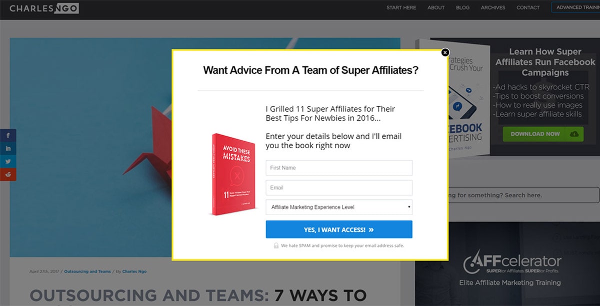
When you go to leave the page you’re greeted by a very catchy modal window. It uses strong heading text and visuals to immediately grab your attention.
The headline is actually one of the most important aspects of this entire modal. You absolutely need to consider how the headline looks and what sort of copy you’re running. How are you pushing your freebie? What’s grabbing the user’s attention?
Spend time working on your copywriting and how to push something with the written word.
Another good example to study is Smart Blogger where the exit intent window offers a free ebook guide. It’s marketed as a viral “cheat sheet” in the headline copy because this makes the guide feel lighter, less of a book and more of a quick guide.
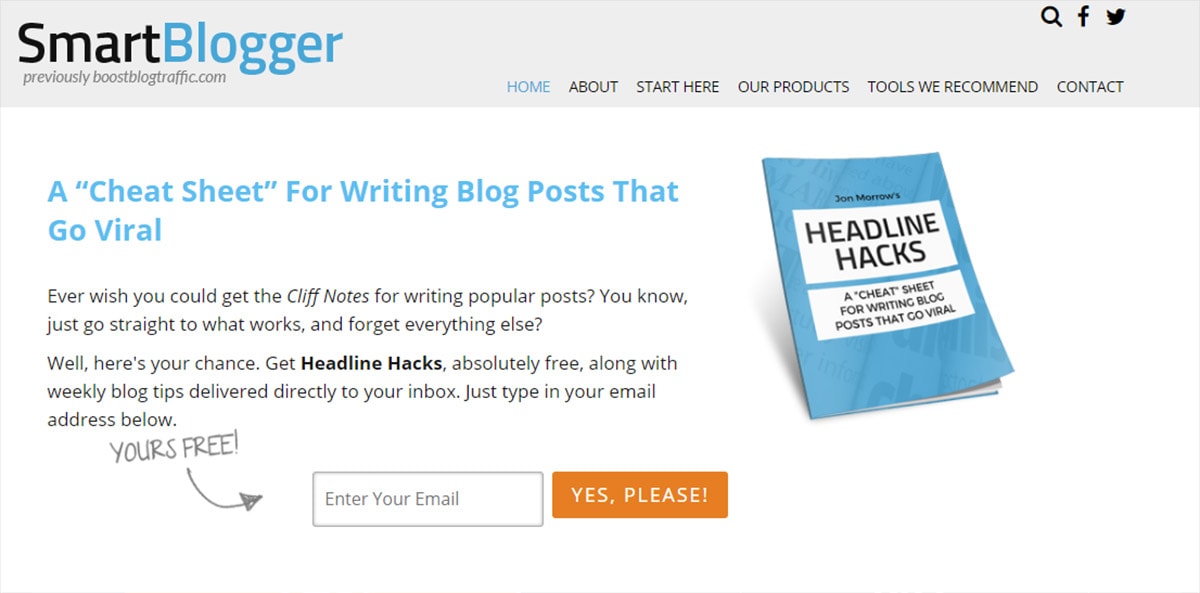
Also notice the CTA button text and the “get it free” icon right next to the form field. These are very subtle techniques but they all grab attention and guide users further into the form.
With Pulsetic you’ll be instantly notified the moment your website, API, or server becomes unavailable. Monitor uptime from multiple global locations and respond to incidents before your users are affected.
Create beautiful status pages in minutes to keep customers informed during outages and build trust with transparent communication.
Start Monitoring for FreePlan some ideas of what you could give away to encourage visitors to stick around. You’ll probably go through a handful of ideas before you find a good one but it’s well worth the effort.
Guilt In Copywriting
Another common trend I’ve noticed is the use of guilt-based copywriting in modal windows. This appears both in the headline and in the CTA buttons.
You can read more in this post but the goal is to convert visitors by making them feel guilty and rethink their decision to ignore your message.
This can be tiresome and annoying, but sites keep following this trend because it simply works. Big sites like Investopedia even have this in their modal windows.
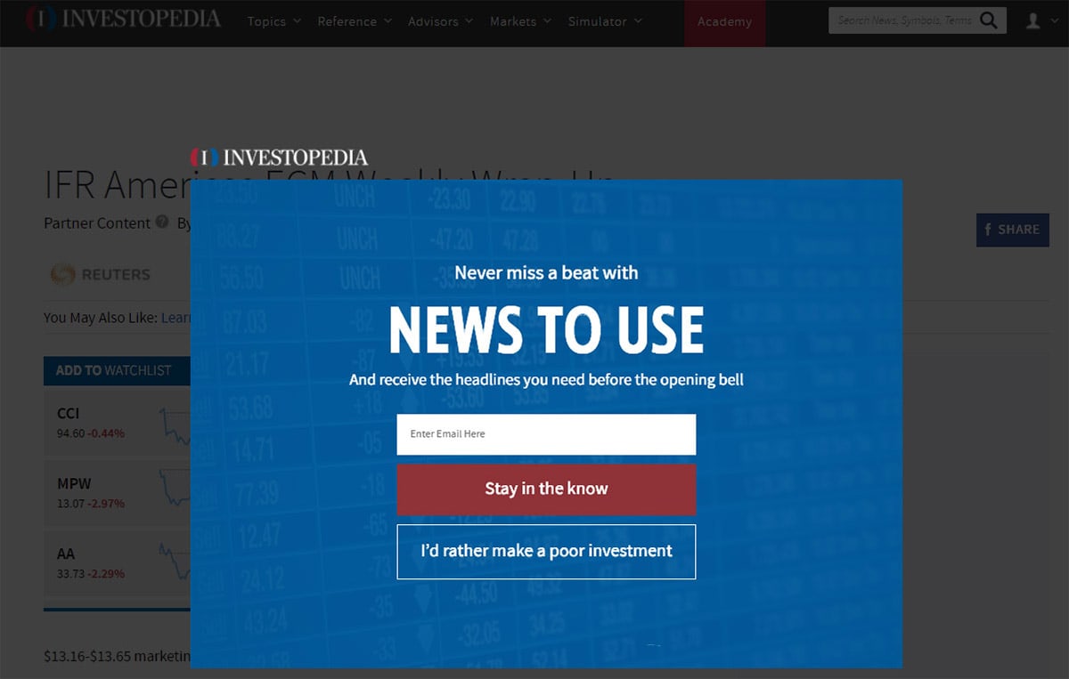
Their two CTA buttons immediately draw attention so that’s where visitors will look. The close/exit button doesn’t say “close” or “no thanks”.
It’s a statement in the first person which connects to the visitor personally, and it’s them admitting that they’d rather stay poor than sign up to Investopedia’s newsletter. This trend is growing rapidly and I see it almost everywhere now.
I think it’s important to understand if you’d want to follow this trend, or if you think it’s in bad taste. Marketers use guilty copywriting in modal windows because people convert.
But this can also harm the user experience and most people are getting sick of this trend.
In fact, there’s an entire Tumblr dedicated to this type of negative copywriting. I highly recommend browsing through that if you need some ideas or a good laugh(or both!)
Dramatic Animations
Modal windows can appear seemingly out of nowhere when the user is scrolling or reading an article. These are generally easy to notice and don’t need animations to grab attention.
But exit intent modals need to grab attention fast because the user is about to close your site. In my eyes these should be as flashy as possible without being overbearing.
The animation is a cornerstone of the modern web with new animation techniques coming out all the time. Your exit intent modals should use any animations that’ll grab attention to encourage users to stick around and maybe sign up to your email list.
Take a look at the example on WPBeginner which uses a slight rocking animation. As soon as you hover outside the screen you’ll notice this modal window rocking back & forth.
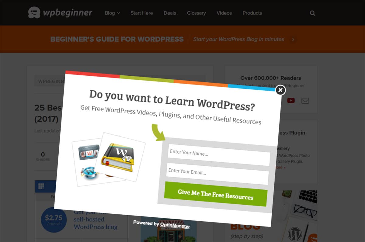
It’s powered by OptinMonster which supports these animations by default. This modal script has its own WordPress plugin and it was developed by the founder of WPBeginner, so this is guaranteed to be a good resource.
But it doesn’t really matter how you add the animation. It doesn’t have to be a shaking, rocking, jumping, or anything too big. Even just a small ease-in can make a big difference.
I’ve just noticed that exit intent modals with strong animations tend to grab my attention quicker and easier. The end goal here is attention so any technique you can try will help.
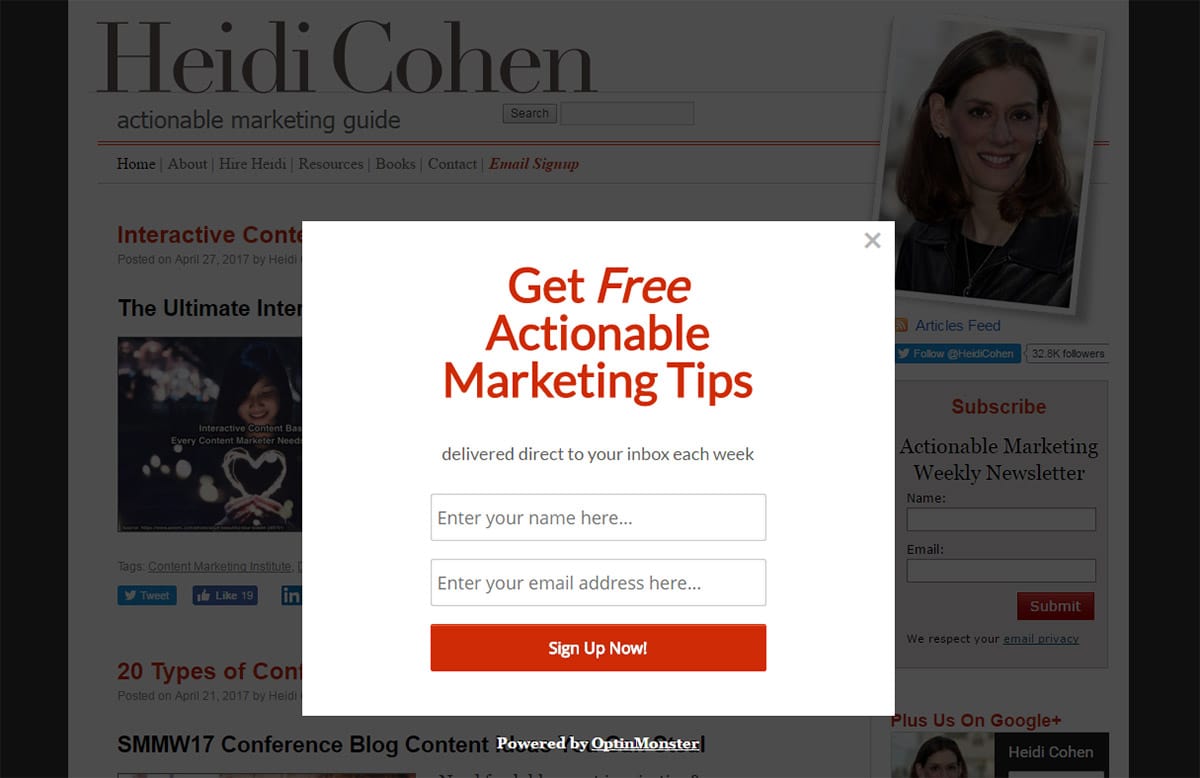
On Heidi Cohen’s site you’ll find a modal animation that rotates into view from the left side of the screen. It uses fading and rotating animations combined. I think it’s a tad gaudy but I bet it converts well.
Be willing to test a few different animations and see if one works better than the others.
The Strong animation is a great way to improve your response from visitors as long as the animations aren’t too bossy.
Exit Intent Plugins
Nobody needs to code an exit intent script from scratch. You can find plenty of open source plugins and frameworks to generate this exit intent modal effect.
I’ve curated my top 4 picks here and I recommend all of these for their features and ease of use.
Ouibounce
The ouibounce library was created solely for exit intent modals. It dates back about 2-3 years so it doesn’t have the most recent updates, but it still works flawlessly.
You can work with a custom template or redesign your own but the modal is pretty easy to setup either way. The ouibounce creator even includes sample screenshots in the GitHub page which you can study for inspiration.
And remember all the trends mentioned earlier: animation, copywriting, valuable offers. Combine these with the ouibounce plugin to see the best results.
Exit Intent Popup
A much smaller and more code-oriented option is the Beeker exit intent script. This runs on top of jQuery so it does have one dependency, but it’s a fairly light script and shouldn’t add much to your HTTP requests.
This is definitely a coder’s script because it requires a good amount of setup. You really need to know your way around jQuery to get this working properly.
But for many developers this is exactly what they want. Plenty of options to customize and configure to get this modal working in any style.
You can learn a bit more reading through this article written by the developer.
Yeloni Exit Popup
Yeloni Exit Popup is a free WordPress exit intent modal plugin made for ultimate simplicity. There’s a free version on the WordPress plugins site but you can also get the paid version if you want any of the advanced features.
From your admin panel you can customize everything about the modal: title text, colors, typography, images, and pretty much anything else you can think of.
The free version comes with so many great features that you never really need to upgrade. It supports MailChimp, Aweber, and a few other email service providers for opt-in forms. And you can even change the trigger from exit intent to other user behaviors like scrolling or clicking.
Exit Intent by OptiMonk
Lastly, I have to recommend another freemium WP plugin Exit Intent by the folks at OptiMonk. This plugin carries many of the same features with email integration and no coding required.
But you also get a full WYSIWYG editor for customizing the colors, styles, and behaviors of your modal window. This plugin is still pretty new but it’s updated frequently so it’s likely to be around for the long haul. And you can find tons of custom templates for design inspiration right on the plugin page.
These are just my personal favorites but there are plenty of others out there. Take a look at Google if you’re willing to search around and try a few others.
And I certainly hope these tips can help you build exit intent modals that not only offer value to your visitors, but also help you radically increase conversions.


