Six Great Alternatives to Helvetica
You’re probably aware that Helvetica is one of the most popular typefaces being used today. We live in an era of sans-serif in flat design and grotesque revivals, and the font seems to fit just fine in the spectrum of modern design.
At the same time, Helvetica has important faults that any designer who takes typography seriously should be aware of, and could even warrant alternatives.
What’s wrong with Helvetica?
The problem is that we use and interpret Helvetica in a lot of situations it wasn’t designed for. The original typeface, Neue Haas Grotesk, was released in 1957 by the Haas foundry to compete with Akzidenz-Grotesk at Berthold. Since then, the typeface had to make significant design compromises to keep up with moving technology: a sloppy family expansion, an adjustment of stroke weights for the linotype machine (where the name was changed to Helvetica for international appeal), character width systems the linotype photo-setting system, and an automatic slant to the roman on digital PostScript with the Macintosh.
Decades of readjustments across platforms changed Helvetica into something that isn’t… really Helvetica. The version we use is boxy, and lacks the fine curves that gave Helvetica its style. Helvetica Neue is even more deviant from the original, as it stretches the width of many of its letters, rounding out counters and increasing crossbar lengths, to create a kind of faux-neutrality that feels forced and disingenuous.
As designer Martin Perks describes, Helvetica was very much “a product of modernism”. It represented the strength of Swiss type, and a new age of design whose power was rooted in clarity and simplicity. Helvetica has changed significantly over the decades, losing its original feeling for a cold rationale that the typeface wasn’t really designed for.
Therefore, I think it’s time to look some alternatives. At this point, the use of Helvetica seems to imply more of a lack of expansive type knowledge than nuanced taste. There are very competent and capable grotesque typefaces out there that deserve your attention. Let’s take a look at them!
With Postcards Email Builder you can create and edit email templates online without any coding skills! Includes more than 100 components to help you create custom emails templates faster than ever before.
Free Email BuilderFree Email TemplatesNeue Haas Grotesk
“I’ve come to think that Helvetica was never intended to be the cold, perfect, rational typeface it’s portrayed to be. There is a subtle warmth in the shapes that was lost over the years.” – Christian Swartz
In 2004, designer Christian Swartz was commissioned to bring the original Neue Haas Grotesk to our digital landscape. Completed in 2010, the typeface is perfect in a new digital font.
Compare Neue Haas to Helvetica and you’ll see softer curves that give it style, counters that are more rounded and relaxed yet avoid the boxed feeling of Helvetica Neue. Whereas Helvetica’s letter widths still conform to an 18-unit system; Neue Haas Grotesk has varied widths that optimise each letter properly. And whereas Helvetica oblique you use on your mac was made by mechanically skewing the regular by 12 degrees, Neue Haas has smoother, more natural curves to feel like a real italic, instead of something that’s been stretched awkwardly.
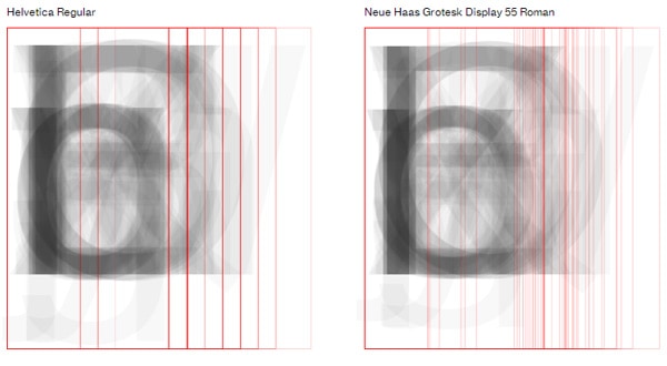
If you’re too attached to Helvetica to let it go, this is absolutely the next best alternative. Neue Haas Grotesk is family of 44 fonts. You can get just one for $54 at myfonts.com.
Univers
If there’s one thing that connects all versions and adjustments of Helvetica, it’s their density. Helvetica’s letters are packed tight; its x-height is large and attention grabbing. But Univers’ power comes from well-placed subtleties in its style. First, the bowl of its ‘a’ is more even and reasonable. Then, when you look at the other letters with bowls, or even shoulders, there’s much more difference in the stroke, which gives it a nice little push out of the neutral zone.
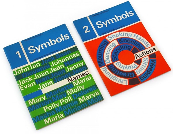
Univers is generally smaller and has more space between letters. It doesn’t break joints to grab my attention; it merely exists comfortably in its own space. It’s a more thoughtful typeface, whose subtle changes in stroke make it interesting and resonant. A good example of its strengths are the 1962 and ‘64 covers of the Typographishe Monstblatter, a swiss magazine known for showing the world the power of swiss type. You can find them and more on the research archive of the University of Art and Design Lausanne.
With Pulsetic you’ll be instantly notified the moment your website, API, or server becomes unavailable. Monitor uptime from multiple global locations and respond to incidents before your users are affected.
Create beautiful status pages in minutes to keep customers informed during outages and build trust with transparent communication.
Start Monitoring for FreeProxima Nova
Proxima Nova, a reimagining of 1994’s Proxima Sans, is a great compromise between a geometric and grotesque sans-serif. Some curves are even and rational, like the lowercase ‘e’ or uppercase ‘G’, while others are fun and quirky, such as the bottom stem of its ’t’ or top stem of its ‘f’. Stroke contrast is in the right places on the right letters, specifically the way which the stroke thickens on letters like d, b and p. And the upward aimed bowl on its lowercase ‘a’ is completely unique.
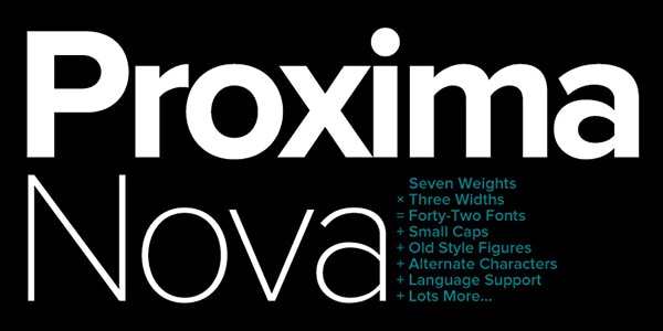
These are smart choices that give Proxima such great personality. It’s stylistic and interesting yet never loses rationality; it won’t look awkward when put in large paragraphs. At large heading sizes, all of Proxima’s strengths stand out, but at lower reading sizes (12-18 pts), they’re not too much of a distraction. Proxima also features alternate versions: an ‘S’ set composed of small caps, and an ‘A’ set that changes the curve structure of some letters, as well as redoes the ‘a’ to something more futura-like. Proxima is a family of 42 fonts starting at $29.
Brandon-Grotesque
Brandon-Grotesque is sharp and classy, a visual harmony between pointy apexes and rounded stems. It’s generally a thin typeface, but its bolder weights carry considerable power and control. Brandon was, supposedly, inspired by the geometric sans-serifs of the ‘20s and ‘30s, but it doesn’t feel like a theme-park re-enactment; it doesn’t scream Art-Deco. Instead, Brandon is a careful reimagining; it picks apart specific points of style, and creates something that feels modern and distinguishable from the time.
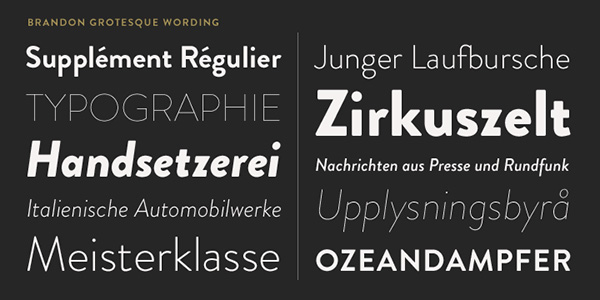
Brandon-Grotesque isn’t a family of many fonts (about 12 fonts), but it’s somehow better that way. There’s a very smart consistency between different weights and styles. Brandon-Grotesque was also the recipient of a Type Director’s Club Award last year, so perhaps that’s a good reason to check it out.
Akzidenz-Grotesque
Akzidenz-Grotesque is probably the best choice for someone who wants to stay as true to the early 20th Century neo-grotesque style as possible, considering it was designed before then. It’s one of the very early grotesque typefaces, released in 1896, 50+ years before Helvetica was even designed. But even though they may seem similar at first glance, there are crucial differences between the feelings they bring out.
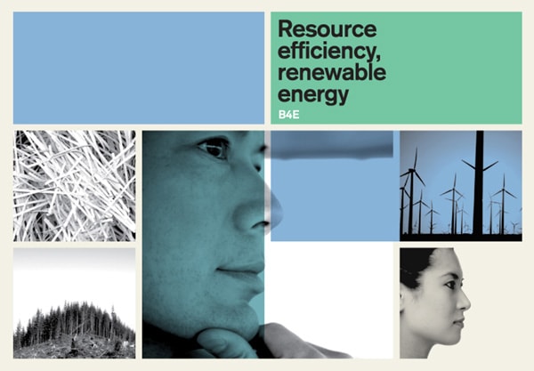
Akzidenz is smaller, rounder, and not nearly as dense. As a result, it’s a typeface that’s less grandiose and more approachable, perhaps even friendly with the right color choices. It also allows Akzidenz-Grotesk to achieve a more effective sense of neutrality than the modern Helvetica fonts. That doesn’t mean it’s boring, rather merely it allows itself to be carried by the soft, rational curves of the neo-grotesque style.
English Grotesque
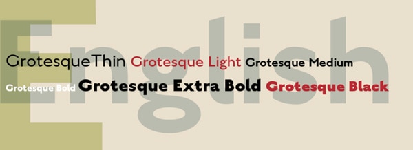
Lastly, English Grotesque is a unique and incredibly interesting take on grotesque typefaces. At first glance, it appears almost stretched horizontally, but English Grotesque is naturally short and wide. It doesn’t look awkward, though; the typeface keeps firm control of its style. English is quite bold, even at thinner weights. It also carries some slick curves, specifically its stylish descenders and stems, and its oval-like C and G. The slants on its “t” and “s” give English Grotesque a sharp edge, and its arm-less “G” becomes the typeface’s signature letter. English-Grotesque is incredibly resonant and distinctive from the more conventional neo-grotesque typefaces.
