Zolani Stewart
Zolani Stewart is a videogame critic and avid type enthusiast. You can read his endless musings over on Twitter at @Fengxii.
Zolani Stewart is a videogame critic and avid type enthusiast. You can read his endless musings over on Twitter at @Fengxii.
If you go back and read my guide to serifs, you’ll notice a trend with the shape of serif type overtime. As you move from old humanist type to the slick Modern serif, the stroke contrast is more apparent, the …
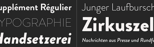
I recently finished reading Tim Brown’s new book “Combining Typefaces.” It’s 63 pages. You can buy it for less than $5 on FiveSimpleSteps, as a pdf or epub. Combining Typefaces is a dense book. It goes through a lot of …
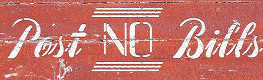
You should be paying attention to stencil. First, I recommend you throw away the image of ugly fonts sprayed onto industrial shipping crates and used for all sorts of army themed media. The stencil style is making a return, coming …
Even if you’re an experienced designer, it’s never a bad time to refresh your memory a little with the structure of serif typefaces, a few recommendations and a little history. Yes, there’s history. It’s painless I promise. Humanist and Old …
You’re probably aware that Helvetica is one of the most popular typefaces being used today. We live in an era of sans-serif in flat design and grotesque revivals, and the font seems to fit just fine in the spectrum of …