Web Design Trends of the Future: High Definition Design
One of the hottest techniques in web design is the HD background, enabled by the growing commonality of HD displays. But it’s not going to be easy when you’re creating a pattern whose trademark is visual complexity.
In this article, we’ll take a look into the future of web design. It’s not a question of if HD web design will dominate the web, but rather when high-res monitors become widespread enough to necessitate improved visual designs.
Let’s get a head start. We’ll explore how to build an HD background, using images, video, or animation, and layering everything together.
Images
Oversized. Hero. Full-screen.
These are the most descriptive words of modern web design when it comes to background images. Not only are designers thinking about HD, but they are taking HD to the extreme with backgrounds that occupy the entire screen.
With Postcards Email Builder you can create and edit email templates online without any coding skills! Includes more than 100 components to help you create custom emails templates faster than ever before.
Free Email BuilderFree Email Templates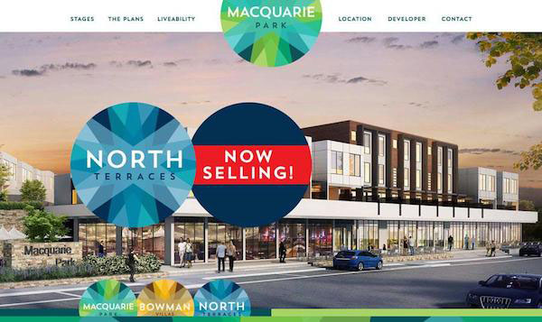
This design technique works because users are innately visual.
After all, vision dominates a lot of our subconscious interpretation of the world around us. On top of that, pleasing images create a better user experience partly because we perceive attractive objects as working better. It seems harshly superficial, but when it comes to design, perception is the reality.
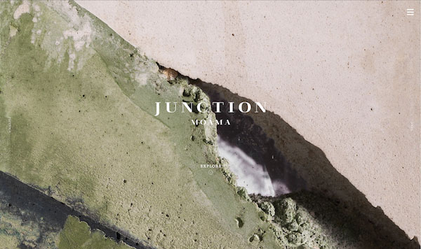
High definition screen resolutions provide the perfect opportunity for users to see images with a level of detail that just wasn’t previously available. Small image details – such as the texture used by Junction Moama to the varying hues in Macquarie Park (both shown above) – add to the visual polish of the interface, contributing to the ever-important first impression.
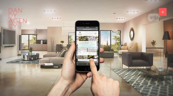
Here’s five ways to use a HD image to your advantage:
- Make a stellar image the focal point – Just because a photo is the background, doesn’t mean it can’t take center stage. A strong photo creates an emotional connection with users, so learn the nuances of how images affect the visual hierarchy of your design.
- Consider multiple images – Use a slider or card-style framework we described in Web UI Patterns to for content-heavy or portfolio sites.
- Use an effect on the image – Blurred or color overlays can add or alter the emphasis on an image (a global red tone will be more energetic, for example). This works well in HD because the underlying image is still discernible thanks to its high resolution.
- Consider how the image will look on different screen sizes – Plan background images for a variety of sizes and so that the background image fits the site at any breakpoint and does not rest on top of a solid color box (which in turn becomes the actual background).
- Think outside the frame – A photo background should not conform to the standard 1 to 1.5 aspect ratio of cameras, and can include images that are cut out of their respective backgrounds.
A background photo can create simple visual interest. The technique works best when you start with a great photo that emphasizes your brand, product or message. Remember, the use of a background photo can include multiple images as well, just ensure that the design framework and surrounding elements support each image individually.
With Startup App and Slides App you can build unlimited websites using the online website editor which includes ready-made designed and coded elements, templates and themes.
Try Startup App Try Slides AppOther ProductsVideos
HD video backgrounds might be one of the most popular techniques of the year – especially incorporating fast-paced action with plenty to look at for an almost frenzied feel. From giants such as AirBnB to smaller sites across almost every genre, streaming video is fast becoming a vital part of the web design landscape.
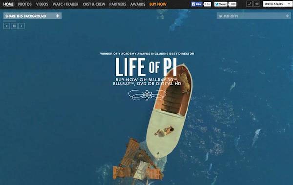
Some of the first websites to take advantage of background video were actual movie themselves. The site for “Life of Pi”, for example, uses an actual preview from the film as a background (in downloadable formats as well).
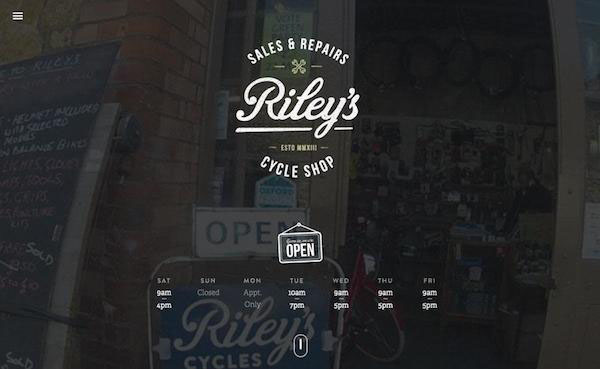
The emergence of video as a design technique has a little to do with its newness. Full-screen video backgrounds were just not something many browsers and internet connections could handle until the introduction of HTML5 (and smartphones with high-definition video capability).
Any discussion of HD video must take production into account. Whether it’s a more surrealist treatment like Dunckelfeld’s black-and-white background video or a more realistic destination montage like AirBnB, you’ll need to play with the saturation and frame rate so the videos are engaging without being distracting.
Just having a video clip is not enough. All the cinematic techniques for creating a great movie – framing, zooming and panning to name a few – are just as essential for web videos, even if used as backgrounds.
Brindisa Tapas Kitchens does an excellent job of putting plenty of short clips together to show its fare and atmosphere. Video is shot at a variety of angles and some clips are sped up in time-lapse fashion while others are paced slower to set the right tone.
Again, we’ll offer five guidelines for using HD video in your design framework:
- Pay attention to video length and duration – A background video should tell a visual story that users can get a feel for in a few seconds. Somewhere between 10 and 30 seconds is a good goal for loop time.
- Turn the sound off – Sound is still a polarizing autoplay element for most users. If you’re going to use sound, set the default as muted.
- Focus on load times – While HD video is fun, it should not bog down your website. It doesn’t matter how amazing your video is if users leave during a slow loading time
- Consider alternatives – Some devices can’t render HD. Check in Google Analytics to reveal your most popular devices, then design accordingly. Usually, you’ll find that you’ll want to use a static image as a backup option.
- Stick to quality video – Whether you film your own, hire someone to do it or use stock video, it needs to be top-notch in terms of visual quality. Not only does it have to work in a high-definition framework, but it has to actually be HD quality. Just like a photo, video falls apart at any resolution above what was originally captured.
Website design, especially when it comes to background video, is becoming a cinematic experience. HD video in websites creates a full multimedia experience with layers of information conveyed through a moving background.
Animations
HD background animation lives in the space between still images and design because these animations often contain both still and moving elements.
For as trendy as loading animations seem, the principles have remained nearly unchanged for decades. What has changed, however, is the level of quality afforded by HD displays.
The key to successful HD animation is timing. Animations should have smooth, seamless effects. Any looping should be unseen to the user.
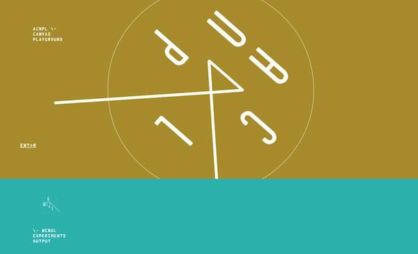
As described in Web Design Trends 2015 & 2016, we’d recommend keeping these five tips in mind:
- Stick to a simple animation – Overly complicated stories or actions may end up increasing cognitive strain, so execute the fundamentals flawlessly before weaving any complex narratives.
- Use bright color and on-screen cues to connect to the user interface – For example, start with a simple hover animation such as a link changing color. Consider the brightest hue from your color palette for the hover state to bring attention to the animation. Another visual cue such as expanding the colored letters during the hover state would add extra emphasis. These simple tools can help clarify the desired user action.
- Take advantage of HD screen capability – For the best visual quality, use scalable image formats like vectors.
- Approach animation like video – The same nuances apply to animations. For example, avoid jarring movements or elements such as sound that may annoy users.
- Plan animation for the right audience – While many designers think of animation and illustration at the same time, this may not be appropriate for every website.
As always, pay attention to detail. Depending on your site and users, animation can be cartoonish, video-style displays, or simply touches of motion in an illustrated framework. Animation can be triggered through user interaction – taps, scrolls or mouse clicks – or it can work in a simple auto-play format.
Layering: Putting It All Together
An HD background is effective only when treated as another layer of information. A phenomenal image, video or animation can’t do it alone – you must consider its relationship to other on-screen content.
Here are three short case studies from sites that successfully put it all together.
Adidas Design Studio
Adidas Design Studio uses a variety of techniques with big, bold images to entice people to join their workforce.
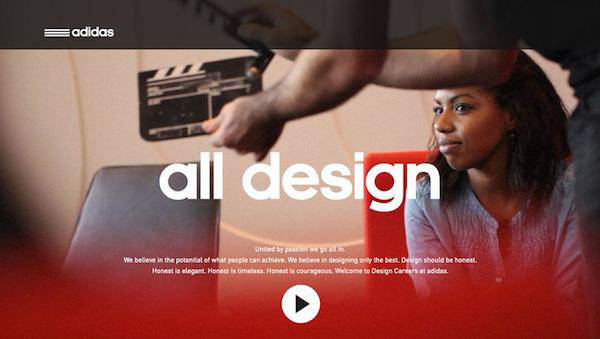
The full screen background actually links to a video and the scroll actions use parallax effects to guide users through product lines and information. Sharp images are paired with equally sharp type. Colors establish a visual hierarchy in a way that’s not overpowering.
Flipboard has perfected the art of the still background image, which relies heavily on the traditional principles of fine art photography.
The HD image includes lots of detail, but is not overwhelming. The image also extends off the screen in a way that you can imagine the table extending from either side, which it actually does at different screen resolutions. The tint also establishes the image as a background element, keeping the focus on the brighter and overlaid call-to-action information.
5 Eme Gauche
5 Eme Gauche features a large image background with multiple layered elements, including down page navigation, social media icons, a brand header and main links in the center of the screen.
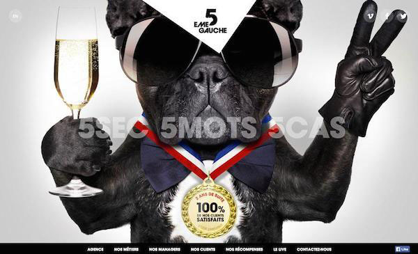
Each layer of content interacts with the background image and stands apart from it in a way that allows you to almost see all the layers on the screen at once. The site maintains good internal consistency since pages throughout the site use the same layering format over images and scroll-action animation.
Conclusion
While HD backgrounds have spiked in popularity lately, it’s not entirely fair to write them off as just a trend. Rather, they are the product of usefulness finally matching up with technological advances.
What this means is that people won’t simply get bored of HD designs and move onto the next big thing. As a growing part of a visually-rich industry, this makes creating them a technique definitely worth learning.
