The Future of Magazine-Style Blog Layouts: Trends & Design Ideas
All major trade & specialty magazines have built a web presence online. Many still release print editions but the Internet is a much cheaper medium to publish content.
The future of online blogging seems to be moving towards a magazine trend. But what does this mean? How do you differentiate between a blog and an online magazine?
In this post I’ll cover some basic design trends that have seeped into the blogging world and radically changed how we view online publications.
Ironically there aren’t many differences between a blog and an online magazine. The biggest factors are public opinion and the website’s overall design.
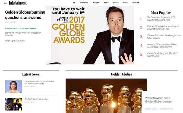
Featured Stories Widgets
Every magazine homepage should have some type of featured posts widget. This is the best way to set your blog apart from the rest and give it a professional look.
Each featured widget should include thumbnail images for the posts organized in a grid or carousel. This could be a large rotating carousel or a fixed grid with varying thumbnail sizes.
With Postcards Email Builder you can create and edit email templates online without any coding skills! Includes more than 100 components to help you create custom emails templates faster than ever before.
Free Email BuilderFree Email TemplatesThere are no wrong answers and the more creative you get the more unique your design will look.
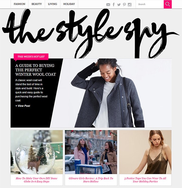
Take for example The Style Spy which uses different thumbnail sizes for different articles.
The top-most article is meant to draw the most attention. It has the largest featured image and spans the whole page width. Three smaller articles are situated underneath with smaller square thumbnails.
Each variation follows a different grid and they all deviate from the normal page flow. This is a tame example but it’s a good one to demonstrate how featured stories can be organized.
Looking into the design space you’ll find Hongkiat which does brand itself as a blog. However the site uses a featured story widget to craft a magazine look on the homepage.
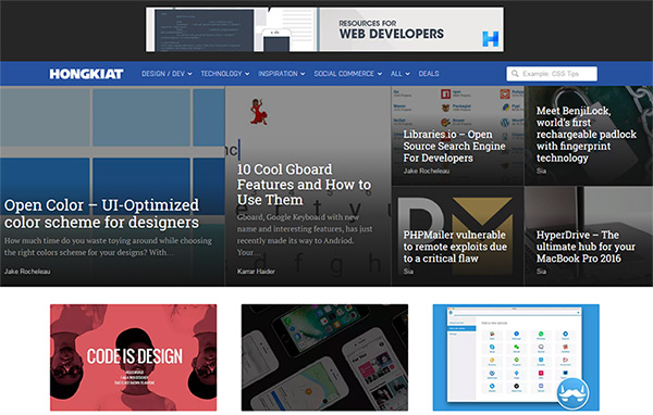
The widget spans the entirety of the screen and it uses a variety of post thumbnail sizes. Again we can see one super large story meant to draw the most amount of attention.
With Pulsetic you’ll be instantly notified the moment your website, API, or server becomes unavailable. Monitor uptime from multiple global locations and respond to incidents before your users are affected.
Create beautiful status pages in minutes to keep customers informed during outages and build trust with transparent communication.
Start Monitoring for FreeThen as you move from left to right you’ll find smaller and smaller thumbnail widgets. It’s also fully responsive so even mobile users can access this cool featured posts widget.
These designs are meant to showcase popular stories and to help garner attention to the most important posts.
Some featured story widgets use carousels to move between different stories. This is a decent strategy but not great.
Carousels are not known for usability and they struggle to draw attention.
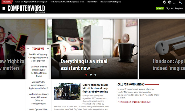
You can see an active carousel on Computerworld with a series of posts that auto-rotate.
If you want to use this technique it’s certainly not a bad one. However I wouldn’t advise it just because it is so technical and the results aren’t that great.
But either way a featured story widget is a must-have for any magazine theme. How you design the widget is up to you. But it’s a proven way to bring a simple blog into a higher level of professionalism.
Headlines with Taglines
You’ll see this a lot in newspapers and print magazines but it’s a new emerging trend on the Internet. Publishers now write headlines that also include taglines with extra information about the story.
You’ll find this mostly on major news sites like this piece for Huffington Post.
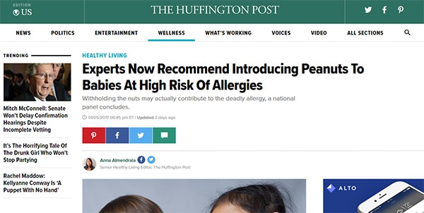
Taglines are great because they feed more detail into the story. They almost work like a lede to keep people reading further into the article.
But if you skim through Huffington Post you’ll notice only a few stories have this tagline. It’s not something you’ll want for every post and it’s not a mandatory feature for all magazines.
However I do see this trend growing with more sites adopting the tagline for new content. It can be used in featured story widgets as a tagline under the header too.
Take a look around some of your favorite “big” blogs and see if they use taglines. I’d wager that most of them do.
Also notice how most headlines have a darker text color than the related tagline. This contrast draws visitors to the headline first, then guides them through the tagline and into the article.
Larger magazines tend to have hundreds of thousands of posts with new content added every day.
With this much volume it’s a good idea to interlink related articles together. You can always add a “related posts” widget to the bottom of each post. But you can also add links directly into the content.
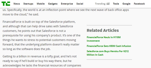
The screenshot above is from this TechCrunch article with a small widget near the end of the post. It’s labeled as “related articles” and it links to a bunch of similar articles on the same topic.
This is an excellent way to keep readers on the site and drive them further into similar posts. I don’t think this can work for every blog but it is a rapidly growing trend.
You could also add these sections to posts that are part of a larger series. For example ZDNet covered CES 2017 in great detail so each post includes a long list of related posts about the 2017 event.
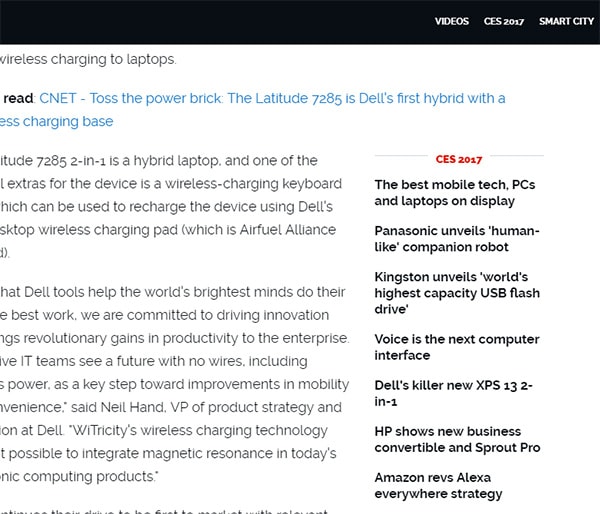
These links are only relevant to this topic but the technique can be applied to any event, or even a product release like a new iPhone.
If you don’t have multiple links then you could add links sporadically if they’re related to the article. This is how Mashable does their internal linking which you can see in any given post.
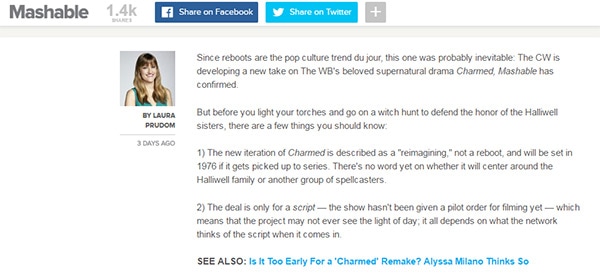
Their template adds the big bold letters “SEE ALSO” which naturally breaks the pace of reading to grab attention.
This trend is very popular on the big magazines and I’m sure it works well to increase the total pageviews per visitor.
It’s fairly common to use a fixed navbar in your blog/magazine design. But a new growing trend is to add a fixed sidebar alongside the main content.
This keeps certain content fixed to the side of the article as the reader scrolls down. It can help increase interactivity but it’ll only work on larger monitors like desktops and laptops.
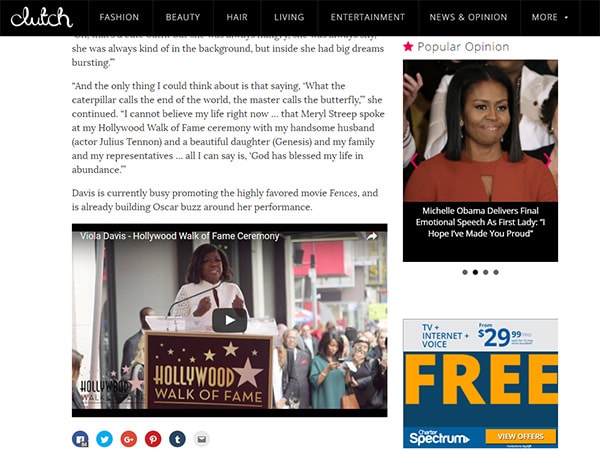
Take a peek at the above example from Clutch Magazine. It has a fixed sidebar with a couple ad blocks and a “related posts” slider sandwiched in-between.
If you have longform content on your site then the sidebar can fall out of view quickly. With a fixed sliding sidebar you can keep the important content in view at all times.
Granted this works better when you have something of value beyond just advertisements. But it can also increase CTR if you’re concerned about that kinda stuff.
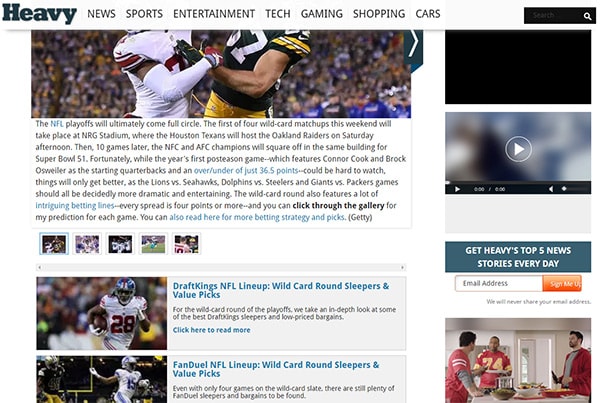
In Heavy’s sidebar you’ll find an email opt-in box sandwiched between ads. Granted if you’re an adblock user then you should only see the email field.
But this field is at least valuable to the user. By forcing it to scroll with the content it’s more likely to garner signups. And there’s really no downside to the fixed sidebar so it’s a trend that I think is worth following.
Custom Homepage Layouts
Magazine homepages have moved away from the typical “blog” design which is usually a series of posts in a linear fashion.
Granted this linear design is a very good thing. It’s great for author archives, date archives, and category pages. But the homepage should be the doorway into your magazine. It should be designed with a bit more flair.
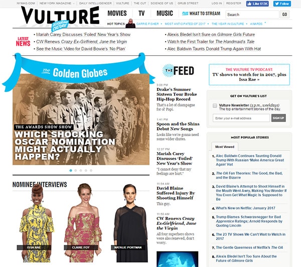
The layout of Vulture is a fantastic example using three columns of varying widths. The posts each have different sizes for their headlines and thumbnails.
Keep in mind that Vulture is a huge magazine with hundreds of new posts each day. This level of detail may not be necessary for a smaller magazine-type blog with only 1-2 posts per day.
For that you can see a simpler design on Ad Age which mixes the linear post layout into the homepage.
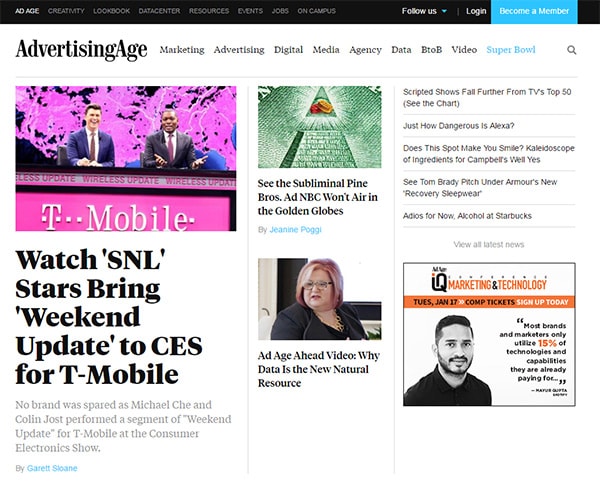
The very top section uses its own grid system and this works like a featured stories widget. Certainly not perfect but it’s a lot more attractive than a simple blog layout.
This is another scenario where you really have to look around to find inspiration.
Take a look over your favorite magazine websites and study their homepage designs. What do you like? What makes it easy(or difficult) to use?
There are no correct answers for modern magazine layouts. They all have similar features but the specifics are often very different.
Find what works best for you and work with those trends to bring your blog into the future of magazine-style designs.
Blog Designs Of The Future
I can imagine a world where bloggers still run their simpler blog designs alongside more detailed magazine sites.
There’s nothing wrong with running a personal blog, and in fact I’d recommend keeping the old-school blog layouts for personal blogs & smaller brands.
But for top branded magazines there is a push to move away from the simple blog design. And with these trends at your disposal it should be easy to craft a brilliant magazine-style layout that’ll blend nicely with other authoritative publications.


