Design Stereotypes: Masculine and Feminine Design Techniques
A user’s first impression of your site can be a lasting one.
In the first few seconds, a person decides to stick with your content or move on. They will also make decisions about whether your site fits their needs. And that first impression has a lot to do with sex.
Male and female users often look to the web for different experiences. The look of your site can instantly appeal to one of the sexes or both.
But how to you know? There are commonly held ideas about what appeals to each gender; here we will apply those principles, and even stereotypes, to design theory.
Images
The first design element a user sees on site is images – especially images containing people.
With Postcards Email Builder you can create and edit email templates online without any coding skills! Includes more than 100 components to help you create custom emails templates faster than ever before.
Free Email BuilderFree Email TemplatesWhat do these people look like?
Demographically, it is likely that the average adult website visitor will look very much like the people on the site. This applies to age, race, size and even gender.
But what if your images aren’t representative of the average adult visitor? Think about a site that contains more images of inanimate objects, landscapes or babies. Those images have certain appeal for the genders as well.
The exception to the image rule is in oversexed images. Imagery that features scantily-clad, attractive women or men will often appeal most to the opposite sex but can be an attention-grabber regardless of gender.
Quick and dirty breakdown
- Babies, puppies and overall cuteness – Feminine
- Sports and action – Masculine
- Flowery landscapes and trees – Feminine
- Rugged landscapes and terrain – Masculine
- Food – Feminine
- Clothing and shoes – Feminine
- Gadgets and electronics – Masculine
Fonts
Type selections can imply masculinity or femininity.
The most important considerations when it comes to gender are slant, stroke and details.
With Pulsetic you’ll be instantly notified the moment your website, API, or server becomes unavailable. Monitor uptime from multiple global locations and respond to incidents before your users are affected.
Create beautiful status pages in minutes to keep customers informed during outages and build trust with transparent communication.
Start Monitoring for FreeMost people quickly associated letters with distinct curves and slant to be feminine, include typefaces from the cursive and script categories. Some might even go the extra step to include italics in the feminine-feeling category.
The stroke of a letter can also imply gender. Thin strokes are often thought to be lighter and more feminine than bolder letterforms. Using this technique, a designer can develop masculine and feminine styles using a single font family by using different parts of a font family.
Finally, a designer should really look at the smallest parts of a typeface. Serifs tend to have a masculine edge, particularly those with very square edges. On the flip side, serifs with rounded and curved edges and imply a more feminine display.
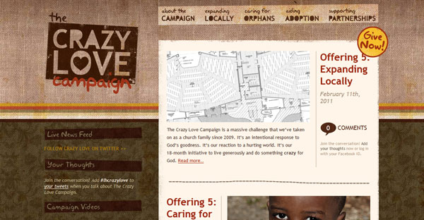
This same principle applies to other strokes and ornamentation as well. More frilly lines and tails are more appealing to women, as are bubbly letters. Feminine font styles, especially those seen on sites for weddings, baby items and crafts, tend to rely on heavy ornamentation. Blocky styles and sharp or pointy accents reflect a masculine tone.
Quick and dirty breakdown
- Old English – Masculine
- Script – Feminine
- Cursive – Feminine
- Slab serif – Masculine
- Hard-edges serifs – Masculine
- Curved-edge serifs – Feminine
- Tall thin, condensed styles – Masculine
- Thick strokes – Masculine
- Thin strokes – Feminine

A designer will also want think about what the words say. Does the message match the presentation?
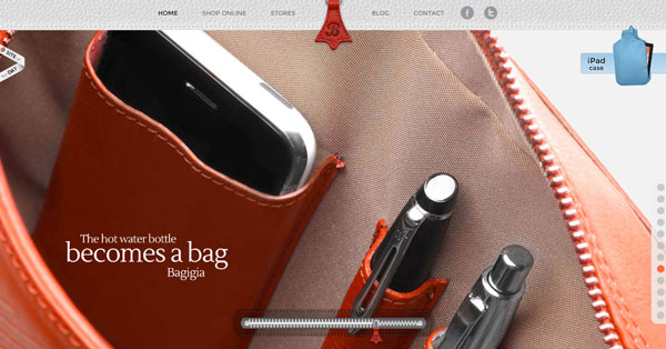
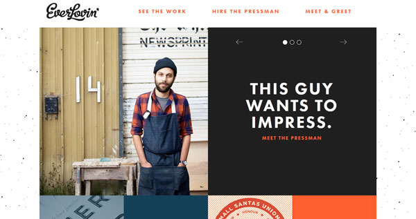
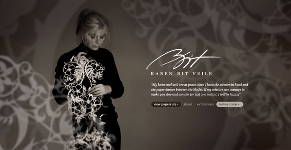
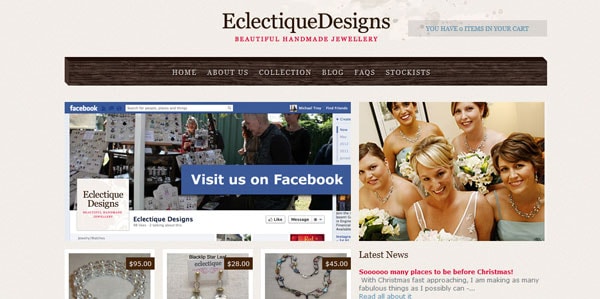
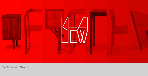
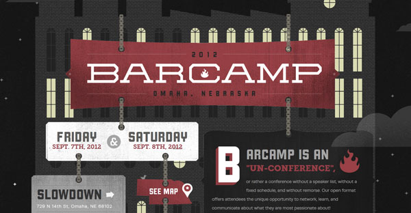
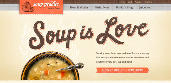
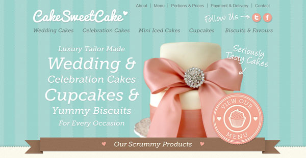
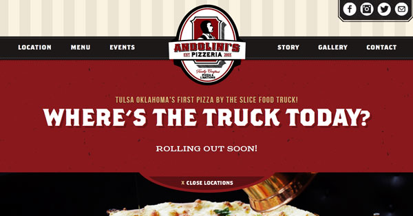
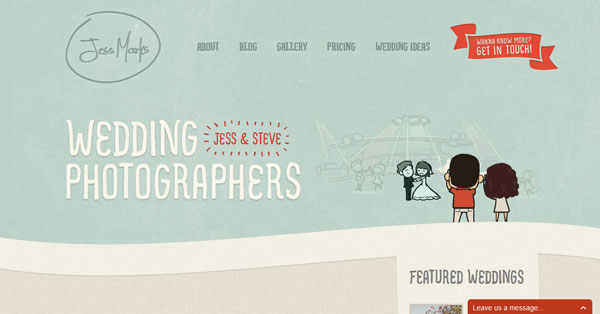
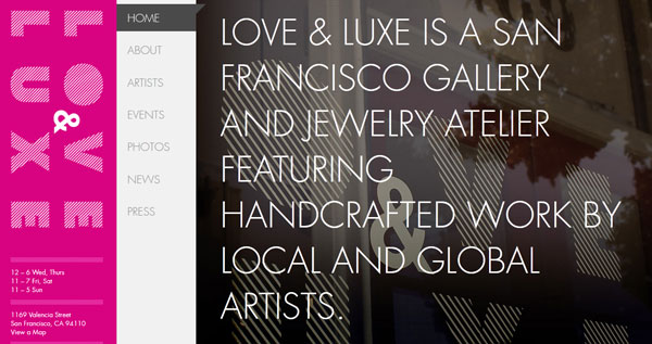
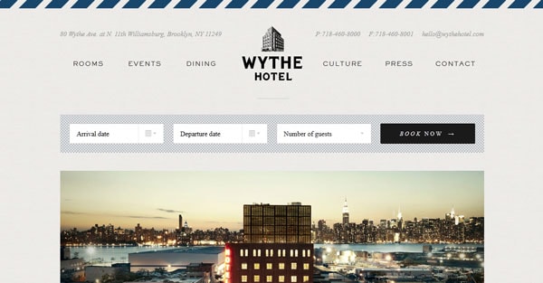
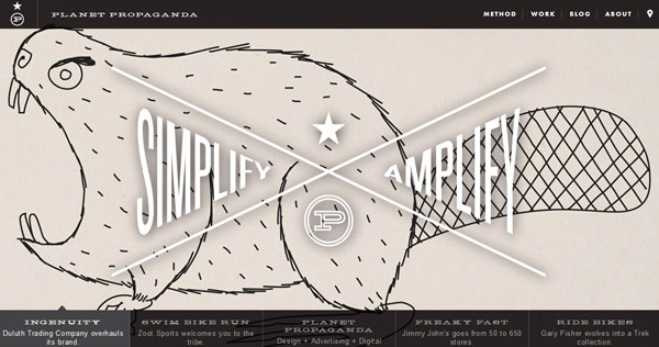
Look at the images above – there are obvious choices for the presentation of the words feminine and masculine.
Colors
You could write a book about masculine versus feminine color associations. Most people start with the common blue for boys and pink for girls. But color associations can be some much more complicated than that.
Color perception can change based on gender and culture.
So how do you know where to start?
Think about saturation.
The darkest colors that have the deepest hues, exude the most masculine undertones – think blacks, navy, dark greens or reds, purples or oranges. If white type will show easily on a background of the color, it likely has a masculine tone.
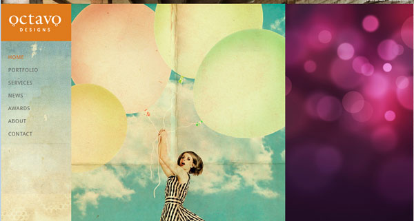
Pastels are generally considered more feminine. So are any other colors with more muted tones – pinks, yellows and greens and blues all fall into this category.
You can learn even more about color perception differences between the genders from a study by Joe Hallock on color perceptions around the world. In those findings the most preferred colors among men are blue, green and red; brown and purple were the least liked. The top three colors for women were blue, purple and green; orange and brown were the least liked. One of the top findings was the use of purple and how it ranked highly among women and not at all for men. Using colors that appeal to a specific gender can sway the tone of a design.
Neutral tones – beiges, pale yellows and greens or blues – are just that neutral and have very little gender bias. These colors will take on the tone of the rest of the design.
Quick and dirty breakdown
- Dark, saturated colors – Masculine
- Pastels – Feminine
- Blue – Masculine
- Pink – Feminine
- Purple – Feminine
Shapes
Hard corners and edges are representative of shapes that have more appeal for men – think squares, triangles and trapezoids. Ninety-degree angles are also a popular technique or visual cue.
Shapes with quite the opposite look appeal to women. Think about curves and delicate detailing – circles, wavy lines and soft repeating patterns.
The styles of shapes that tend to include more dimension have a feminine appeal, whereas flat, raw forms are more masculine. Strong lines and dark color blocks can also indicate a masculine tone, whereas thin lines (very much as in letterforms) and light strokes indicate a more female look.
Quick and dirty breakdown
- Hard corners and edges – Masculine
- Curves – Feminine
- Squares, triangles – Masculine
- Circles and hearts – Feminine
Conclusion
Now before you get upset that there are exceptions… of course there are! (And meanings can change depending on how you mix and match concepts.)
The use of generalizations when it comes to masculine versus feminine design is to get you thinking about audience. Who is your target audience and what type of visual approach will appeal to them? Understanding gender preconceptions and predispositions is just a starting place, not a set of hard and fast rules. Use this set of ideas to determine if the look of your site design fits the group of people you want to get use from it.
