What is the Point of Material Design?
In the simplest of explanations, Google developed Material Design to unify the experiences users have across various Google platforms. Additionally, this unification is to bring improved overall experience a user has with technology by making the interaction easier, simpler and more intuitive.
Tell Me, What is Google?
Google is a very big company, which includes various technologies from search engine to browser to laptop to operating system to glasses to watches to a lot of things. It only makes sense for a company with so many technologies under its ownership to synchronize the experience between various devices or interactions.
Material Design is a lot more than just a new UI; it’s a whole (new) Google experience.
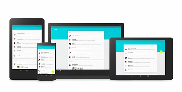
A big part of Material Design is the way a user interacts with various technologies in that they have a seamless flow between interactions. Say you’re writing an email and walk away from your computer while it’s still unfinished and open. You can continue writing that email on your watch, phone or tablet without having to worry about saving it as a draft, syncing it, finding it and continuing where you left off.
Another example: You’ve just arrived home and the emails that pop up first are from your friends and family not work because Google’s technology knows not to bother you with work-related stuff when it’s family time. This technically has nothing to do with UI. Material Design is about how Google can improve your life by making their technology smarter.
With Postcards Email Builder you can create and edit email templates online without any coding skills! Includes more than 100 components to help you create custom emails templates faster than ever before.
Free Email BuilderFree Email TemplatesThe UI of Material Design
Now that Material Design will be the staple of Google’s interface it’s important to understand how they came about making it. A big part of making Material Design is the physical world. Google Design Lead for Search Jon Wiley told Fast Company:
“When you make things, you inherit thousands of years of expertise. But software design is just getting started.”
This statement alone means that in making the UI for Material Design they wanted to create something brilliant and astonishing. However, they needed tsome serious research to figure out what would give Material Design that specific design influence. Wiley further explained:
“We took a step back. We looked at all of the software and asked, what is this made of?”
Cardstock to Influence Design
Google wanted to add perceptiveness of physical objects into the digital world. As you may remember Apple was notorious for trying to do that with skeumorphism; in Google’s eyes Skeumorphism was on the right track but can be done better. There are no fancy textures in Material Design, the UI is clean and simple. Skeumorphism was a big exaggeration compared to Material Design. But, how does cardstock fit in?
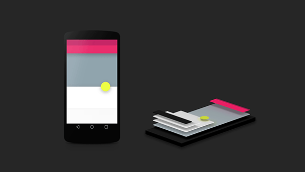
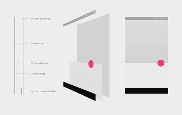
Cardstock is a big part of making Material Design what it is. The designers at Google, wanting to make the digital as physical as possible, stacked UI elements one behind another – like stacks of cards. This is nothing new, as a lot of designs are like this. However, Google did take a step further by implementing shadows to make the UI actually appear like cardstock. The real world was important for Google designers to preserve; the real world and physics serves as big reference point.
With Pulsetic you’ll be instantly notified the moment your website, API, or server becomes unavailable. Monitor uptime from multiple global locations and respond to incidents before your users are affected.
Create beautiful status pages in minutes to keep customers informed during outages and build trust with transparent communication.
Start Monitoring for FreeStudying Real Paper
Google took paper to heart as a fundamental influence of the design. Google Design Lead for Andriod Matias Duarte explained to Fast Company that Material Design is looking to improve pixels form just having color and instead leverage your screen to change shape and depth of the pixels in response to a touch. In order to bring the most realistic experience into the digital world, they studied actual paper. The designers made paper icons with various layers to see how shadows were actually cast. Although real paper cannot morph and manipulate like the cardstock within Material Design’s UI, it helped to study it anyhow. After all, Material Design is making headway within the design community. More importantly, it will be a big part of design for Google as they roll it out. Even if Material Design wasn’t making headway, it’s still crucial to test your design, as it will impact users.
Aiming for Digital Physics
One big principle within Material Design was to create a sense of faux physics within the digital realm. This was to create some type of sense and relationship for the user in the way they see the screen and various apps interacting and working. It was important to showcase some sort of relationship since physics don’t apply to the digital world. The reason to do this would be quiet simple: To forgo having to implement “intuitive” app design. As apps or websites – or any single one of their components – aren’t by nature intuitive, designers have to rely on conventions. Otherwise, apps and websites are hard to use. Material Design aims to create a visual relationship within its UI so that intuitive is easier to come by for users. The key is also to realize they want to cater to a relationship, that’s why the actual UI has subtle animation, shadows and color to make interacting with Material Design more fun.
What’s the Point of Material Design?
All in all, Material Design is how Google is going to unify its experience across various products and technologies. A fundamental part of Material Design is to enable seamless information flow between devices and having smarter technology. Think about how tedious it is to deal with just email — there are various apps for email alone; some apps aren’t cross platform. Same goes for file sharing, pictures, or even text messages.
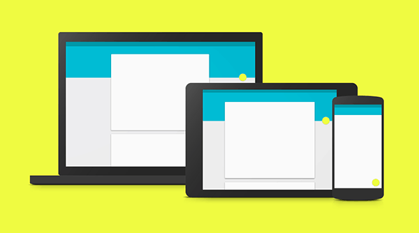
If the synchronization between your TV, watch and smartphone or your car is in fact seamless it will be easier for you. As a user, you won’t have to worry about making sure your messages or files are synced to a device, you won’t be bombarded with work emails while you’re at home – and vice versa, pictures sent to you from last night won’t be popping up while you’re at work.
Material Design is much more than just elegant UI (no matter how elegant it may actually be). A big takeaway from what Google is doing is that they are going after overall experiences. Most importantly, they are trying to improve how people use technology and make it easier and better.
If you read through Google’s material design documentation you know how detail oriented and extensive it is. When you look through the document you can learn many things. One of the greatest lessons is that it proves that it’s possible to create complex visual style guides. By no means is it easy but it is possible, especially for the complicated array of products that Google has.
If you want to learn a few things about visual design you should take a closer look at the way material design handles individual elements or components. The documentation specifies 18 different design elements, from buttons to menus to tabs. So, what can be learned from analyzing them?
Accept Variations
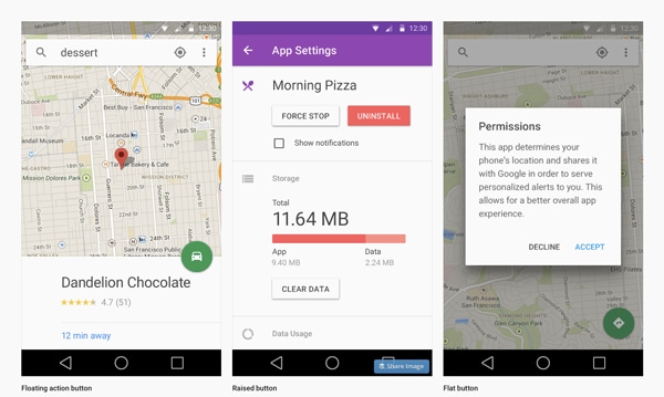
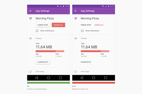
There are many rules just for buttons. There are three different button types within material design: floating, raised and flat. It’s difficult to have a single button type working across the various interfaces material design could be used to make.
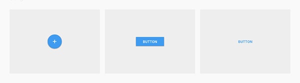
It’s also difficult to keep consistency in mind with all the various interfaces. Yet, material design embraces three different types of buttons in order to make the best of its design. The alternative is to pigeonhole the design into something that may not work well at times.
“Choosing button type for your main buttons depends on the primacy of the button, the number of containers on screen, and the overall layout of the screen.” – Buttons Usage
There are certain guidelines for buttons that are specific and some guidelines that are more vague. All in all, the guide is well thought out. The guide has specific details about how to and not to use buttons so it’s easy for the designer to work. And that’s the beautiful thing about this whole guide; design decisions are left at the designer’s discretion.
Pay Attention to Often Forgotten Elements
How often when you design an interface to you take into consideration a pop up or an alert module? The material design documentation has a section dedicated to dialogs. These boxes are not something designers often use to begin with. But when they are used, they are still part of a design and need to be addressed.
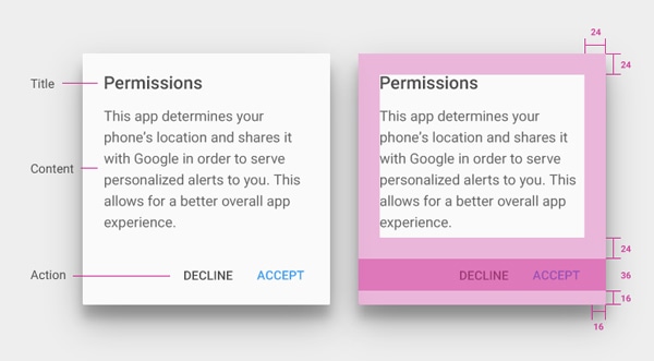
The guidelines regarding dialogs are specific. They outline the kind of button you should use and why. The anatomy of the dialog is spelled out too; it’s informative and thorough.
“Side-by-side buttons are recommended when the text of each label does not exceed the maximum button width, such as the commonly used OK/Cancel buttons.” – Dialogs
“When text labels exceed the maximum button width, you can use stacked buttons to accommodate the text.” – Dialogs
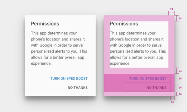
They guidelines specify the type of content and actions that should be included within a dialog box. The type of detail that this extends to is fascinating and interesting, as it’s a design element often overlooked. It goes to show that in order to create a powerful style guide and a powerful design language, no element is too small or unimportant.
It’s All About Affordance
There is a lot of emphasis on affordance within the documentation. The sole purpose of creating a new and unifying design language is to provide cross browser/device affordance. A quality style guide will accommodate affordance into the design language in order to create a high quality design guide.
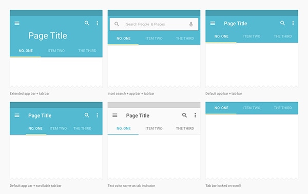
“A tab provides the affordance for displaying an associated grouping of content. A tab label succinctly describes the tab’s associated grouping of content.” – Tabs
The way tabs are described within the material design documentation is brilliant. Material design doesn’t use tabs as a form of navigation, it uses them as an additional way to browse through content. It’s refreshing to see that specific elements, like a tab bar, have limitations. It’s good to know that the designers who crafted material design thought through the functionality of the elements in addition to the style so that it cannot be misused.
If functionality of different elements is clearly defined then the elements will be used only in a certain way. In turn, this helps build affordance. If an element is reused in various ways it will confuse the user; that’s unclear and unfair to the user.
“Tabs make it easy to explore and switch between different views or functional aspects of an app, or to browse categorized data sets.” – Tabs
Create Your Own Elements
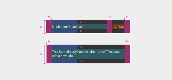
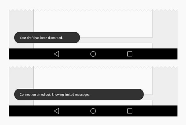
“Snackbars provide lightweight feedback about an operation in a small popup at the base of the screen on mobile and at the lower left on desktop. They are above all over elements on screen, including the floating action button.” – Snackbars and Toasts
“Toasts are similar to snackbars but do not contain actions and cannot be swiped off screen.” – Snackbars and Toasts
The material design document has an interesting section for components called “Snackbars and Toasts.” It’s a design term you don’t hear everyday; snackbars and toasts are a design element we already know. If you read the quotes above and take a look at the image below you’ll realize that the concept of snackbars and toasts is a simple pop up notification.
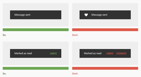
But the lesson here is grander. Material design divided up the various pop up types. The design language needed it and so it was done. Snackbars and toasts are similar to dialogs but different; therefore, they are separate. Material design simply divided them up because it needs them to preform various functions. It’s okay to create new elements. And just like with every other component of material design, snackbars and toasts too have specific guidelines — use cases, measurements and colors.
Often, we forget that these elements can’t be used in various or new ways. It’s interesting to see how something simple like defining two different functions for pop ups can go a long way. Let’s not forget to innovate design by including elements that may be deemed out of style or elements which you wish exited but don’t. It’s great to innovate on the little stuff as they make a great difference within the design down the road.
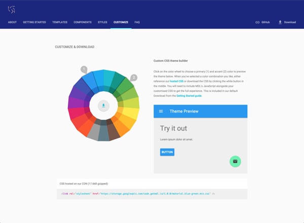
Material Design Lite – A Giant Library of Web Components
Google Developer team recently released a library of components in their Material Design style called Material Design Lite, or MDL for short. It’s a library filled with numerous design components like buttons, forms, and everything else your heart could desire really. They are considering this library to be framework-agnostic in order to make it extremely flexible for people to use. Additionally, one of its key benefits is the fact that it is developed in ‘vanilla CSS, HTML, and JS. So far so good.
“Material Design Lite lets you add a Material Design look and feel to your websites. It doesn’t rely on any JavaScript frameworks and aims to optimize for cross-device use, gracefully degrade in older browsers, and offer an experience that is immediately accessible.”
You can download the Material Design Lite library, on their website. You can also peruse their Github repo.
Simple tech behind the scenes
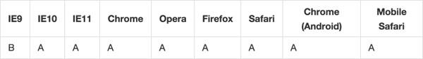
A key component to this library is the fact that it’s easy to install. That’s a brilliant step one because it would not make for a great free resource if it was difficult to use from the get go. However, the whole library is based on simple markup, hence they describe it as vanilla. The simple structure of the library makes it compatible with many browsers – another plus. It supports modern browsers like Chrome, Firefox, and even Microsoft Edge. The library does promise smooth degradation to the more challenging browsers, like IE9.
A big principle in making this library was its flexibility and accessibility across devices and browsers; it’s impressive that they have achieved it. We all know this is important but we can’t always afford the time to make our designs this flexible ourselves; once again, it’s a huge plus for the library.
Take a look a code snippet for the round flowing buttons. The markup for the library is easy to follow in terms of syntax as well.
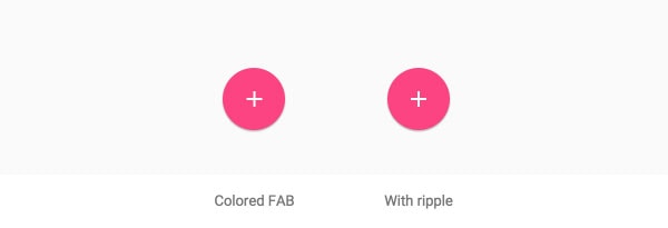
<!-- Colored FAB button -->
<button class="mdl-button mdl-js-button mdl-button--fab mdl-button--colored">
  <i class="material-icons">add</i>
</button>
<!-- Colored FAB button with ripple -->
<button class="mdl-button mdl-js-button mdl-button--fab mdl-js-ripple-effect mdl-button--colored">
  <i class="material-icons">add</i>
</button>
They use great APIs to make the code aspect of the library great, like Polymer for the various paper components and BEM for Sass. If that’s not good enough for you, the CSS can be used by referencing their CDN or imported through npm as well. You know, in case you wanted choices.
A bold idea
I think it’s an interesting idea to share such a library with the world. The previously released Material Design documentation was geared towards explaining the philosophy of their overall user experience and how it relates to user interfaces. It was a document based on how Google goes about creating their own apps. We share our work with each other all the time, we have plenty of UI kits and code snippets being used throughout our work. That’s nothing new. MDL is geared towards sharing its design and letting everyone else take a stab at it; what makes it interesting is the fact that Google is a big company whose aesthetic is very unique.
I’m also having a hard time seeing a company like Apple, which too is known for its aesthetics, opening up its style for everyone to use. That’s why I think it’s a bold move for Google to freely open up the use of their style actually and I’m curious how it will go about over time.
Easy to utilize
All in all, the setup steps are neatly laid out to be easy to follow. The library itself is actually pretty well displayed on their website as there is a lot you can do without even downloading it. On their site, there is a section dedicated just to components where you can browse through all the various elements and interact with them yourself. You can even open them in CodePen to edit it quickly and play around with it.
Google really thought this library though; that’s clear. They provided a whole section designated to color customization so you can check out to see how their colors play out with each other.
There is even a whole section designated towards the Material Design style that feeds off their Material Design documentation in order to help you understand the design principles governing their visual style. It goes over basic design elements like typography and iconography. You can download zipped file assets too. As I said, the Google Development team give this a lot of thought and it shows.
In order to help us see the potential of MDL, there is a templates section to help spark our creativity. These templates are free for use and are also customizable. They vary from portfolio websites to stand-alone articles. There are only a few of them but who needs an infinite list, anyways? I think the template page was a great idea in helping people conceptualize the ability of the MDL’s capabilities – another smart move.
And now the bad
With everything flattering I’ve already said about the library, I have concerns. As a designer, I don’t want my website to look like a Google app. This to me is concerning. It’s really awesome of them to make this public and free for use but the last thing we need is another set of websites that look the same. It’s unoriginal. It’s not good for design.
Joshua Johnson did a take on this point of view for Smashing Magazine not too long ago either. In an article titled Beyond The Boring: The Hunt For The Web’s Lost Soul, he too points out that too many websites look alike. The lack of originality in terms of style and especially layout is jarring. Joshual Johnson was inspired by Noah Stokes who feels the same way; he’s resentful of the fact that most current designs rely on clear boxes and grids making for uninteresting designs.
As a designer, I consider myself creative. Now, some design elements will always be reused, like left-hand side logos and top navigations. I was much more impressed with Material Design documentation because it provided explanations on why they designed the way they designed. Insight into their philosophy, so that I could learn from it, was not only more useful to me but more empowering. Frankly, I can’t find a single good use for this library as it looks exactly like Google; the library doesn’t provide much creative freedom.
Conclusion
Google Development team has built an incredible library filled with, what seems like, endless design elements. The library is well thought out and extensive. It’s also built with simple ‘vanilla’ markup in mind making it a very flexible framework for the browsers. Unfortunately, I’m not sure it’s the best resource for designers.
Conclusion
Google, being the awesome giant that they are, announced they are going to implement Material Design in various platforms. When you think about it, they own so many technologies that it only makes sense for them to provide a unified interaction experience. What do you think of Material Design? Do you think it’s a good move on their part to try to unify and improve the experiences people have while using Google products?