The Power of Microcopy in Web Design
“Copy” has turned into a buzzword. Have you noticed it? People are putting more and more importance onto the words you use on your website. They are trying to put value in copy and it’s a wonderful idea! Words are a prominent way of communicating online. And it’s the small things that matter, especially when it comes to user experience.
Words help enhance an experience at both functional and delightful levels. Words set the tone, voice and brand personality. Words should always be considered as part of a design, not just where they are placed and how are they displayed but also what they actually say.
But, what is microcopy? It’s small bursts of copy which helps you along. Microcopy includes things such as error messages when you incorrectly fill out a credit card form, or the copy on the form’s submit button. It’s the page title, the copy by the terms and conditions agreement checkbox, sign up instructions, form labels, loading screen message, placeholder text, or disclaimers that your email won’t be shared. Microcopy is all over your website.
Microcopy Improves Users’ Lives
Let’s take credit card errors, as a starting example. If you get an error which says “invalid input” versus “your credit card number is too long,” which one is more helpful? The former doesn’t help you figure out what’s wrong if it doesn’t specify which input was incorrect, it simply states there is a problem and does little to help you fix it. The latter specifically tells you what the issue is so you can address it. The latter is also a better usability and user experience practice as the former can leaves users confused.
You Are Being Vague
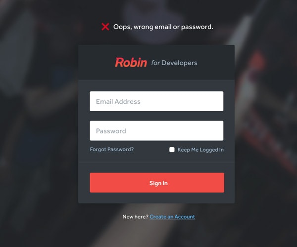
I perused Dribbble and found a few shots that help illustrate bad and good examples of microcopy. The shot below tells you when you incorrectly log in that either your email or your password is incorrect. Which one was it? It’s easy for an application to determine if an email is on file for a user, if it isn’t then it must be the email as it’s not recognized; if it is on file yet you can’t log in, it must be the password. It’s not that hard to tell, so tell it like it is.
With Postcards Email Builder you can create and edit email templates online without any coding skills! Includes more than 100 components to help you create custom emails templates faster than ever before.
Free Email BuilderFree Email TemplatesYou Are Not Helping At All
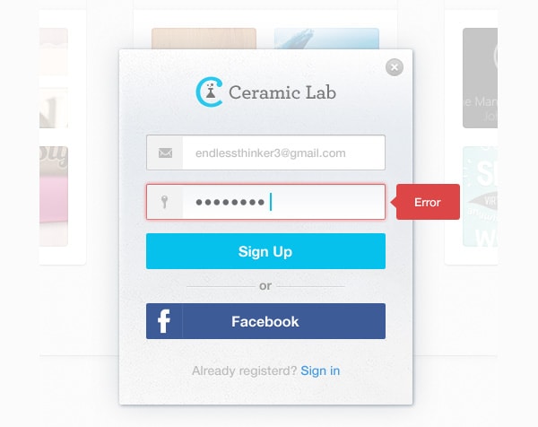
With the following shot, the error specifically identifies the password as the problem but mind you this is a sign up form, not sign in. Therefore, it’s not an easy assumption that the password is incorrect. If you are having people create a password and it’s not up to your standard, tell them what they are missing. Is it too short, should it contain a number?
Be Specific To Be Functional
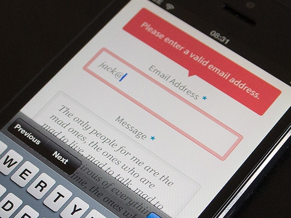
Here we have an error that tells it like it is. The entered email is not a valid one, therefore you should look into making sure the email syntax is correct. Does it have an @ symbol and a period? Straightforward instructions, or guidelines, make all the difference. There is no guessing game for the user who receives this error, and more importantly, there is no confusion or frustration.
Delightful Microcopy
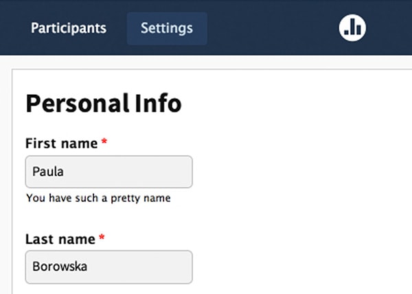
The three examples above contain functional microcopy where text simply helps the experience be easy or usable. There is another level of copy and that’s to delight. A good example of this is a form that flatters you by saying you have a pretty name. It’s unexpected, and often unnecessary, but delightful. The below screenshot is taken from an account form at Poll Everywhere.
What’s The Fuss About?
When you think about it, none of the examples are a big deal; they are simple and obvious. Yet, how many websites delight you with bits of humor, flattery or just plain politeness? Not that many, actually. Otherwise, websites like MailChimp or Woofoo wouldn’t be talked about like they are gods for having cheeky copy. Now, when you really think about it, most copy on the internet is impersonal. Some of it is clever and useful – sure – but how much of it is actually funny or enjoyable? I’ll repeat myself, not that much.
Actually, let’s take a step backward. How many websites have informative copy? There are way too many instances where copy is vague, where you don’t know what simple words like “skip” or “ok” really mean. When things are unclear, it’s a failure of the design. Just because it is not visual or aesthetic doesn’t mean it’s not a design failure.
With Pulsetic you’ll be instantly notified the moment your website, API, or server becomes unavailable. Monitor uptime from multiple global locations and respond to incidents before your users are affected.
Create beautiful status pages in minutes to keep customers informed during outages and build trust with transparent communication.
Start Monitoring for FreeHow Do You Create Good Microcopy?
When it comes to creating effective microcopy you need to realize two things. First, the content needs to be informative, as you’ve seen with the error messages. The copy can’t be delightful if it’s not functional. Then you can add delight, which will depend on the tone of the message. By adding a bit of humor to your copy, politeness or whatever your brand’s personality is, you can achieve delight.
Learn By Example
Let’s skip over all the talking, as I can talk all day. Instead, let’s see some examples:
Virb
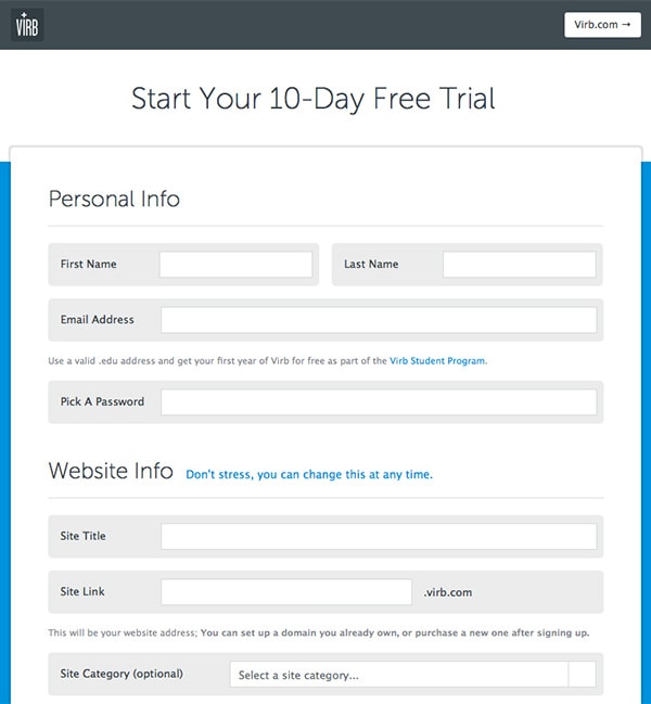
The sign up page has a very lovely line on it. Can you spot it? “Don’t stress, you can change this at any time.” It’s lovely because it reassures users that what they choose as a their domain is not set in stone. Additionally, the language is casual, which makes it seem like it was written by a friend rather than a corporation.
Campaign Monitor
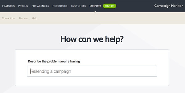
The support page is something else as well. Instead saying: “Describe the problem you are having,” I wish it said “Describe the problem you are having to me.” I can see why it doesn’t but look how much more personable it would be. What’s more, they provide an example in the place holder. Brilliant!
Github
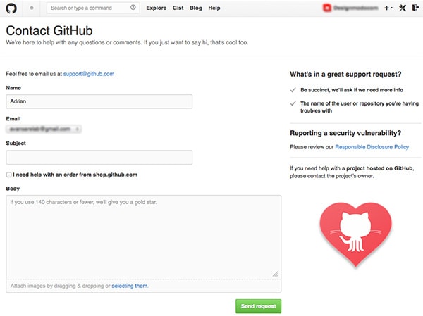
Oh Github, you are full of personality. On the contact page, there are a bunch of little things that are funny, cute and amazing. How many instances of great microcopy can you find? For starters: “If you just want to say hi, that’s cool too.” Sounds like a real person wrote that, better yet, said that! In the message placeholder is microcopy gold: “If you use 140 characters or fewer, we’ll give you a gold star.” Why? Because not only are they trying to get you to keep the message short, they do it in a charismatic way. It makes you smile and it makes for a good experience. Chances are you are more likely to oblige to their request because of this.
So about this power…
I hope that you realize how powerful microcopy can be. The biggest argument I can make for it is this: At the end of the day you are trying to get conversions, right? Functional microcopy is the first step because it will make you stand out, something not enough websites take advantage of. If your site is memorable, you win. (Because people will come back, they will like you and tell their friends. Come on, did I really have to spell it out for you?!)