How to Migrate from Bootstrap Version 3 to 4
So what do you need to know before migrating from Bootstrap 3 to Bootstrap 4?
Read how to migrate from Bootstrap Version 4 to 5.
You’re in luck; today we’ll walk through the changes and new features between versions. The changes you need to make are generally just class renames and some set-up.
Looking for a Bootstrap online builder?
- 👉 Try our Bootstrap Builder and create unlimited projects for unlimited clients.
- 👉 Start to build a website using our Bootstrap Templates.
To save you a lot of time scouring the changelog, I have compiled a list of the things you need to know when migrating from Bootstrap 3 to Bootstrap 4.

We will start by discussing the changes made in Bootstrap 4 framework and how it will affect your website performance. Then we will examine the new way of installing bootstrap and how the grid measurement unit has change and how flexbox can help on responsive designs. We will also discuss changes to some of the components and take a look what happens to JavaScript on the new version.
With Postcards Email Builder you can create and edit email templates online without any coding skills! Includes more than 100 components to help you create custom emails templates faster than ever before.
Free Email BuilderFree Email TemplatesFinally, we’ll take a look at some of the new components including cards, tooltips and flexbox. If you are getting ready to migrate a site from the old Bootstrap version to Bootstrap 4, this article is for you.
Let’s get started.
Video Tutorial
Global Changes
These are the global changes in Bootstrap 4:
- Switch from Less to Sass for the source CSS files.
- Switched from px to rem as the primary CSS unit.
- Media queries are now in ems instead of pxs.
- Global font-size increased from 14px to 16px.
Bootstrap Source Code
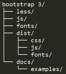
Bootstrap 3 source code includes the precompiled CSS, JavaScript, and font assets, along with source Less, JavaScript, and documentation. It has the following file hierarchy.
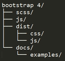
In Bootstrap v4.0.0-alpha the source Less was replaced with Sass files due to its migration from Less to Sass via libSass. Since Bootstrap 4 doesn’t support glyphicons anymore, the fonts folder also was omitted. Bootstrap 4 has the following file hierarchy.
With Pulsetic you’ll be instantly notified the moment your website, API, or server becomes unavailable. Monitor uptime from multiple global locations and respond to incidents before your users are affected.
Create beautiful status pages in minutes to keep customers informed during outages and build trust with transparent communication.
Start Monitoring for FreeAt the time of this writing, Bootstrap 4 compiled version is not yet available.
Installing Bootstrap 4
Bootstrap 4 offers a variety of options to install. Bootstrap 4 Alpha just came out so not all package managers have the version 4 alpha published yet, but it will come out very soon.
You can choose the options you want according to what you need.
- Source Files: Use Bootstrap by downloading the complete package source which includes Sass, JavaScript, and documentation files. This requires a Sass compiler, Autoprefixer, and some setup. If you wish to just use the bootstrap files you can just copy the location of the CSS and JavaScript inside the <link> tag into your <head> section before all other stylesheets to load the CSS.
- Bootstrap CDN: Use the Bootstrap CDN, provided for free by the folks at MaxCDN. Copy the link inside the <link> tag into your <head> section before all other stylesheets to load the CSS.
- Package Managers: Use a package manager such as Bower, npm, meteor and composer to install Bootstrap. This will require a Sass compiler and Autoprefixer for a setup that matches the official compiled versions.
- Custom build: If you only need only a part of Bootstrap’s CSS or JS you can use one of the custom builds available:
- Reboot includes variables/mixins, Normalize, and Reboot. No JavaScript.
- Grid only includes variables/mixins and our grid system. No JavaScript.
- Flexbox includes all of Bootstrap with flexbox enabled and lower browser support.
Grid System Updates
The Bootstrap 4 grid system still follows the same HTML syntax, but the measurement unit change.
For example, you can still use the same 12-column grid markup and nest grids.
&amp;lt;div class=&amp;quot;container-fluid&amp;quot;&amp;gt; &amp;lt;div class=&amp;quot;row&amp;quot;&amp;gt; &amp;lt;div class=&amp;quot;col-lg-7 sm-6&amp;quot;&amp;gt; &amp;lt;div class=&amp;quot;row&amp;quot;&amp;gt; &amp;lt;div class=&amp;quot;col-lg-7 sm-4&amp;quot;&amp;gt; &amp;lt;p&amp;gt;Lorem ipsum dolor sit amet, consectetur adipiscing elit, sed do eiusmod tempor incididunt ut labore et dolore magna aliqua.&amp;lt;/p&amp;gt; &amp;lt;/div&amp;gt; &amp;lt;div class=&amp;quot;col-lg-5 sm-8&amp;quot;&amp;gt; &amp;lt;p&amp;gt;Lorem ipsum dolor sit amet, consectetur adipiscing elit, sed do eiusmod tempor incididunt ut labore et dolore magna aliqua.&amp;lt;/p&amp;gt; &amp;lt;/div&amp;gt; &amp;lt;/div&amp;gt; &amp;lt;/div&amp;gt; &amp;lt;div class=&amp;quot;col-lg-5 sm-6&amp;quot;&amp;gt; &amp;lt;p&amp;gt;Lorem ipsum dolor sit amet, consectetur adipiscing elit, sed do eiusmod tempor incididunt ut labore et dolore magna aliqua.&amp;lt;/p&amp;gt; &amp;lt;/div&amp;gt; &amp;lt;/div&amp;gt; &amp;lt;/div&amp;gt;
This is not new; Bootstrap 3 used the same classes. However, Bootstrap 4 classes used ems not pixels and they’ve added one new tier for extra large screens. Check out the classes along with their screen sizes.
- col-xs for extra small display (screen width less than 34em)
- col-sm for smaller display (screen width 34em and up)
- col-md for medium display (screen width 48em and up)
- col-lg for larger display (screen width 62em and up)
- col-xl for extra large display (screen width 75em and up)
Another thing worth noting is the container and row class. The container has max-width set in rems while row has a negative left and right margin of -.9375rem and a left and right padding of 0.9375 rem which were 15px on Bootsrap 3.
While this might be a good thing to support all screen sizes, it may take time for some web designers and developers to get used to it as most of the graphic programs that are being used today like Photoshop used pixel on its design.
If you’re using the Sass CSS source versions of Bootstrap 4, you can control the grid sizes by changing the following variables:
- $grid-columns: number of grids horizontally (12 default)
- $grid-gutter-width: total padding around each grid (30px default)
- $grid-float-breakpoint: minimum size the navbar becomes uncollapsed ($screen-sm-min default)
- $grid-float-breakpoint-max: maximum size where the navbar begins collapsing (the default would be the size of the $grid-float-breakpoint – 1)
Reset Component Updates
Nicolas Gallagher’s normalize.css file was used in Bootstrap 3 for the CSS reset and it was improved in Bootstrap 4.
Using the same file you see in Boostrap 3, they added some Bootstrap reset and base styles that are handy and compressed it into a single file and call it reboot.css. For example, some <table> styles we’re customized for a simpler baseline and later provide .table, .table-bordered, and more.
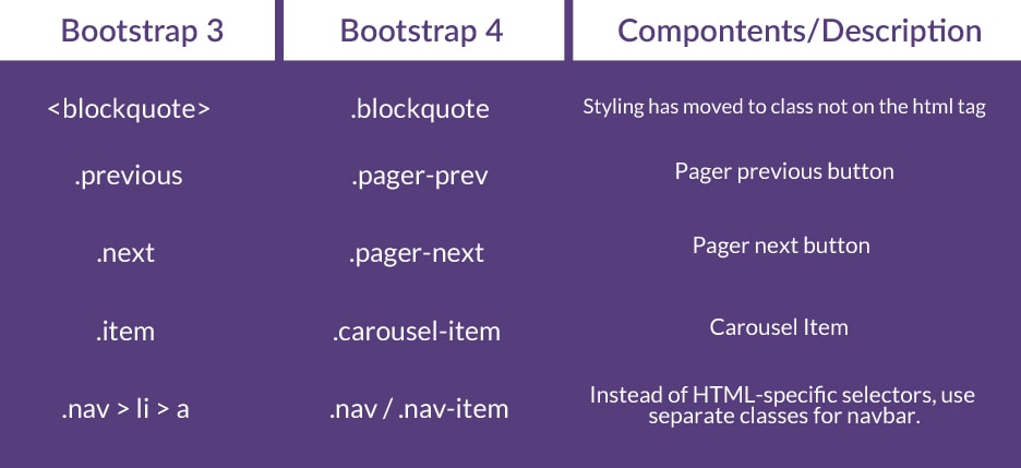
Class Changes and Updates
There have been a quite few class name changes between the two versions, and some classes have been withdrawn.
Typography
Bootstrap typography is using rems. Unlike px and em, it is not a fixed or relative unit that is direct or nearest to its parent measurement. The rem unit is dynamic and relative to the root HTML tag. However, you can still use px, em and pt on Bootstrap projects if you want.
To give you an idea how rems work, you can divide the target to base size of html in pixels.
Let’s say we have the following code.
html{
font-size: 16px;
}
p{
font-size: 1rem; /* 1rem = 16px */
}
h1 {
    font-size: 1.875rem; /* 30px / 16px = 1.875rem */
}
In the example above, we set out paragraph tag into 1 rem which is equivalent to 16px as our html root size. While h1 tag will have 1.875rem if you will divide the target size which is 30px to the html root size of 16px.
Bootstrap 4 pulled rems units into scene to have 100% perfect scaling of the entire application. This makes it easier to scale up or down for devices. It also worth noting that size of the html tag can be customized to your preferred size.
Tables Contextual Classes
Bootstrap 3 used contextual class to put some background color on table rows or individual cells. In Bootstrap 4, they added the .table-* prefix on each contextual classes.
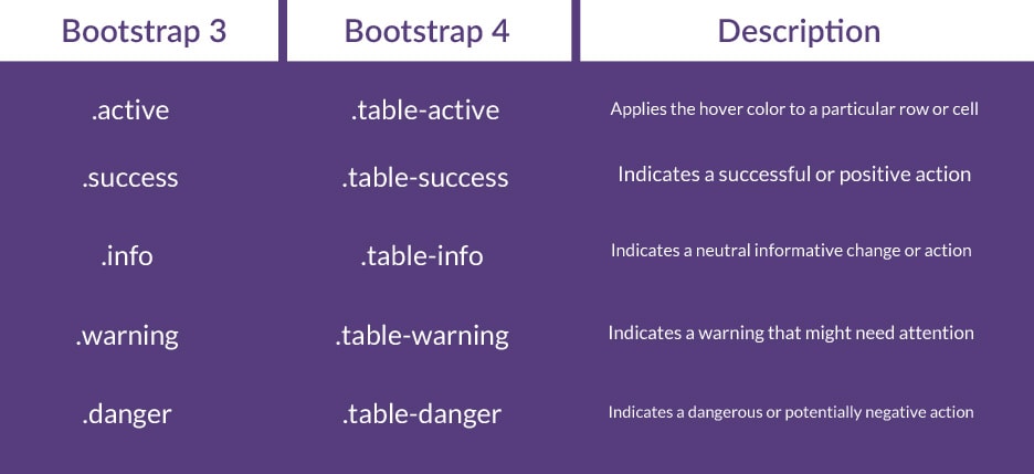
Table Condensed Renamed
Bootstrap 3 used .table-condensed class to make a table more compact by cutting cell padding in half. In Bootstrap 4, it was renamed to .table-sm for consistency.
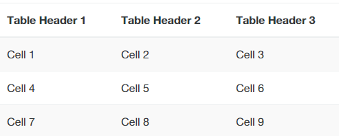
Check out the code example below.
&amp;lt;table class=&amp;quot;table table-striped&amp;quot;&amp;gt; &amp;lt;thead&amp;gt; &amp;lt;tr&amp;gt; &amp;lt;th&amp;gt;Table Header 1&amp;lt;/th&amp;gt; &amp;lt;th&amp;gt;Table Header 2&amp;lt;/th&amp;gt; &amp;lt;th&amp;gt;Table Header 3&amp;lt;/th&amp;gt; &amp;lt;/tr&amp;gt; &amp;lt;/thead&amp;gt; &amp;lt;tbody&amp;gt; &amp;lt;tr&amp;gt; &amp;lt;td&amp;gt;Cell 1&amp;lt;/td&amp;gt; &amp;lt;td&amp;gt;Cell 2&amp;lt;/td&amp;gt; &amp;lt;td&amp;gt;Cell 3&amp;lt;/td&amp;gt; &amp;lt;/tr&amp;gt; &amp;lt;tr&amp;gt; &amp;lt;td&amp;gt;Cell 4&amp;lt;/td&amp;gt; &amp;lt;td&amp;gt;Cell 5&amp;lt;/td&amp;gt; &amp;lt;td&amp;gt;Cell 6&amp;lt;/td&amp;gt; &amp;lt;/tr&amp;gt; &amp;lt;tr&amp;gt; &amp;lt;td&amp;gt;Cell 7&amp;lt;/td&amp;gt; &amp;lt;td&amp;gt;Cell 8&amp;lt;/td&amp;gt; &amp;lt;td&amp;gt;Cell 9&amp;lt;/td&amp;gt; &amp;lt;/tr&amp;gt; &amp;lt;/tbody&amp;gt; &amp;lt;/table&amp;gt;
The code above will like this.
Form Classes
Forms have some changes to classes. The two major changes made are renaming the .input-lg and .input-sm classes to .form-control-lg and .form-control-sm and dropping the .form-group-*.
In Bootstrap 4 adds the new .form-control-label class to vertically center labels with .form-control.
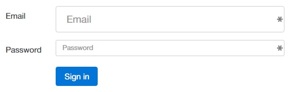
Let’s see the changes in action.
&amp;lt;form&amp;gt; &amp;lt;div class=&amp;quot;form-group row&amp;quot;&amp;gt; &amp;lt;label for=&amp;quot;inputEmail3&amp;quot; class=&amp;quot;col-sm-2 form-control-label&amp;quot;&amp;gt;Email&amp;lt;/label&amp;gt; &amp;lt;div class=&amp;quot;col-sm-10&amp;quot;&amp;gt; &amp;lt;input type=&amp;quot;email&amp;quot; class=&amp;quot;form-control form-control-lg&amp;quot; id=&amp;quot;inputEmail3&amp;quot; placeholder=&amp;quot;Email&amp;quot;&amp;gt; &amp;lt;/div&amp;gt; &amp;lt;/div&amp;gt; &amp;lt;div class=&amp;quot;form-group row&amp;quot;&amp;gt; &amp;lt;label for=&amp;quot;inputPassword3&amp;quot; class=&amp;quot;col-sm-2 form-control-label&amp;quot;&amp;gt;Password&amp;lt;/label&amp;gt; &amp;lt;div class=&amp;quot;col-sm-10&amp;quot;&amp;gt; &amp;lt;input type=&amp;quot;password&amp;quot; class=&amp;quot;form-control form-control-sm&amp;quot; id=&amp;quot;inputPassword3&amp;quot; placeholder=&amp;quot;Password&amp;quot;&amp;gt; &amp;lt;/div&amp;gt; &amp;lt;/div&amp;gt; &amp;lt;div class=&amp;quot;form-group row&amp;quot;&amp;gt; &amp;lt;div class=&amp;quot;col-sm-offset-2 col-sm-10&amp;quot;&amp;gt; &amp;lt;button type=&amp;quot;submit&amp;quot; class=&amp;quot;btn btn-primary&amp;quot;&amp;gt;Sign in&amp;lt;/button&amp;gt; &amp;lt;/div&amp;gt; &amp;lt;/div&amp;gt; &amp;lt;/form&amp;gt;
The code above will look like this.
Other Migrations
In addition to the classes change and updates above, the following class names also need to be changed if you’re migrating from Bootstrap 3 to Bootstrap 4.
JavaScript Changes
Bootstrap uses a lot of JavaScript’s dependent components and just like in the regular components there’s not really a lot of changes especially on the JavaScript part.
On occasion we will see some few adjustments but overall the coding state is pretty similar. Here are some of the adjustments:
- Drop Support for IE8: Now that Internet Explorer 8 support is dropped, it’s safe to use jQuery 2.0 which is a faster version of jQuery.
- ES6 Support: All plugins were written in ES6 and compiled with Babel, a JavaScript compiler. The good thing about this is that it can be compiled and maintain easier and faster.
- AMD and UMD issues are resolved
New Features
Most of the changes have been made to bring conformity to the naming scheme used by various classes but on this part, let’s go over some of the main new features.
Cards
In Bootstrap 4, panels, thumbnails and wells were removed and replaced with cards. This component can be used to display information as a page or a container which supports different kinds of content such as links, text, images, headers, footers and many more with a variety of background colors.
To enable cards, add the .card and .card-block classes to an element. There are also some more classes that you can use inside the .card class.
- .card-title for heading title
- .card-text for the text element
- .card-header for the header
- .card-footer for the footer
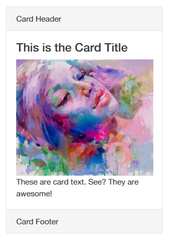
Check out the code below to see it in action.
&amp;lt;div class=&amp;quot;card&amp;quot;&amp;gt; &amp;lt;!-- Card Header --&amp;gt; &amp;lt;div class=&amp;quot;card-header&amp;quot;&amp;gt; Card Header &amp;lt;/div&amp;gt; &amp;lt;div class=&amp;quot;card-block&amp;quot;&amp;gt; &amp;lt;!-- Card Title --&amp;gt; &amp;lt;h4 class=&amp;quot;card-title&amp;quot;&amp;gt;This is the Card Title&amp;lt;/h4&amp;gt; &amp;lt;!-- Image --&amp;gt; &amp;lt;img alt=&amp;quot;&amp;quot; src=&amp;quot;https://goo.gl/oxHSMr&amp;quot; width=&amp;quot;280&amp;quot;&amp;gt; &amp;lt;!-- Card Text --&amp;gt; &amp;lt;p class=&amp;quot;card-text&amp;quot;&amp;gt;These are card text. See? They are awesome!&amp;lt;/p&amp;gt; &amp;lt;/div&amp;gt; &amp;lt;!-- Card Footer --&amp;gt; &amp;lt;div class=&amp;quot;card-footer&amp;quot;&amp;gt; Card Footer &amp;lt;/div&amp;gt; &amp;lt;/div&amp;gt;
The code above will have this result.
Flexbox
Another optional feature added in Bootstrap 4 is flexbox. Flexible box layout or flexbox is a new box model optimized for UI layout that works with CSS3. It allows arrangement of elements on a page so that the elements “anticipate” when the page layout is resized.
To enable it in your Bootstrap 4 project, set the Boolean variable $enable-flex to true in the _variables.scss file and after recompiling expect that all grid layout immediately switch to using flexbox adjusting your HTML syntax.
Note: Flexbox doesn’t support Internet Explorer 9
Tooltips
The Bootstrap tooltip plugin was originally based on the jQuery.tipsy plugin written by Jason Frame. However, in Bootstrap 4, it move to Tether, a third party plugin. If you want to use this new feature include tether.js just before the bootstrap.js.
Final Words
In this article, you’ve learned about the things you need to know when migrating from Bootstrap 3 to Bootstrap 4. It is advised to always check the official documentation and for the future updates.
You might want to consider using a package manager in working through your migration. Something like a Grunt.js task along with node.js, so that when you run your build system, these changes are performed in real time. However, at it is worth noting that not all package managers have the Bootsrap 4 alpha published yet.
In the next tutorial, I’ll go into more detailed instructions as use Sass and grunt.js to speed up the Boostrap development process.