The What, Why, and How of Mockups
Before we get into how to make the most of your mockups, it helps to know what exactly they are — and what they’re not.
As discussed in The Guide to Wireframing, mockups, wireframes, and prototypes can be confused with each other, making it difficult to find accurate information on each. However, all are integral parts of the UX design process, and so each should be given due attention.
Source: UX Booth
We’ll start our exploration of mockups by giving a broad overview, discussing the terminology, and showing how they fit into the design process as a whole.
A Word about Wording
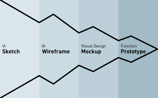
Getting back to basics, before a website or app is released, most of them go through three preliminary stages. These stages allow the team, and sometimes a few select users, to test its appearance, structure, and functionality before its release. Ideally, these preliminary stages allow you to fix any problems while they’re still small, and fine-tune your design to communicate your message most clearly.
With Postcards Email Builder you can create and edit email templates online without any coding skills! Includes more than 100 components to help you create custom emails templates faster than ever before.
Free Email BuilderFree Email TemplatesBut because these phases are similar, they’re often confused with each other. That’s why we’ll take a moment here to clarify the proper terminology for each. Marcin Treder lists the three formative stages of the UX design process as wireframes, mockups, and prototypes. Let’s take a deeper look at each stage.
1. Wireframes
Wireframes are typically a low-fidelity, bare-bones blueprint, usually represented with gray boxes and placeholders for detailed content. Their goal is to help establish what goes where, without consuming too much time on aesthetics just yet. A good wireframe should explain:
- how the content is grouped
- how the information is structured
- the most basic visuals involved in the UI interaction
Source: User Testing & Design
The purpose of a wireframe is to map out concretely for the entire team how the website should be designed. As described in the free Guide to Wireframing, the main goals of wireframing are documentation and design structure, but can also be shown to clients and stakeholders to get feedback while changes aren’t painstakingly difficult.
To see how high-fidelity designs can start as wireframes, check out UXPorn and hover over each design to see the transformations.
2. Mockups
The main character of our Guide to Mockups, the mockup is typically a mid- to high-fidelity representation of the product’s appearance, and shows the basics of its functionality. Mockups fill in the visual details (such as colors, typography, etc.) and are usually static. By looking at a mockup, you should get a good idea of how the final product will look and a rough idea of how it might function (even if the functions aren’t yet working). A mockup can be considered a high-profile visual design draft.
With Pulsetic you’ll be instantly notified the moment your website, API, or server becomes unavailable. Monitor uptime from multiple global locations and respond to incidents before your users are affected.
Create beautiful status pages in minutes to keep customers informed during outages and build trust with transparent communication.
Start Monitoring for FreeSource: Mockup via UXPin
The wireframe lays the foundation and the mockup adds visual richness. While the mockup furthers the wireframe’s purpose of documentation and organizing the team’s vision, it does have an extra advantage the wireframe does not: with its superior visuals, the mockup is more impressive to stakeholders and investors, and so better at generating interest.
While the wireframe is visually stunted, the mockup is close to the final version in appearance, though it lacks the functionality of a prototype. In this way the mockup acts as the bridge between the wireframe and the prototype.
3. Prototypes
The end of the beginning stages, the prototype can be a low- or high-fidelity representation of the product that includes functionality and the finer point of the UI design. In addition to the information structure and visualizations of the previous two phases, the prototype introduces more depth to the early UI, allowing users to:
- experience actual content
- interact with the UI in a way similar to the final product
- predict and solve usability problems before further development
When it comes to finding the right fidelity for prototypes, remember that going low-fi will let you test and tweak faster, while going hi-fi will get you as close to the final product as possible without sinking resources into development.
A common design process is starting with a low-fi prototype (similar to what Apple does by creating hundreds of early prototypes), and then iterating into high-fidelity prototypes. That way, you reap the benefits of customer-driven design due to early testing (as advised by notable entrepreneur Andrew Chen) as well as the clear specifications demonstrated by high fidelity (as explained by SVPG Partner Marty Cagan).
Source: UXPin
A high-fidelity prototype should be one step below the final product; it should look and function as closely to the final version as possible.
The Differences Between Wireframes and Mockups
While the distinctions of each phase are clearly defined, the truth is that even seasoned designers sometimes confuse the names of the different phases. Like we discuss in The Guide to Mockups, perhaps the most common mix-up happens with wireframes and mockups.
There’s no doubt that wireframes and mockups are similar: they both are static phases of UI design, they both deal primarily with how the site looks, and they both don’t require functionality. The main difference is in their quality. Libby Fisher, freelance web developer and design blogger, describes the mockup as the “decorated” version of a wireframe.
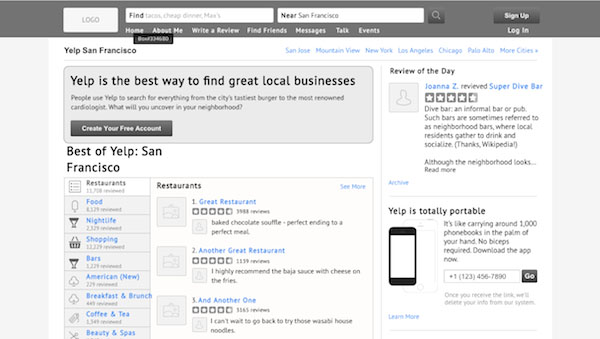
While wireframes are merely shapes and placeholders, mockups are designed to give the viewer an accurate impression of what the final product will look like. To help illustrate the differences, we’ll examine a sample of each, taken from our User Testing & Design e-book, which chronicles our exercise of improving Yelp based on usability testing.
Source: UXPin Low-Fidelity Yelp Design
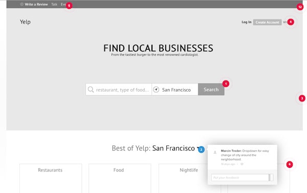
We created the above wireframe as a roadmap for the improvements we wanted to make on Yelp’s website. Compared with the current Yelp site, you can see how the wireframe is the skeleton of the new site with a larger Search bar and simplified categories.
Notice the low fidelity and lack of detail — flourishes aren’t necessary at this stage. Think of wireframing as doing the heavy lifting, and save the finesse for mockups. Our goal was to first revise the structure of the site indicated by the qualitative insights and quantitative insights of the usability testing. The numbered red dots are our comments, explaining the changes so everyone is on the same page. This wireframe was later turned into a lo-fi prototype by adding interactions from our animations libraries.

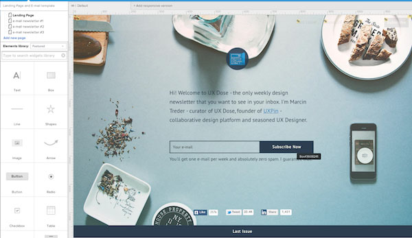
Source: UXPin
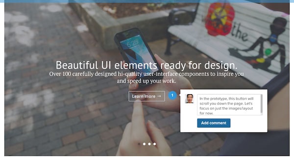
Here is our mockup. The key difference, obviously, is the graphic detail — colors, icons, photos, etc. These visuals aren’t just cosmetic, they also give an idea of how the functionality works. For example, even though it’s not a prototype, you can alter a few elements to give stakeholders a taste of the interactive states (look at what we did to the “food” category to show what it looks like when clicked). Compare this mockup to the wireframe: the pieces are all the same and all in the same places, but the look and feel of the mockup is a lot more like the final product — and that is the fundamental difference between wireframes and mockups.
Don’t Mock Mockups
While some designers hold the opinion that mockups aren’t necessary (especially for the rapid prototyping of Lean UX), mockups are extremely helpful for exploring visual design decisions before you need to live with the consequences of code. Because mockups are a transitional phase between wireframes and prototypes, they are a sandbox for visual experimentation. There’s a lot of details to keep track of in the UX design and development process, and overlooking the mockup phase can lead to subpar visuals.
Source: UXPorn
Anthony Tseng, editor-in-chief for UX Movement, believes in the power of both mockups and wireframes. In his opinion, design is “the synthesis of form and content.” The wireframe outlines the basic structure of the content, while mockups present a vision of the form. Thus, a skilled designer will spend the appropriate amount of time perfecting both, and that means using wireframes and mockups.
The importance of mockups is worth elaborating upon. Bima Arafah, freelance web designer and design author, explains why mockups are an essential part of the process. According to him, mockups are worthwhile for several reasons:
- Organization of details — Mockups can help reveal any clashing visual elements in a way that mirrors the final design. As discussed in Web UI Best Design Practices, fine details such as color, contrast, and visual hierarchies should be determined in the mockup stage (where they can be easily changed) and solidified in the development stage.
- Design implementation — How does your initial design perform? From a usability perspective, a mockup lets you test the visual details and change them before it’s committed to code.
- Immersion in the user’s perspective — As you add detail to the wireframe (or maybe you jump right into a mockup), you are constantly looking at and altering a design that is closer to the final state. It’s a subtle difference, but an important one, since a high-fidelity mindset helps you make design decisions from the user’s point of view.
- Flexibility — Revisions that carry over from wireframing can stack up pretty quickly, but making them in a mockup is (comparatively) easy compared to CSS or HTML.
A lot of the criticism against mockups comes from the time and energy it takes to create something that eventually needs to be rebuilt in HTML or CSS. But with the availability of mockup tools, like Moqups for lower fidelity or UXPin for all types of fidelity, designers can create mockups faster with premade element libraries.
Context for Mockups
With this discussion of the benefits of mockups, it’s necessary to mention that there are some pitfalls to watch out for, namely in how it opens the product up to unjust criticism.
Luke Wroblewski, product designer for Google, explains how the presentation of a mockup will affect the feedback it receives. A mockup is static, but final products are rich and interactive. When showing a mockup to stakeholders, you’re inherently at a disadvantage since the mockup currently exists in a vacuum. That’s why you should frame the presentation in the context of what problem the product design is solving — otherwise stakeholders may request features simply because they’re focusing on a tree and can’t see the forest yet.
Source: Collaboration via UXPin
Remember that mockups are still a design deliverable and just a means to the final design. This will guide the feedback more towards how it accomplishes its goal, and less towards criticism on the mockup itself.
You also don’t want to let stakeholders have the final say in the mockup decisions, as this can lead to a dreaded design by committee, or at least diminishes the value of the designer in the eyes of the stakeholders. Find the right mockup tool for the right fidelity (mid or high), conduct usability testing to back up your decisions, and always provide context when presenting the mockup.
Takeaway
As the middle phase between the wireframe and the prototype, the mockup is a key component not just for the design team, but also for the stakeholders. It helps find and fix visual inconsistencies earlier in the process before they become too costly.
By now you understand what a mockup is (and is not), how it fits in to the development process, and why you shouldn’t ignore it. Equally important, you also want to create context when presenting mockups since the design isn’t final and the functionality can’t be experienced.
For more practical advice on different types of mockups, download the free The Guide to Mockups. Tips are included from UI experts along with best practices for Photoshop & Sketch.