Beware of Orange: Active and Controversial
We all dream in color. Every design concept and sketch comes with some sort of color association. But what do those colors mean? What associations are we making just with that choice alone?
Orange could be called the most controversial color. People either love it or hate it.
Here we take a look at orange – meanings, color pairings and sites that are doing it well. Orange can have either positive or negative associations. The hue, whether it is saturated more with red or yellow, can feel earthly or aggressive or more happy and warm. Commonly, orange is linked to heat and energy because it is the color of fire and a citrus fruit.
Shades of Orange
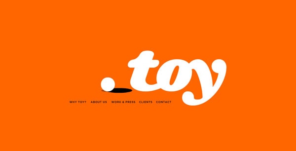
T O Y
Webdesign Karlsruhe Blog
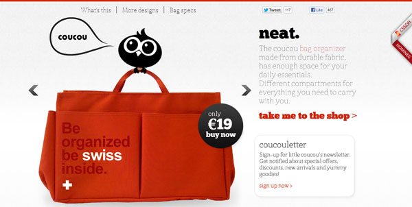
coucou
With Postcards Email Builder you can create and edit email templates online without any coding skills! Includes more than 100 components to help you create custom emails templates faster than ever before.
Free Email BuilderFree Email TemplatesGo Live!

In the most pure forms, orange stirs up a bit of color controversy. The color associations people have with orange are usually quite strong, in part because of the nature of the color. Orange is a high-visibility color and is often used to catch people’s attention in print and web publication; therefore it can make a great accent color.
Orange represents fire and the sun and is thought to help stimulate the brain and appetite. The color is also representative of nature and the autumn, because it is part of the range of colors on display when trees begin to lose their leaves.
On the other hand, paler hues can be calming and have wide-ranging appeal to both men and women. Brighter oranges are more accepted by younger people rather than older generations.
Positive meanings of orange include warmth, energy, youthfulness, health and adventure. The most common negative associations of the color include crassness, rudeness and frivolity.
Dark orange: Darker shades of orange seem to have the most negative associations, such as untrustworthiness and deceitfulness.
Red-orange: This hue is the more aggressive of oranges (because of the extra red) and has some of the same associations as its sister color. Red-orange can be used to highlight desire, passion, dominance, aggression and action.
Peach: Peach tones are the most earthy of the oranges, especially when the colors are toned to resemble shades of beige. Peach tones have broad appeal and are also considered a feminine color.
With Startup App and Slides App you can build unlimited websites using the online website editor which includes ready-made designed and coded elements, templates and themes.
Try Startup App Try Slides AppOther ProductsGold or yellow-orange: The most yellow hues are considered the most prestigious, especially when they result in a golden color. Yellow-oranges are linked to wealth, smarts, quality and illumination.
Cultural Considerations

The most common association to orange in the United States and Canada is to Halloween, a children’s holiday celebrated on the last day of October.
In many Native American cultures, orange is representative of kinship and family.
Orange is the creative center of the body, found in the abdomen, as the orange Chakra in Eastern philosophy.
In both China and Japan, the color represents happiness and love.
Color Wheel and Pairing
Orange is a secondary color on the color wheel, meaning it is made by combining two primary colors. (The other secondary colors are green and purple.) Orange is formed by mixing yellow and red. Even more shades can be created with the additions of white or black.
You can use the color wheel to create color schemes of multiple hues that can create a sense of harmony or chaos. Create a scheme using three side-by-side colors for an analogous scheme – yellow-orange, orange and red-orange. A complementary scheme pairs orange and blue (opposites on the wheel).
Famous Brand Associations
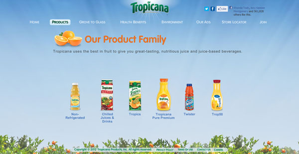
Food companies often use orange to represent their brands, especially those selling items related to the citrus fruit. The color is also a favorite among sports clubs when selecting a color scheme and for brands that want to create a sense of activity.
One of the most common negative “brand” associations with the color comes from the chemical Agent Orange. The herbicide (which was produced in orange containers) was used by the U.S. military in the 1960s and 1970s but was later banned after it was found to linger in the ground and water and cause health problems such as cancer and birth defects.
Despite strong color branding connections to orange, you will see that many of these companies opt to use the shade as an accent or secondary color in their marketing.
Home Depot

Baltimore Orioles
Tropicana
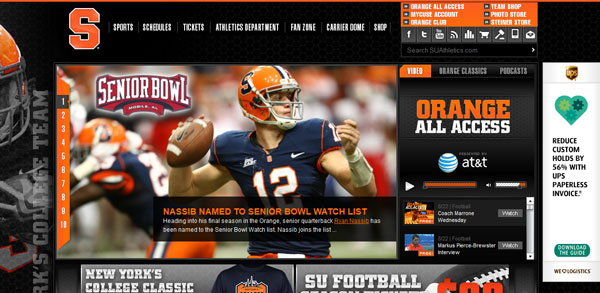
Syracuse Orange
Doing it Well
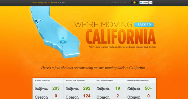
The Hemsley: This site does a great job of using orange to grab your attention. The combination of bright colors is warm, inviting and really encourages you to stop and take a look.
Fox Classics

Fox Classics: Nothing makes a color pop, like pairing it with no color. Orange is impactful and strong in this showcase of black and white with orange tones. It makes you just want to watch as all the text and images scroll through.
The Hickensian
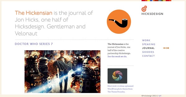
The Hickensian: This online journal site does a great job of combining orange hues to create a mood. The peach-tinted background is soothing and calm. It stands in contrast to the orange pipe logo and dramatic image filled with passionate, red-orange tones.
Letter Learner

Letter Learner: Using orange as a background color is difficult, but the Letter Learner has found a successful way to use the color in a fun way without being overbearing. The color works well (again here with black and white) and provides just the right contrast.


