Responsive vs. Adaptive: 7 Best Mobile Web Design Practices
In 2024, around 98% of users accessed the internet via mobile phones, while 97.8% reported doing so via smartphones. (Source: Statista) How your website displays to mobile users can make or break your brand.
With the number of users who rely on mobile devices, it’s a no-brainer that developers are rushing to find the holy grail of mobile web design solutions.
In this article, we’ll take a look at the 7 best mobile web design practices and how you can implement them into your business.
Responsive vs. Adaptive Web Design
One of the biggest decisions when designing for mobile is whether to opt for a responsive or adaptive design. Let’s look at the key differences between the two.
Responsive Design
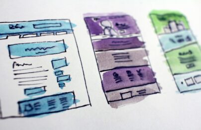
Responsive design dynamically adapts to fit the screen size of any device. The layout uses CSS media queries to resize aspects of a page like its width and height.
Spark Box offers a good example of responsive design:
With Postcards Email Builder you can create and edit email templates online without any coding skills! Includes more than 100 components to help you create custom emails templates faster than ever before.
Free Email BuilderFree Email Templates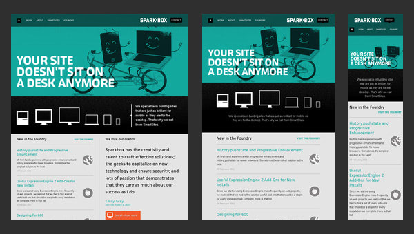
Users can browse a website with responsive design from any device. The difference is the content on a page will dynamically arrange to fit their screen size.
Pros of responsive design
- Seamless browsing experience across all devices
- Easier to implement and more budget-friendly
- Only need to maintain one version of a site
- Google recommends responsive design
Cons of responsive design
- Not compatible with older web browsers
- Advertisements may not properly display
- Slower loading times for mobile devices
- Some elements may be pushed down the page
Adaptive Design
Adaptive design is still mobile-friendly, but it takes a different approach. It displays static layouts for multiple screen sizes.
A designer would need to develop layouts for an adaptive site for six screen widths: 320, 480, 760, 960, 1200, and 1600 pixels.
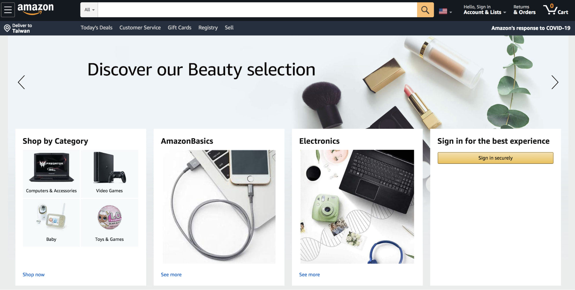
Amazon uses adaptive design. Here’s how the homepage looks on a desktop:
And here’s how the site looks on mobile:
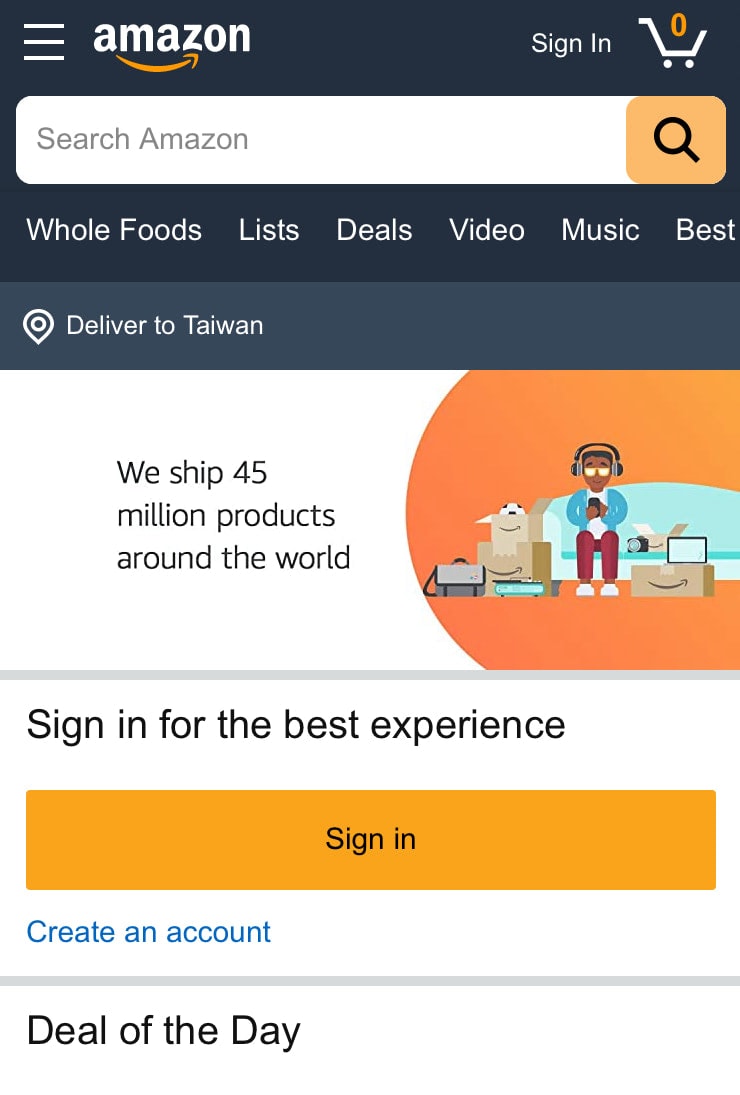
Users can still browse and shop from any device they own. But the elements on the page are displayed differently.
Pros of adaptive design
- Optimized browsing experience for individual devices
- Faster loading times across all devices
- Designers can optimize advertisements
- Can be adapted to existing websites
Cons of adaptive design
- More expensive and labor-intensive to implement
- Requires a team of developers to maintain
- Design changes need to be made to all layouts
- New screen sizes are always coming out
So which design should you choose?
It depends.
With Pulsetic you’ll be instantly notified the moment your website, API, or server becomes unavailable. Monitor uptime from multiple global locations and respond to incidents before your users are affected.
Create beautiful status pages in minutes to keep customers informed during outages and build trust with transparent communication.
Start Monitoring for FreeResponsive design is highly flexible and easier to maintain. Adaptive designs, while harder to build, give you greater control over how users experience your site on different devices.
Which design you choose is ultimately up to you. But it’s important to weigh the pros and cons of each before making a decision.
Importance of Website Usability
Website usability is a measure of how well users can navigate a site. If users can’t easily accomplish what they set out to do, they won’t hesitate to leave.
It goes without saying that usability plays a vital role for mobile users. Follow this three-step process to improve your website usability and discover what you need to focus on:
- Step 1: Evaluate every element on a page and assess whether it fits in the reader’s journey.
- Step 2: Determine if any elements have a secondary role and if they can be hidden under a tab or accordion.
- Step 3: Decide what you want visitors to pay attention to and make that front and center (e.g., a call to action on a landing page).
Now let’s look at best mobile web design best practices.
Best Mobile Web Design Practices
1: Understand the Journey
Mobile devices don’t have the same screen real estate as desktops and tablets. That means you need to prioritize elements you’ll display to mobile users.
Start with mapping a customer journey. Who is your target audience and what are they trying to accomplish? What are their pain points and what is their end goal?
Answering these questions allows you to optimize the mobile experience and deliver content that’s relevant to your audience.
Navigation bars allow users to navigate to the right section on a site. These are typically located at the top or side of a site where users can clearly see them.
One challenge is implementing navigation bars for mobile devices. Smaller screen sizes mean that a full navigation bar would take up too much space.
Consider using a hamburger menu. These open up navigation links when users tap on them and create a much cleaner interface.
Here’s an example of a hamburger menu on the top right corner of our site:

Hamburger menus can be implemented on both responsive and adaptive designs. It’s a good idea to reorganize your menu to include as few links as possible.
Now, what’s important to keep?
3: Limit Options
Our brains can only hold so much information. Too many options can become confusing and make it harder for users to navigate your site.
When designing for mobile users, keep the number of options on a page to a minimum. If your primary goal is to get visitors to start a free trial then make that the primary focus.
Here’s a good example of how Shopify limits options on its homepage:

There’s really only one action for visitors to take here. Think about what your primary goals are and give users just enough options so as not to overwhelm them.
4: Simplify
Don’t make things harder for visitors than they need to be. If something doesn’t serve a purpose or isn’t necessary, then trash it.
This also applies to any forms on your pages. Cut down on your forms and only ask for information that’s absolutely necessary. The example from Shopify only had one form and you can bet that was intentional.
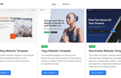
5: Images and Video
Adding images to a page is a great way to grab attention and increase engagement. Images should be relevant to your offer and sized correctly for adaptive designs.
Here’s an example of a context-relevant image on our Postcards page:

Another important consideration is image sizes. Unoptimized images can slow down your site and affect the overall user experience.
Use a photo editing software like Photoshop to compress your images before uploading them to your site. For videos, host them somewhere else if possible and add a link.
6: Placement
People typically navigate mobile sites with their thumbs. That means some areas on a screen are easier to access as shown here:
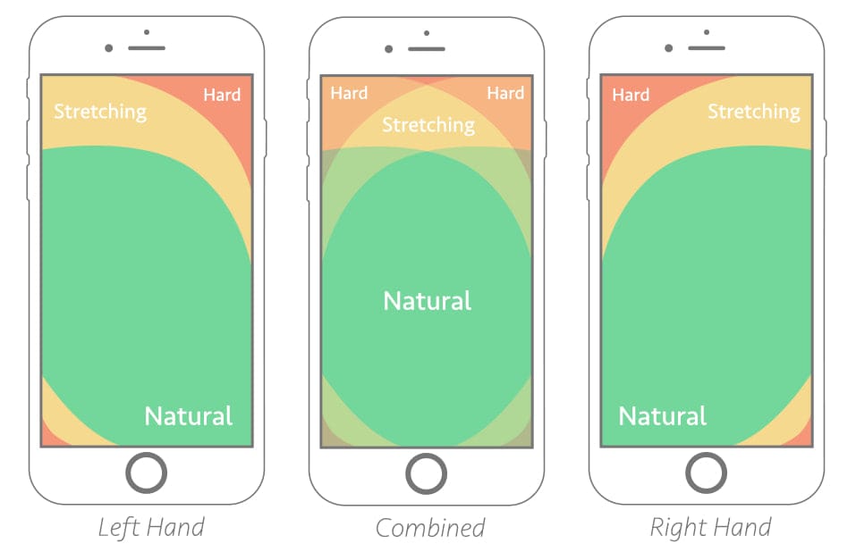
It’s important to ensure navigational and interactive areas are closer to the center. Be sure to test placements whether you opt for responsive or adaptive design.
7: Link Contact Info
Mobile users on the go want to get things done quickly. They don’t have the patience to scroll through pages of content to find what they’re looking for.
Phone numbers should link to call your business immediately. That way they don’t have to switch back and forth from your site to their phone app. Here’s an example from BestBuy:
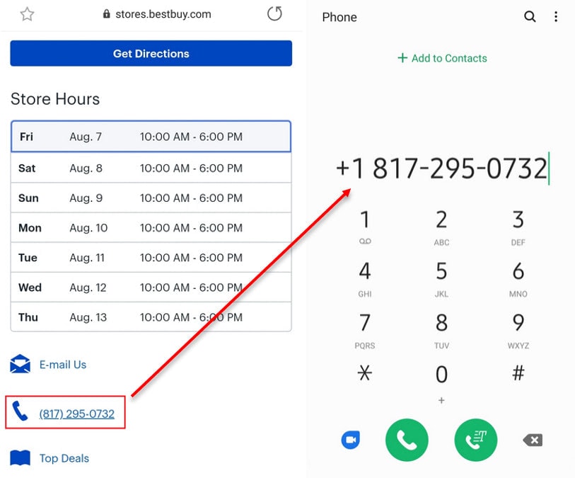
Clicking the hyperlinked number from BestBuy’s site automatically opens your phone keypad.
Likewise, tapping your address should also pull up maps, so users can easily navigate to your business. These last two points are especially important if you’re a local business.
Conclusion
Choosing between responsive or adaptive design takes careful consideration.
Responsive design is generally a safe bet for smaller pages with low complexity, while adaptive design is better for more complicated setups.
No matter which mobile design you choose, it’s important to know how your audience is using your site and to always test its usability. And remember to keep things simple.