A Quick Guide to Sans-Serif Fonts
If you go back and read my guide to serifs, you’ll notice a trend with the shape of serif type overtime. As you move from old humanist type to the slick Modern serif, the stroke contrast is more apparent, the serifs become thinner, and lines and crossbars are straighter, losing their calligraphic nature. The track for sans-serifs isn’t as straightforward.
The Sans-Serif has gained the reputation as a “modern” style of typography, but we can find some very early examples of sans-serif type, written in Latin, Estruscan, and Greek letterforms. The first documented usage of sans-serif type was in 1723, by Scottish scholar Thomas Dempster, in his book De Etruria regali libri VII. One of the earliest foundries to design sans-serif type was Caslon, a foundry that was making typefaces in the Estruscan language during the mid-18th Century.
A New Era, An identity to Match
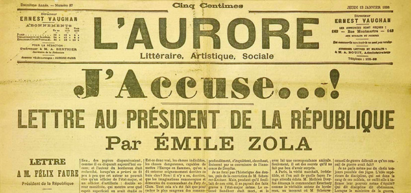
The best way to understand the rise of the sans-serif is to understand its context. Within the early 19th Century, those within the new Republic of France started to revolve around a new kind of identity that represented their new ideologies, as well as the industrialized economic landscape. Within art, architecture and typography, it was visible that people were either clinging to old ideas, or attempting new forms, or both. The result was a feeling of confusion within all art forms during the time. The photo below is a good example: a weird mesh of a sans-serif headline and a thick, fat-face byline, with traditional serif text.
But what does sans-serif mean in a period where serifs are the norm? Linotype has quite a fantastic read on the history of sans-serif typefaces. In their first part, they discuss the sans-serif interpreted as the line which doesn’t end:
“Every line which does not close in on itself has a beginning and an end. If such a line does not have fortified endings, the observer is left with the uneasy feeling that something is incomplete, the line could flow on forever. […] In former times, a column was always decorated with a base at the bottom and a capital at the top. It was not until the birth of modernism that architects ventured to introduce a naked column, made of concrete. The fear that a line without boundaries might flow on forever gave way to a worldview defined by rationality – heralding the beginning of widespread use of sans serif typefaces.”
No-Code Email Template BuilderWith Postcards Email Builder you can create and edit email templates online without any coding skills! Includes more than 100 components to help you create custom emails templates faster than ever before.
Free Email BuilderFree Email Templates
The Sans-Serif Shape
In 1816, William Caslon published a type sample containing his new Sans-serif typeface. The sample caught fire and spread quickly across Europe, mostly referenced as simply “Grotesque” and “Sans Serif.” The evolution of the sans-serif shape is much less straightforward, but we can separate the sans-serif shape into certain types: The Grotesque, the Humanist, and the Geometric sans-serif.
We can see Grotesques as the traditional sans-serif: Helvetica, Univers, Akzidenz-Grotesque, and Normal Grotesque represent its early forms, as well as the early forms of the sans-serif itself.
I tend to view the grotesque shape as stern, resilient, consistent, and sometimes serious. The strokes have little contrast, and they rely on straight strokes (horizontal, vertical, diagonal) more than their curves, counters, and ‘r’ terminals. So the letters aren’t as playful. What makes the grotesque shape significant is what that sturdiness implies. There’s an important architectural context to the grotesque shape. The letters don’t feel artful and expressive, but rather rational and *physical*, like the corporate skyscrapers of mid-century Chicago, or the brutalism of 60s American housing projects. Indeed, the relationship between the grotesque shape and early 20th Century architecture is important to appreciating early grotesque typefaces, as well as early geometric typefaces like Futura and Erbar Grotesk.
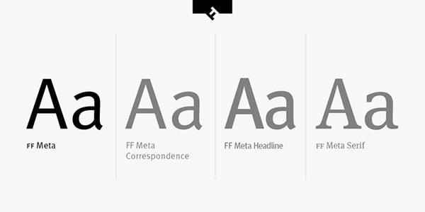
The Humanist sans-serif is flag shipped with typefaces like Gill Sans, ITC Johnston, Frutiger (and its modern revival, Myriad) and FF Meta. Humanist typefaces are friendlier and generally more approachable. Their strokes are playful and show visible contrast. Sometimes terminals are rounded, and the curves often feel loose rather than rigid.
We can trace the origins of the humanist style to the early 1900s, with types like Gill sans and Johnston. Johnston was used for signage in London’s subway system until it was expanded to New Johnston in 1979 and then ITC Johnston in 1999 by Richard Dawson and Dave Farey. The type was an inspiration to Eric Gill, who designed Gill Sans and released the typeset in 1926, about the same time the Bauer Foundry released Futura.
In 1975, Linotype released Frutiger, a typeface that would serve as the model shape for the kind of modern humanist types we see today. Signs of Frutiger are seen from Myriad to Wayfinding Sans and to a certain degree, FF Meta.
Geometric sans-serifs consist of types like Futura and its imitators, Century Gothic and Gotham. Their letterforms are composed purely (or mostly) of circles and straight lines, and generally, have low stroke contrast. Futura is the most “geo-like” typeface on the spectrum, whereas Gotham deviates from the form.
With Pulsetic you’ll be instantly notified the moment your website, API, or server becomes unavailable. Monitor uptime from multiple global locations and respond to incidents before your users are affected.
Create beautiful status pages in minutes to keep customers informed during outages and build trust with transparent communication.
Start Monitoring for FreeHow do Sans-serifs fit into design?
One generalized, widespread conception of the sans-serif I often come across is the assumption that sans-serifs are friendlier and ‘modern,’ while serifs are ‘old’ and ‘classy.’ But this is way too simplistic to be of any meaningful use. A better generalization you tend to see in design is the idea that serifs are better for text, and sans-serif for headlines and titles. While this often makes effective works, the idea still creates a binary that can be very easily subverted, and often is.
But there’s a reason why the assumption exists: we see headlines as places for succinct and attractive summaries. And many sans-serifs, through their shape, can communicate succinctness in the right context. Their low stroke contrast allows for consistent thickness and creates the simplicity of the shape, making headlines a little easier on the eyes when the headline size reaches past a certain threshold. I find the headlines on Autostraddle nicer to read than the ones on Metro News, for example.
Conversely, the high contrast of post-old style serifs makes them easily readable in dense text bodies, or at least it’s understood that way. But we also see contexts where these ideas don’t hold. The best example I can use is probably Twitter itself, which uses a basic Arial/Helvetica. While we understand that serifs are good for dense text, Twitter’s safe use of widespread, easily loadable sans-serifs works surprisingly well. In fact, I’ve seen the opposite occur while using third party twitter apps, where the use of classic serifs like Times made the timeline unpleasant to read. The lower contrast of Times New Roman, coupled with the density of twitter, made the entire type environment too “textured;” too many lines of different sizes jumbled around each other, and it was difficult to discern what was what.
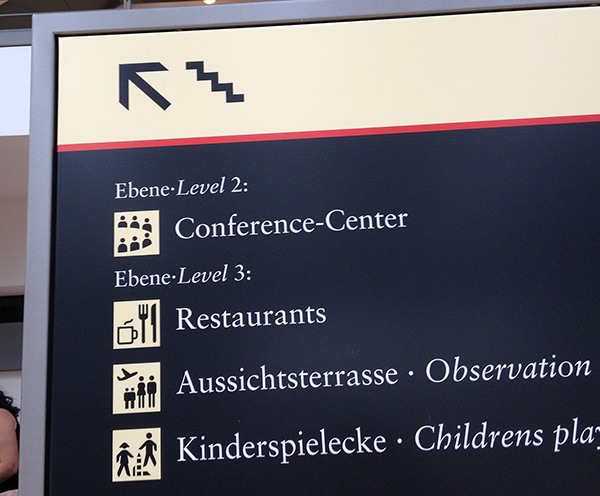
And lastly, I want to point to Albert-Jan Pool, who recently posted a FontsInUse of the signage at the Hamburg Airport, noting the significance of its use of serif text for ‘waypointing’. I’ll quote him here, as he says it better than I could:
“Serifs and signage can go together very well, it’s rather the thin strokes often being too thin (or too thick, in case of a Slab / Egyptian) or the spacing being too tight, the contrast between the luminance densities of type and background being too high (especially in back-lit signage) and the surface being too glossy”.
The tight spacing can probably explain the issue with serifs in Twitter environments. Regardless, we see how the established ideas of the sans-serif, how they break, and how they can be subverted.


