The New Rules for Scrolling in Web Design
What was once taboo in website design has made a complete resurgence as one of the most popular techniques in recent years as users are finding a new love and appreciation for sites where scrolling is a necessity. Shedding its old stigmas, scrolling is reinventing itself as a core interaction design element – that also means designers need to learn the new rules.

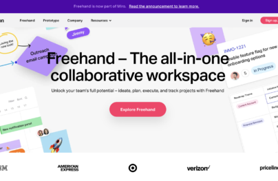
Photo credit: Fitbit
In this piece, we’ll explore the rebirth of scrolling, discuss some pros and cons, and list out some quick tips for the technique.
Why Scrolling is Reborn
The simple answer is mobile devices.
Ever since mobile users have surpassed desktop users, UI designers everywhere have adjusted accordingly. And with so many users on smaller screens, scrolling is becoming more of a necessity: the smaller the screen, the longer the scroll.
With Postcards Email Builder you can create and edit email templates online without any coding skills! Includes more than 100 components to help you create custom emails templates faster than ever before.
Free Email BuilderFree Email TemplatesBut there are other factors. Access to high speed internet is available in more places, making the scroll a quicker way to access information than clicking from page to page. The growing strength of social media sites also feeds the technique: scrolling naturally accommodates their wealth of user-generated content.
As explained in the guide Web Design Trends 2015 & 2016, long scroll evolved right alongside card-based design. When combined, the techniques let you provide users an endless stream of bite-sized content (which is perfect for web and especially mobile experiences).
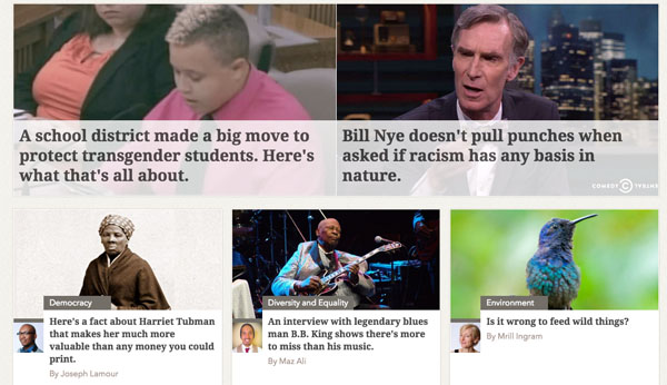
Photo credit: Upworthy
Plus, the above-the-fold doctrine that was holding scrolling back is now being recognized as the myth it really is. The truth, according to actual studies, is that users really don’t mind scrolling. The practice of jamming everything above the fold is losing out to spacing everything out along a even and smooth scroll.
Part of the reason the myth became popular, of course, was that scrolling was only seriously considered as an intentional design pattern after advances in Javascript and CSS. Before that, it was much more difficult to make scrolling “sexy” through visual storytelling. As you might imagine, a long page full of text (interrupted by occasional images) isn’t a very engaging UI layout.
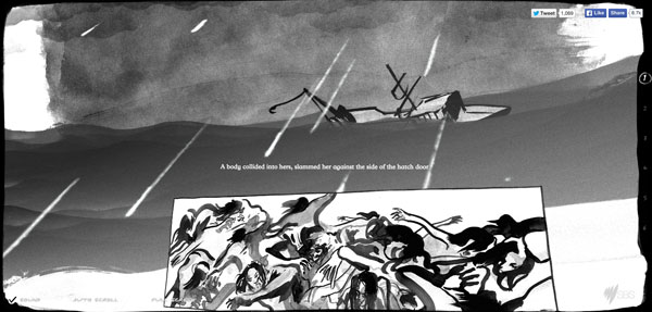
Photo credit: The Boat
With Pulsetic you’ll be instantly notified the moment your website, API, or server becomes unavailable. Monitor uptime from multiple global locations and respond to incidents before your users are affected.
Create beautiful status pages in minutes to keep customers informed during outages and build trust with transparent communication.
Start Monitoring for FreeBut once you start approaching the long scroll as a canvas for illustrating a beginning, middle, and end (through graphics, animations, icons, etc.), then you start to see it’s film-like power in capturing user attention.
In fact, some hybrid patterns are emerging as the latest trend in scrolling. For example, the “fixed-in-place scroll” that we use on our own UXPin tour page creates the same interactive experience of a traditional long-scroll site without stretching the site vertically.
Is Scrolling Right for You?
With every design technique and tool, there are those who love the concept and those who hate it. In most cases, neither side is intrinsically right or wrong; that’s why it’s important to weigh all considerations before tackling such a project.
Advantages of Scrolling:
- Encourages interaction – With the ever constant stimulation of changing element, it can be an interesting storytelling method that encourages user interaction – especially with tastefully-executed parallax scrolling.
- Faster – Long scrolling is faster than clicking through a complex navigation path and does not slow down or limit the user experience. As described in Interaction Design Best Practices, the perception of time is often more important than the actual passing of time.
- Entices users – The ease of use promotes interactivity and increase time on site. This is especially true for infinite scrolling sites, where you can help users discover relevant content that they may not have even thought of.
- Responsive design – Page designing can get complicated across devices with different screen sizes and capabilities, but scrolling helps simplify the differences.
- Gesture controls – Scrolling seems organically linked with touch, since swiping downwards is much easier than repeated taps on different areas of the screen. Users (especially mobile) are commonly accepting this as a way to display information.
- Delightful design – Few clicks can result in quicker interactions for a more app- or game-like user experience.

Photo credit: Bauer
Disadvantages of Scrolling:
- Stubborn users – Nevermind why, some users always resist change. Nonetheless, the technique is so widespread now (especially during mobile experiences) that it’s probably safe to say that the majority of users are accustomed to the technique.
- SEO drawbacks – Having only one page may have a negative effect on the site’s SEO. (To learn how to minimize these SEO downsides, check out this Moz piece for parallax scroll and this Quicksprout piece for infinite scroll.)
- Disorienting – The disconnection between scrolling and content may leave users confused or disjointed.
- Navigational difficulties – It can be awkward to “go back” to previous content on the page. To counter this, you could create a persistent top navigation where each item is anchored to a page section
- Site Speed – Large pieces of content such as video or image galleries may slow down the site speed, especially for parallax-scrolling sites, which rely upon Javascript and jQuery (check out this tutorial to learn how to create parallax sites without slow site speed).
- No footers – With infinite-scrolling sites, we’d recommend a lean “sticky” footer so you don’t sacrifice navigability. Otherwise, users may be confused by a lack of further navigation at the bottom of the page.
Advantages and disadvantages aside, the long scroll is a technique that suits some types of sites more than others. Longer scrolling websites and best suited for content and design plans that…
- … are going to include a significant portion of mobile traffic (most users)
- … include frequent updates or new content (such as a blog)
- … have a lot of information presented in a singular way for comprehension (such as an infographic)
- … do not contain rich media because of the drain this can cause in terms of load times
Social media sites, with constant and extensive user-generated content, do well with long scrolling (in fact, Facebook and Twitter helped popularize the technique years ago). On the other hand, goal-oriented sites like e-commerce – which require coherent navigation – tend more towards conservative page lengths.
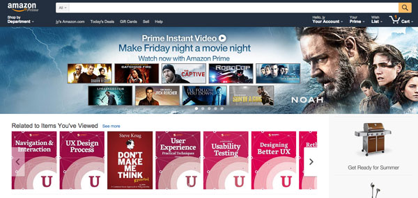
Photo credit: Amazon
The middle ground would be a site like Etsy, an online store for user-generated products, which uses a hybrid solution: several pages of so-called “infinite” scrolling, ending with a call-to-action of “Show Me More.”

Photo credits: Etsy
Like all web design trends, don’t use longer scrolls just because you’ve seen other sites follow the pattern. Make sure your website fits the criteria we’ve discussed, otherwise you might actually experience worse performance.
Scrolling Best Practices
Long scrolling, parallax effects and similar mechanisms are still relatively new to the realm of design (~4 years) , but still some rudimentary trial-and-error has produced some fundamental best practices.
Summarized from Web Design Trends 2015 & 2016, here are some everyday tips for successfully implementing long scrolling.
- Don’t be afraid to alternate long with short scroll. Let the content dictate the scroll length, not the other way around. It’s totally fine (and quite popular) to use a short-scroll homepage and long-scroll landing pages (like Products, Tour, etc.).
- Consider sticky navigation, such as that used by Free Range Designs, so that users can always “get back” quickly or bounce from element to element in the scroll.
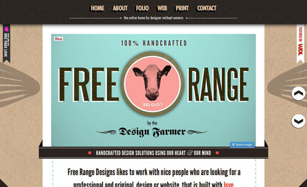
Photo credits: Free Range Designs
- Suggest scrolling with design elements or tools so that every user can quickly see how the site works. Arrows, animated buttons or similar user interface tools are fun and easy ways to help the user determine what to do next. Some sites even include a small button with instructions like “Scroll for More” or “Get Started” to help navigate a site with unconventional techniques.
- Make clear distinctions between scrolling clicks or taps and other calls-to-action so that your website gets the desired interaction.
- Do some research and look at how users are interacting with the scroll. In Google Analytics, for example, you can open the “In Page Analytics” tab to see how many people click below the fold. Based on the data, you can then tweak the design as necessary.
- Don’t go overboard. Long scrolling does not mean 500 pages of continuous content – a long scroll can also be simple. Tell your story and then stop. Don’t force it. Deca, below, uses a scroll that is only a few pages long.
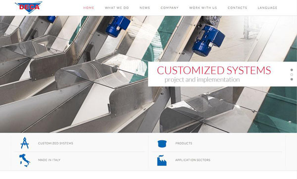
Photo credits: Decasrl
- Focus on your user goals and accept that even infinite scrolling sites are not truly endless. When creating longer-scrolling sites, understand that users still require a sense of orientation (their current location) and navigation (other possible paths).
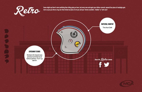
- Include visual cues that help orient users in the scroll, such as the helmet icons used in the left hand side for “The Seven Types of Motorcycle Rider” site below.
Scrolling can be a double-edged sword, so stick to its recommended usage to avoid it doing more harm than good.
Pageless Designs of the Future
Long scrolling sites are not going anywhere. While we’ve seen ebbs and flows (or increases and decreases) in the sizes of screens on popular devices, small is here for the foreseeable future. And small screens require more scrolling.
Actually, the transition from long-scrolling to “pageless” design has already started, and some designers (like those at Digital Telepathy) even believe it is the future of the web. As websites continue to shed some of the constraints of how users think about and consume information, designers must think more radically about the best ways to create content in different environments.

Photo credits: Photohigh
Interaction design is the foundation of long scrolling website design. If users like the interface and find it intuitive and fun to use, then they won’t really mind the length of the scroll (as long as it’s not atrociously long).
You don’t always need to shorten the line – you could just make the wait far more entertaining.
If you found this post helpful, check out the free e-book Web Design Trends 2015 & 2016. In addition to best practices for long-scrolling, you’ll also get tips for 9 other successful web design trends. The techniques are illustrated with 160+ analyzed examples from some of the best sites available.