Using Space to Create a Simple and Effective Design
Sometimes the most effective design technique involves nothing at all.
And it is quite intentional.
Space can be one of the greatest tools in your design kit. It can make text easier to read, bring focus to certain parts of the design and help create an overall mood or feel.
Here, we will look at some great uses of space and how they contribute to both simple and effectively design schemes for different websites.
Space Basics
With Postcards Email Builder you can create and edit email templates online without any coding skills! Includes more than 100 components to help you create custom emails templates faster than ever before.
Free Email BuilderFree Email Templates
The terms white and negative space are used almost interchangeably these days to refer to any space on the canvas (or digital space) that does not contain anything. Simply put, white space is empty.
This space though does not have to actually be white. The terms reference any space that is the color of the background. So it can be white, black or even contain a subtle pattern.
Space is a vital part of any design. The amount of space between letters or between lines of text determines how readable the characters are. If letters are too tight or too loose, they can be quite difficult to read. Finding the right balance is key.
Space also separates images and other elements from each other. Think about some of the cluttered websites you have seen. Often the problem is that there is not enough space between elements. Remember to include plenty of wrap between elements and type and try to use uniform wrapping specifications for an even more professional look. The same is also true when you use multiple columns in the site design (even if it just includes a main column and sidebar); by adding adequate space between these vertical elements, you create a distinct separation.
Space also helps you know where to look, what’s important and is key to developing hierarchy in a design. The eyes will immediately go to an element surrounded by white space. The space adds impact to the element embedded in it.
Space is the tool that creates balance, harmony and is the basis for the organization of content on your site. Without space, how would you group or even find navigation elements? How would you know there is more content on the scroll or that you read from top left to bottom right? All of these visual cues come from proper use of space in the design.
Places Where Space is Vital
While using white space effectively is an important part of any overall design, there are a few areas where you should really focus your attention.
With Pulsetic you’ll be instantly notified the moment your website, API, or server becomes unavailable. Monitor uptime from multiple global locations and respond to incidents before your users are affected.
Create beautiful status pages in minutes to keep customers informed during outages and build trust with transparent communication.
Start Monitoring for FreeHere’s a checklist:
- Around your logo
- Around each navigation button or icon and around the “container” for these elements
- Between columns of text and between the main body and sidebar
- Between “scrolls” when using parallax features
- Between any objects that are different, such as photos and text or the main content area and footer
12 Effective Uses of Space
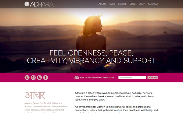
Adhara: Look at the distance space between the left sidebar and the main copy. The space here really creates a nice separation between the elements and makes each stand out in its own way.
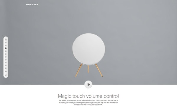
BeoPlay A9: The simplicity of the background versus the object in the center of the screen creates distinct focus. Combined with great alignment, space also helps you navigate from the image to the accompanying text block.
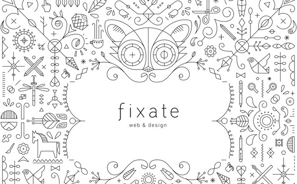
Fixate: In a busy design such as this one, space tells your eyes where to go (and click).
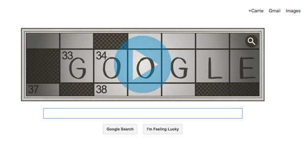
Google: The search engine has long used space to its advantage with a simple data entry box and logo in a sea of space.
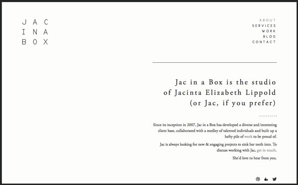
Jac in a Box: The use of space here is eye-catching because there is so much of it. You are drawn from the logo (which uses space perfectly in itself) to the main text in the opposite corner.
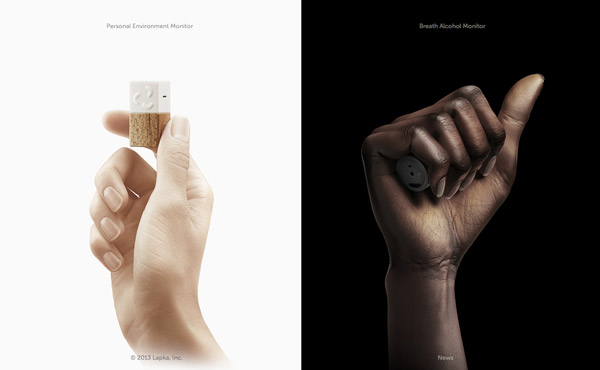
Lapka: Space in yin and yang style brings the eye to the tiny items this company focuses on in a creative way.
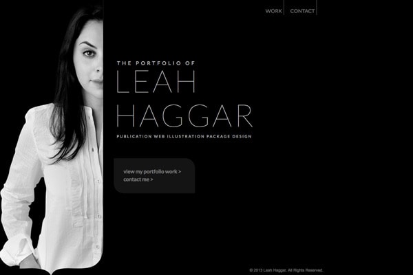
Leah Haggar: The white typography stands out beautifully against a black space. Subtle shading adds to the overall effect.
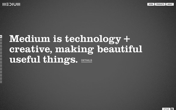
Medium: This is a great example of using white space that is not white at all.
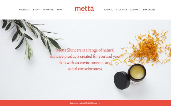
Metta Skincare: Space provides the perfect location for text, framed by images.
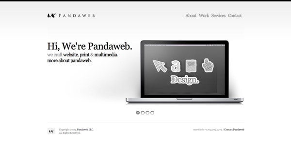
PandaWeb: Space brings your attention right to what this company does.
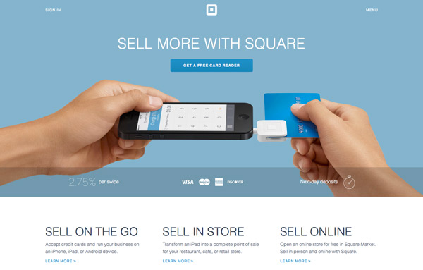
Square: This site combines great use of space between objects, as a focal point for an image and button and for separating columns. Each detail is handled with optimum spacing for impact.
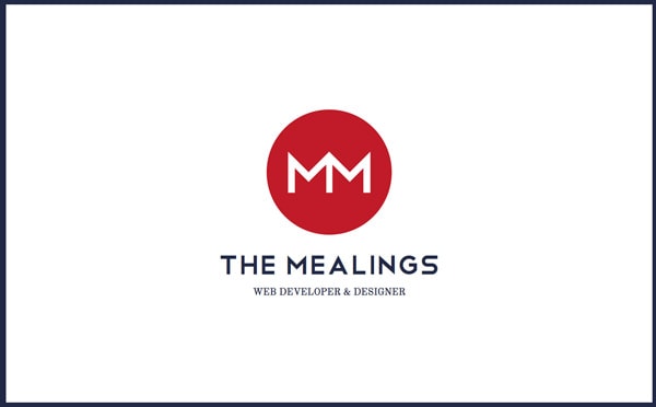
The Mealings: Simple, beautiful, easy. Space – in the design and logo – make all of this happen and look incredibly easy.


