A Look at Stencil Typography
You should be paying attention to stencil.
First, I recommend you throw away the image of ugly fonts sprayed onto industrial shipping crates and used for all sorts of army themed media. The stencil style is making a return, coming to its own style, and the results are fantastic.
Stencils are typefaces with slits in their strokes that make them appear as though they’ve been cut. There’s been a sort of surge in available stencil fonts within the past several years that show an interest in the style, beyond the faux-military aesthetic. And I’ll admit that I’ve been stuck in this rut of thinking as well. But after searching around, I’ve learned a lot of things about stencils and their strengths, and I think they’re valuable and deserve your wonderful attention. Let’s go through some notable ones!
FF Container
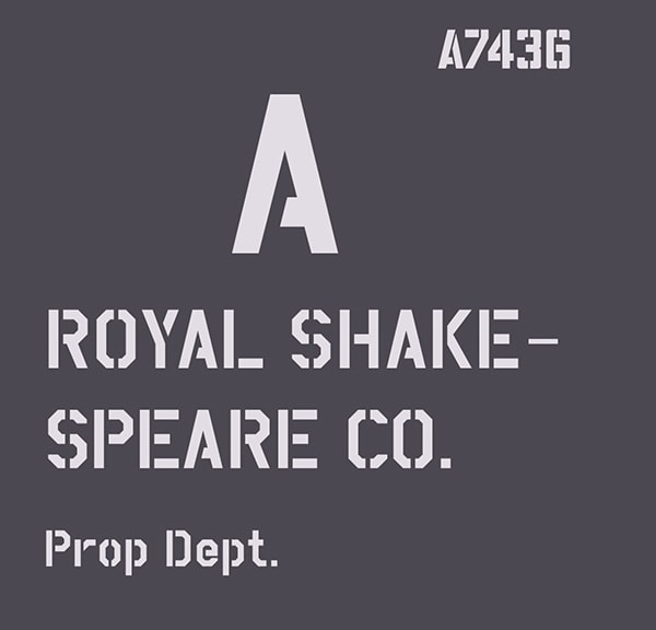
FF Container is the stencil style designed for its root form, as large labels to be put on all sorts of industrial materials. It’s different because it lacks rounded strokes; instead, they’re compositions a few bold, straight lines. This makes FF Container sharper and arguably better for quick viewing in such an environment. Letters with spines or open counters will be cut vertically in the middle, and the rest with branching stems, like, “E”, “F” and “T” are cut at their joints. The cuts, especially on letters with diagonal branches, are made on the angle of the main stem, which makes them sort of invisible—you can take each piece of a letter and connect them to make a whole normal letter. This is the beauty of FF Container. If I step very far away, to the point where the slits are barely visible, they will just come out as normal letters, yet at close reading, they’re readable and distinct!
Container is probably one of the older types on the list. Regardless, it’s still a smart, modern take on industrial stencil. FF Container is part of the FontFont Backstage Pack, selling at $40.
With Postcards Email Builder you can create and edit email templates online without any coding skills! Includes more than 100 components to help you create custom emails templates faster than ever before.
Free Email BuilderFree Email TemplatesTyponine Stencil Pro
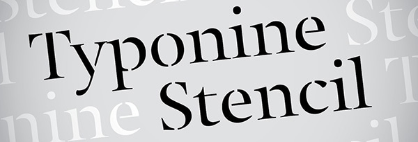
Typonine is a great example of stencil’s versatility and capability; any sort of conceptions of the limits of stencil or where stencil belongs are crushed. The type’s thin serifs, pointed terminals, and high stroke contrast make it feel sharp, and more stylish and interesting than more traditional old-style serifs. The true distinction with Typonine Stencil comes through its subtle, strategic cuts, less drastic than those of FF Container. Most of its letter strokes are separated on the hairline, which allows the same kind of “invisible” readability, and is sort of a pattern among well-designed stencils.
Dala Floda
Another example of how stencil can subtly insert itself into familiar styles, Dala Floda, designed by Paul Barnes, is elegant and thoughtful. Its slits aren’t really slits, rather stroke omissions that are large and drastic, like a whiteboard eraser taken to the letters, leaving only the most critical strokes. A little ball on its terminals, a separated ear on its ‘g’, detached crossbars and missing stems are features that make Dala unique and provoking, even if it isn’t as functional in small sizes. It’s probably best for display, but I encourage experiment, as I think it suits the type’s philosophy well. Dala Floda is certainly an experiment in itself, and it’s incredibly successful.
Plan Grotesque
If you haven’t noticed the pattern, we’re basically going through a lot of traditional type categories. Although stencils act as more than decoration (well-designed ones have cuts that really feel like part of their letters), they’re sort of removable from the eye. You can still recognize letters and the nature of their strokes. Because of this, stencils can still give a natural feel that can come with specific types of typefaces.
Plan Grotesque is a pretty great example of this. It’s still a grotesque, or at least the kind of grotesque that we’re used to seeing. It has the soft sans-serif look with small contrast and near-circular strokes to make letters appear humanist and approachable. It appears geometric at first glance but its letters do have a slight narrowness to them. It also plays with stroke in fun, subtle ways: the top of its ‘a’ curves inwards, and terminals on letters like “s,” “e,” and “r” actually thicken outwards, almost like a foot. Halfway cuts are done on letters like ‘e’ and ‘c’, while UPPERCASE letters like “N” or “M” will have one slit instead of two. It’s a little abnormal, but a good example of how type enthusiasts can play around with slits.
Axia (Stencil Display)
Axia from Kontour is like FF Container in that its curves also contain many straight lines, but they’re much less drastic. It makes Axia sharp, but more approachable and flexible. It’s quite smart, actually: the straight lines only appear on one side of the stroke, so the bottom end of the bowl on its ‘a’, for example, will appear as though it’s coming into the horizontal stem. It’s a harmony and balance between sharp and rounded that makes Axia intelligent and unique. Axia’s cuts are also interesting because they’re very incoherent. Some vertical slits don’t exactly line up. Others like “F” and “E” are inconsistent with their direction. Again, all this is Axia playing with how we as observers view stencil. It doesn’t cut in the parts we expect, and the typeface becomes distinctive because of that.
With Pulsetic you’ll be instantly notified the moment your website, API, or server becomes unavailable. Monitor uptime from multiple global locations and respond to incidents before your users are affected.
Create beautiful status pages in minutes to keep customers informed during outages and build trust with transparent communication.
Start Monitoring for FreeAxia is a little expensive, unfortunately, but if you have the funds I recommend it. It also comes in a non-stencil form that doesn’t lag behind. Its stencil display comes in two weights.
Concrete Stencil
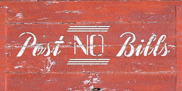
Wondering if stencil can work on script typefaces? Guess what, they can. Versatility!
The description for Concrete Stencil on myfonts.com is: “No need to explain. This is the best stencil script.” And can you blame them? Concrete is beautiful. Rarely have I ever seen a script typeface so debunked, so grounded. I love script typefaces, but they’re often so indulgent and inward. I don’t feel like Concrete Stencil is trying to sell me an archetype of a script typeface. Rather, I feel like Concrete Stencil is trying to sell me a specific idea: the merging of the elegant and the rugged, the display of beauty through the rough and urban landscape. It’s incredibly compelling.
Concrete’s cuts and slits are intricate and plentiful, taking full advantage of the complexity of script. It’s often hard to tell where cuts actually are; they seem to be everywhere all at once, on apexes and thin terminal strokes, between loops and counters and through g-loops. It’s not enough to say there’s high contrast; Concrete feels like a duality between thick and thin, sifting in and out of each other like a dual spiral.
Interestingly enough, it’s sister style, Concrete Stenciled, is abnormal but still feels applicable. Letters are thicker, yet feel smudged, like they’re being viewed with bad depth perception, as strokes are shaky and even carry a few more slits on their hairlines. Perhaps both styles can work well together, somehow.
Vanitas Stencil
And lastly, we move to Vanitas, a typeface that feels like a reimagining of Bodoni/Didot as a sans serif. It carries the same sharp, thin, high contrast elements. Letters are quite large, especially in relation to the capital letters. Counters appear slightly inflated yet none of them lose control. Its curves feel slightly narrow, so as it doesn’t feel too expansive or even imposing. And an interesting quirk to note is straight leg of its ‘R’, which is the only one of its kind in the group.
When it comes to its cuts, Vanitas is strategic and reserved. Some letters don’t even have cuts, like its ‘t’, and its uppercase ‘S’ and ‘J”. Some cuts or slits are arguable as to whether they even are cuts or slits, as certain letters only have subtly incomplete crossbars.
What should I take away from all this?
That stencil is a legitimate and valuable stylistic approach, and it’s something that deserves your precious attention and maybe even your money. Stencils are absolutely not confined to the tropes that general knowledge or even designers have probably boxed them in. But like all recommendations and artistic explorations here on Designmodo, I encourage experiment and skepticism above anything else.
Continue creating.