Typographic Style: Identifying Type Categories
Typography is about so much more than just picking a couple of fonts and working them into a design. A designer must understand some of the basic characteristics of type in order to effectively use fonts.
Different typefaces can create very different tones for a project. Think of some of the most well-known logos in the world and how they might be different using another typeface. How might you feel differently about the brand?
Figma to Website in One Click and No-Code
A key part of understanding typography is to start with type categories. Typefaces are divided in to several groupings of similar characteristics – Old English, serifs (multiple types), sans serifs, scripts and novelty. Each of these categories can be used for a number of different projects, but some are more universally applicable whereas others are best used sparingly.
Serifs vs. Sans Serifs

With Postcards Email Builder you can create and edit email templates online without any coding skills! Includes more than 100 components to help you create custom emails templates faster than ever before.
Free Email BuilderFree Email TemplatesBefore identifying the first category of type, it is important to have a good understanding of the terms serif and sans serif. Serifs are letters that have a small (or sometimes large) horizontal stroke on the ends of letters. Sans serifs are letters created without this additional stroke.
Serifs and sans serifs are broken into different type categories. Sans serifs are rather simple to identify. Serifs are further divided into four categories – old style, modern, transitional and square or slab.
Serif fonts are most commonly used in print publishing. Sans serifs are the standard for digital design. Sans serifs tend to be preferred online because serifs and alternating thick and thin strokes can be hard to render well on screens, especially at small sizes. In digital and web applications serifs are most often used for large-sized type. Sans serifs are used from the smallest of typefaces to the largest with ease.
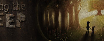
Old English or Black Letter

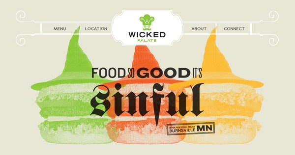
Wicked Palate
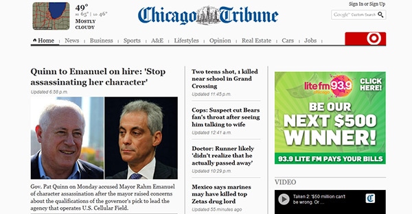
Chicago Tribune
The Old English type category is the oldest and considered to be the most recognizable style. It is characterized by many elaborate and broken strokes for each letter. Old English typefaces are also called black letter or fraktur (Latin for “broken”) fonts.
The type style dates to the Middle Ages when all letterforms were created with pen and paper. This style is representative of a person’s inability to create letters without lifting a writing tool from the surface.
With Pulsetic you’ll be instantly notified the moment your website, API, or server becomes unavailable. Monitor uptime from multiple global locations and respond to incidents before your users are affected.
Create beautiful status pages in minutes to keep customers informed during outages and build trust with transparent communication.
Start Monitoring for FreeOld English typefaces can generally be difficult to use. They are best reserved for limited applications with only one or two words.
The style is very elaborate and can create a feeling of age or history and would not work well in a project that tries to create a sense of modernism or has a contemporary feel.
Old Style Serifs

Google Ventures

Hiut Denim
Old style serifs carry over some of the traditional look and feel from Old English typefaces. While the style of each serif is rather small, the letter forms tend to be quite round and have even strokes with very little or no contrast between thick and thin strokes.
Fonts in this type category are often used in print publishing. They work well in digital design when used at larger point sizes (think 18 points or higher).
Old style fonts can create a sense of credibility and feeling of formality in a design project.
Modern Serifs

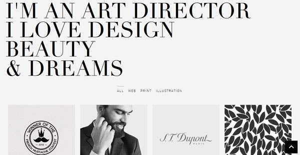
Johann Lucchini
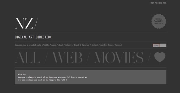
nanozoom
Modern serifs are part of a standard font set used widely by the newspaper industry. The type category is characterized by distinctly contrasting thick and thin letter strokes.
Modern serifs are not commonly used in web design, aside from headers or other big words, because the thick and thin strokes can cause problems for the eye in many color combinations (both with high or low contrast).
Modern serifs are best used in projects that create a sense of authority and even newsiness, because of the type category’s long-standing association with newspaper design.
Transitional Serifs

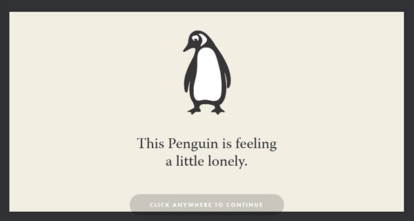
Impress A Penguin
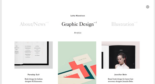
Lotta Nieminen
Transitional serifs are the most-commonly used serifs in digital work. Much of that can be attributed in part to the computer software industry because applications such as Microsoft Word come out of the box with Times New Roman as the default typeface, a transitional serif. This type category combines the properties of old-style and modern serifs to create typefaces that are rounded in shape and have strokes of varying widths.
Transitional serifs are quite readable and can be used in a variety of applications, but like other serifs be careful using them in small-size type for digital projects. Because of the common popularity of this typestyle, it can have an almost-vanilla feel, eliciting little exact emotion.
Square or Slab Serifs

Lyudmil Shoshorov
Life in Greenville
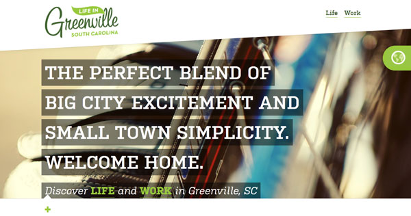
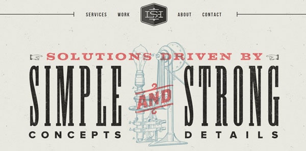
Square or slab serifs are the biggest, boldest and baddest of the serifs. They are characterized by thick uniform strokes and square-edged serifs.
Fonts from this category are an excellent choice for display type that creates high-impact lettering.
Sans Serifs

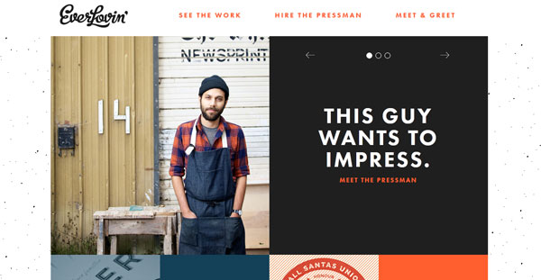
Everlovin’ Press
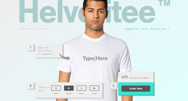
Helvetitee
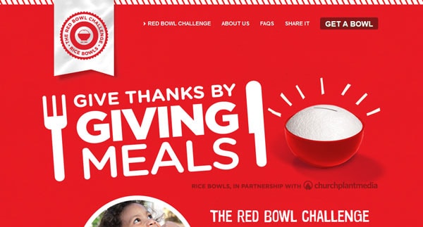
Red Bowl Challenge
CaptainDash

Sans serif fonts are the preferred type category of the digital design industry. They are easy to read and are wide-ranging in look and feel. Moreover, all letter strokes are weighted equally, making sans serifs easy to read against a variety of contrasting (or not) backgrounds.
Sans serifs can be used at almost any size and render nicely on the screen, making them great for almost any web project. Designers, however, must choose sans serif fonts carefully because they are almost an unlimited number of options to choose from, all with wide-ranging emotional associations.
Script or Cursive

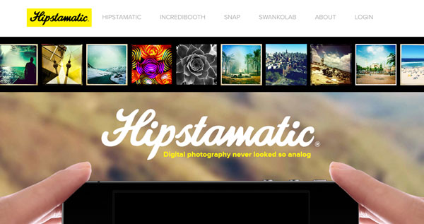
Hipstamatic
Minerva
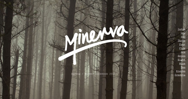
Script or cursive fonts are design to mirror handwriting. The difference between script and cursive is simple: Script letters are connected to each other within each word; cursive letters are not connected.
This fancy form of lettering tends to have a rather feminine feel and does not work well for small-sized typography. Use these fonts sparingly and at large sizes for the greatest effect.
Novelty

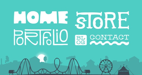
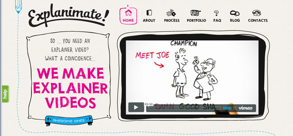
Explanimate!
Denise Chandler
Every other typeface is considered to be a novelty font because its characteristics do not fit into one of the categories described above. Novelty fonts can be fun and interesting to look at. They tend to create a definitive mood based on the look of characters in the type set.
Novelty fonts are best used for only a few words and for a certain, very well-defined purpose. Avoid using novelty typefaces for large blocks of type and make sure the mood of the letters corresponds to the feel your site is trying to create. Novelty fonts can be considered as much an art form as typography.
