User Experience and Credit Card Payment Forms
Everybody loves shopping, until you get to the checkout and have to swipe your credit card. This is not the most pleasurable part of shopping, is it? And when you add in the painful user experience of payment forms, you will get either a distressed customer or a user that eventually fails to convert.
The importance of a good credit card payment form is huge. There is a whole process leading to this very last step and you simply can’t afford to lose the user before payment. Sometimes a single form field description can be a game changer, that’s why it is important to test and analyze the usability of the checkout form on a regular basis.
There are lots of payment options from the popular PayPal and to Bitcoin payments. There is plenty of choice, but usually these payment options have their own design, which can hardly ever be changed. For example, if you choose to accept payments via PayPal, users will be redirected to PayPal, where they need to fill in account detail, pay and are redirected back to your website. Not the best experience, so having your own credit card payment form becomes absolutely necessary.
Designing your own payment form will let you be in control of both the design process and the overall experience. The biggest challenge is to be able to prove your website is secure and trustworthy. (And you won’t be able to blame PayPal for bad UX and failed conversions anymore.) That’s a huge responsibility, so if you decide to go for it you have to make the whole process more usable for your user, otherwise it won’t make sense.
How Do You Design a Usable Payment Form?
If you already have one, I would advise doing some user testing and talking to your users directly in order to understand some of the main issues that may be holding them back from making a purchase. This can help you optimize the form particularly for your customer.
With Postcards Email Builder you can create and edit email templates online without any coding skills! Includes more than 100 components to help you create custom emails templates faster than ever before.
Free Email BuilderFree Email TemplatesHowever, there is a number of things you need to consider when designing credit card payment forms for maximum usability.
Require Only a Minimum
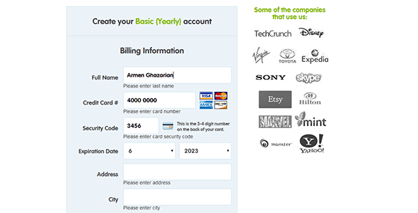
You need to research and determine the minimal information you really need to process a payment. Anything other than that should be eliminated. The less information you require the less likely the user is to make a mistake, the less time it will take and the happier customers you will have.
For example, some online payment forms require you to submit cardholder’s name, some do not. The name on card is usually not used when processing a payment. So if your research supports this statement then maybe you could eliminate that field right away.
Spend some time to check local regulations and requirements for online payment processing and make sure your form is not only usable but also legal.
Do Your Homework
Good user experience is all about making it easier, smoother and faster for the user. Do whatever you can to reduce extra steps in the credit card payment process and fill in the form instead of the user whenever possible.
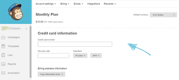
First, remove the “credit card type” field. Although most of major websites still use this field in payment forms, it is an extra step to type in this information. Do you know the first digit of a credit card number can tell you exactly what type of card is that? It’s that simple.
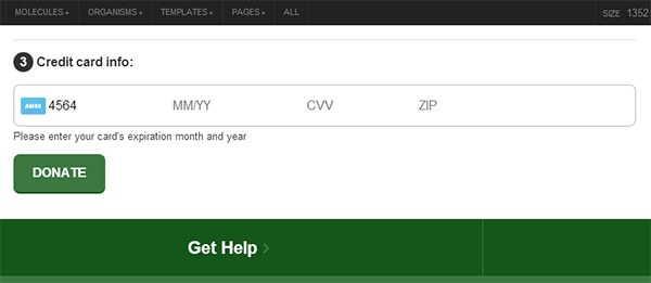
Another thing you can do to make the credit card form more user-friendly is to prevent possible errors with automatic data-validation. Don’t wait for the user to hit “submit” to tell him that the credit card number doesn’t exist. That’s poor usability. Moz.com is a good example.
With Pulsetic you’ll be instantly notified the moment your website, API, or server becomes unavailable. Monitor uptime from multiple global locations and respond to incidents before your users are affected.
Create beautiful status pages in minutes to keep customers informed during outages and build trust with transparent communication.
Start Monitoring for Free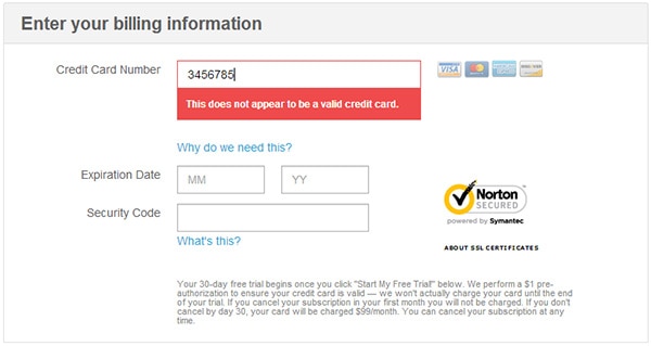
Keep the Design Clear and Focused
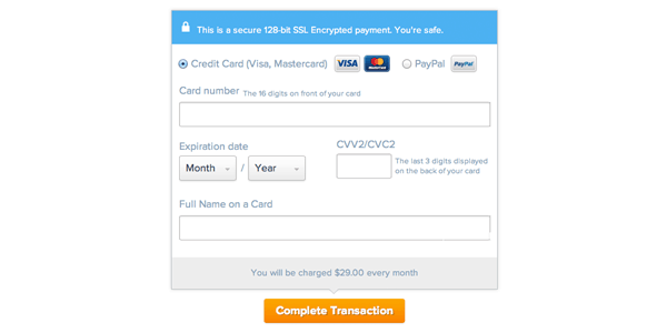
The credit card payment form is undoubtedly the most important part of a checkout form, where users try to get more focused and not miss out any hint of insecurity. Try to reduce clutter from this page and make it straightforward and transparent. Highlight important details, like “1 month FREE trial” or “100% Moneyback guarantee.” Online payment forms tend to look and feel rather serious to reinforce the sense of security.
Be Obvious
If you think that data labels are more than enough for a comprehensible web form, think twice. Labels are necessary, but not at all sufficient for a usable form. A short and simple instruction just below the field can make a big difference in error prevention and user experience. Don’t be afraid to sound too obvious, go ahead and add any hints that can help the user fill in the information easier and faster. (E.g. please fill in the credit card number without dashes or spaces.)
Deserve a User’s Trust
Before anything else, you need to make sure it is safe to collect and store credit card information on your website. Install all necessary security certificates on your server to ensure that sensitive user data won’t be used for malicious purposes or won’t be lost, because there’s nothing more important than a user’s trust. And when you have taken all security measures, point it out to the user and make him feel safe on your website. You can make use of security certificate badges and even tell them “You’re safe,” like UXPin does.
Final Thoughts
Web form usability is something you always need to keep an eye on. It is probably one of the most vulnerable parts of a website, where users are most likely to feel frustrated. But it is also your only chance to turn regular website visitors into customers, so never stop improving your web forms. And I am not talking about desktop only. It is even more important to have a mobile-optimized online checkout form and some people have already done a great job creating mobile-friendly payment forms.
One of my favorites is the single-field credit card input form first presented by Luke Wroblewski and beautifully implemented by www.bradfrostweb.com.
Users type all numerical credit card information (card number, expiration date, cvv) in a single field, one after another with a help of a simple numerical keyboard. This is a genius way to improve the mobile user experience of payment forms.
So the idea is to try and think out of the box. Collect user data and don’t be afraid to be different.