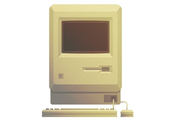
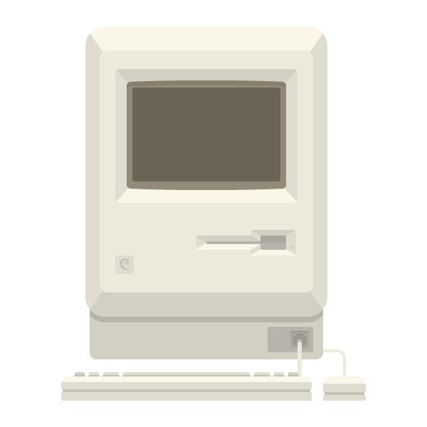
How to Create a Vintage Macintosh in Adobe Illustrator
Hi guys, if you’re a tech geek like I am, I know you are absolutely going to love this neat tutorial on how to create a vintage looking Macintosh, using Adobe Illustrator.
Step 1 – setting up our document
For the current tutorial, we will need to set up a new Illustrator file (ctrl + N on a pc or cmd + N on a mac) with the following attributes:
- artboard size: 800 x 800px;
- color mode: RGB (as we will be designing for the digital medium);
- raster effects: 72ppi (screen intended);
- units: pixels;
Also make sure that the Align New Objects to Pixel Grid checkbox is checked as we want everything to look as crisp and clean as possible.
Quick tip: if you’re new to the whole pixel perfect process you can read more on the subject in one of my previous tutorials that will teach you all you need to know in order to understand and grasp the technical steps behind any pixel perfect design.
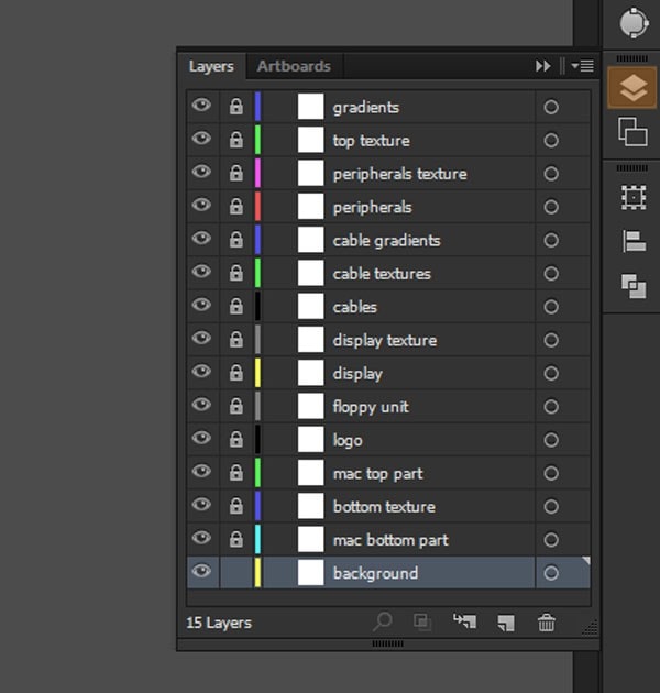
Step 2 – layering our design
As we will be working with gradients, textures, and a large number of objects, I found it much easier to layer the entire design so that we won’t have to use and abuse grouping and isolating objects which would make some steps more difficult than needed.
With Postcards Email Builder you can create and edit email templates online without any coding skills! Includes more than 100 components to help you create custom emails templates faster than ever before.
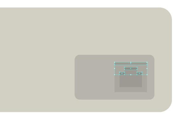
Free Email BuilderFree Email TemplatesSo, from the Layers panel, create a number of 15 layers and name them from the bottom up as follows:
- background (by default I will leave it on white, but you can change it however you please);
- mac bottom part (will host the keyboard input);
- bottom texture (pretty self-explanatory);
- mac top part (will define the top form of the mac) ;
- logo (in my case I gave it a Designmodo flavor);
- floppy unit (again, pretty self-explanatory);
- display;
- display texture;
- cables;
- cable textures;
- cable gradients;
- peripherals;
- peripherals textures;
- top texture;
- gradients.
You should have something like this. As you can see, I’ve locked the layers that I won’t be working on, as this helps focusing on just the layer you need.
Step 3 – building our color scheme
You might be wondering why I said “building”. Well, wonder no more! Instead of picking colors randomly, or using RGB/ HSB values we will create our base color palette using the Blend tool.
Assuming you’re on the background layer, grab the rectangle tool (M) and create two 60 x 60px squares. Select the first one and color it in a light grey #FAF7E9 (R: 250, G: 247, B: 233) and then the second one and give it a darker value of #8F8D85 (R: 143, G: 141, B: 133). Now comes the cool part. With both objects selected, go to Object>Blend>Blend Options…
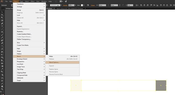
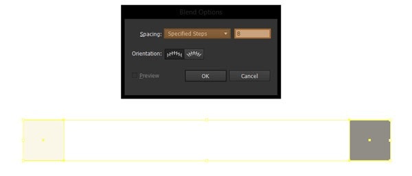
and from the new box, where it says Spacing, select Specified Steps and input the value 8 in the empty field, then click OK.
With Startup App and Slides App you can build unlimited websites using the online website editor which includes ready-made designed and coded elements, templates and themes.
Try Startup App Try Slides AppOther ProductsWith both of the squares still selected, go to Object>Blend>Make, then expand the blend by going to Object>Expand>Fill and stroke. You should now have a smooth 9 color palette that flows from light to dark values.
Quick tip: in order to know which colors to apply to the different parts of the design, I would recommend numbering them as you see bellow so that you won’t mix the ones which have similar values.
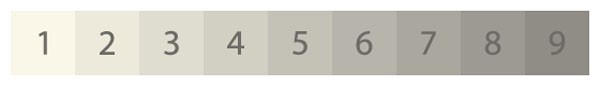
Color values:
1= #FAF7E9 (R: 250, G: 247, B: 233);
2= #EDEADC (R: 237, G: 234, B: 220);
3= #DFDDD0 (R: 223, G: 221, B: 208);
4= #D2CFC3 (R: 210, G: 207, B: 195);
5= #C4C2B7 (R: 196, G: 194, B: 183);
6= #B7B5AB (R: 183, G: 181, B: 171);
7= #AAA89E (R: 170, G: 168, B: 158);
8= #9C9A92 (R: 156, G: 154, B: 146);
9= #8F8D85 (R: 143, G: 141, B: 133);
To easily apply a color value from a number to one part of our design we will be using the Eyedropper tool – I will show you how in just a few moments.
Step 4 – building our base forms
4.1. Mac bottom part
Now that we have set our colors, document size and all that stuff, we will move on to building the actual Mac. As we progress through our process, you will lock the previous layer you worked on, and then unlock the one above it so that you won’t lose track of the layer you’re currently on.
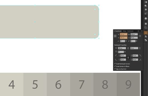
So, with the background locked, move to the mac bottom part and with the rounded rectangle tool create a 328 x 84px object with a 10px corner radius. Using the Eyedropper Tool (I) grab the color value from square number 4 and then holding down Alt apply it to our rounded rectangle. Now using the Transform panel (Window>Transform), position the object using the following coordinates:
- x: 400px;
- y: 566px.
Next we need to create the input port for the keyboard. Grab the rounded rectangle tool and create a 64 x 36px object with a corner radius of 4px. Using the same trick with the Eyedropper tool give it the color value from square 6 and then position it using the following values:
- x: 518px;
- y: 580px.
On top of this object, create a 26 x 24px rectangle and color it using square 7 with the following position:
- x: 531px;
- y: 580px.
Now inside this form, we need to create the actual connector head using 2 different objects on top of each other with the following values and positions:
- bottom object:
- width: 18px;
- height: 16px;
- color: number 8;
- position: w: 531px / y: 582px;
- top object:
- width: 10px;
- height: 14px;
- color: number 8;
- position: w: 531px / y: 574px.
In order to give it a sense of depth we will add some simple shadows by creating 1px rectangles and positioning them above the 3 center objects.
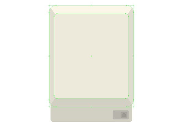
4.2. Mac top part
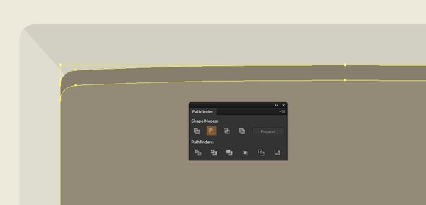
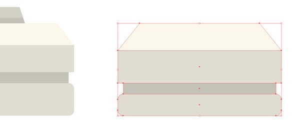
Now that we have the base built up, let’s start working on the top part. Grab the rounded rectangle tool and create a 340 x 408px object with a corner radius of 28px. Using the eyedropper select and apply the color from number 3 and position it using these values:
- x: 400px;
- y: 344px.
Then create another 300 x 340px object with a corner radius of 12px and vertically and horizontally align it to the previous one. Give it a lighter color using number 2.
You should now have something like this.
As the objects needs to look more realistic, we will add a lighter and a darker section to the top and bottom of the main rectangle.
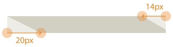
Using the rectangle tool (M) create a 340 x 44px object, color it using number 1, and then position it with the following coordinates:
- x: 400px;
- y: 162px.
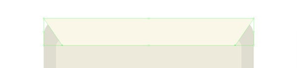
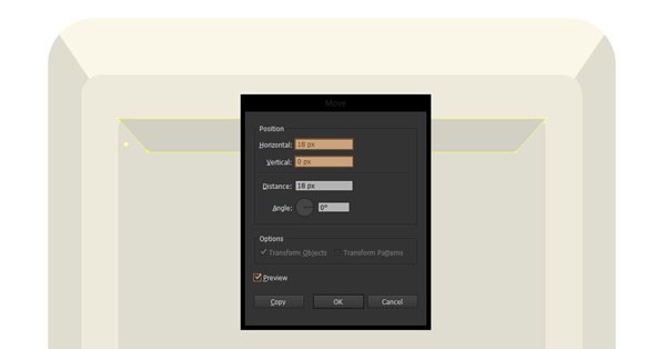
Now with the Direct Selection Tool (A) select its left lower anchor point and then go to Object>Transform>Move. In the new pop up box, enter 30px for the Horizontal field and 0 (zero) for the vertical one.
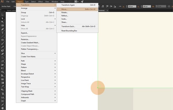
Do the same for the right lower anchor point, and you should have something like this.
Now copy the big rectangle underneath it and paste it in front so that you can select them both and create a clipping mask (right click>Make Clipping Mask) in order to hide the top corners that go outside. Duplicate this masked object, then flip it horizontally (right click>Transform>Reflect>Horizontal) and change its color using the value from number 4. Select both the lighter top section and the dark one at the bottom, group them and then position them underneath the center object.
As you can see, the lower section has the same color with the Mac’s bottom part so we need to add a shadow in order to separate the two. First copy the largest object on the mac top part layer, paste it in place and move it down 8px using the Object>Transform>Move function. Then copy the main body from the mac bottom part layer and paste it on top of the object we previously moved. With both of them selected, create another clipping mask, and then color the object using the value from number 6.
4.3. The logo
If you’re on the logo layer, you can either add the official Apple logo or go wild and make your own. In my case I went with something else.
Quick tip: you can easily find the apple logo in a vector format by searching for the following keywords “apple logo vector”.
4.4. The floppy-disk unit
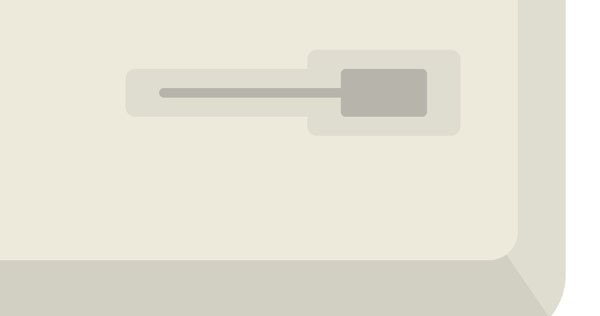
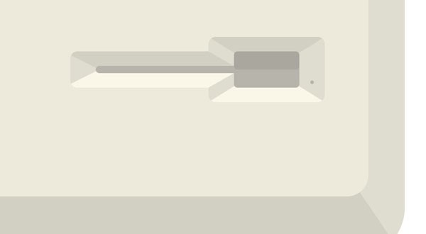
The first thing we need to do in order to create our floppy unit is to define its base form. Using the rounded rectangle tool create an object with the following values:
- width: 140px;
- height: 20px;
- corner radius: 4px;
- color: value from number 3;
- position: w: 456px / y: 444px.
Next, create another 64 x 36px object with a corner radius of 4px, use the same color as for the one before, and position it using these values:
- x: 494px;
- y:
Now we need to add the channel where the actual floppy-disk would fit into. With the rounded rectangle create a 112 x 4px form, with a corner radius of 2px and color it with the value from number 6. Using the transform panel, position it after the following coordinates:
- x: 456px;
- y: 444px;
Then, create a 36 x 20px rectangle with a corner radius of 2px, use the same color as before, and position it at:
- x: 494px;
- y: 444px;
At this point you should see something like this.
Once we have our main forms, we need to add some depth to them as we did with the top and bottom part of the Mac’s body. First create a 64 x 10px rectangle, and nudge its lower anchor points about 16px towards the inside using the move function. Then color it using the value from square number 2, and create a clipping mask by copying the object underneath it in front. To position it use the following values:
- x: 494px;
- y: 431px.
To create the bottom lighter portion, select the masked object, flip it horizontally and then change the duplicate’s color to the value from number 1.
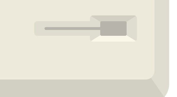
We also need to apply the same effect to the left portion of the disk socket. This time we need to create a 94 x 10px rectangle (use the color value from square number 2), shift its lower left anchor point by 20px to the right and then add an extra anchor point to the lower right side at about 2px from the bottom base. After that, we need to select the top right anchor point and move it 14px to the left. To position it use the following coordinates:
- x: 429px;
- y: 439px.
As before, we need to create a clipping mask by copying the object underneath in front. Then we can flip the new object, and change its color using the value from number 1 to get the lighter segment.
Still at this step, we need to create the little door that flips when a disk is inserted and the circular spot, so grab the rounded rectangle tool, create a 36 x 10px door with a corner radius of 2px, color it using a darker value from number 7 and the position it as follows:
- x: 494px;
- y: 439px.
For the circle, use the Ellipse tool and draw a 2 x 2px object color it using number 6 and then as always position it:
- x: 519px;
- y: 451px.
4.5. The display
The most important part of the actual illustration is the display. As before, it needs to reflect the feeling of depth generated by its surrounding borders but first we need to lay down the most basic shape. Using the rounded rectangle tool, draw a 256 x 188px shape with the following attributes:
- corner radius: 6px;
- color: number 3;
- position: x: 400px / y: 294px.
Next we need to add the darker and lighter top and bottom segments. Grab the rectangle tool (M), create a 256 x 20px object and color it by picking the color from square number 4. Using the Direct Selection Tool (A) in combination with the Object>Transform>Move function, nudge both the left and right lower anchor points towards the center by 18px.
In order to mask the top outer corners, copy the rectangle underneath, paste it in front and create yet another clipping mask. For the bottom lighter segment, just duplicate the top one, flip it horizontally and then color it using square number 1.
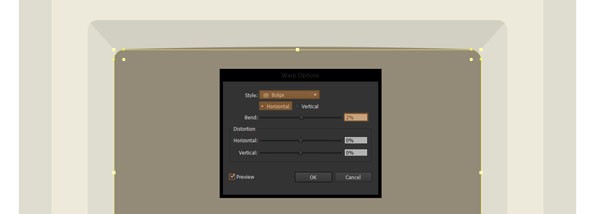
After we have constructed the surrounding borders we need to create the glass panel. With the help of the rounded rectangle tool create a 224 x 150 object setting the corner radius to 6px. Color it in a darker brown shade #948A78, and then with the object still selected, go to Effect>Warp>Bulge and bend it horizontally by 2% so that the upper and bottom parts get a little extruded towards the outside. Next with the object selected expand it by going to Object>Expand>Fill and stroke. To position it in the right place set the following values in the transform panel:
- x: 400px;
- y: 293px.
For the darker section that normally shows the information, we will create a 208 x 132 rectangle with a corner radius of 4px, color it #6B6457 and then vertically and horizontally align it to the previous object using the pathfinder panel.
The final piece that we need to add at this step is the top shadow created by the frame. To do that, just copy the bulged objected created previously, paste it in front twice (ctrl + F on a pc, cmd + F on a mac), move the one above 6px down on the vertical axix and then using the minus front option in pathfinder delete the lower section. Then select it and change the color to an even darker shade of brown #877E6E.
4.6. The peripherals
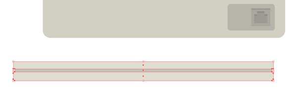
This step should be fairly simple. Make sure that you’re on the peripherals layer and then create a 352 x 12px object with a 2px corner radius and color it using number 3. Position it under the Mac’s body by inputting the following coordinates:
- x: 372px;
- y: 660px.
This will act as the base for our keyboard. Next we need to add the center darker part. Grab the rectangle tool (M) and make a 348 x 4px object which we will color using number 5. Position this element on top of the previous one and vertically center them.
Then add another 352 x 10px rectangle, color it using number 3 and position it above the previous two objects. You should have something like this.
For the top part of the keyboard, just create a 352 x 8px element, move the top anchor points 6px towards the center and make sure you change the color to number 1.
When it comes to the keys, we will create a base version and then increase the length to create the other two.
First create a rectangle with the following values:
- width: 16px;
- height: 6px;
- color: number 4;
- position: x: 222px / y: 629px.
Next duplicate the key and position it on the right side at a distance of 4px. Change its color to number 3 and then duplicate this one and position it the same as before. Now grab the direct selection tool (A), select the right anchor points and using the Object>Transform>Move function, nudge them 8px horizontally to the right.
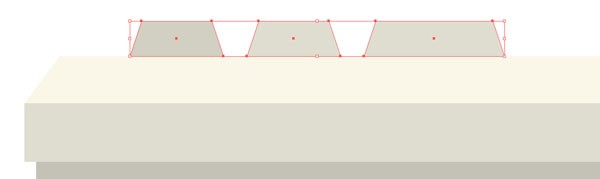
For the spacebar, just grab the longest key we have so far, position it 4px to the right and then move the right anchor points by 156px. At this point we should have the left 3 keys and the center spacebar. For the right side keys, just group the first set, copy and place them in place, horizontally reflect them and then position them using these coordinates:
- x: 498px;
- y: 629px.
The last detail we need to add is the shadow from the bottom. To do so, select all the keys, copy and place them in place (ctrl + F on a pc, cmd + F on a mac), then draw a 320 x 2px rectangle and position it at the bottom of the keys overlapping them. With both of them selected, right click>Make clipping mask. Now to change its color, using the direct selection tool select the shadow and color it using number 5.
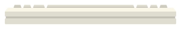
For the mouse, we will create a smaller base of 60 x 8px with a 2px corner radius, color it using number 3 and position it at a distance of 16px to the right side of the keyboard. Next we will draw the middle darker segment, using a rectangle of 56 x 4px, and position it above the base structure. On top of this element we will add a 60 x 12px object which we will color using number 3.
In order to finish the design of the mouse, draw a 60 x 10px rectangle and shift the top anchor points towards the center by 8px.
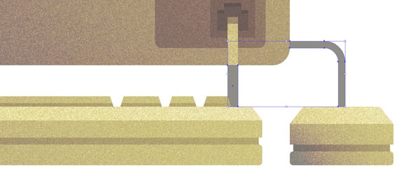
4.7. The cables
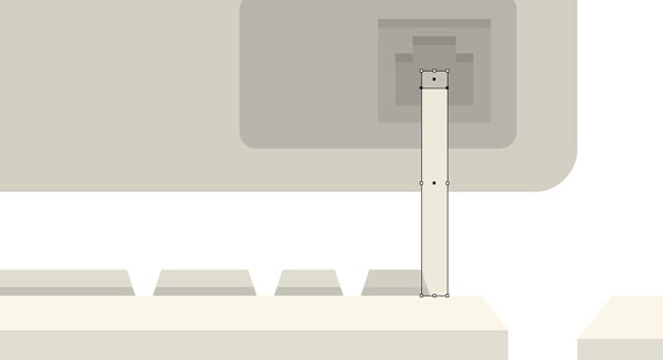
As you’ve noticed by now, our peripherals are ready but they look as if they are “wireless”, a thing that the old mighty mac did not have. To correct this, go to the cables layer and create a rectangle with the following values:
- width: 6px;
- height: 52px;
- color: number 2;
- position: x: 531px / y: 606px.
Next add a shadow to the top part by creating a 6 x 4px object, position it at the top of the previous element and then color it using number 5.
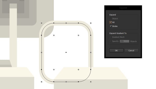
We now have the cable for the keyboard but how about the mouse? Grab the rounded rectangle tool, draw a 40 x 48px object with a 10px corner radius. Change its color to number 2, then flip the fill to a stroke by pressing shift + x and position it after the following coordinates:
- x: 574px;
- y: 620px.
With the object still selected we need to expand it so go to Object>Expand and in the popup box select both fill and stroke.
Now we need to get rid of the left and bottom sections of the form. Copy the bottom rectangle from the mac bottom part layer and the top part of the mouse from the peripherals layer and paste them both into the cables layer on top of the rectangle we created above. With all three of them selected, go to the pathfinder panel and click on minus front.
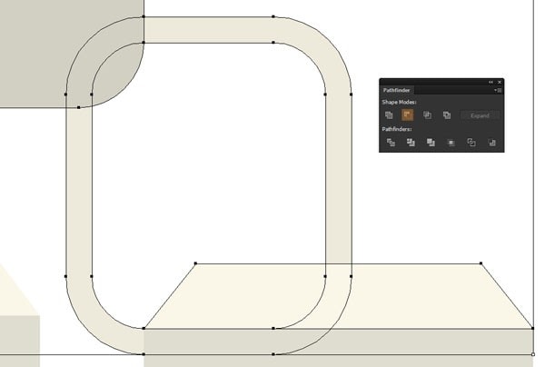
As you can see we now have the cable section we need and an unnecessary section that we can delete by selecting it with the direct selection tool and pressing Del (delete).
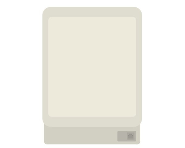
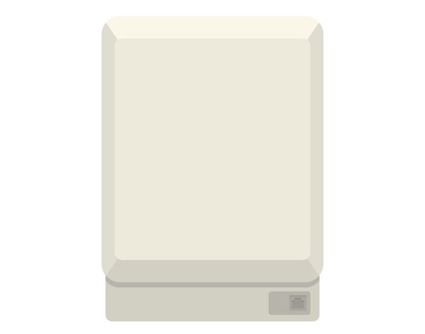
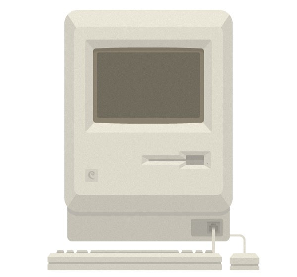
At the end of this step, you should now have the entire Macintosh composed and ready for the “aging” process.
Step 5 – Aging our Mac
5.1. Adding textures
Our Mac is almost done, all we need to do now is add some details so that it can tell its real age. To do so, we will add individual textures to the different components of our illustration.
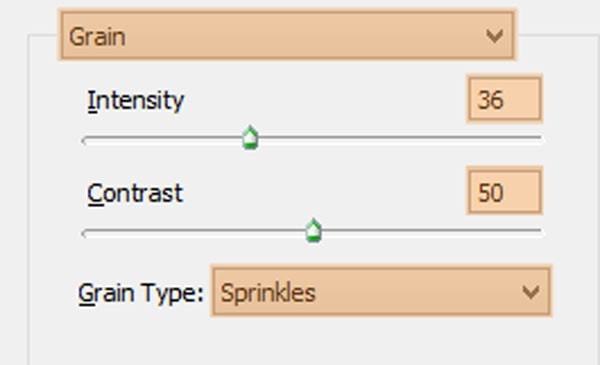
First, unlock the mac bottom part and copy the base rectangle and then paste it on the bottom texture layer. Change its color to #443C2E (R: 68, G: 60, B: 46) and then having it selected go to Effect>Texture>Grain and set up the following values:
- intensity: 36;
- contrast: 50;
- grain type: sprinkles.
Next go to the Appearance panel and change the blending mode to multiply and lower the opacity to 14%.
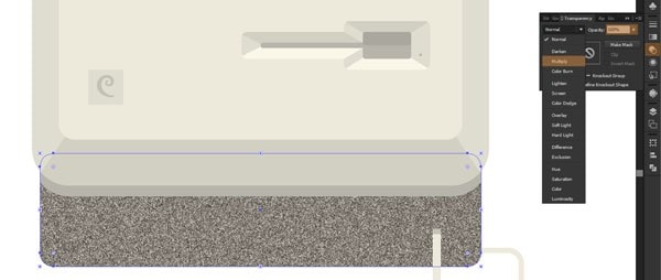
Do the same for the peripherals, mac top part, and cables. For the display copy and paste in place the top rectangle, change its color to #999999 (R: 153, G: 153, B: 153), apply the same grain texture effect (using the values from above) but instead of multiply change the blending mode to Soft Light and lower to opacity to 50%.
It’s a little bit rustier and it’s definitely an improvement over the pure version but we still need to add some effects to get it right. This is when gradients come out to play.
5.2. Adding gradients
First unlock the gradients layer and then using the direct selection tool copy all the main objects that form both the mac, and peripherals to the above mentioned layer. Select the top and bottom components of the computer and using the unite function in Pathfinder combine them into one object. Do the same for both the keyboard and the mouse.
Next select all 3 objects (the mac main body, the keyboard, and the mouse) and go to the gradient panel and give it the following attributes:
- type: linear;
- angle: 45º;
- left color: #1A1A1A / location: 0%;
- right color: #FBB03B / location: 86%.
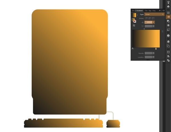
All we need to do now is change the blending mode to Color Burn and lower the opacity to 34%. As you might have seen, we need to apply the same process to the cables but because the objects need to be layered under the peripherals we couldn’t have positioned their gradients on the top most layer as it would have interfered with the gradient from the keyboard.
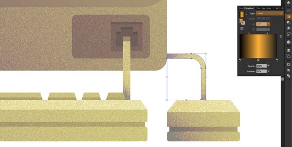
So to fix this, copy the right cable from the cables layer onto the cable gradients one, and create a 6 x 24px rectangle (position – x: 531px / y: 620px) which will cover the section that comes out of the actual mac.
Now if before we used the same gradient values for all of the gradients layer, for the last two we will need to adjust them a little.
Use the same color values for both of the cables, but change their location and angles as bellow:
- left cable gradient
- location: greenish black to 20% and the light orange to 100%;
- angle: 45º;
- right cable gradient:
- location: greenish black to 0%, light orange to 50% and add another color same as the first at 100%;
- angle: -45º.
It might have been a long journey but if you followed my steps I’m sure you got yourself a darn good looking Macintosh, and in the process learned some useful tricks that you can use and apply on other projects you might encounter.