Four Design Lessons from Material Design Documentation
Material Design is a new visual language Google created to unify its various products. When Google announced the material design concept, it also released some documentation to allow curious minds to browse through their visual guidelines.
The Material Design document is a wonderful resource about how design should be handled.
Google’s document is great for new designers that wish to learn from an industry leader to see how a visual aesthetic is created. It’s also a great resource for experienced designers to see how Google thinks. It’s a well organized and thought out document that brings insight to the minds of Google’s designers. The document includes plenty of lessons; I’ve read through it and want to share with you some great takeaways.
Use Motion to Build Meaningful Relationships
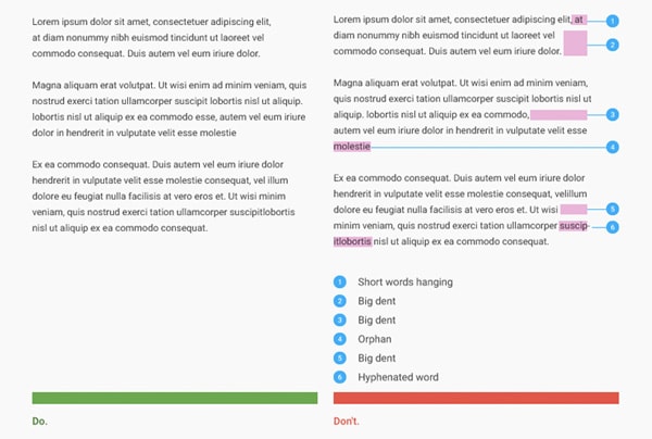
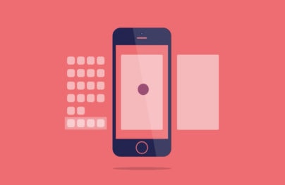
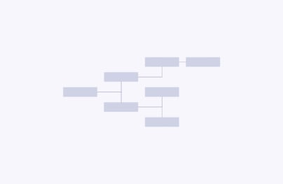
Material Design puts a lot of emphasis on motion and animation within design. A big reason for this is to allow a user to clearly see how his actions impact an interface. Google uses an example of adding an image to an album. If you take a look at the example below you’ll notice that the overlapping interface fades in and out. This is for two reasons: clarity and delight. First, it establishes a visual hierarchy for a user who sees that one of the interfaces in on top of the other. Although this is technically not true because interfaces don’t have layers; it allows the user to comprehend the interface in an easier way. That’s clarity.
Compare that to the next image where the transition is actually nonexistent and the overlapping interface just appears. It’s jarring – which is the second reason fading in and out is preferred – it also doesn’t establish any visual understanding. The new interface just appears and doesn’t give the user any understanding of the relationship between his action and an incoming visual change; that’s a missed opportunity to delight.
With Postcards Email Builder you can create and edit email templates online without any coding skills! Includes more than 100 components to help you create custom emails templates faster than ever before.
Free Email BuilderFree Email Templates“Avoid hard cuts. Hard cuts are jarring and make the user work too hard to understand the transition.” Visual Continuity
Pay Close Attention to Typography
The Material Design guide has an extensive typography section. The obvious takeaway is to pay attention to typography in order to provide the best possible reading experience. This will help make the overall experience better. So many designs put focus on UI details like buttons but how may actually cater to typography? It’s not something often talked about. Within the typography section you see how much effort Google’s designers put into it.
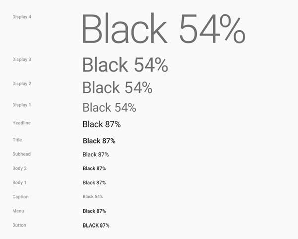
“It makes sense that text that is the same color as the background is hard to read. What’s less obvious is that text with too much contrast can dazzle and be hard to read. This is especially true against dark backgrounds.” Standard Styles
Things like line height and color have been specifically defined to bring about the best possible experience for a user. Even Roboto has been redefined to improve its legibility across various platforms. Furthermore, the way a paragraph is displayed matters because having gaps and orphans make reading experience harder. Paying attention to and eliminating things like hanging short words or hyphenated words goes a long way.
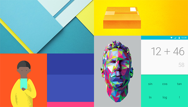
Take Advantage of Color
One of the first things most people notice about material design is the bold and bright color scheme. If you take a look at the color section of the documentation you will see so many colors. This is a great thing for a few reasons. First, bold colors are an amazing way to give any Google UI a personality. There is nothing wrong with creating a design with a fantastic color scheme; it’s a nice change as when iOS7 came out, it celebrated light gray scale colors. Additionally, the way Google sets up the guidelines for color is clear and makes for a great reference on how to use color well.
Let’s face it, color can be scary especially when there are a lot more hues to choose from. Although Google provides an enormous color range, it has some great guidelines on how to use them. Google starts out by stating the obvious: Limit your color choices, use varying shades of gray when needed and use accent color wisely.
With Startup App and Slides App you can build unlimited websites using the online website editor which includes ready-made designed and coded elements, templates and themes.
Try Startup App Try Slides AppOther Products
“Bold use of color in large fields in the UI is strongly encouraged. Different elements in the UI will take on different parts of the color theme. Toolbars and larger color blocks will take on the primary [color]. This is the main color of your app. The status bar should be the darker […] tint of your primary color.” UI Color Application
It All Comes Down to Usability
One of the last sections within the material design document seems to be of great importance. The usability and accessibility section mentions a lot of questions a designer needs to think through when creating an app or interface. This section serves as a reminder that your design needs to be accessible no matter what.
“A product is accessible when all people—regardless of ability—can navigate it, understand it, and use it to achieve their goals. A truly successful product is accessible to the widest possible audience.” Accessibility
The document is asking you to answer some serious questions about how your product is accessible without sound, color or a screen. Can a user with disabilities use your product with ease?
This section of the document jumps into specifics for navigation, readability and guidance and feedback to give you a clear idea of what kind of concerns your product needs to address. If you read through it you’ll notice that some of the issues pointed out are obvious things such as making sure that minimum touch screen element is 48 pixels by 48 pixels so that a typical human finger can interact with the element without being too small. Some are more specific, like making sure links have a proper and meaningful title.
“Give meaning to your links. Is the purpose of each link clear? Generic anchor text like “click here” does not explain a link’s purpose. Put the purpose of the link in the link text itself. A better solution to “click here” is a concrete link like “Device settings.” Some assistive technology modes let the user scan just the links, ignoring other content, to make navigation more efficient.”
With the wide increase of technology users, it’s so important to pay attention to usability. It’s nice to see a whole section dedicated in the material design documentation to usability and accessibility to keep as a reminder that our products – no matter what they are – need to be accessible by all sorts of users.
Conclusion
I encourage you to take an in depth look at the Material Design documentation which is available free online. It’s an amazing resource filed with great advice and takeaways. It serves as a learning tool for new designers as well as people interested in learning more about interface design. It’s also a great refresher for experienced designers who want a sneak peek into the design mind of an industry leader.

 siter.io
 pulsetic.com
 static.app
 mailpost.io