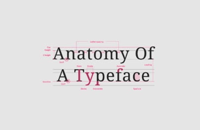
Misalignment and Asymmetry in Web Design
I have here a collection of interesting looking websites. The various elements, whether it is text, links, images or dictation they are misaligned, one on top of the other with lack of symmetry. They are most certainly something else. I truly hope you will enjoy this collection of website which not only look good but are also so different than we are used to.
Quechua
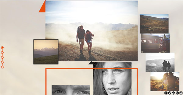
This website is a long single page look book for some camping and traveling gear and fashion. It poses a lot of different sized images, one on top of the other. As you scroll things are moving, flowing in and telling you a story about how you too could be camping or climbing in or with their products. This type of layout works well with fashion as it tends to favor high end design styles that this type of layout evokes.
Steph Orozco
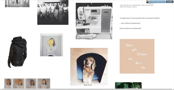
Once again we have a fashion website however this time it is a blog of a fashion designer Steph Orozco. This Tumble theme is something else because all of the various images and text look as if they have been thrown around a bit, they don’t necessarily overlap but they are not aligned in a typical grid that most blogs favor – especially tumblr. Once again we have a design that is after high end feel and this type of careless content scattering coupled with the designer images accomplishes that very well.
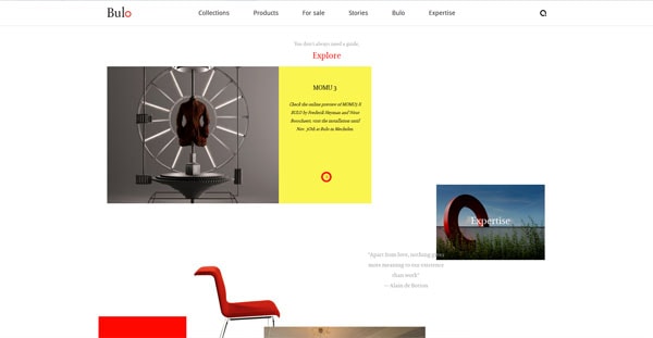
Bulo
With Postcards Email Builder you can create and edit email templates online without any coding skills! Includes more than 100 components to help you create custom emails templates faster than ever before.
Free Email BuilderFree Email TemplatesAs you can see, there is a theme for high end design this time from a product design website. Compared to the previous two examples this site feel a bit more airy as there is less going on at one time. In the screenshot provided there is a lot of white space and much less content. The juxtaposition between the white background and rich, vibrant images is stunning. Once more, high end feel is well achieved thorough out the whole website.
A chronology
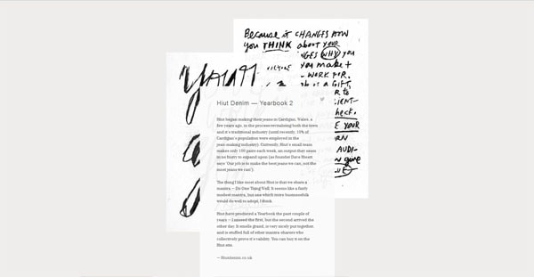
I personally love the design of this blog; it is unique, it is intriguing. As you scroll you are presented with a short letter that is companied by a few images that relate. The images are not breaking up the actual post; they are there in addition to it, to support it – not to interrupt it. On top of that, the layering between the post itself and the images is very well done; it looks good and cool.
Curious Space
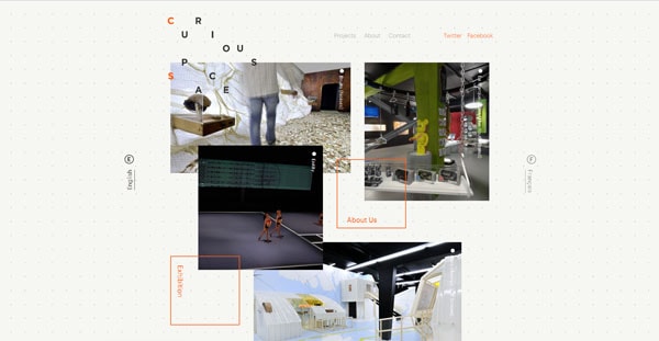
Talk about high end stuff, this is a website for a design stupid which creates “unique and inspiring spaces for museums, galleries, public spaces and performance”. It makes sense for them to have a creative website where elements are different – are layered one on top of the other. Their logo is so weirdly arranged, it is cool! It is such a refreshing feeling to look at their website as they are not afraid to be themselves.
Il-Ho Jung
Although this website has a modern feel to it, it doesn’t have as much going on as other examples here. If you take a look, you’ll notice that their links are limited in numbers, yes, but they are also all around the border of the browser window. That is definitely unique, especially since none of the links seem to be aligned to anything. Additionally, the graphics in the home page slide show, they are totally cluttered which draws your attention right to it, how clever.
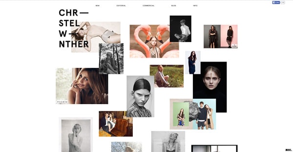
Christel Winther
With Startup App and Slides App you can build unlimited websites using the online website editor which includes ready-made designed and coded elements, templates and themes.
Try Startup App Try Slides AppOther ProductsAnd here we go with a fashion model’s website whose homepage is filled with small photographs showing off some of her favorite shots. As a professional portfolio, this website’s home page is so perfect, so to the point. Maybe we designer should too consider just throwing our screenshots onto the home page, carefully reshuffle them and leave them on display?
Owl Optics
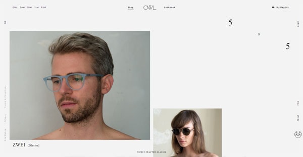
This eyeglass and sunglass company has a very specific target audience in mind. I can assume that they are after 20 to 40 year olds who enjoy classy and modern lifestyle, especially when it comes to the way they dress and accessories. I find the choice of naked models interesting. Although you can’t see much but their heads I think it is unique for them to only wear the glasses – there is no t-shirts or hats to be distracted by, just the products themselves.
iErnest
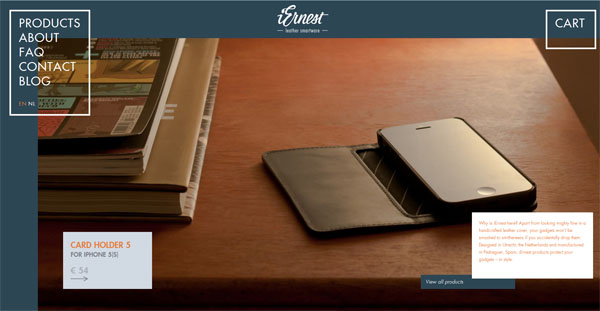
iErnest is a product collection of iPhone and iPad cases which are made up of high quality leather and product design. They are not tremendously expenses but are on the higher side for sure. The product present itself very well, the photography depicts a certain more luxurious lifestyle for the product owner. I find their choice of having more eclectic website design a very good choice to complement the type of feel the product is after.
Ola Kvernberg
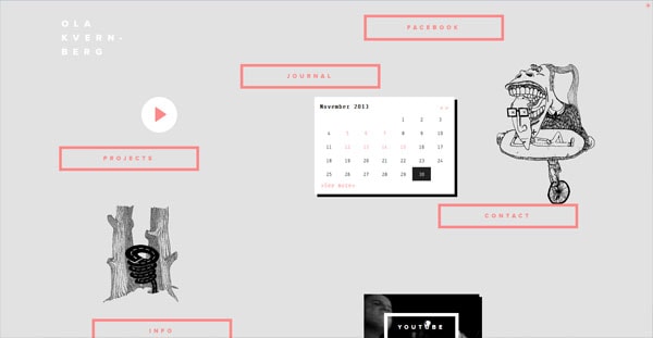
This is by far, one of my favorites form this collection simply because the overall website has such quirkiness to it. It is a portfolio of a musician, a violinist, and it doesn’t seem like such until you take a look around. The interesting drawings, the overall layout and minimalism is not something I would expect from a musician; but hey, I have a great feeling that is exactly the point. As you navigate the site you can see that a traditional website is not something they were going after.
Oliver Staub
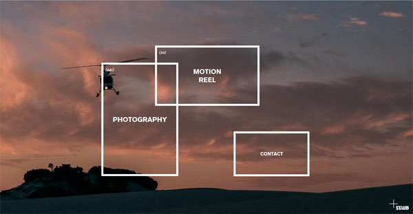
Ah, once again we have another portfolio this time of a photographer, cinematographer and director. The website has a very artistic feeling; it is minimal but to the point. There is very little, if any, distractions and clear directions which you could take in order to explore the various work Oliver is showing off or about Oliver himself.
Andrzej Capinski Studio
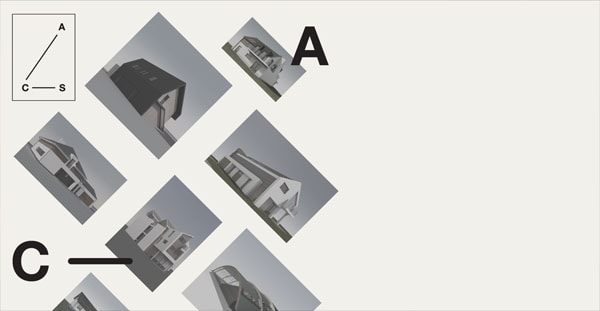
Here we have a studio of a Polish architect who seems to have a love for all things simple and all things modern. You can bet that he has only specific exclusive client types. Not everybody is going to be comfortable with an architect with such minimal and odd portfolio and frankly that is obviously who Andzej would not want to work with. I think his portfolio is fantastic and it speaks to the character of the type of work he enjoys doing as well as character of him.
Ende
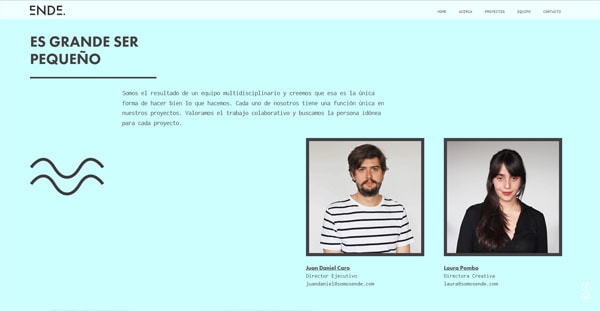
This studio’s website is very much modern and displays the individuality and the culture of the firm very well. Here we have another firm who is targeting a specific type of client, someone who understand fine art, modern design and uniqueness. I find that although this website is very clean, the unaligned elements, the changing background, the typography choices and overall design style of this whole website is friendly and I would be very comfortable working with the people representing this studio.
Sjobygda
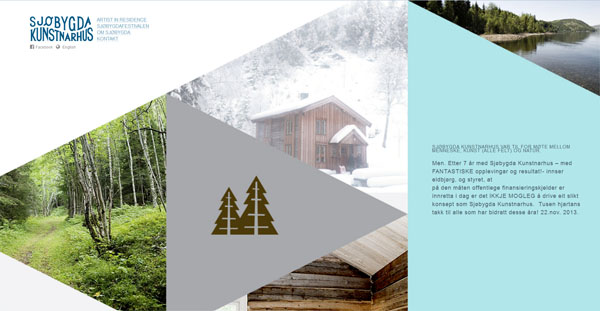
Although this website doesn’t have anything overlaying anything else, it does have a very unique layout that is not only interesting but very pretty. It definitely grabs your attentions and draws you in. The colours are calm but the photography just awesome. The triangular motif we have going on here is different, it stands out and, most importantly, it works. From a purely design standpoint this is one good looking website.