Tips and Tricks to Design with Pixel Perfection in Adobe Illustrator
Ever since Adobe Illustrator was launched, people wondered if they could make the transition and change the way they create and develop pixel-based artwork. As you know, before CS5 using Ai for vector pixel work was a kind of hard/clumsy process. Why? Because as opposed to Photoshop, which is a raster based software (which deals straightly with pixels), Illustrator is a vector program (that deals with points, lines and curves all mathematically drawn). In Illustrator’s early days, it wasn’t perfectly adapted to deal with the raw force of pixels. Luckily over the years things have changed for the better, and with the most recent CC version, Illustrator is becoming the “go to” tool for designers with pixel perfection in mind.
There are a lot of articles that show the ins and outs of setting up and using Illustrator, but unfortunately there is some fragmentation of information. Here, I’ll share my prepping process that has proven to work great.
Before we begin I feel that I need to make sure that all of you reading this article get to understand that creating pixel based artwork as the terms suggest is a process of creating for the digital medium but things don’t stop here. At this point you might say “OK so when I want to design stuff for digital displays I’ll go this way and for print I’ll just use the regular settings I got used to.” Not at all. In most cases (there are some situations where you won’t want to use this approach: hand drawn artwork, illustrations with more organic curvatures, etc.) the best way to design for both mediums is to embrace a pixel-based process.
Hypothetical situation: You’re working on a project that involves creating for digital and print mediums. You might think, I’ll make two different documents, one in which everything is aligned to a pixel grid (the stuff you need displayed digitally) and another one in which everything is loose to float all over the place (stuff that has to get printed). Well that could work out just fine, but why not try and do them both as intended for digital.
As you might know, the only difference between digital and print design (besides the RGB vs CMYK) is the quality of the raster effects, which you can easily change at any point by going to Effect>Document Raster Effects Settings and choosing a higher value such as 300ppi (compared to the lower 72ppi recommended for the screen). So you could just create a crisp design and just as well print it, after you make some color compensations. Simple as that.
Now that I’ve pointed that out, let’s see how we can prep for pixel perfection.
With Postcards Email Builder you can create and edit email templates online without any coding skills! Includes more than 100 components to help you create custom emails templates faster than ever before.
Free Email BuilderFree Email TemplatesStep 1: Understanding the “Pixel Grid” Concept
You’ve probably heard of “align to the pixel grid” and some of you might be wondering what exactly that is. Every digital display is pixel based, which means it has both the height and width set in a pixel value. When working with Illustrator, to align an object to the pixel grid means to tell the program that it will occupy a specific position on the artboard but more important, its anchor points (that define the form) will be set at the intersection of 4 pixels (the gridline intersection). The difference between an object that is aligned and one that is not can be easily seen if it has rounded corners and curves but most important when working with small artwork that needs to look crisp.
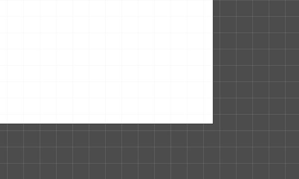
Here you have an example of two simple rectangles (both the same size), onto which I’ve zoomed in to demonstrate the sharpness of pixel aligning. As you can see while the left one looks super crisp, the one on the right is fuzzy, looking as if it was anti-aliased.
![]()
So what went wrong? This did.
![]()
As you can see now, each corner of the left rectangle perfectly aligns at the grid intersection, whilst the right one tries to align to the center of an actual pixel, which in the end produces a fuzzy effect. This is something that can be easily explained by the fact that a point, or object can’t occupy half a pixel, or a certain part of it and look crisp. As the actual rectangle is composed out of pixels, each and every one of them must occupy an entire pixel off the grid so that things get aligned properly and end up looking sharp. If you were to print the two rectangles, you wouldn’t see any difference because printers aren’t pixel dependent.
What happens if you have curves? When it comes to curves, Illustrator applies an anti-aliasing process that in the end gives it a clear look. As with any other object that you align to a pixel grid, anchor points (start and ending) that form the curve need to be aligned to the grid, too.
Let’s take the first step to creating artwork that is intended to look as crisp as possible.
With Startup App and Slides App you can build unlimited websites using the online website editor which includes ready-made designed and coded elements, templates and themes.
Try Startup App Try Slides AppOther ProductsStep 2: Set Up a New Document
There are three key aspects for when setting up a pixel perfect document:
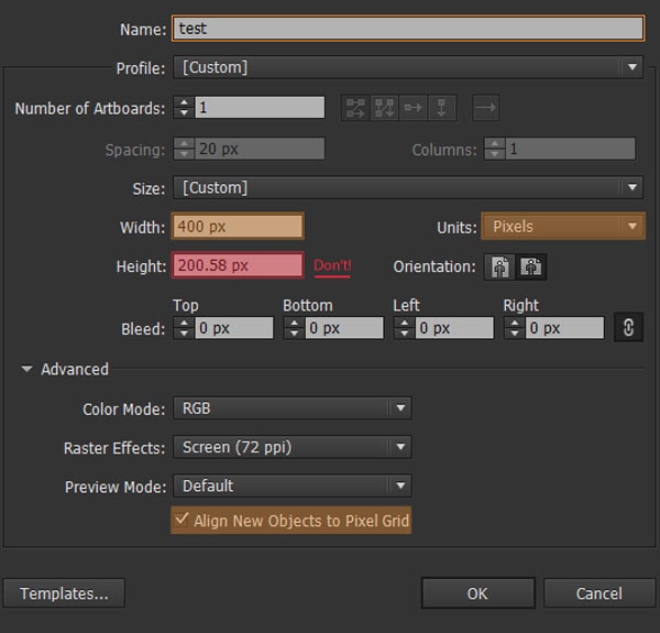
Document size (width and height): When setting dimensions of the artboard always input whole values and never numbers followed by a comma (for example the value 200,58px for the height) – if you do set comma delimited values, you will end up with an artboard that has (depending on where you input the value: height or width) it’s lower side or right side protruding toward the interior of a pixel instead of the intersection of four different pixels.
Quick tip: If you accidentally set up a document with wrong values, you can always modify it using the Artboard Tool by pressing Shift+O and then Enter. A new dialogue box will pop up letting you modify both the width and height of the artboard. After you set the right values, you need to go into Pixel Preview Mode and make sure the artboard is correctly aligned to the grid. If you find it’s not aligning well, grab the Artboard Tool again and click and drag using the mouse until it snaps in place.
- Units: Always make sure this is set to “pixels”
- Align New Objecs to Pixel Grid checkbox: Checked
Quick tip: The Align New Objects to Pixel Grid will only work as the option suggests on newly created objects. If you copy and paste an object from a file that had this option unchecked it will not align until you set it to do so.
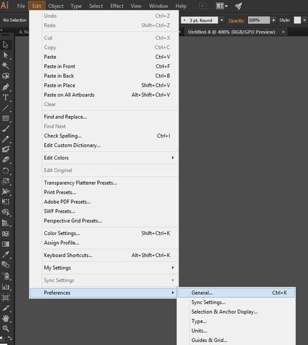
Step 3: Adobe Preferences Settings
Here we will go through some basic settings. In order to get the Preferences Window, go to Edit>Preferences> and click General. You should now see a window, with subsettings and tabs. We will focus on the following:
- General Settings
- Units
- Guides & Grid
3.1. Keyboard Increment Value Settings
Most of you have used arrow keys in order to move artwork around. But did you ever wonder about the actual value of one arrow movement?
With the Preferences Window open, at the General Settings Tab, you can identify the Keyboard Increment setting right at the top.
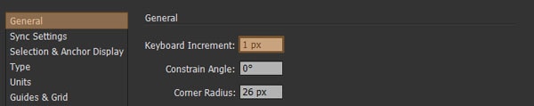
Enter 1. This small value will allow us to move objects by a value of one pixel, making sure they will always stay aligned to the pixel grid.
Quick tip: The keyboard increment uses a pt value instead of a px value. Don’t worry, we will change that next!
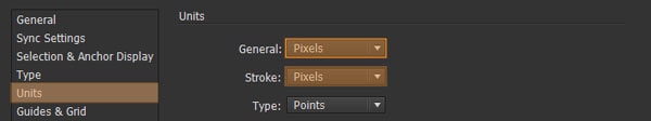
3.2. Setting Up Units
The next important step is to make sure General and Stroke units values are set to Pixels. Navigate to the Units tab (in the Preferences Window) and from the dropdowns make the proper selection.
You might be wondering why we didn’t do the same for Type. I found that as hard because fonts are usually hard to align to the grid. Your best option is to leave it set on points. Also, it would be really weird to get the right dimensions for example if you’re wireframing for an iOS or Android app, as 12px ≠ 12pt.
3.3. Guides & Grid
The Grid is probably the least explained setting, but one that is really important to get right.
The Grid allows us to position things on the artboard. But how do values work? If you take a look at the options at hand, you will see that we have the possibility to set a value for the distance at which the gridlines (vertical and horizontal lines) appear but most important the number of subdivisions it has.
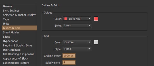
To make things more understandable, let’s say you want to Gridline every 1000px and assign four subdivisions to it. That means that at every 1000px (both horizontal and vertical) you will set a line, which will form a square, that will have four subsquares. Each subsquare will have a width and height of 250px (1000/4=250). Pretty logical, but what does it mean for our pixel perfect design?
Quick tip: In order to be able to see the actual grid you need to go to View>Show Grid (Ctrl+”).
Assuming you have a artboard of 1000 x 1000px, and you create a 250 x 250px square, and most important that you have the Snap to Grid on (View>Snap to Grid) if you try to move the little square around using your keyboard, you will see that for each direction tap you give it, it will jump exactly one subdivision of the grid.
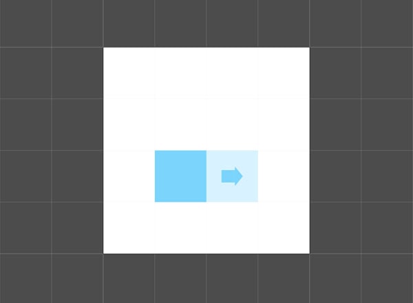
But this is kind of a perfect situation, where the artboard is a perfect square, width and height fit the Grid, and most important the blue object that we drew is the exact same width and height as the Grid’s subdivision. How will these settings stack up against a different scenario? Pretty much they won’t. With Grids you have the option of setting them up differently for different jobs.
There is however a universal solution, that of using a complex Grid that gridlines every 1px and has a subdivision value of just 1. I guarantee that by using these settings you will have total control on your objects and everything will snap like crazy to the pixels on your screen.
Step 4: Understanding the Snap to Pixel Function
One of the most important and helpful tools in Illustrator is the Snap to Pixel function. The option is available once you’re in Pixel Preview mode – if not it will appear as Snap to Grid as you depend on the grid for alignment.
You can activate it by going to View>Snap to Pixel (Shift+Ctrl+”), and what it does is basically instruct any new object to snap its anchor points to the nearest pixel gridline intersection. For example, if you leave this option disabled, whenever you move an object around, it will position itself inside a pixel square, which is exactly where it shouldn’t be. However, if you accidentally moved something around and you’ve noticed it isn’t snapping correctly, select the object, activate the function and then move it back and forward and it should quickly snap back in place.
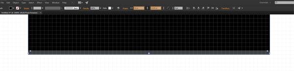
Step 5: The Magic of Pixel Preview
Pixel Preview is the ultimate resource for providing pixel perfect designs. You can find it under View>Pixel Preview (Alt+Ctrl+Y) and once you turn it on, you can zoom in on your artwork and check if it’s aligned properly. I highly recommend you use it.
![]()
Step 6: Correct Use of Measurements
As I pointed out in Step 2, whole values are a must even for objects. If you start building shapes, and one of them has a whole width but a comma delimited height its bottom will never align properly to the grid, making your design choppy or fuzzy depending on the form itself.
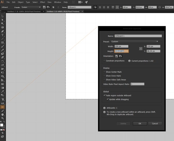
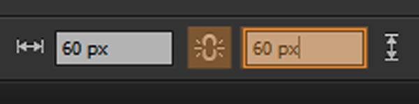
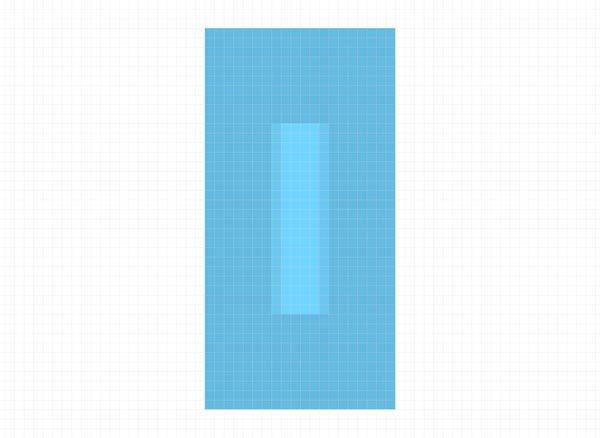
If you accidentally manage to get an object with a weird value, it most of the cases you can fix it by adjusting it. Let’s say I created a 60 x 60.68px square.
As you can see the bottom edge is completely misaligned. What we want to do is first disable the Constrain Width and Height Proportions, change the height to a whole value of 60px and then using the keyboard move the object up and down once to get it back in place. Problem fixed.
Another quick insight, if you start using even values (ex. 2, 4, 6 etc.) try and make all the other objects even. The same rule applies if you build around uneven values (ex. 1, 3, 5 etc.), Why? Well if you have a 20 x 40px rectangle and create another 5 x 20px object and then try to both vertical and horizontally align them you will see that because one is even and one is not, they won’t align properly. So just try to keep a balance between the dimensions you choose to work with and everything will be fine.
Step 7: Dealing with Objects From a Non-Pixel-Aligned Document
One of the biggest problems when working with different files is that you will find that there are a large number that are designed with a non-pixel approach. There is a solution. Simply copy the desired object(s) to your working artboard, select all objects using Ctrl+A and from the Transform Panel (Window>Transform) check the Align to Pixel Grid option.
Note: This will only work on artwork that has whole values. For situations where you have comma delimited values, you will need to manually tweak them (using the steps above) in order to get them properly aligned.
![]()
Conclusion
There you have it, seven simple steps to ensure your artwork looks pixel crisp on any display. I hope you enjoyed this tutorial and learned something useful along the way.