Product Design Process & Documentation Essentials (Part 2)
In Part 1, we looked at sketching, wireframing, mockups, and low-fidelity prototypes as early stage design deliverables. As you progress in design, the visual fidelity may naturally increase as the functionality is finalized.
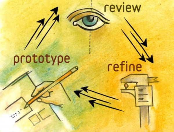
Source: Design Better With Rapid Prototyping
While it might feel like the process is littered with crumpled paper and even a broken screen or two, you can rest assured knowing there is a method to the madness. In this piece, we’ll explain the different forms of documentation you can use as your idea grows into a product design that’s informed by user research. Read on to learn about prototyping principles, high fidelity prototypes, and product design specification.
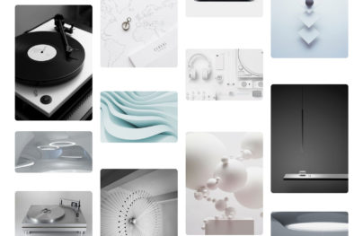
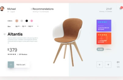
High Fidelity Prototypes
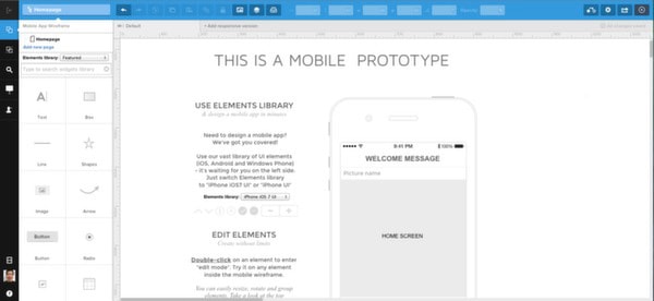
High fidelity prototypes are more suitable when you are in the later stages of UX design and thinking about things like branding, look and feel, and other details. The high fidelity prototype lets you get as close as possible to the real product but still at lower cost. Just like low fidelity prototypes, you can also use online apps or HTML coding to create a high fidelity version.
With Postcards Email Builder you can create and edit email templates online without any coding skills! Includes more than 100 components to help you create custom emails templates faster than ever before.
Free Email BuilderFree Email TemplatesSource: UXPin
According to Marty Cagan, Partner at the Silicon Valley Product Group, high fidelity prototypes can encourage a deeper level of collaboration between product managers, designers, and engineers to uncover what’s needed for a feasible product. Higher fidelity prototypes offers benefits such as:
- An early representation of the full product — Marketing, sales, and business development can all come to a useful understanding of the product early enough so that they can prepare accurately
- Reduced development time — Validating a high-fidelity prototype with users may significantly reduce development since the product is more polished and you may have resolved many of the questions early that otherwise complicate development
- Better idea of scope — High fidelity prototypes provide more detailed information for accurate engineering cost estimates early in the process (when they’re most useful). This is especially helpful if your product introduces new technology.
Regardless of the fidelity, Smashing Magazine author Lyndon Cerjeo suggests that prototypes should be built piece by piece rather than in a single iteration. An effective approach is to start prototyping broadly and widely and then diving deep into selected areas of the solution with higher fidelity. For example, the first iteration of a website prototype would build out the key landing pages while further iterations could be higher fidelity and drill down into specific website sections (such as the steps you’d take to download something).
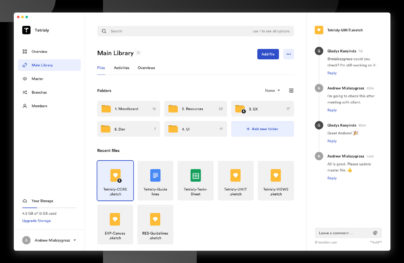
Product Design Specifications
While prototypes show interaction and aesthetics, design specifications describe the processes and artistic assets needed to make all that work.
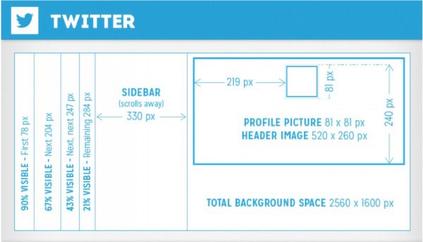
Source: Twitter Design Specs
Design specifications consist mostly of user flow & task flow diagrams which outline the functionality and asset & style requirements which explain the creative and technical details of the visual identity. For tips on user stories and job stories, check out the Guide to UX Design & Process Documentation.
1. User Flow Diagram
User flows, or journeys, map the entire realm of circumstances and decisions that influences how someone achieves their goal. This is highly comprehensive and includes the moment the idea forms in the user’s head until when the goal is achieved.
With Startup App and Slides App you can build unlimited websites using the online website editor which includes ready-made designed and coded elements, templates and themes.
Try Startup App Try Slides AppOther Products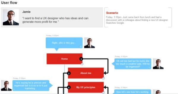
Source: Breaking the UX Status Quo
A user flow diagram maps out broad goals such as planning travel, or like the above diagram, hiring an employee. For example, two people seeking to purchase a CD online may experience completely different journeys. One might enter Amazon.com via the address bar, search for an album with intent to buy, and add to basket while another might search on Google, click the first result, browse reviews online, compare CDs, and dive deeper into detail before entering the buying funnel. Therefore, your user flow diagram could become quite complex.
According to Wireframes Magazine, the above Speech Bubble User Flow is an effective method of focusing on the thoughts and needs of real people as you create the product interaction. As projects build momentum, it can be easy to get lost in the technicalities of the product. The Speech Bubble User Flow ensures that you don’t lose sight of the personas you developed in the Analysis stage.
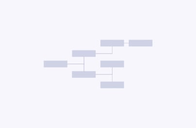
2. Task Flow Diagram
If user flows are holistic in strategy, then task flows are microscopic in execution. Task flows describe specific and repeatable series of actions such as setting the alarm time on an alarm clock app.
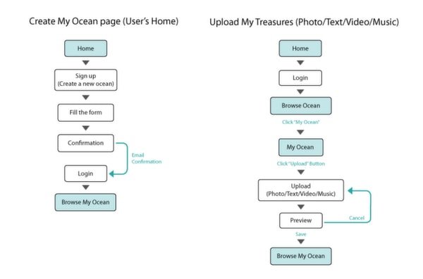
Source: Task Flowchart
As you can see in the above example, task flowcharts are less visually sexy than user flows since they describe almost algorithmic processes. But they are essential to helping you streamline the steps that must be taken to accomplish everything your product promises.
3. Design Assets & Style Requirements
A product style guide is often used to outline the aesthetic and technical specifications of the look and feel. Product style guides will include everything from brand rules describing what emotional states to achieve to technical specifications like specific pixels, file formats, and overall size/dimensions of design assets. The guidelines may be brief and loose to promote creativity like Mozilla’s “brand toolkit”, or precise and exhaustive like Apple’s “Human Interface Guidelines”.
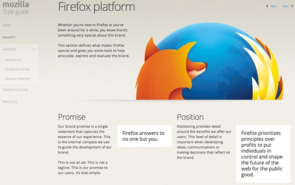
Source: Firefox Identity
Brad Haynes, Product Designer at Salesforce, built the Salesforce style guide around the product rather than a concept. Faced with repetitive questions from his team, Brad was able to create uniformity in Salesforce’s look and feel by reimagining it as a mobile app. The core of the new product style guide contained the following elements:
- Principles — Guidelines related to hierarchy, alignment, and simplicity were clearly laid out to explain the reasoning behind the product design
- Colors — A small snapshot of the color palette was shown to give just enough information without overwhelming the design team
- Typography — The design was kept simple by constraining to only one font and listing specific font weights
- Iconography — The full system and library of icons (along with technical details like pixels) were provided
At Yelp, the style guide is taken a step further as a livable document that benefits designers as well as developers. Their style guide even includes snippets of code to help reduce technical debt. As a result, the collaboration between their design and development team actually helped reduce the time needed to create new features since the teams could work off of reusable lines of code and updated design pattern libraries.
For additional best practices, you can check out these product style guides from Google, MailChimp, and Salesforce.