Responsive Typography: A Quick Tutorial
Typography is a primary way in which we communicate information. It’s true for print, websites and even TV commercials. You can’t disagree that typography is a powerful design element. However, getting it right can be a bit tricky. Typography is not one-size-fits all, yet that’s often how we approach it on the web. We understand the value of responsive design but seldom do we design responsive typography.
I plan to show you that responsive typography important and also easy to achieve.
Typography Is a Big Deal
Typography is a fundamental building block in design; we all know this. In web design, typography had a rough start – like a lot of design elements; we didn’t have technology that displayed fonts well or even supported many of them to begin with. Creating a baseline alignment was tedious and just hard even 5 years ago. But thankfully, we’re past those days.
Typography is a big deal because it helps us communicate. When it’s done correctly, our communication becomes clearer and more effective. Readability is big problem all designs need to address. So with that said, let’s design some text.
Set Up Your Content
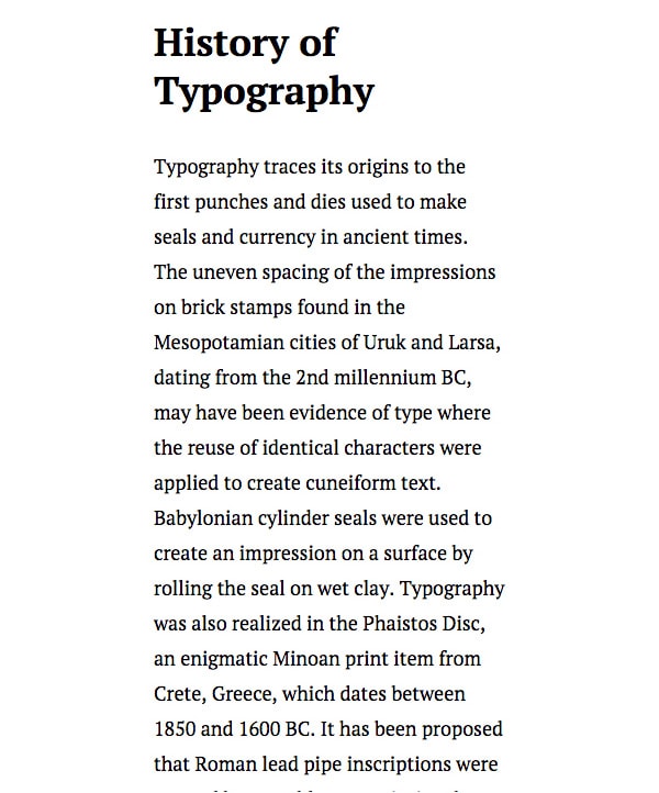
Below you can see an image of content that’s only text. I’ve copied a snippet of text form Wikipedia and placed it into a plain HTML document.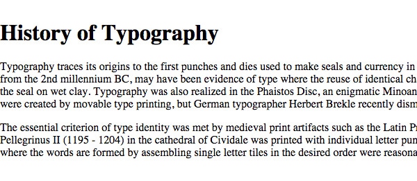
It’s extremely plain. It’s also difficult to read. The screenshot above showcases browser defaults like 16px Times New Roman. It’s just sad, so let’s upgrade it to 18px PT Serif, which is a Google Font.
With Postcards Email Builder you can create and edit email templates online without any coding skills! Includes more than 100 components to help you create custom emails templates faster than ever before.
Free Email BuilderFree Email Templates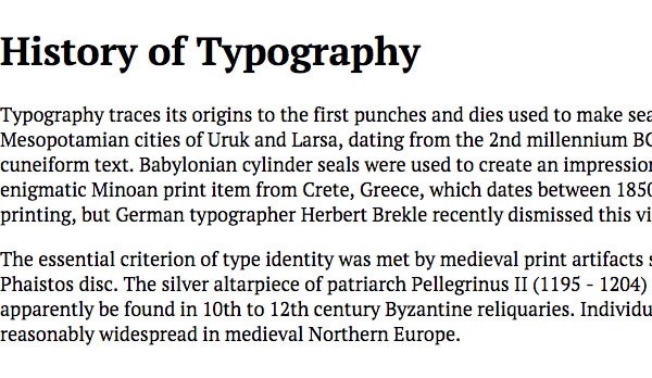
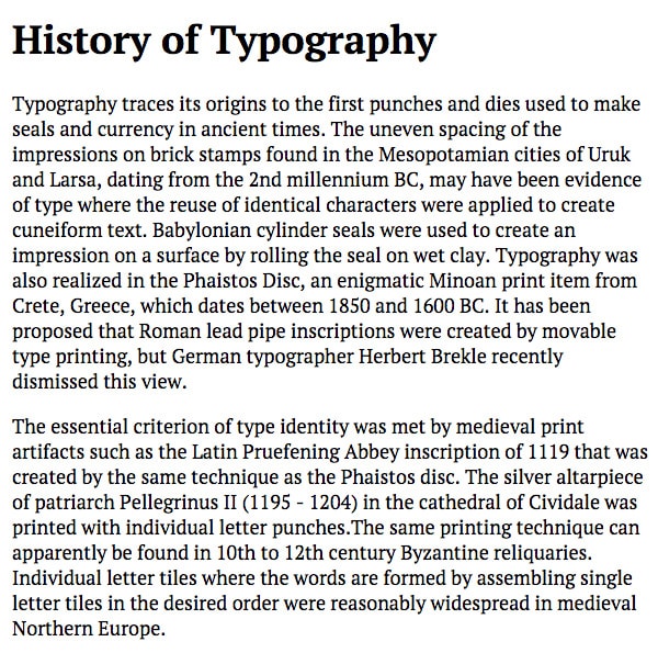
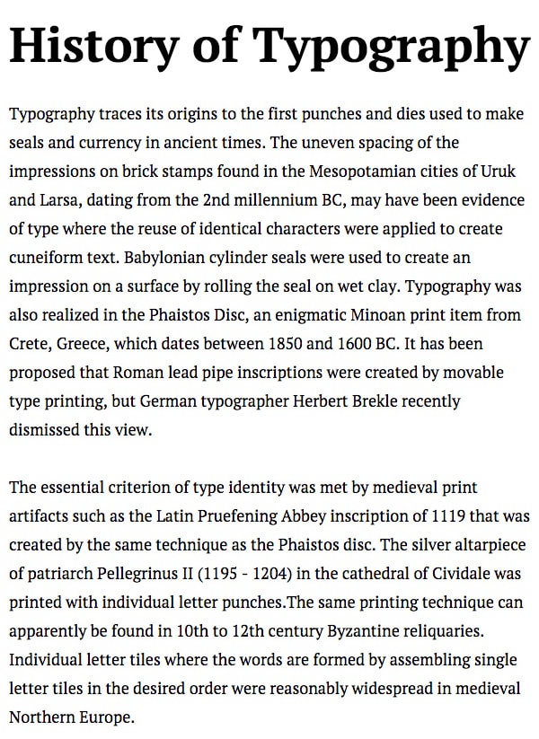
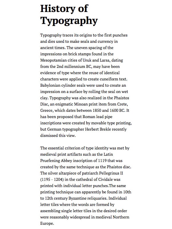
The next thing this design needs to address is number of characters per line, which on a desktop should be 60 to 75 characters. To do so, I set the body width to 580px. Compare the above and you’ll agree that limiting characters per line helps. But it’s only the start.
Create Vertical Rhythm
In our current design vertical rhythm is set by default elements, often dictated differently by each browser. That’s not right. We need to figure out an appropriate line height, margins and font sizes for our typography. I’ve mentioned before I’ve set the default body font size to 18px. That will be my 1em.
Now, some people prefer to do this by eye and other through numbers. If you’re a numbers kind of person, there are a variety of tools to help you with the math. One of my favorites is the Vertical Rhythm Tool by Pascal Cauhepe. Another favorite is Gridlover by Tuomas Jomppanen and Ville Vanninen.
In my design, the paragraph or body font size is 18px and the line height is 1.77, which is 32 pixels. I’m using the golden ratio to scale up the heading, which means that H1 is 3ems or 54px. Below is the break down of the different font sizes. Each of these would be aligned to the same baseline grid that in itself is based on 32px line height.
Font size
P 18px (1em)
With Pulsetic you’ll be instantly notified the moment your website, API, or server becomes unavailable. Monitor uptime from multiple global locations and respond to incidents before your users are affected.
Create beautiful status pages in minutes to keep customers informed during outages and build trust with transparent communication.
Start Monitoring for FreeH1 54px (3em)
H2 45px (2.5em)
H3 36px (2em)
H4 32px (1.75em)
H5 27px (1.5em)
H6 18px (1em)
As you can see this is child’s play; it’s extremely easy to figure out a vertical grid. It’s beneficial when you do the vertical grid first as it helps you determine the horizontal one.
Scaling Down
Many times once vertical rhythm is identified, we move on to other things like color, grids or even layout. Figuring out breakpoints in your grid system is important but you can’t overlook responsive typography. It’s also important to adjust the vertical rhythm based on screen size. Using the same font size and spacing on a mobile device as a desktop is just as absurd as using the same type of grid. A mobile device is used differently than a desktop – meaning reading on it is a different experience too.
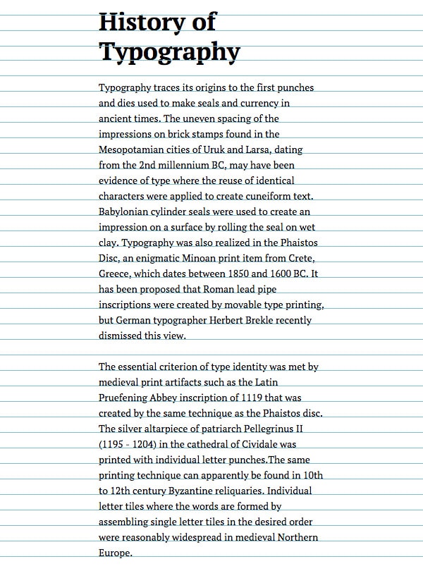
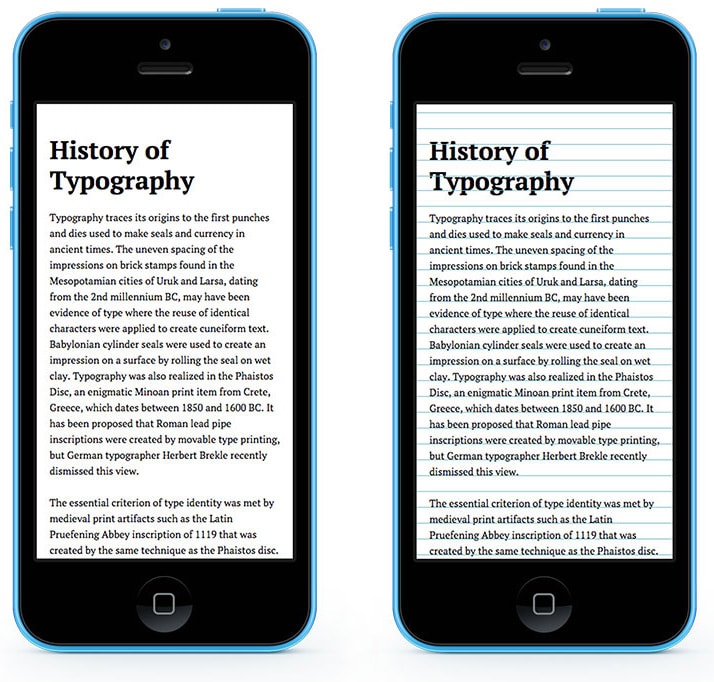
iA wrote an extensive peace on this back in 2012 which holds true today. (You should reading the article, “Responsive Typography: the Basics.”) The premise is that the distance at which you hold and read your phone is different than the distance of your desktop monitor. This, in turn, is the basic factor affecting the reading experience. They are absolutely correct. Proportions of text on a desktop screen versus a mobile screen are different and need to be addressed. Take a look at the below image and you will realize that the 18px body font size is too big for mobile devices. It magnifies the copy extremely and doesn’t provide a good visual balance for a great reading experience. You’ve got scale down the font.
Mobile Vertical Rhythm
When you’re creating the best possible mobile experience you have to look at typography first. In such a tight space as 320px width, all other additional elements – whether decorative, like textures or gradients, or content, like images – have to come second. It’s not that they are less special, they are simply less important than written content. However, the text needs more love than just room to breathe from other element. It needs to be styled appropriately to provide a good mobile reading experience.
The first step in doing so is realizing it’s okay to have smaller font size on mobile. We hold our mobile devices significantly closer to our faces then we do our monitors. This means that having a font size as small as even 14px won’t look as tiny as it would on a computer monitor. It’s been recommended that characters per line on a mobile device should be kept in the 35 to 40 character range.
Setting up the new rhythm
Font sizes: Desktop Font sizes: Mobile
P 18px (1em) 14px(1em)
H1 54px (3em) 35px(2.5em)
H2 45px (2.5em) 31px(2.25em)
H3 36px (2em) 24px(2em)
H4 32px (1.75em) 21px(1.5em)
H5 27px (1.5em) 18px(1.25em)
H6 18px (1em) 14px(1em)
Above is an extension of the previous chart but this time you can compare the scale between desktop and mobile. Further more, I am establishing the line height to be 22px. It seems to be a good and cozy number for PT Serif. If it were a thinner, sans serif font I would be inclined to at least see if a line height of 20px would work well. It doesn’t here; 20px line height makes things too cramped even on a phone.
Jason Pamental did a guest post for Typecast about responsive typography, “A More Modern Scale for Web Typography.” Please read it. He explains why scaling typography is important for different break points. In it he point out three very important points about typography.
“Wow people tend to read; the ease or difficulty in following a line to the end and bringing your eye back to the start of the next line; and quickly understanding the relative importance of various levels of headings between blocks of copy.”
When typography gets those three factors, the reading experience becomes harmonious. He’s absolutely right.
Conclusion
Typography is an important design element; use it appropriately. It’s silly to assume that font sizes and spacing will work across all devices, because it doesn’t. You don’t view your phone the same way you’d view your laptop or desktop monitor. The same holds true of tablets, too. It’s important for responsive design to include different vertical rhythms for each device. You will create a better user experience if you create a catered reading experience for your users. Let’s not forget – typography is a big deal!