How to Create a School-Themed Vector Pack in Adobe Illustrator
Learning something new is not just for the kids; it can be for teachers and educators, too. That especially applies when it comes to creating images for use in class projects or for a school webpage. Luckily for you, we have a new tutorial that will teach you how to create a nice minimalistic school-themed vector pack in Adobe Illustrator.
So let’s start learning!
Step 1: Grab a Pen and Make a List
The first step for creating any pack is deciding what objects will be part of it (in other words, getting the theme right). In this tutorial I chose the following components:
- small calculator
- triangle ruler
- eraser
- sharp pencil
- pack of sticky notes
- iPod shuffle
- pin
- paper clip
- big notebook
So there you have it, nine objects that will form our small pack and give it a geeky feeling.
Step 2: Set Up a New Document
First, it is important to determine whether you’re designing for the web or for print. If we were to design something for the web and at one point decided to print the material out, know that color reproduction from RGB to CMYK will shift, in some case dramatically altering the quality and direction of our design.
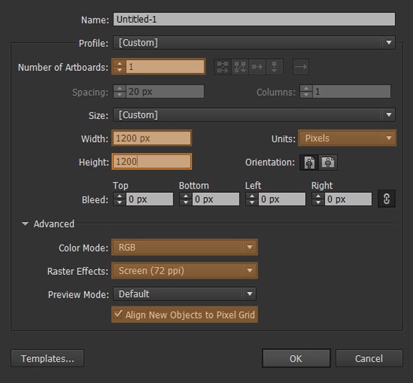
In our present example, we will create something destined for digital use, so without wasting any more time let’s launch Illustrator and create a new document (File>New) with the following settings:
With Postcards Email Builder you can create and edit email templates online without any coding skills! Includes more than 100 components to help you create custom emails templates faster than ever before.
Free Email BuilderFree Email Templates- number of artboards: 1
- width: 1200px
- height: 1200px (yes we will be creating a square artboard, and quite a big one)
- units: make sure you have them set on pixels
And from the Advanced tab
- color mode: RGB
- raster effects: Screen (72ppi)
- align new objects to pixel grid: checked (as we want everything to look pixel crisp)
Also, make sure that you have Snap to Pixel on by going to View>Snap to Pixel. This will ensure that our artwork will be aligned to the pixel grid so that it won’t look chopped on the edges.
Step 3: Building the Objects
3.1. Layering and Centering Our Composition
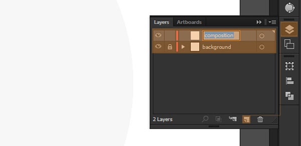
Before we begin creating separate elements so that we can easily access parts of our composition. Using the Layers panel we will set up two layers one for the background and another one for our objects.
Quick Tip: You can easily rename a layer by double clicking it.
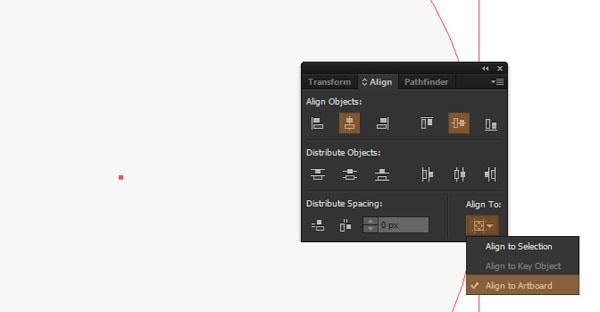
Because presentation is everything, we are going to first lay down a center point to which our elements will carefully align. Grab the Ellipse Tool (L), click on the artboard and create an 800 x 800px circle. As we need it to be perfectly both vertical and horizontal center aligned to the artboard, we will use the Align Panel (Window>Align in case you don’t have it set up) and click on Horizontal Align Center and then Vertical Align Center.
With Startup App and Slides App you can build unlimited websites using the online website editor which includes ready-made designed and coded elements, templates and themes.
Try Startup App Try Slides AppOther ProductsQuick Tip: Make sure that alignment is set to artboard and not to the key object or selection.
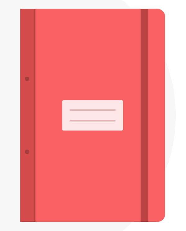
3.2. Building the Notebook
Grab the Rounded Rectangle Tool and let’s create the body for the notebook using the following values:
- width: 400px
- height: 560px
- corner radius: 20px
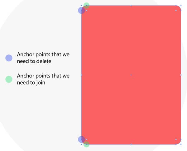
Let’s give it a color so that we can start getting an idea of what we would like to work with. I went with a red tint: F96262 (R: 249, G: 98, B: 98). Now we need to get rid of rounded corners on the left side. Using the Direct Selection Tool (A), select the object and then look for the left-middle centered anchor points. Click the first and while holding SHIFT select the second. With both selected, press DEL (Delete) and they are erased from the structure. Unite the remaining anchor points that hold up the left side. Select both (again with the Direct Selection Tool) and press CTRL + J to join them.
The next thing we need to build is the case liner that holds the book together. Grab the rectangle tool and use the following values:
- width: 40px
- height: 560px
- color: D44B4B (R: 212, G: 75, B: 75)
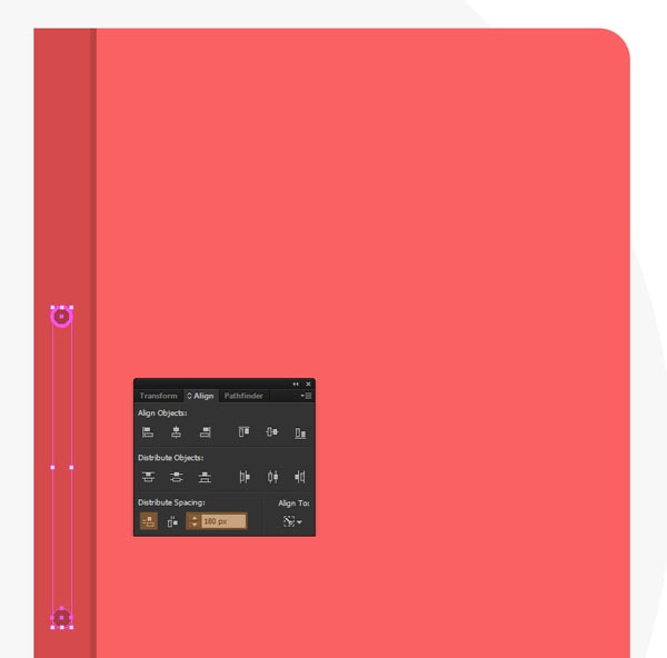
Make another 4 x 560px rectangle (color it BA4242, R: 186, G: 66, B: 66) and right align it (using pathfinder) to the case liner. Next let’s give the cover some bindings. Create a 12 x 12px circle (A53D3D, R: 165, G: 61, B: 61) and then duplicate it by holding down Alt (or on Mac) and dragging the object to the bottom side. Now select them both and vertical align them at a distance of 180px.
Now let’s add another little detail by making an elastic band to keep the notebook closed. Using the Rectangle Tool create a 20 x 560px object (BA4242, R: 186, G: 66, B: 66). Horizontally align it to the main body of the book and then position it towards the right side. Because usually kids love to leave their name written on their objects, we will add a small sticker of 160 x 80px with a rounded corner of 4px. Change the color to FFE6E6 (R: 255, G: 230, B: 230) and add two 120 x 4px lines with 24px in between them. Now group the lines (CTRL+G) and vertically and horizontally align them to the sticker.
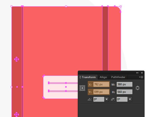
Once the object is composed, you should group all of its elements and position it on the artboard. Select the grouped object and then from the Transform panel (located near the Pathfinder one) input the following coordinates:
- x: 782px
- y: 599px
3.3. Building the Calculator
As before, the first thing we need to do is set up the main body of the object. To do so select the Rounded Rectangle Tool, and enter the following values:
- width: 104px
- height: 132px
- corner radius: 6px
- color: E2E2E2 (R: 226, G: 226, B: 226)
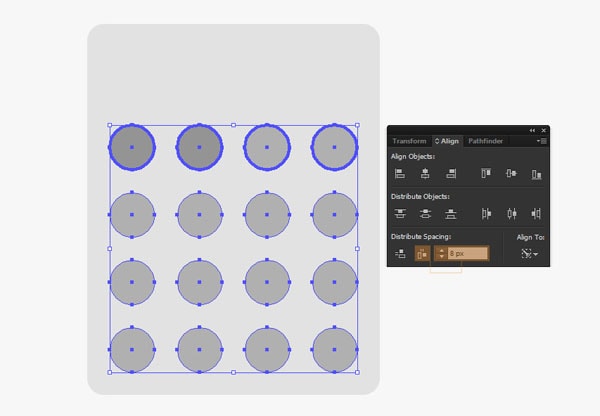
Start adding some buttons. Create a 16 x 16px circle (color it B0B0B0, R: 176, G: 176, B: 176) and duplicate it four times. Horizontally align and distribute them at a distance of 8px from each other. Next group all of them and duplicate them another four times by dragging down with ALT pressed. As before, select them all, click on the first group and vertically distribute at the same distance of 8px. To keep things interesting, change the color of the first two buttons from the top row into 949494 (R: 148, G: 148, B: 148). You should now have something like this.
Now we need to add a display to output the values a regular calculator operates with. Using the Rounded Rectangle Tool draw an object with the following values:
- width: 88px
- height: 20px
- corner radius: 2px
- color: A3A3A3 (R: 163, G: 163, B: 163)
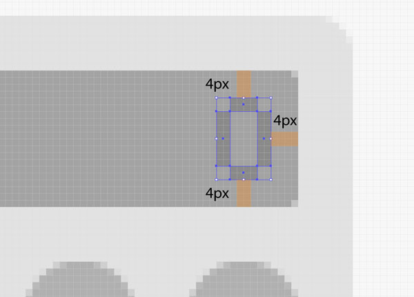
Position the display at 8px from the buttons, group them all, and vertically and horizontally align them to the main body of the calculator. Because we don’t want the display to look dull, we will create and add a zero to it. Draw a rectangle of 2 x 8px, duplicate it and align the pair at a distance of 4px. Now draw another rectangle of 4 x 2px, duplicate it also and align this pair at a distance of 8px. Group each of the pairs and vertically and horizontally align them to each other. Change the color to 8A8A8A (R: 138, G: 138, B: 138) so that it can blend out from the rest of the screen.
OK, now comes the interesting part where we will get to use a little of the Pixel Preview magic.
Go to View>Pixel Preview and now you should be able to zoom in and see the actual grid (stack of little squares) on which our design stands on. This is extremely useful when you want/need to get pixel perfect illustrations destined to be used for the web. Going back to our illustration, we will drag and position our digital zero until it’s has about 4px remaining between it and the right margin of the display of the display, and 4px up and down of it.
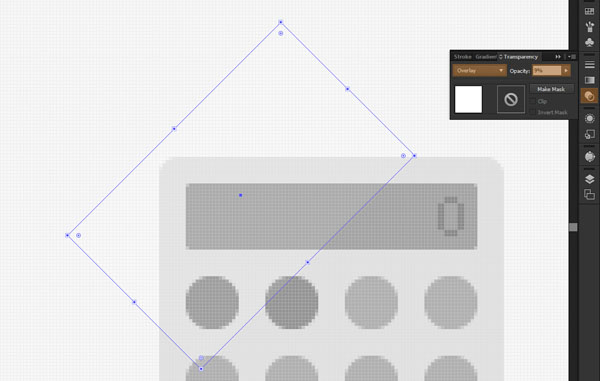
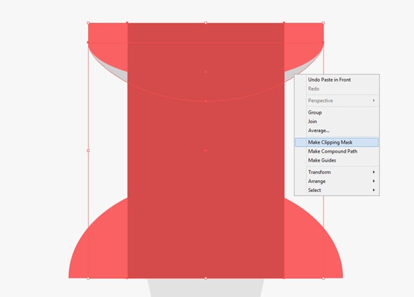
To finish the calculator, we will add a reflection to the display. Create a 80 x 120px rectangle, color it white (FFFFFF) and then rotate it at a 45º angle by pressing R and holding down SHIFT while dragging from one of the corners. Lower the opacity to about 9% and set the blending mode to Overlay. Next copy and paste the display rectangle in front of the reflection select them both, right click and choose Make a Clipping Mask. This will make the reflection fit inside the display which is what we want.
The only thing left now is to specify a position for the object from the Transform tab:
- x: 498px
- y: 403px
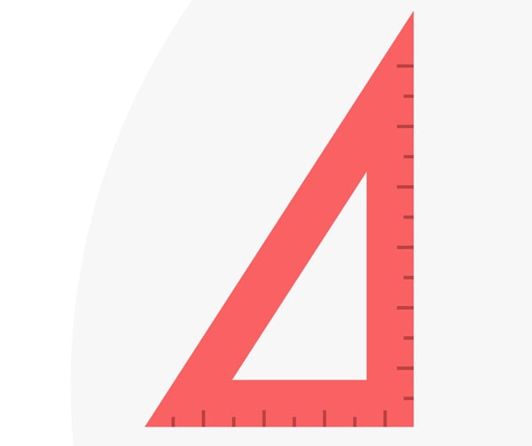
3.4. Building the Ruler
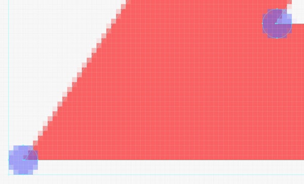
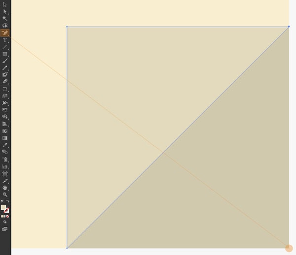
Using the Pen Tool, draw a triangle with a base of 120px and a height of 186px. Change the color to F96262 (R: 249, G: 98, B: 98) and flip the fill with the stroke. Now change the stroke to 28px and expand the object by going to Object>Expand>and select both Fill and Stroke (in the popup box). If you’re still in the Pixel Preview mode, you might see that some corners of the object are not perfectly aligned to the pixel grid. You will need to manually drag and align them to the nearest point (the intersection of two boxes from the grid) using the Direct Selection Tool (A). This is a general rule that you have to follow, so when anchor points get misaligned just drag them to their proper position.
Next we need to add the little measurement lines. Create a 2 x 10px rectangle and multiply it eight times. Horizontally align them at a distance of 16px, now group them and vertically align them with the bottom side of the ruler. Double click on one of the little lines (to enter Isolation Mode) and change the height of four of them to 6px. Once you’ve done this, exit isolation mode (ESC – escape) copy and paste the group in place (CTRL + C – CTRL + F) and rotate it at a 90º angle and right align it to the ruler. You should now have something looking like this.
Finally just position the ruler using these coordinates:
- x: 324px
- y: 501px
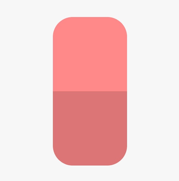
3.5. Building the Eraser
This is probably the easiest part of the process. Make a rounded rectangle with the following values:
- width: 60px
- height: 120px
- corner radius: 16px
- color: FF8989 (R: 255, G: 137, B: 137)
Duplicate the new object (CTRL + C) and paste it in place (CTRL + F) changing its color to DB7676 (R: 219, G: 118, B: 118). Following the same process I showed you at step 3.2., delete the top middle anchor points and then unite the remaining ones (CTRL + J) and drag them down towards the middle of the eraser. The best way to do this would be using the Pixel Preview as you can accurately find the center I told you about.
The final result should look something like this.
3.6. Building the Pencil
Select the rectangle tool and let’s create the basic shape for our pencil using these values:
- width: 16px
- height: 320px
- color: F96262 (R: 249, G: 98, B: 98)
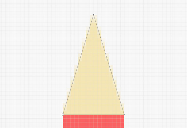
Create the tip using the Pen Tool; starting from the top base of the previous object (the skeleton) create a triangle with a height of 26px. Change the color to F4E5B3 (R: 244, G: 229, B: 179).
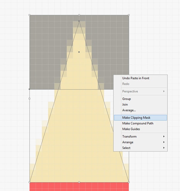
Once we have the tip, make it more real by adding a piece of charcoal at the top. To do this, draw a rectangle (A6A49C, R: 166, G: 164, B: 156), copy and place the tip on top of the rectangle, right click and Make a Clipping Mask.
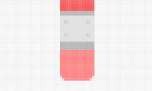
Another thing we need to take care of is the intrusion of the wood part into the painted zone. To do this we will create a 8 x 4px circle (same color as the tip) and we will actually delete the top anchor using the Direct Selection Tool (A), unite the remaining parts using CTRL + J and lower the bottom anchor point by 2px. Once the form is right, duplicate it, and align the two together to the center of the pencil.
Now we need to take care of the other end of the pencil, by adding an eraser. Create a 16 x 16px square (E2E2E2, R: 226, G: 226, B: 226) and align it at the bottom. Then make another 16 x 2px rectangle (BABABA, R: 186, G: 186, B: 186) and align it to the top of the square, and a secondary 16 x 4px rectangle (same color as the previous) which we will align to the bottom of the square. In order to add some details we will make four – 2 x 2px circles that we will position at a 2px distance from the margins of the square.
Last but not least we will add the actual eraser by creating a 16 x 18px round rectangle with a corner radius of 4px. Change its color to FF8989 (R: 255, G: 137, B: 137) and delete to top middle anchor points, uniting the ones that remain. See the example bellow.
To position the object use the following coordinates:
- x: 542px
- y: 691px
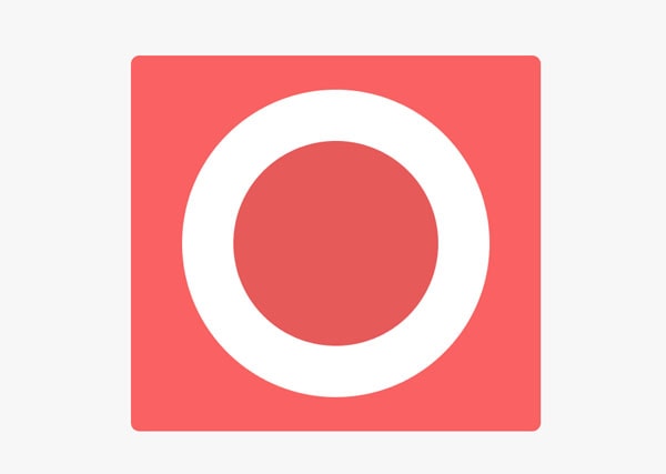
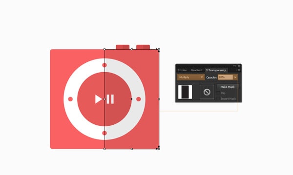
3.7. Building the iPod
Create a rounded rectangle that will act as the main body for the player using these values:
- width: 96px
- height: 88px
- corner radius: 2px
- color: F96262 (R: 249, G: 98, B: 98)
Then create a 72 x 72px circle (color it white) and put it above the previous rectangle. Now make another 48 x 48px circle (E65A5A, R: 230, G: 90, B: 90) and put it above all of the other pieces.
As our iPod is taking shape, it’s time to start adding details such as the front and top buttons. Grab the Pen Tool (P) and draw a triangle with a 8px base and a 6px height, after that rotate (R) it so that the top tip is now facing right. Next make two – 2 x 8px rectangles with a spacing of 2px between them. Group them and after that align them at a distance of 4px from the triangle. Once we have the Play and Pause buttons we can create two – 4 x 4px circles and horizontally align them at a distance of 56px. Then, copy and paste them in place and rotate them at a 90º angle group the pair with the horizontal buttons and vertically and horizontally align them to the iPod’s body.
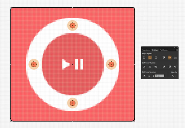
For the top buttons, we will make a 12 x 6px rounded rectangle with a corner radius of 1px. Change the color to D44B4B (R: 212, G: 75, B: 75) and then duplicate and position the second rectangle at a distance of 6px. After selecting and uniting the 2 buttons, push them down 2px and then drag them towards the iPods’ right margin until you have a space of 8px left. To put the buttons behind the main form just right click>Arrange>Send to Back.
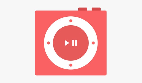
Position the iPod using the following coordinates:
- x: 458px
- y: 717px
3.8. Building the Sticky Notes
As with the eraser, sticky notes are fairly simple to create. First draw a rectangle with:
- width: 120px
- height: 120px
- color: F9EECF (R: 249, G: 238, B: 207)
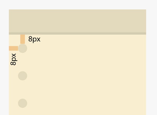
Then draw another 120 x 20px rectangle, color it with E3DABC (R: 227, G: 218, B: 188) and center – top align it to the main form. Then create another 120 x 2px object (D4CCB0, R: 212, G: 204, B: 176) and position it at the bottom of the previous rectangle. Now it’s time to add some details by creating the bullet list dots. Grab the Ellipse Tool and draw a 8 x 8px circle (E3DABC, R: 227, G: 218, B: 188); duplicate it four times and vertically align the objects at a distance of 16px.
Perfect! Now group and position the list at about 8px from the left margin of the main body, and another 8px from the 2px tall rectangle.
Next, create a folded corner effect. Using the rectangle tool draw a 24 x 24px square and right – bottom align it to the main body. Change its color to D1C9AE (R: 209, G: 201, B: 174) then duplicate it and give the new object the following color E3DABC (R: 227, G: 218, B: 188). We now need to cut the bottom right corner so that it will give that folded effect. Grab the Direct Selection Tool click on the anchor point and using the Delete Anchor Point Tool erase it.
Now that we’ve finished our sticky notes, it’s time to place them correctly on the artboard using these coordinates:
- x: 304px
- y: 719px
3.9. Building the Pin
We’re almost there guys so let’s try to focus just a little bit more and work on the pin. Using the Ellipse Tool create a 28 x 20px circle and then delete the bottom anchor point. After joining the unlinked anchors, color the new form to F96262 (R: 249, G: 98, B: 98). Next create a 16 x 24px rectangle (D44B4B, R: 212, G: 75, B: 75) and bottom – vertical align it to the previous form. Then create another 24 x 8px ellipse and this time delete the top anchor point. Unite the remaining anchor points and then top – center align the object to the main rectangle. At this point make sure that both the top and bottom semi-ellipses are positioned in front of the pin’s main shape.

Grab the Pen Tool (P) and draw a triangle with a base of 12px and a height of 26px and color it with a light grey E2E2E2 (R: 226, G: 226, B: 226). Center and align it to the bottom of the rest of the forms. As the top base of the pin seems a little bit to flat we will add a 24 x 2px rectangle to make it a bit bulkier. Now how about adding some details like for example some shadows. Copy and paste in place the top semi-circle. Using the Direct Selection Tool (A) select and move the lower anchor point down by 2px. Change its color to black, and lower the opacity to about 18%. Then copy and paste the middle rectangle above it and create a Clipping Mask.
The second shadow will be just under the bottom semi-circle where the tip connects to the red part of the pin. Draw a 12 x 2px rectangle, color it black, again same 18% opacity and by copying the tip above this new object create a Clipping Mask so that the shadow will follow the lines of the form it is sitting on.
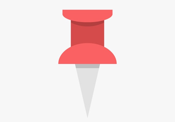
Now just group and position the entire pin using these coordinates:
- x: 424px
- y: 823px
3.10. Building the Paper Clip
Using the Rounded Rectangle Tool create a base form with the following values:
- width: 24px
- height: 64px
- corder radius: 12px
- color: FF5A5A (R: 255, G: 90, B: 90)
Flip the fill with the stroke and give it a weight of 4px. Use the Direct Selection Tool (A) and delete the lower – right anchor point and the one at the bottom.
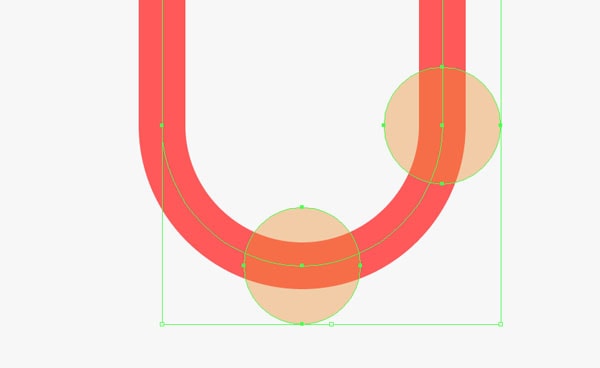
Create another 16 x 50px rounded rectangle with a corner radius of 8px. Keep the same color as the previous object, and align it to the left side of it. Grab the Direct Selection Tool again, and this time delete the top – left and top anchor points. Now create the inner piece of the clip using a 8 x 38px rounded rectangle with a corner radius of 4px and delete its right lower and bottom anchor points. Your illustration should look something like this.
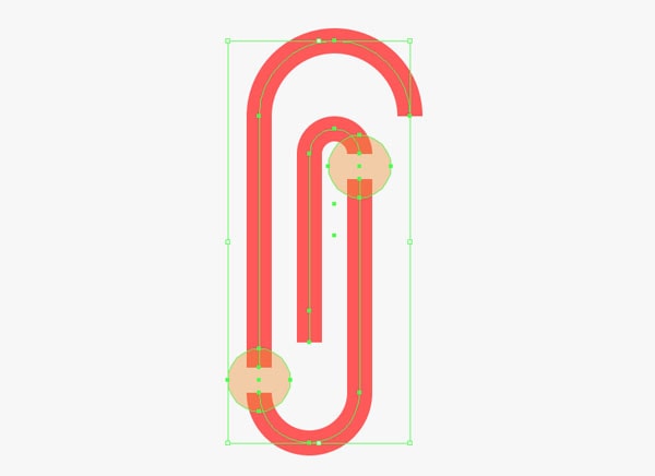
Remove the gaps by uniting the anchor points and then level the top right part until it reaches the same level with the interior handle.

To finish, position the clip using the following coordinates:
- x: 492px
- y: 845px
Your illustration should look something like this.
Step 4 – Finishing Touches
4.1. Add a Background Color
Lock the composition layer and draw a 1200 x 1200px rectangle on top of the background layer. Color it using F96E6E (R: 249, G: 110, B: 110).
4.2. Add Half-Shadows to Objects
Basically a half-shadow is a flat-inspired shadow that covers just half of the object it is applied to. If the light source would be on the left side, then it would cast a highlight on just half of the object it hits.
In our case, we will copy each object and paste it in place on top of the original and then delete the half left size. For the remaining right part, we will change its color to black and depending on the color of the object underneath adjust it’s opacity so that it won’t be powerful nor weak.
If our object has components that go outside the main body (for example the iPod) we will apply the same effect by duplicating and splitting the object to obtain the half-shadow.
4.3. Add Surface Shadows
The last part of the process will focus on adding shadows beneath objects. Compared to half-shadows, these won’t be cut in half but rather will take the entire form of the object. Copy and paste the notebook in place and then change its color to a darker red tint A03333 (R: 160, G: 51, B: 51), set the Blending Mode to Multiply and dim the opacity to 24%. Next move the shadow 6px downward and another 6px to the right and make sure to Send it to the Back (right click>Arrange>Send to Back). Do this for all of the objects and you are done.
Conclusion
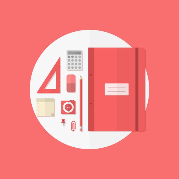
There you have it guys! A sweet illustration that you can use however you want. I hope you found some of the steps interesting and useful and luckily you’ve learned something new along the process.