How To Create a Web Icon in Adobe Illustrator
Ever wanted to design an icon for the web? Today is your day. In this tutorial you’ll learn how to design web icons.
If you’re an icon addict, you probably already know the power iconography (the careful use of symbols instead of words) has in making a website more attractive but more importantly, easier to navigate.
For this tutorial, I’ve taken a hypothetical e-book website (let’s call it Libro) that could use some visual touches, so that the user browsing it could distinguish different sections by simply looking at icons. Since the most popular e-book reader out there is made by Amazon, we will use the Kindle as a visual representation for device portability and create a vector based icon from it.
Step 1 – Do Your Research
As with any new project, the first stage of the creative process begins with defining the idea, phrase or word that you want to portray using imagery.
By doing so, you will lay down defining aspects that you will need in order to figure out what might (or might not) help you shape your icon.
The best resources to do this include:
With Postcards Email Builder you can create and edit email templates online without any coding skills! Includes more than 100 components to help you create custom emails templates faster than ever before.
Free Email BuilderFree Email Templates- A dictionary: Whether it’s online or hardcover, this little guy will always help you get a first glimpse at what your product should be or represent.
- A website specialized in dealing with icons: Try Iconfinder, which has a nifty search engine that goes through tons of categorized icons that are related to specific keywords.
- A stroll through the city: You’ll be amazed of the amount of information our surroundings have to offer in terms of symbols.
- Google: If there’s something that Google does best, it’s finding relevant information (definitions, characteristics and most important images) all directly linked to the word you search.
Assuming that you’ve carried out your detective work, you should have a deeper sense of what it is that you want to represent by use of color, lines and other forms of imagery. Now you can actually start getting creative.
Step 2 – Start Sketching
As with any new product, the way you translate the information you now hold is deeply connected to your person, as no two ideas are identical. There are no rules, but most importantly no boundaries to which you need to adapt or constrain to – the only true variable is your imagination.
Whether it’s a cup a coffee or some good old Nirvana (the band), find that something that gets your mind going and your hand flowing and start drawing. It doesn’t matter how good you are, what matters is that by doing so, you start laying down the form and functions that your icon will use.
Quick tip: Never throw stuff away. Even if you started an idea, and abandoned it along the way, always try to establish a path, so that you can see the directions from which your design emerged. By doing so, you can overlay pieces from one version to another and refine the quality of the visual composition.
These first two steps are somewhat general. For our project, a couple of images representing the actual Kindle will suffice; it has a simple design that can be easily reproduced using basic shapes.
Step 3 – Commence Illustrator
Whether you’ve been pushing pixels for a long time, or just starting, one of the most important tools is Adobe Illustrator. I’m not going to talk about the actual software, but will guide you through setting up a New Document and starting to build an icon.
3.1. Set Up a New Document
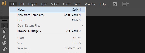
Assuming you already had Illustrator up and running in the background, create a New Document by pressing Ctrl + n (or ⌘ + n if you’re using a Mac) or by going to FILE > New… and let’s go through some of the settings that will pop-up.
With Pulsetic you’ll be instantly notified the moment your website, API, or server becomes unavailable. Monitor uptime from multiple global locations and respond to incidents before your users are affected.
Create beautiful status pages in minutes to keep customers informed during outages and build trust with transparent communication.
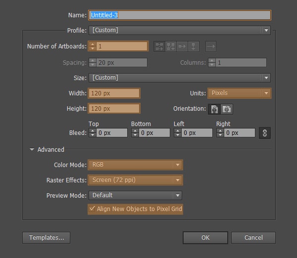
Start Monitoring for Free- Name: This one is obvious; give it any name that suits your project.
- Profile: This is important because graphics designed for the web will be different from those based on a profile for printing. Make sure to select Web from the drop down menu.
- Number of Artboards: The Artboard according to Adobe, represents regions that can contain actual artwork. I usually go for a bigger artboard even if I have multiple designs, and put them on different layers so they will be at hand and select exactly the ones I want to see.
- Width and Height: Measures from which you can size your artboard – in our case, we’ll go for a 120 by 120 pixels.
- Units: Illustrator is intended for use with web and print, so you have a lot of options; for this project we will go with pixels.
- Color Mode: Double-check that this option suits the medium you are creating for. RGB (Red, Green, Blue) is color specific to the digital medium, whereas CMYK (Cyan, Magenta, Yellow, Black) is used in projects that involve printing. For our project, we will use RGB.
Quick Tip: Learn more about the differences between RGB and CMYK in this official Adobe tutorial (which does a good job explaining key differences you need to be aware of).
- Raster Effects: There are three values to choose from
- Screen (72 ppi), which is the default value. This is the standard option that you would go for if you would design for the web (which in our case, we are).
- Medium (150 ppi).
- High (300 ppi). The two last options are intended for graphics that will be used for printing.
Quick Tip: Now that you’ve created artwork, and let’s assume your design uses effects from the Stylize menu such as Drop Shadows, Outer Glow or Inner Glow, you need to ensure quality. The printed version needs to look as smooth and clean as the one on your monitor. Accomplish this by selecting Effect > Document Raster Effects Settings and choosing a higher resolution from the checkboxes – you can also input your own value in the Other field.
Although we are going to design for the web (72 ppi), the art will end up as a png or jpeg which are raster images. If you go to the Adobe site, you will find out another tip that focuses on the effect of the ppi on the strokes of the design:
“The crisp appearance of pixel-aligned strokes is maintained in the raster output at a resolution of 72-ppi only. For other resolutions, there is a high possibility of such strokes producing anti-aliased results.”
- Align New Objects to Pixel Grid: If you’re shooting for pixel-perfect designs, this is a must. The program instructs vector objects to align themselves to the pixel grid whenever they are moved or scaled, realigning them with new positions.
There it is: A one-time tell-it-all intro that will fill in some gaps that might appear when starting out.
3.2. Getting Basic Shapes
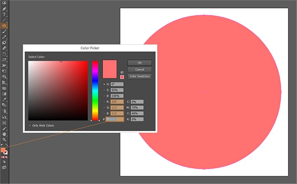
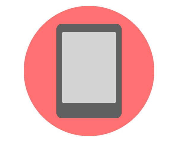
First, set up a circle that will act as a background for the entire design. Using the Ellipse Tool (L) left click anywhere in Illustrator to get the Rounded Rectangle Settings Box and set the Width and Height of the circle. Enter 110px for both and click OK. Select the newly created object and remove the color from the stroke, and give it a nice light redish fill (HEX=ff7171 or R=255, G=113, B=113).
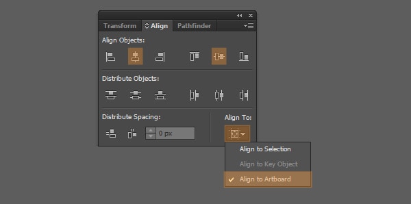
Grab the Rounded Rectangle Tool (located on the left tool bar, same place as the Rectangle Tool), left click on the artboard and create a 55 x 80px shape with a 5px corner radius. Using Align options (Window > Align) select the new object and horizontally and vertically align it to the artboard. Give it a dark grey fill #606060 (R=96, G=96, B=96)
Quick Tip: If you just set up the Align panel, default alignment will apply to selected objects. To align to the artboard, look at the right lower corner, click “Align To” and select Align to Artboard.
Following the same steps as before, create a new rounded rectangle (Width=39px, Height=64px, Corner radius=1px). Select the new object and horizontally align it to the artboard and move it toward the top of the larger rectangle.
With the object selected, change its fill color to a slightly lighter grey D3D3D3 (R=211, G=211, B=211).
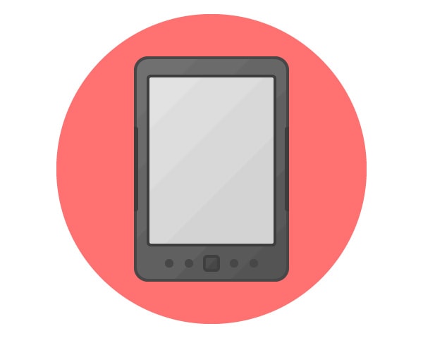
This is the basic frame and screen that will represent a Kindle.
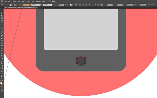
The next step has to do with buttons. Select the Rounded rectangle tool and create a 5 x 5px object with a 2px corner radius. Horizontally align it to the other parts, and move it to the middle of the space between the lower side of the screen and the lower side of the body (you can also do this by dragging and creating a rectangle and vertically aligning the button to it). Assign a fill color (474747, R=71, G=71, B=71), then copy it and paste it in place (Ctrl + f / ⌘ +f). Select the duplicate button and flip its stroke with the fill color, leaving it at 1px.
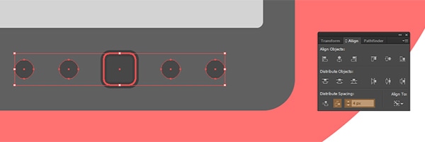
We now have our main button; next are the four rounded ones. Select the Ellipse Tool (L) and create a 3 x 3px circle. Select it, and while holding Alt, drag it to the left to duplicate. Having both selected, again hold down Alt (⌥ Option on Mac), and drag to the right side of the main button. Select all the round buttons and the main one. Left click on the center button and using the Align panel and vertically center them. Now we need to space them up, with all the objects still selected, go the left lower corner of the Align to Distribute Spacing, and give it 4px and select Horizontal Distribute Space.
For the side buttons, we will create a round corner object (Width=5px, Height=30px, Corner Radius=1px), and vertically align it to the main body of the icon. Drag it a little to the right so that it overlaps. Using the Shape Builder Tool (Shift + m) subtract the intersection of the two objects and you have page navigation buttons.
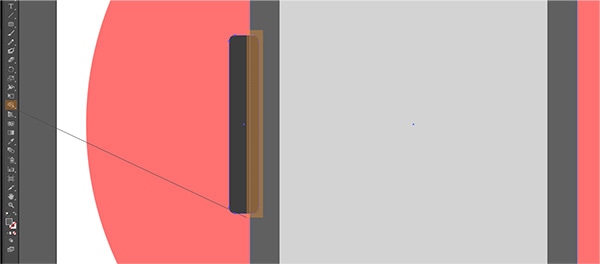
Select the new object and change the fill to 3d3d3d (R=61, G=61, B=61). Duplicate and flip it vertically (right click > Transform > Reflect > Vertical), then align to the right side of the main body.
At this point, the icon is starting to take shape. In the next step we will start adding details.
3.4. Adding Details
With our Kindle now laid out, we will start adding finishing touches to the screen. Grab the Rectangle Tool and draw a 100 x 55px object. Rotate it by pressing R, and then drag one corner to the left while holding down Shift to get a nice 45-degree angle. Duplicate the screen of the Kindle and select both it and the rotated object and press Shift + M for the Shape Builder Tool. Subtract the intersected path for a nice reflection.
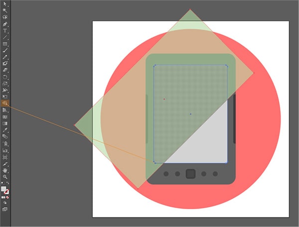
Repeat the step above, but instead of subtracting from the screen rectangle, move the rotated object slightly above the first reflection, subtract again and give it a lighter color. Also use this effect on the primary button of the device, and its actual body to give it a little more polish.
Once more select the screen, copy and paste it in place, flipping the fill with the stroke and giving it a darker grey (3d3d3d).
Select the main body of the device, duplicate it, and again flip the fill with its stroke. From the color palette select a more visible grey so that you can distinguish it from the rest of the body.
3.5. Add a Long Shadow
We will finish our icon by casting a long shadow. Duplicate the main icon body (Ctrl + c then Ctrl + f) to paste in place. Select the new object and drag it at a 45 angle toward the right lower corner. We will do so by holding down Alt and while dragging to the right, press and hold Shift so that you get it exactly at 45 degrees.
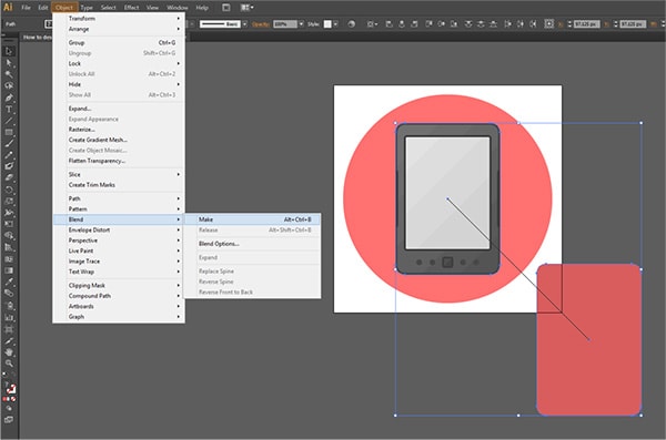
Create a blend between the two objects; go to Object > Blend Options and in the Specified Steps enter 200. Now using the same path select Make.
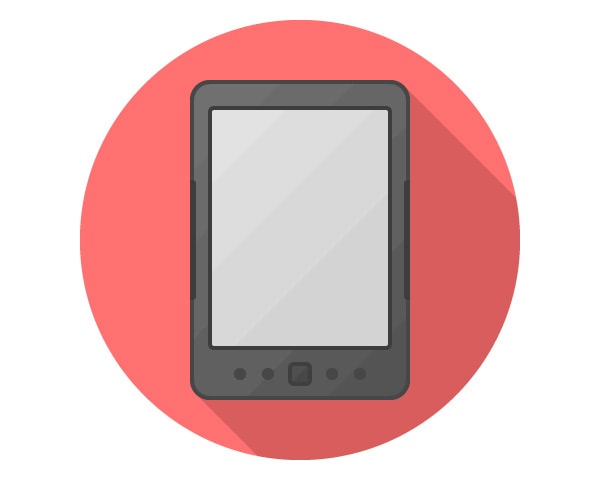
The two have united into a single form. Go to Object > Expand > OK, and then from the Transform window, click on Unite. This is a basic shadow. Give it a darker color than the background circle, and then mask it so that it doesn’t fall out of the actual design. Change the color to d85d5d (R=216, G=93, B=93) then copy and paste the circle in front of the long shadow. Select both the shadow and its above object and then right click > Make Clipping Mask.
We nailed it!
You can change the colors as you please, adapting the style to your needs. Also, as we did all this using vectors, we can scale the icon as big or as small as we want.
Step 4 – Save for the Web
We have a nice looking icon, but how about saving it so that we can actually use it for what we had in mind in the first place — the web? Export artwork using the SVG (Scalable Vector Graphics) XML based vector format. The main advantages of using SVG compared to other formats (such as PNG) are:
- Editability: You can edit the image at any time using any text editor.
- Scalability: You can easily scale images once they’re live on the internet without the need of creating multiple versions.
So let’s go ahead and see some of the settings that come with this format. Go to File > Save as > and from the Save as type click on the dropdown and select SVG (*.SVG) – don’t forget to click on the Use Artboards checkbox so that it only saves the elements on your artboard. You should get a pop-up window – click on the more option to see the full set of options. Let’s go through each of them:
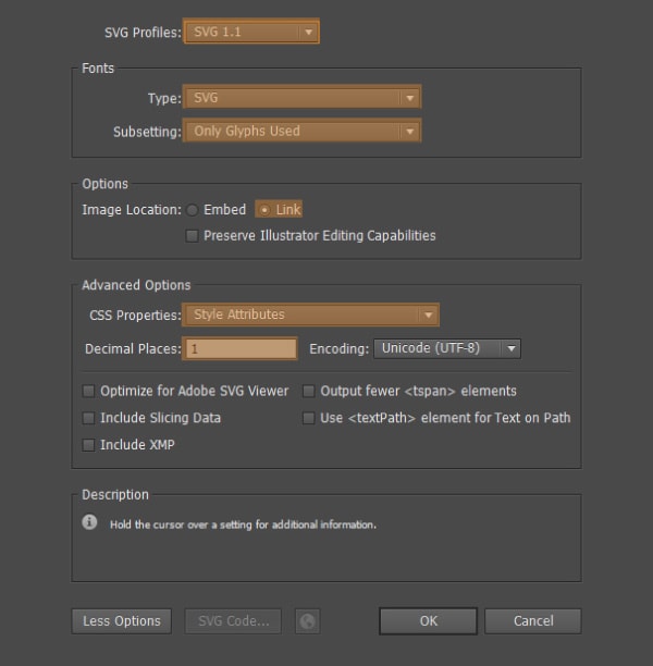
- SVG Profiles: Since August 2011, the standard version promoted by the W3C is 1.1
- Fonts
Type: Controls the way fonts are embedded in the actual file. Usually if you have text, Adobe recommends SVG, but this has some drawbacks and isn’t supported by Firefox.
Subsetting: Using SVG you can save a subset of glyphs (characters) into the actual file (which will increase size but will allow you to modify content) but we will go with Only Glyphs Used because our design does not include text.
- Image Location: This option has a lot to do with how you choose to embed images within the SVG file. According to Adobe, the best option is to use Link, and then modify the href parameter to point to your own image file, which you should compress using Photoshop or any other image editing software.
- CSS Properties: By using Style Elements you can modify your SVG code to your needs after exporting the file, and using it on your website.
- Decimal Places: The value here will define the precision of vectors you export. The higher number the larger file size. It is recommended that you input a value of 1.
- Output fewer <tspan> elements: If your artwork incorporates a lot of text, use this option to reduce the overall file size of your SVG – our icon doesn’t rely on text, so we can leave this unchecked.
After selecting all of the above options, click Save.
Quick tip: For more info on the rest of the save options please visit this link.
It’s a wrap!
I hope you enjoyed this tutorial, and managed to learn how to build icons in Illustrator. These techniques can be applied to any project, no matter the subject.
