Bootstrap 5: What’s New About It and Release Date
Bootstrap, the most popular front-end framework built to design modern, responsive, and dynamic interfaces for professional design web pages, is currently undertaking a major update, Bootstrap 5.
UPDATE: Bootstrap 5 alpha was officially released on June 16, 2020 after several months of refining. With all of the major changes in this version, the Boostrap 5 development team informed the users that the current version is still in alpha version thus, breaking changes will continue to occur until the first beta is released so it’s better to always check the open issues and pull requests on their official GitHub repository for open questions and feedback.
Looking for a Bootstrap online builder?
- 👉 Try our Bootstrap Builder and create unlimited projects for unlimited clients.
- 👉 Start to build a website using our Bootstrap Templates.
Bootstrap is a free and open-source collection of CSS and JavaScript/jQuery code used for creating dynamic layout websites and web applications. Being a tool for creating front-end design, it consists of a series of HTML- and CSS-based design templates for different components of a website or application such as forms, buttons, navigation, modals, typography and other interface components with helpful JavaScript extensions. It doesn’t matter if you are a beginner to web development or an experienced developer, Bootstrap is a powerful tool for whatever type of website and web application you are trying to build.
In addition, Bootstrap provides an out-of-the-box solution with hundreds of third-party components that you can integrate with it which allows you to build a prototype fast to materialize your ideal website without spending a lot of time. Which in the end you might end up customizing to build the final design of your website or web application as most of the configuration is already set up for you.
Bootstrap 4 is currently on version 4.4.1 which now has a lot of vital features such as cards, flexbox, Sass integration and powerful plugins built on jQuery. After more than 4 years of progress since the alpha version of Bootstrap 4 was released on August 19, 2015; an update is being developed in the background for the version 5 upgrade.
With Postcards Email Builder you can create and edit email templates online without any coding skills! Includes more than 100 components to help you create custom emails templates faster than ever before.
Free Email BuilderFree Email TemplatesThe Startup app will be updated to Bootstrap 5 as soon as the framework is updated. Also, we’ll update the Bootstrap templates gallery.
In this article, let’s take a look at Bootstrap 5’s major updates including the release date, integration, and modification.
Bootstrap Version 5: What Should We Expect?
Bootstrap 5’s official Github project tracking board has more than 765 tasks being shipped with more than 83 pull requests and 311 issues. If we base the release date from the previous development timeframe (Bootstrap 4 to Bootstrap 4.1) the development team took about 3 months to complete Bootstrap 4.1 to Bootstrap 4.2 took about 8 months. We might expect Bootstrap 5 in the first half of 2020. Bootstrap hasn’t confirmed the official release date yet.
In hindsight, there is a list of changes that we expect on version 5 such as the removal of jQuery which is a major lift for this version and the drop of Internet Explorer 10 and 11 support.
The following are some of the expected changes in Bootstrap 5:
- jQuery was removed
- Switch to Vanilla JavaScript
- Responsive Font Sizes
- Drop Internet Explorer 10 and 11 support
- Change of gutter width unit of measurement
- Removed Card Decks
- Navbar Optimization
- Custom SVG icon library
- Switching from Jekyll to Hugo
- Class updates
jQuery Removed

jQuery is a library that offers a general-purpose abstraction layer for classic web scripting that is efficient in almost any web development requirements. Its extensible nature allows you to access elements in a document without writing a lot of JavaScript, modify the appearance of your content in a web page which developers take advantage of to bridge the gap across all browsers, change the content of a document, respond to a user’s interaction, retrieve information from a server without refreshing a page through AJAX, add animation to your web page, simplify common JavaScript tasks and the list goes on.
While Bootstrap has been using jQuery for more than 8 years, jQuery has become quite a large and bloated framework that requires websites using it to download and add trivial load time for a library that may not be used by any other plugin except Bootstrap itself.
As JavaScript frameworks like Angular, Vue and React dominate the web development community nowadays, jQuery has been losing its popularity as most of these modern frameworks work through the virtual DOM and not on the DOM directly that leads to much faster performance. Although it might sound absurd, it turns out it is much more proficient and anyone using these frameworks will have better control and maintenance over their code than those who use jQuery.
With Pulsetic you’ll be instantly notified the moment your website, API, or server becomes unavailable. Monitor uptime from multiple global locations and respond to incidents before your users are affected.
Create beautiful status pages in minutes to keep customers informed during outages and build trust with transparent communication.
Start Monitoring for FreeMoving forward, any jQuery querying features will have to be done with pure or vanilla JavaScript code in Bootstrap 5 which will help with the file size or weight of the framework.
Switch to Vanilla JavaScript
JavaScript is the programming language of the web. Most modern websites are powered by JavaScript and all modern web browsers on desktops, consoles, tablets, games and mobile phones include JavaScript interpreters, which makes JavaScript the most universal programming language in the world.
The removal of jQuery support in Bootstrap 5 gives way to writing efficient vanilla JavaScript code without worrying about the size or adding up any other non-essential functions. While jQuery has been around for a long time, it is completely impossible to use jQuery alone because for the most part, what jQuery does is add a $ object to the global scope, with a lot of functions in it. Even more slick libraries like prototype are not an alternative to JavaScript, but exist only as extra tools to solve common problems.
If you know how JavaScript works from the root, this major change won’t affect you much but for some developers who only know how to use jQuery, this might be a good chance to learn the language.
Responsive Font Sizes
Designing a website that looks good across multiple platforms or viewports has been quite challenging for some developers. Media queries have been a great tool to solve typography common problems that allow developers to control the appearance of typographies on web pages by specifying specific font sizes for the typography elements on a specific viewport.
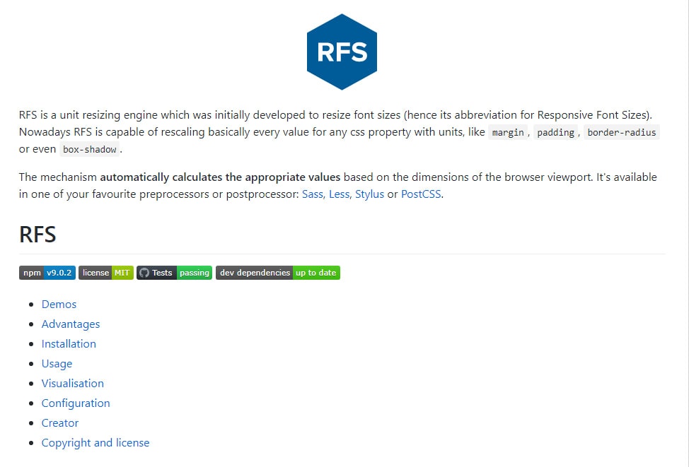
Bootstrap 5 will enable responsive font sizes by default which will automatically resize the typography element according to the size of the user’s viewport through RFS engine or Responsive Font Sizes.
According to RFS repository, RFS is a unit resizing engine which was originally developed to resize font sizes. RFS offers the ability to resize basically every value for any CSS property with units, like margin, padding, border-radius or box-shadow.
It is a preprocessor or postprocessor-powered-mechanism that automatically calculates the appropriate font-size values based on the user’s screen size or viewport. It works on known preprocessors or postprocessor tools such as Sass, Less, Stylus or PostCSS.
As an example, assuming that you have a hero-title class which is a class for your h1 tag element that you want to use for your main title on the hero section. Using Sass the following mixin will do the trick:
.hero-title {
  @include font-size(4rem);
}
This will be compiled to this:
.hero-title {
  font-size: calc(1.525rem + 3.3vw);
}
@media (min-width: 1200px) {
  .hero-title {
            font-size: 4rem;
  }
}
Drop Internet Explorer 10 and 11 Support
In 1995, Microsoft released the Internet Explorer which blew everyone’s mind because for the first time there was a browser that supported CSS and Java applets that made it one of the most widely used web browsers back in 2003 with 95% usage share.
Fast forward to 2020, Internet Explorer is no longer relevant with Chrome, Firefox, and Edge. In fact, it became one of the web designer’s nightmares since it doesn’t support modern JavaScript standards. In order to work with Internet Explorer, be it 10 or 11, JavaScript codes need to be compiled to ES5 instead of ES6, which increases the size of your projects up to 30%. This obviously limits your ability to use the features of ES6 or newer JavaScript standards. What’s even worse is it doesn’t support a lot of modern CSS properties which limits your modern web design potential.
In Bootstrap 5, the Bootstrap team decided to drop the support for Internet Explorer 10 and 11 which is a pretty good move as it will enable web designers and developers focus more on designing modern web pages without having to worry about breaking any piece of codes on old browsers or increasing the size of every project.
Change Gutter Width Unit of Measurement
CSS offers ways to specify sizes or lengths of elements using various units of measurement such as px, em, rem, % vw, and vh. While pixels or px is considered to be widely known and used for its absolute units, relative to DPI and resolution of the viewing device, it does not change based on any other element which is not good for modern responsive web design.
Bootstrap has been using px for its gutter width for quite a long time which will no longer be the case in Bootstrap 5. According to the fixes made on Bootstrap 5’s official Github project tracking board, the gutter width will now be on rem instead of px.
Rem stands for “root em” which means equal to the calculated value of font-size on the root element. For instance, 1 rem is equal to the font size of the HTML element (most browsers have a default value of 16px).
Remove Card Decks
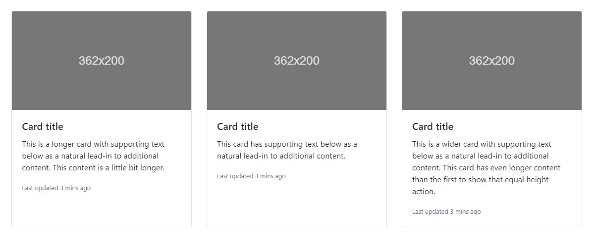
In Bootstrap 4, in order for you to be able to set equal width and height cards that aren’t attached to one another, you need to use card decks as shown below.
<div class="card-deck">
   <div class="card">
      <img class="card-img-top" src="..." alt="Card image cap">
      <div class="card-body">
         <h5 class="card-title">Card title</h5>
         <p class="card-text">This is a longer card with supporting text below as a natural lead-in to additional content. This content is a little bit longer.</p>
         <p class="card-text"><small class="text-muted">Last updated 3 mins ago</small></p>
      </div>
   </div>
   <div class="card">
      <img class="card-img-top" src="..." alt="Card image cap">
      <div class="card-body">
         <h5 class="card-title">Card title</h5>
         <p class="card-text">This card has supporting text below as a natural lead-in to additional content.</p>
         <p class="card-text"><small class="text-muted">Last updated 3 mins ago</small></p>
      </div>
   </div>
   <div class="card">
      <img class="card-img-top" src="..." alt="Card image cap">
      <div class="card-body">
         <h5 class="card-title">Card title</h5>
         <p class="card-text">This is a wider card with supporting text below as a natural lead-in to additional content. This card has even longer content than the first to show that equal height action.</p>
         <p class="card-text"><small class="text-muted">Last updated 3 mins ago</small></p>
      </div>
   </div>
</div>
In Bootstrap 5, the Bootstrap team removed the card decks since the new grid system offers more responsive control. Hence, removing unnecessary extra classes that can be solved via grid.
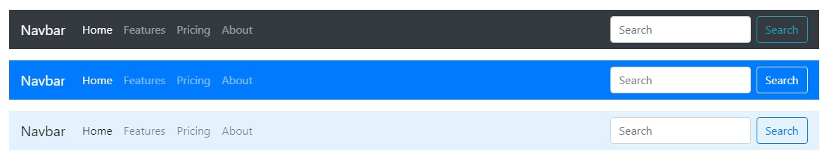
The Bootstrap navbar component is a principal part of Bootstrap that gets used all the time. In previous versions of Bootstrap, you need to have a decent amount of markup in order to make it work. However, in Bootstrap 4 they simplified this through the use of a nav or div HTML element and unordered list. The navbar class is the default class that always needs to appear on the component.
By default, Bootstrap 4 uses inline-block on its display option but in Bootstrap 5, it was removed. They also used flex shorthand and removed the brand margin caused by requiring containers in navbars. Aside from this, they have also implemented a dark dropdown via dropdown-menu-dark class that turns the dropdown into a black background which we usually see on navbar dropdown items.
Custom SVG Icon Library
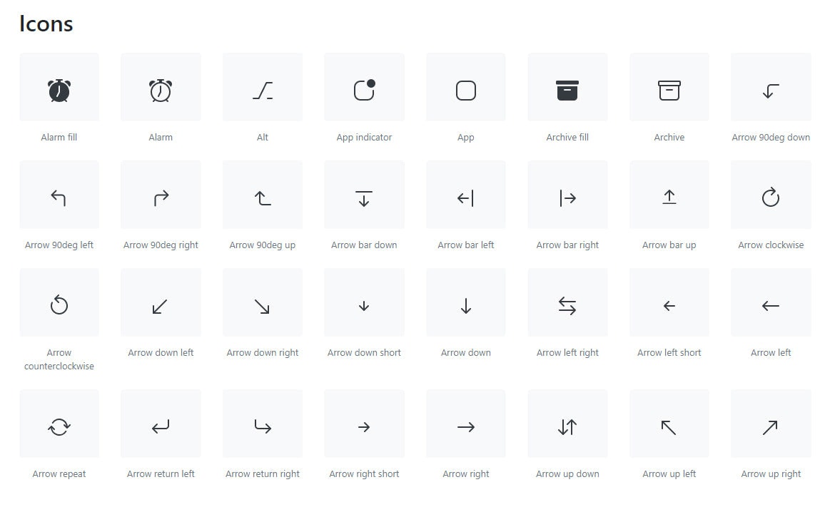
In version 3 of Bootstrap, there are 250 reusable icon components in the font format called “Glyphicons” created to provide iconography to input groups, alert, dropdowns and to other useful Bootstrap components.
However, in Bootstrap 4 it was totally scrapped and web designers and developers need to rely on free icon fonts like Font Awesome or use their own custom SVG icons in order to add value to their web design.
In Bootstrap 5, there’s a brand new SVG icon library crafted carefully by Mark Otto, co-founder of Bootstrap. Before the official release of Bootstrap 5, these icons can now be added and used to your project at this moment of time. You can visit this page to learn more.
Switching from Jekyll to Hugo

Jekyll is a free and open-source static site generator. If you know how WordPress, Joomla or Drupal works, then, you probably have an idea of how it works. Jekyll is used to build websites with easy to use navigation, website components and generates all the content at once. Jekyll basically provides page templates such as navigation and footers that will reflect on all of your web pages. These templates are merged with other files with definite information (for instance, a file for each blog post on your website) to generate full HTML pages for website users to see.
Bootstrap 4 has been a great tool to integrate with Jekyll through Sass (Syntactically Awesome Style Sheets) but in Bootstrap 5, a major switch from Jekyll to Hugo is anticipated.
Hugo is described as “A Fast and Flexible Static Site Generator built with love by spf13 in GoLang”. Similar to Jekyll, it is a static site generator but written in Go language. A possible reason for the switch is that Hugo is lightning fast, easy to use and configurable. Compared with Jekyll, it has a great integration with the popular web host and can organize your content with any URL structure.
Class Updates
Of course, Bootstrap 5 will not be interesting without the new Bootstrap CSS class. Bootstrap 4 has more than 1,500 CSS classes. There will be some CSS class that will no longer be available in the new version and some CSS class that will be added.
Some of the CSS classes that are already removed, according to the Bootstrap 5’s official Github project tracking board are:
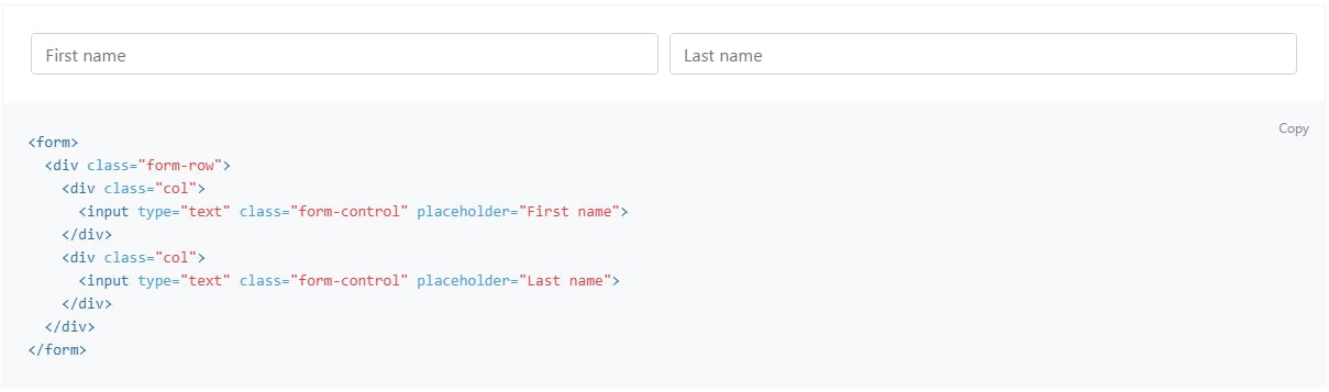
- form-row
- form-inline
- list-inline
- card-deck
Here are some new Bootstrap 5 CSS class added:
- gx-* classes control the horizontal/column gutter width
- gy-* classes control the vertical/row gutter width
- g-* classes control the horizontal & vertical gutter width
- row-cols-auto
Conclusion
One of the frustrating experiences of being a developer is reinventing the base HTML, CSS, and JavaScript for each project. While some prefer to write their own code, it still makes sense to just use an existing framework like Bootstrap.
With all the new updates coming in Bootstrap 5, it’s safe to say that the Bootstrap team is making huge steps to make the framework lightweight, simple, useful and faster for the developer’s benefit.
If you use Bootstrap in your projects, then you will probably love Startup app – Bootstrap Builder. It is a great development tool with lots of ready-made designed and coded templates and themes for faster deployment of your projects.