Building a Responsive Knowledge Base Theme using Bootstrap 5
The term “knowledge base” usually attributes to the information stored in a system. Generally, knowledge bases are used to basically store any information in a container, formerly, in a form of a database. With the new advances in technology, this idea has changed in many ways.
In today’s state of technology, a knowledge base is simply a page or set of pages with a list of information about a specific topic or technology. It is a self-service online library of information about a product, service, or technology written in a way to help customers, site visitors or even employees to find information as quickly as possible without taking up too much time and human intervention.
The way the knowledge base content is laid out is very diverse and structured in such a way that people looking for a specific question or topic can find it in a short period of time. Most of the modern knowledge base uses different media to share information about a specific topic such as videos, articles, images, charts or even interactive web programs.
In today’s tutorial, I am going to show you how you can easily use Bootstrap 5 to create a modern knowledge base theme that you can use for any of your products or services.
You can check the demo here.
Knowledge Base Theme Wireframe
Before we begin coding our knowledge base theme, let’s first look at the wireframe of our theme for this project. I am using Mockflow for our knowledge base theme’s wireframe.
With Postcards Email Builder you can create and edit email templates online without any coding skills! Includes more than 100 components to help you create custom emails templates faster than ever before.
Free Email BuilderFree Email Templates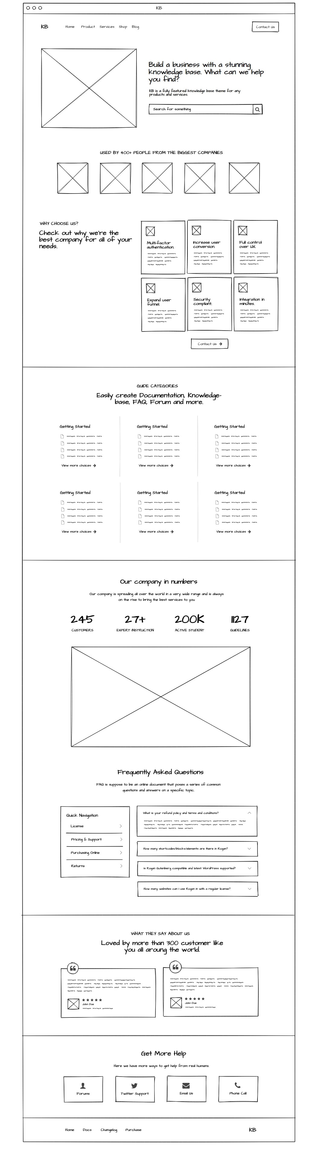
Our wireframe is very straightforward. Our knowledge base theme will have the following sections: navbar, header, benefits, knowledge base listing, users count, FAQ, testimonials and footer.
File Structure
After creating our design on Mockflow, it’s time to create the necessary files and folder first before we get into the basic knowledge base theme’s markup. We need to create the following files and folders following this composition:
root/
|—css/
|——style.css
|—img/
|—js/
|——script.js
|—index.html
Downloading Bootstrap’s Source Files
Next, we need to download the Bootstrap source files and add them to our css and js folder. In order to do this, go to the Bootstrap download page and download the source files of any theme. Inside the download source files, we need to copy the bootstrap.min.css to our CSS folder. We also need to copy the bootstrap.bundle.min.js inside our js folder.
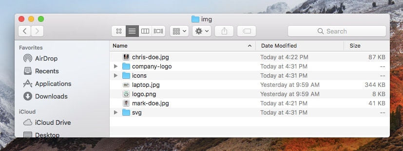
Images
I’ve already set up all the images that we need for our knowledge base theme. You can download them here and place these images inside the img theme folder.
Font Awesome Icons
For our icons, we’re going to use Font Awesome icons. Instead of CDN, we’re going to use Font Awesome Kits. Using kits is usually the best approach for both the performance and flexibility of your website or application. In order to use Font Awesome kits, you need to follow the getting started page instructions here and log-in to your account. You can create an account if you don’t have one yet.
You will be able to create a kit at this point by clicking on the “New Kit” button at the upper right corner of the screen and then copy the kit’s code to your project similar to this screen.
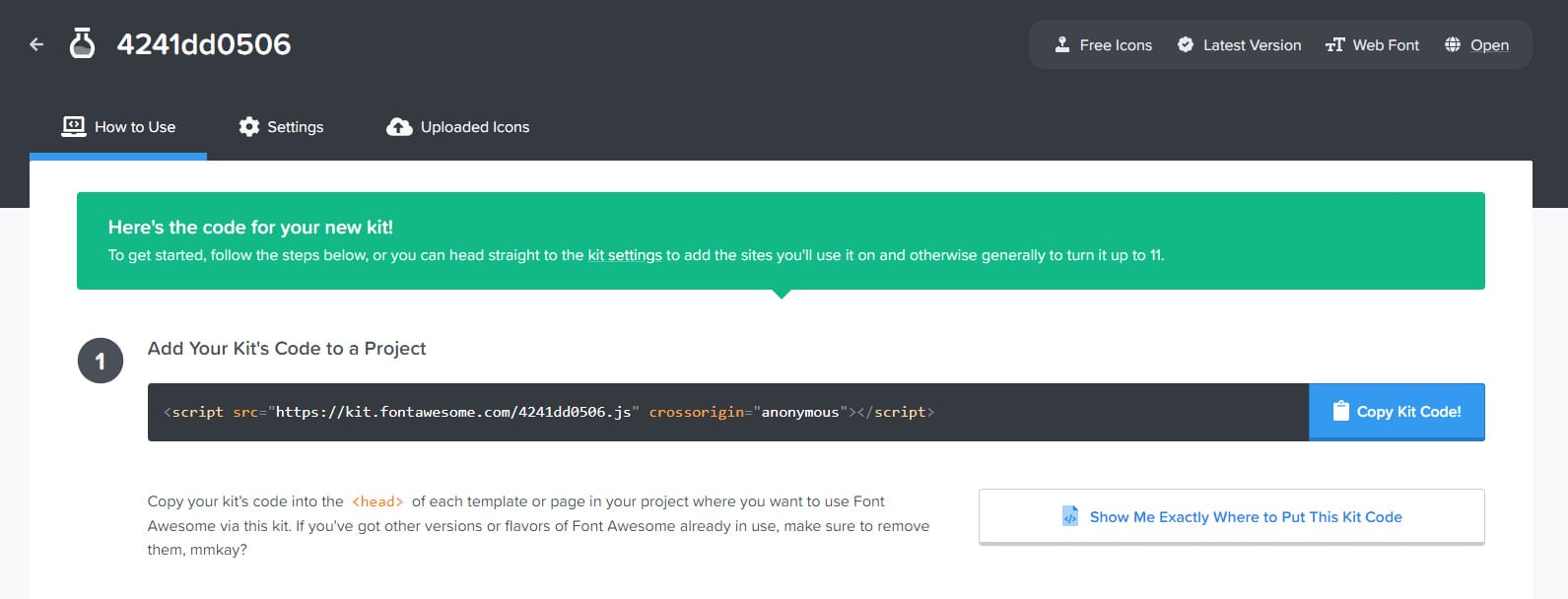
We will simply copy this script code at the bottom of our markup before the closing </body> tag (more on this later).
With Pulsetic you’ll be instantly notified the moment your website, API, or server becomes unavailable. Monitor uptime from multiple global locations and respond to incidents before your users are affected.
Create beautiful status pages in minutes to keep customers informed during outages and build trust with transparent communication.
Start Monitoring for FreeGetting started with the markup
After downloading all of the necessary files for our project, it’s now time to set up the basic starter html codes along with the links to our CSS and JavaScript files. Inside the index.html file, we need to add the following codes:
<!DOCTYPE html>
<html lang="en">
  <head>
    <meta charset="UTF-8" />
    <meta http-equiv="X-UA-Compatible" content="IE=edge" />
    <meta name="viewport" content="width=device-width, initial-scale=1.0" />
    <title>KB - Bootstrap 5 Knowledge Base Theme</title>

    <!-- FONT -->
    <link rel="preconnect" href="https://fonts.gstatic.com" crossorigin />
    <link
      href="https://fonts.googleapis.com/css2?family=Poppins:wght@400;700&display=swap"
      rel="stylesheet"
    />

    <!-- CSS (load Bootstrap first, then your overrides) -->
    <link rel="stylesheet" href="css/bootstrap.min.css" />
    <link rel="stylesheet" href="css/style.css" />
  </head>

  <body>
    <!-- Page content goes here -->

    <!-- JS (load Bootstrap first, then your script) -->
    <script
      src="https://kit.fontawesome.com/4241dd0506.js"
      crossorigin="anonymous"
    ></script>
    <script src="js/bootstrap.bundle.min.js"></script>
    <script src="js/script.js"></script>
  </body>
</html>
Now that we have all of the basic markup, let’s start working on our navbar.
For our navbar, we will use the latest bootstrap 5 navbar component and then customize the look and feel using CSS style later on. We’ll have a couple of navbar links that will be toggled on a small device screen.
<nav id="navbar" class="navbar navbar-expand-lg navbar-light">
  <div class="container-xxl container-fluid">
    <a id="navbar-brand" class="navbar-brand" href="#">KB</a>

    <button
      class="navbar-toggler"
      type="button"
      data-bs-toggle="collapse"
      data-bs-target="#navbarText"
      aria-controls="navbarText"
      aria-expanded="false"
      aria-label="Toggle navigation"
    >
      <span class="navbar-toggler-icon"></span>
    </button>

    <div class="collapse navbar-collapse" id="navbarText">
      <ul class="navbar-nav me-auto mb-2 mb-lg-0">
        <li class="nav-item">
          <a class="nav-link active" aria-current="page" href="#">Home</a>
        </li>
        <li class="nav-item">
          <a class="nav-link" href="#">Product</a>
        </li>
        <li class="nav-item">
          <a class="nav-link" href="#">Services</a>
        </li>
        <li class="nav-item">
          <a class="nav-link" href="#">Shop</a>
        </li>
        <li class="nav-item">
          <a class="nav-link" href="#">Blog</a>
        </li>
      </ul>

      <span class="navbar-text">
        <a class="btn primary-button" href="#">Contact Us</a>
      </span>
    </div>
  </div>
</nav>
Header Section
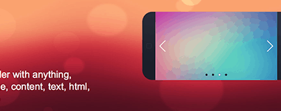
Next, let’s create our header section. Usually, web designers and developers create this section with a bootstrap’s jumbotron component but we will not use this bootstrap component this time, instead of a regular section markup that has all the necessary bootstrap and custom classes including images and a search bar component to make it look nice and presentable.
<section id="header">
  <div class="header-content">
    <div class="container-fluid container-xl hero">
      <div class="row">
        <div class="col-sm-12 col-md-5 svg-header-container">
          <img
            src="img/svg/illustration2.svg"
            alt="Mobile SVG illustration"
          />
        </div>

        <div class="col-sm-12 col-md-7 header-content-container">
          <div>
            <h1 class="text--white text-heading">
              Build a business with a stunning
              <span class="text--green">knowledge base</span>.
              What can we help you
              <span class="text--green">find</span>?
            </h1>

            <p class="header-content-text">
              KB is a fully featured knowledge base theme for any products and services.
            </p>

            <div class="search-container">
              <form action="#">
                <input
                  class="form-control"
                  placeholder="Search for something"
                  aria-label="Search"
                />
                <button class="btn secondary-button" type="submit">
                  <i class="fas fa-search" aria-hidden="true"></i>
                  <span class="visually-hidden">Search</span>
                </button>
              </form>
            </div>
          </div>
        </div>
      </div>
    </div>
  </div>

  <svg
    class="wave"
    xmlns="http://www.w3.org/2000/svg"
    viewBox="0 0 1440 320"
    aria-hidden="true"
    focusable="false"
  >
    <path
      fill="#ffffff"
      fill-opacity="1"
      d="M0,32L34.3,48C68.6,64,137,96,206,96C274.3,96,343,64,411,48C480,32,549,32,617,80C685.7,128,754,224,823,234.7C891.4,245,960,171,1029,160C1097.1,149,1166,203,1234,224C1302.9,245,1371,235,1406,229.3L1440,224L1440,320L1405.7,320C1371.4,320,1303,320,1234,320C1165.7,320,1097,320,1029,320C960,320,891,320,823,320C754.3,320,686,320,617,320C548.6,320,480,320,411,320C342.9,320,274,320,206,320C137.1,320,69,320,34,320L0,320Z"
    ></path>
  </svg>
</section>
Benefits and Associated Companies Section
Now, let’s add an extra section where we will feature the figurative companies that are associated with our knowledge base product for demonstration purposes only. We will also add the features that our figurative company is offering and its benefits in this section.
<section id="companies" class="section">
<div class="container">
<h5>Used by 400+ people from the biggest companies</h5>
<div class="company-img-container">
<img class="company-img" src="img/company-logo/amazon.png" alt="Amazon" />
<img class="company-img" src="img/company-logo/disney.png" alt="Disney" />
<img class="company-img" src="img/company-logo/kfc.png" alt="KFC" />
<img class="company-img" src="img/company-logo/mailchimp.png" alt="Mailchimp" />
<img class="company-img" src="img/company-logo/shopify.png" alt="Shopify" />
</div>
</div>
</section>
<section id="about" class="section">
<div class="container-fluid">
<div class="row">
<div class="col-xl-4 col-md-10 col-sm-12 offset-xl-1 left">
<div class="sticky-element">
<h3 class="text-heading text--violet">WHY CHOOSE US?</h3>
<h2 class="text-heading">
Check out why we’re the best company for all of your needs.
</h2>
</div>
</div>
<div class="col-xl-6 col-lg-12 col-md-12 col-sm-12 right">
<div class="row">
<div class="col-xl-4 col-lg-4 col-md-4 col-sm-6 col-12 col-flex">
<div class="about-card">
<img src="img/icons/shield.png" alt="Multi-factor authentication icon" />
<h4 class="text-heading">Multi-factor authentication.</h4>
<p>
Increase learner engagement & knowledge retention in higher
education and corporate training.
</p>
</div>
</div>
<div class="col-xl-4 col-lg-4 col-md-4 col-sm-6 col-12 col-flex">
<div class="about-card">
<img src="img/icons/flag.png" alt="Increase user conversion icon" />
<h4 class="text-heading">Increase user conversion.</h4>
<p>
Increase learner engagement & knowledge retention in higher
education and corporate training.
</p>
</div>
</div>
<div class="col-xl-4 col-lg-4 col-md-4 col-sm-6 col-12 col-flex">
<div class="about-card">
<img
src="img/icons/heart-shape-outline-with-lifeline.png"
alt="Full control over UX icon"
/>
<h4 class="text-heading">Full control over UX.</h4>
<p>
Increase learner engagement & knowledge retention in higher
education and corporate training.
</p>
</div>
</div>
<div class="col-xl-4 col-lg-4 col-md-4 col-sm-6 col-12 col-flex">
<div class="about-card">
<img src="img/icons/selective.png" alt="Expand user funnel icon" />
<h4 class="text-heading">Expand user funnel.</h4>
<p>
Increase learner engagement & knowledge retention in higher
education and corporate training.
</p>
</div>
</div>
<div class="col-xl-4 col-lg-4 col-md-4 col-sm-6 col-12 col-flex">
<div class="about-card">
<img src="img/icons/favorites.png" alt="Security compliant icon" />
<h4 class="text-heading">Security compliant.</h4>
<p>
Increase learner engagement & knowledge retention in higher
education and corporate training.
</p>
</div>
</div>
<div class="col-xl-4 col-lg-4 col-md-4 col-sm-6 col-12 col-flex">
<div class="about-card">
<img src="img/icons/fire.png" alt="Integration in minutes icon" />
<h4 class="text-heading">Integration in minutes.</h4>
<p>
Increase learner engagement & knowledge retention in higher
education and corporate training.
</p>
</div>
</div>
<div class="col-xl-12 col-lg-12 col-sm-12 about-link-container">
<a class="btn primary-button" href="#">
View more choices
<i class="fas fa-arrow-right" aria-hidden="true"></i>
</a>
</div>
</div>
</div>
</div>
</div>
</section>
Knowledge Base Listing Section
Next, let’s create the actual listing of our knowledge base. This will include categories and links of articles for a particular topic. We will add a <div> tag with a custom class of .cat-card-content for each of our cards to contain all the listings for our knowledge base.
<section id="categories" class="section">
  <div class="container guide-container">
    <div class="row">
      <div class="col-sm-12 col-md-8 offset-md-2 title-section">
        <h3 class="text-heading text--violet">GUIDE CATEGORIES</h3>
        <h2 class="text-heading">
          Easily create Documentation, Knowledge-base, FAQ, Forum and more.
        </h2>
      </div>
    </div>

    <div class="row">
      <div class="col-md-4 col-sm-12 cat-card">
        <div class="cat-card-content">
          <h4 class="text-heading">Getting Started</h4>
          <ul>
            <li><a class="hvr-link" href="#">Welcome to Ghost</a></li>
            <li><a class="hvr-link" href="#">Writing posts with Ghost</a></li>
            <li><a class="hvr-link" href="#">Publishing options</a></li>
            <li><a class="hvr-link" href="#">Managing admin settings</a></li>
            <li>
              <a class="btn text--green link-button" href="#">
                View more choices
                <i class="fas fa-arrow-right" aria-hidden="true"></i>
              </a>
            </li>
          </ul>
        </div>
      </div>

      <div class="col-md-4 col-sm-12 cat-card">
        <div class="cat-card-content">
          <h4 class="text-heading">Advanced Usage</h4>
          <ul>
            <li>
              <a class="hvr-link" href="#">How do I set a publication language?</a>
            </li>
            <li>
              <a class="hvr-link" href="#">How do I change my configured site URL?</a>
            </li>
            <li>
              <a class="btn text--green link-button" href="#">
                View more choices
                <i class="fas fa-arrow-right" aria-hidden="true"></i>
              </a>
            </li>
          </ul>
        </div>
      </div>

      <div class="col-md-4 col-sm-12 cat-card">
        <div class="cat-card-content">
          <h4 class="text-heading">Writing posts and pages</h4>
          <ul>
            <li><a class="hvr-link" href="#">Organising content in Ghost</a></li>
            <li><a class="hvr-link" href="#">Using the editor</a></li>
            <li><a class="hvr-link" href="#">Publishing Options</a></li>
            <li><a class="hvr-link" href="#">General publication settings</a></li>
            <li>
              <a class="btn text--green link-button" href="#">
                View more choices
                <i class="fas fa-arrow-right" aria-hidden="true"></i>
              </a>
            </li>
          </ul>
        </div>
      </div>
    </div>

    <div class="row">
      <div class="col-md-4 col-sm-12 cat-card">
        <div class="cat-card-content">
          <h4 class="text-heading">Website Configuration</h4>
          <ul>
            <li><a class="hvr-link" href="#">Managing your team</a></li>
            <li><a class="hvr-link" href="#">Imports and exports</a></li>
            <li><a class="hvr-link" href="#">Design Settings</a></li>
            <li>
              <a class="btn text--green link-button" href="#">
                View more choices
                <i class="fas fa-arrow-right" aria-hidden="true"></i>
              </a>
            </li>
          </ul>
        </div>
      </div>

      <div class="col-md-4 col-sm-12 cat-card">
        <div class="cat-card-content">
          <h4 class="text-heading">Databases</h4>
          <ul>
            <li><a class="hvr-link" href="#">Setup home page layout</a></li>
            <li><a class="hvr-link" href="#">Where do I post support query?</a></li>
            <li><a class="hvr-link" href="#">Multiple Installs on One Domain</a></li>
            <li><a class="hvr-link" href="#">Setup shop page</a></li>
            <li>
              <a class="btn text--green link-button" href="#">
                View more choices
                <i class="fas fa-arrow-right" aria-hidden="true"></i>
              </a>
            </li>
          </ul>
        </div>
      </div>

      <div class="col-md-4 col-sm-12 cat-card">
        <div class="cat-card-content">
          <h4 class="text-heading">Most Popular Articles</h4>
          <ul>
            <li>
              <a class="hvr-link" href="#">
                How do I change link and button color globally?
              </a>
            </li>
            <li><a class="hvr-link" href="#">Where do I post support query?</a></li>
            <li><a class="hvr-link" href="#">Private Article</a></li>
            <li><a class="hvr-link" href="#">Setup shop page</a></li>
            <li>
              <a class="btn text--green link-button" href="#">
                View more choices
                <i class="fas fa-arrow-right" aria-hidden="true"></i>
              </a>
            </li>
          </ul>
        </div>
      </div>
    </div>
  </div>
</section>
Users Count
Next, let’s work on the users count section. In this section, we’re going to showcase the number of users of our knowledge base in general. You can modify the text and numbers according to your liking.
<section id="stats" class="section">
  <div class="container">
    <div class="row">
      <div class="col-lg-6 col-md-12 offset-lg-3 title-section">
        <h2 class="text-heading section-heading">Our company in numbers</h2>
        <p>
          Our company is spreading all over the world in a very wide range and is
          always on the rise to bring the best services to you.
        </p>
      </div>
    </div>

    <div class="row">
      <div class="col-md-3 col-sm-6 col-12">
        <div class="stat-item">
          <h6>245</h6>
          <p>Customers</p>
        </div>
      </div>

      <div class="col-md-3 col-sm-6 col-12">
        <div class="stat-item">
          <h6>27+</h6>
          <p>Expert Instruction</p>
        </div>
      </div>

      <div class="col-md-3 col-sm-6 col-12">
        <div class="stat-item">
          <h6>200k</h6>
          <p>Active Students</p>
        </div>
      </div>

      <div class="col-md-3 col-sm-6 col-12">
        <div class="stat-item">
          <h6>1127</h6>
          <p>Guidelines</p>
        </div>
      </div>

      <div class="col-md-10 offset-md-1">
        <div class="stat-img">
          <img src="img/laptop.jpg" alt="Laptop showing knowledge base interface" />
        </div>
      </div>
    </div>
  </div>
</section>
FAQ Section
An FAQ or Frequently Asked Questions is often used in articles, websites as well as forums where common questions tend to persist. We’re going to add this section by using the Bootstrap list group and accordion component along with our custom classes which we can later on style using our CSS file.
<section id="faq" class="section">
<div class="container">
<div class="row">
<div class="col-lg-6 col-md-12 offset-lg-3 title-section">
<h2 class="text-heading section-heading">Frequently Asked Questions</h2>
<p>
FAQ is supposed to be an online document that poses a series of common
questions and answers on a specific topic.
</p>
</div>
<div class="col-lg-4 col-md-5 col-sm-12">
<div class="card sticky-element">
<div class="list-group list-group-flush">
<h4 class="text-heading m-3 mb-0">Quick Navigation</h4>
<a
href="#"
class="list-group-item list-group-item-action d-flex justify-content-between align-items-center active"
aria-current="true"
>
<span>License</span>
<i class="fas fa-chevron-right" aria-hidden="true"></i>
</a>
<a
href="#"
class="list-group-item list-group-item-action d-flex justify-content-between align-items-center"
>
<span>Pricing & Support</span>
<i class="fas fa-chevron-right" aria-hidden="true"></i>
</a>
<a
href="#"
class="list-group-item list-group-item-action d-flex justify-content-between align-items-center"
>
<span>Purchasing Online</span>
<i class="fas fa-chevron-right" aria-hidden="true"></i>
</a>
<a
href="#"
class="list-group-item list-group-item-action d-flex justify-content-between align-items-center"
>
<span>Returns</span>
<i class="fas fa-chevron-right" aria-hidden="true"></i>
</a>
</div>
</div>
</div>
<div class="col-lg-8 col-md-7 col-sm-12">
<div class="accordion" id="accordionExample">
<div class="accordion-item">
<h2 class="accordion-header" id="headingOne">
<button
class="accordion-button"
type="button"
data-bs-toggle="collapse"
data-bs-target="#collapseOne"
aria-expanded="true"
aria-controls="collapseOne"
>
What is your refund policy and terms and conditions?
</button>
</h2>
<div
id="collapseOne"
class="accordion-collapse collapse show"
aria-labelledby="headingOne"
data-bs-parent="#accordionExample"
>
<div class="accordion-body">
We comply fully with KB’s refund policy. We issue refunds for the
reasons KB permits us to give refunds and we don’t issue refunds
in cases KB does not guarantee refunds. Please check KB’s refund
policy.
</div>
</div>
</div>
<div class="accordion-item">
<h2 class="accordion-header" id="headingTwo">
<button
class="accordion-button collapsed"
type="button"
data-bs-toggle="collapse"
data-bs-target="#collapseTwo"
aria-expanded="false"
aria-controls="collapseTwo"
>
How many shortcodes/blocks/elements are there in Rogan?
</button>
</h2>
<div
id="collapseTwo"
class="accordion-collapse collapse"
aria-labelledby="headingTwo"
data-bs-parent="#accordionExample"
>
<div class="accordion-body">
There are over 200 shortcodes/blocks/elements in Rogan WordPress
Theme. You can use any block/element on any page as you want.
</div>
</div>
</div>
<div class="accordion-item">
<h2 class="accordion-header" id="headingThree">
<button
class="accordion-button collapsed"
type="button"
data-bs-toggle="collapse"
data-bs-target="#collapseThree"
aria-expanded="false"
aria-controls="collapseThree"
>
Is Rogan Gutenberg compatible and latest WordPress supported?
</button>
</h2>
<div
id="collapseThree"
class="accordion-collapse collapse"
aria-labelledby="headingThree"
data-bs-parent="#accordionExample"
>
<div class="accordion-body">
Yes, SaasLand is compatible with Gutenberg.
</div>
</div>
</div>
<div class="accordion-item">
<h2 class="accordion-header" id="headingFour">
<button
class="accordion-button collapsed"
type="button"
data-bs-toggle="collapse"
data-bs-target="#collapseFour"
aria-expanded="false"
aria-controls="collapseFour"
>
How many websites can I use Rogan in with a regular license?
</button>
</h2>
<div
id="collapseFour"
class="accordion-collapse collapse"
aria-labelledby="headingFour"
data-bs-parent="#accordionExample"
>
<div class="accordion-body">
According to KB’s licensing, you can use SaasLand or any other
theme on only one website. If you want to use it on multiple
websites, you must buy multiple licenses.
</div>
</div>
</div>
</div>
</div>
</div>
</div>
</section>
<section id="testimonials" class="section">
<div class="space-between-blocks">
<div class="container">
<div class="row">
<div class="col-md-8 offset-md-2 title-section">
<h3 class="text-heading text--violet">WHAT THEY SAY ABOUT US</h3>
<h2 class="text-heading">
Approved by more than 300 customers like you all around the world.
</h2>
</div>
<div class="row px-2 pt-4">
<div class="col-lg-6 pb-5">
<div class="testimonial-card-1">
<p class="testimonial-card-1__paragraph">
Knowledge base is one of the critical tools for both customer
support and internal knowledge management. That’s why KB always
aim to use the best technology available and do periodic market
reviews to make sure we are using the latest and the most
advanced tools.
</p>
<div class="testimonial-blk-person">
<div>
<img
class="testimonial-blk-person__avatar"
src="img/mark-doe.jpg"
alt="Mark Doe"
/>
</div>
<div class="px-2"></div>
<div class="flex-grow-1 d-flex flex-column">
<span
class="testimonial-blk-person__rating"
aria-label="5 out of 5 stars"
>
<i class="fas fa-star" aria-hidden="true"></i>
<i class="fas fa-star" aria-hidden="true"></i>
<i class="fas fa-star" aria-hidden="true"></i>
<i class="fas fa-star" aria-hidden="true"></i>
<i class="fas fa-star" aria-hidden="true"></i>
</span>
<span class="testimonial-blk-person__name my-1">Mark Doe</span>
<span class="testimonial-blk-person__info">XYZ Company</span>
</div>
</div>
<span class="testimonial-card-1__quote-symbol" aria-hidden="true">
<i class="fas fa-quote-left"></i>
</span>
</div>
</div>
<div class="col-lg-6 pb-5">
<div class="testimonial-card-1">
<p class="testimonial-card-1__paragraph">
My experience with KB goes back several years. I've had a few KB
programs over the years because I create and manage multiple
websites. I recently made the decision to have all of our KB's
convert to KB and I've been very, very pleased.
</p>
<div class="testimonial-blk-person">
<div>
<img
class="testimonial-blk-person__avatar"
src="img/chris-doe.jpg"
alt="Chris Doe"
/>
</div>
<div class="px-2"></div>
<div class="flex-grow-1 d-flex flex-column">
<span
class="testimonial-blk-person__rating"
aria-label="5 out of 5 stars"
>
<i class="fas fa-star" aria-hidden="true"></i>
<i class="fas fa-star" aria-hidden="true"></i>
<i class="fas fa-star" aria-hidden="true"></i>
<i class="fas fa-star" aria-hidden="true"></i>
<i class="fas fa-star" aria-hidden="true"></i>
</span>
<span class="testimonial-blk-person__name my-1">Chris Doe</span>
<span class="testimonial-blk-person__info">CHO Digital</span>
</div>
</div>
<span class="testimonial-card-1__quote-symbol" aria-hidden="true">
<i class="fas fa-quote-left"></i>
</span>
</div>
</div>
</div>
</div>
</div>
</div>
</section>
Finally, we will be adding our footer section’s markup at the very bottom of our knowledge base theme. This will have a four column layout for additional support mediums such as forums, Twitter, email and phone support. And then lastly, we’re going to add the footer links and logo right after these columns.
<section id="contact" class="section">
  <div class="container">
    <div class="row">
      <div class="col-md-6 offset-md-3 title-section">
        <h2 class="text-heading section-heading">Get More Help</h2>
        <p>Here we have more ways to get help from real humans.</p>
      </div>
    </div>

    <div class="row">
      <div class="col-lg-3 col-sm-6 col-12">
        <a href="#">
          <div class="card">
            <i class="fas fa-user-friends" aria-hidden="true"></i>
            <p>Forums</p>
          </div>
        </a>
      </div>

      <div class="col-lg-3 col-sm-6 col-12">
        <a href="#">
          <div class="card">
            <i class="fab fa-twitter" aria-hidden="true"></i>
            <p>Twitter Support</p>
          </div>
        </a>
      </div>

      <div class="col-lg-3 col-sm-6 col-12">
        <a href="#">
          <div class="card">
            <i class="fas fa-envelope" aria-hidden="true"></i>
            <p>Email Us</p>
          </div>
        </a>
      </div>

      <div class="col-lg-3 col-sm-6 col-12">
        <a href="#">
          <div class="card">
            <i class="fas fa-phone-alt" aria-hidden="true"></i>
            <p>Phone Call</p>
          </div>
        </a>
      </div>
    </div>
  </div>
</section>

<footer>
  <div class="container">
    <div class="row">
      <div class="col-md-9 col-sm-12 left">
        <ul>
          <li><a href="#" class="nav-link">Home</a></li>
          <li><a href="#" class="nav-link">Docs</a></li>
          <li><a href="#" class="nav-link">Changelog</a></li>
          <li><a href="#" class="nav-link">Purchase</a></li>
        </ul>
      </div>

      <div class="col-md-3 col-sm-12 right footer-logo">
        <a id="footer-brand" class="navbar-brand" href="#">KB</a>
      </div>
    </div>
  </div>
</footer>
After adding all of these markups, our theme will surely look like a mess. We need to put some CSS styles inside our style.css in order to make it look good and presentable. Let’s do this next.
Adding the Stylesheet
To make our knowledge base theme look really nice, we will now be adding our CSS for each section of our Bootstrap theme inside the style.css file.
General CSS
Before we move to other important CSS styles, we need to add our general CSS. These are CSS codes that will simply format our basic markup such as the font that we’re going to use throughout our theme, the starting font-size and background and so forth.
/*********************************************/
/* GENERAL CSS &quot;/
/*********************************************/
* {
padding: 0;
margin: 0;
box-sizing: border-box;
font-family: 'Poppins', sans-serif;
}
h1.text-heading {
font-size: 50px;
font-weight: bold;
}
h2.text-heading {
font-weight: bold;
font-size: 40px;
}
h3.text-heading {
font-size: 15px;
font-weight: bold;
letter-spacing: 2px;
}
h4.text-heading {
font-weight: bold;
font-size: 20px;
padding: 12px 0;
}
Utilities CSS
Now let’s add some set of CSS utility classes that can be used on any element of our knowledge base theme in order to modify the text, element placement or adjust the padding and margin.
/*********************************************/
/* UTILITIES CSS &quot;/
/*********************************************/
.primary-button {
padding: 10px 22px !important;
background: #4ED199 !important;
border-radius: 10px;
box-shadow: 0px 0px 30px 0px rgb(0 0 0 / 9%);
color: #ffffff !important;
font-family: 'Poppins', sans-serif;
font-size: 14px !important;
letter-spacing: 1px;
}
.secondary-button {
background: #2f2e41 !important;
border-radius: 35px !important;
box-shadow: 0px 0px 30px 0px rgb(0 0 0 / 9%);
color: #ffffff !important;
font-family: 'Poppins', sans-serif;
font-weight: bold !important;
font-size: 14px !important;
letter-spacing: 1px;
padding: 0.8rem 1.2rem !important;
text-decoration: none;
}
.primary-button:hover {
transform: translateY(-5px);
transition: all .5s;
}
#categories ul li .link-button {
padding: 0;
margin-top: 20px;
font-size: 16px;
}
#categories ul li .link-button:hover {
transform: translateX(5px);
transition: all .5s;
}
section .link-button {
font-weight: bold;
font-size: 18px;
letter-spacing: 1px;
padding: 0 15px;
}
button:focus {
box-shadow: none !important;
}
/* colors */
.bg--violet {
height: 40vh;
background: #6851ff;
}
.text--white {
color: #ffffff;
}
.text--green {
color: #4ED199 !important;
}
.text--violet {
color: #6851ff;
}
Bootstrap 5 navbar design contains the generic design of a navbar. For this part of our stylesheet, we’re going to customize the look of our navbar to make it completely different, matching our knowledge theme’s design. We will start by styling up our link items and logo (a.k.a .navbar-brand).
/*********************************************/
/* NAVBAR CSS &quot;/
/*********************************************/
nav {
padding: 0.7rem !important;
border-bottom: 1px solid rgba(255, 255, 255, 0.5);
position: fixed !important;
width: 100%;
z-index: 99999 !important;
}
#navbar .navbar-brand {
color: #ffffff;
font-weight: bold;
letter-spacing: 1px;
font-size: 25px;
}
#navbar .nav-item {
padding: 0 8px;
}
#navbar .nav-link {
color: #ffffff;
font-size: 14px;
}
Sections CSS
Now it’s time to put some CSS styles on each section specifically for header, benefits, knowledge base listing, users count, FAQ and testimonials.
Basically, the following CSS codes will simply set some properties such as the background, shadow, size, gradient color and border that we used on our markup above.
/*********************************************/
/* SECTIONS CSS &quot;/
/*********************************************/
.section {
padding: 80px 20px;
}
#header {
background: linear-gradient(180deg, #380a7f, #5855b7);
height: 100vh;
}
.header-content {
display: flex;
height: 100vh;
align-items: center;
}
.header-content .hero {
z-index: 9;
}
.header-content-container {
display: flex;
align-items: center;
}
.header-content-heading {
padding-top: 50px;
font-size: 52px;
}
.svg-header-container {
text-align: center;
}
.header-content-text {
font-size: 18px;
line-height: 160.1%;
color: #ffffff;
margin-top: 15px;
}
.svg-header-container img {
height: 100%;
}
.search-container {
background: #ffffff;
border-radius: 35px;
padding: 5px;
padding-left: 15px;
margin-top: 40px;
margin-right: 15%;
margin-bottom: 50px;
}
.search-container .form-control {
border: #ffffff
}
.search-container .form-control:focus {
outline: none;
border: #ffffff;
box-shadow: none;
}
.search-container form {
display: flex;
}
.search-container .btn.main-button {
font-size: 13px;
}
.wave {
position: absolute;
bottom: 0;
left: 0;
}
#companies .company-img-container {
display: block;
text-align: center;
}
#companies h5 {
text-transform: uppercase;
font-weight: bold;
color: #212529;
text-align: center;
font-family: 'Poppins', sans-serif;
margin-bottom: 40px;
}
.company-img {
height: 70px;
width: auto;
filter: grayscale(1);
margin: 20px;
}
.sticky-element {
position: sticky !important;
top: 80px;
padding: 30px 10px;
}
section#categories {
background: #f9f8fc;
}
.about-card {
border: 1px solid #F1F1F1;
border-radius: 10px;
box-shadow: 0px 0px 30px 0px rgb(0 0 0 / 5%);
padding: 30px 20px;
margin-bottom: 50px;
flex: 1;
}
.about-card p {
font-family: 'Poppins', sans-serif;
font-size: 16px;
color: #868080;
}
.about-card img {
height: 35px;
width: auto;
}
.about-link-container {
text-align: center;
}
section#categories,
section#testimonials {
background: #f9f8fc;
}
#categories .row .cat-card:first-child,
#categories .row .cat-card:nth-child(2) {
border-right: 1px solid #e6e6e6;
}
#categories .row .cat-card {
margin: 30px 0;
padding: 20px 50px;
}
#categories ul {
list-style: none;
padding-left: 0;
margin-bottom: 0;
}
#categories ul li::before {
content: &quot;\f15c&quot;;
font-family: &quot;Font Awesome 5 Free&quot;;
padding-right: 10px;
}
#categories ul li:last-child::before {
content: &quot;&quot;;
display: none;
}
#categories ul li {
padding: 5px 0;
}
#categories ul li a {
text-decoration: none;
color: #212529;
font-family: 'Poppins', sans-serif;
}
#categories ul li a:hover {
color: #380a7f;
}
#categories .title-section,
#stats .title-section,
#faq .title-section,
#testimonials .title-section,
#contact .title-section {
text-align: center;
margin-bottom: 40px;
margin-top: 20px;
}
#contact .title-section h2,
#faq .title-section h2,
#stats .title-section h2 {
margin-bottom: 25px;
}
.stat-item {
text-align: center;
}
.stat-item h6 {
font-size: 70px;
font-weight: bold;
color: #6851ff;
}
.stat-item p {
color: #868080;
text-transform: uppercase;
letter-spacing: 1px;
}
.stat-img {
margin-top: 40px;
position: relative;
border-radius: 5px;
}
.stat-img img {
width: 100%;
height: auto;
border-radius: 5px;
}
.stat-img::before {
content: &quot;&quot;;
display: block;
position: absolute;
top: 0;
bottom: 0;
left: 0;
right: 0;
border-radius: 5px;
background: rgb(104 81 255 / 60%);
}
#faq .card {
padding: 25px;
box-shadow: 0px 0px 30px 0px rgb(0 0 0 / 9%);
}
#faq .accordion-item {
box-shadow: 0px 12px 30px 0px rgb(0 0 0 / 9%);
margin-bottom: 40px;
}
#faq .accordion-button {
font-weight: bold;
}
#faq .accordion-button:not(.collapsed) {
color: #6851ff;
font-weight: bold;
background-color: transparent;
box-shadow: none;
}
#faq .accordion-button {
padding: 15px 25px;
}
#faq .accordion-body {
padding: 15px 25px 35px 25px
}
#faq .accordion-item {
border: none;
}
#faq .list-group-item.active {
z-index: 2;
font-weight: bold;
color: #6851ff;
background-color: transparent;
border-color: #dfdfdf;
}
#faq .list-group-flush&gt;.list-group-item {
padding: 12px;
}
.testimonial-card-1 {
padding: 3rem 2.2rem 2.2rem 2.2rem;
border-radius: 5px;
position: relative;
background: #ffffff;
box-shadow: 0 0 30px 0 rgba(0, 0, 0, .09);
display: flex;
flex-direction: column;
height: 100%
}
.testimonial-card-1__paragraph {
font-size: .95rem;
opacity: .9;
line-height: 1.7;
flex-grow: 1;
padding-bottom: 1.5rem
}
.testimonial-card-1__quote-symbol {
display: flex;
align-items: center;
justify-content: center;
width: 50px;
height: 50px;
background: #6856ff;
color: #ffffff;
font-size: 1.3rem;
border-radius: 10rem;
position: absolute;
top: -25px;
left: 30px
}
.testimonial-blk-person {
display: flex;
align-items: center;
margin-top: -1rem
}
.testimonial-blk-person__avatar {
width: 56px;
height: 56px;
border-radius: 10rem
}
.testimonial-blk-person__rating {
font-size: .75rem;
color: #ffe200
}
.testimonial-blk-person__name {
font-size: .87rem;
font-weight: 600
}
.testimonial-blk-person__info {
font-size: .87rem;
opacity: .8
}
Next, let’s add some CSS styles for our footer. We’re going to add some custom styles for our footer logo as well as unordered list links including the four column contact cards.
footer {
	padding: 35px 0;
	border-top: 1px solid #efeef2;
}

footer .navbar-brand {
	color: #380a7f;
	font-weight: bold;
	letter-spacing: 1px;
	font-size: 25px;
}

footer .navbar-brand:hover {
	color: #380a7f;
}

footer .left ul {
	list-style: none;
	margin-bottom: 0;
}

footer .left ul li {
	display: inline-block;
	padding-right: 8px;
}

footer .left ul li a {
	color: #212529;
}

footer .right {
	text-align: right;
}

#contact a {
	text-decoration: none;
	color: #868080;
}

#contact .card {
	padding: 40px 20px;
	text-align: center;
}

#contact .card:hover {
	box-shadow: 0px 0px 30px 0px rgb(0 0 0 / 10%);
	transform: translateY(-2px);
	transition: all .2s;
}

#contact .card p {
	margin-bottom: 0;
}

#contact .card .fas,
#contact .card .fab {
	font-size: 40px;
	color: #6851ff;
	margin-bottom: 15px;
}
Responsive CSS
Lastly, it’s time to add some responsive CSS to our knowledge base theme. We will start with mobile devices first moving towards tablets and large screens. We will customize the sections and components that need some adjustment on different viewports such as the spacing, font-size, alignment and width.
@media (max-width: 576px) {
	h1.text-heading {
		margin-top: -120px;
		font-size: 35px;
	}
	.header-content-container {
		padding-top: 30px;
	}
	.svg-header-container {
		height: 50vh;
	}
	.svg-header-container img {
		width: 70%;
		height: 70%;
	}
	.bg-violet {
		height: 90vh;
	}
	.sm-height {
		height: 40px;
	}
	.search-container {
		margin-right: 0%;
	}
	h2.text-heading {
		font-size: 30px;
	}
	.stat-item h6 {
		font-size: 40px;
	}
	.footer-logo {
		display: none;
	}
}

@media (max-width: 768px) {
	#categories .row .cat-card:first-child,
	#categories .row .cat-card:nth-child(2) {
		border-right: none;
	}
	#categories .row .cat-card {
		margin: 0;
	}
	#faq .card.sticky-element {
		margin-bottom: 40px;
	}
	.svg-header-container img {
		height: 65%;
	}
	.header-content-heading {
		font-size: 34px;
	}
	.header-content-text {
		font-size: 15px;
	}
	.search-container {
		border-radius: 35px;
		padding: 0px;
		padding-left: 15px;
		margin-top: 24px;
		margin-right: 0%;
	}
	.form-control {
		font-size: 0.7rem !important;
	}
	.guide-container {
		max-width: 80% !important;
	}
	footer .left ul li {
		display: block;
		padding-bottom: 8px;
	}
	footer {
		text-align: center;
	}
	footer .right {
		text-align: center;
	}
	footer .navbar-brand {
		display: none;
	}
}

@media (max-width: 992px) {
	nav#navbar {
		background: #ffffff !important;
	}
	#navbar .navbar-brand {
		color: #380a7f;
	}
	#navbar .nav-link {
		color: #000000;
	}
	nav {
		padding-top: 1rem !important;
		padding-bottom: 1rem !important;
	}
	.nav-bg {
		background-color: blue !important;
	}
	img.nav-logo {
		height: 60px;
		width: auto;
	}
	nav .nav-link {
		padding: 20px 1px;
	}
	.nav-item {
		display: flex;
		justify-content: center;
	}
	.navbar-text {
		display: flex;
		justify-content: center;
	}
	.nav-item {
		padding-left: 0px
	}
	.svg-header-container img {
		height: 70%;
	}
	.header-content-heading {
		padding-top: 10px;
		font-size: 33px;
	}
	h1.text-heading {
		margin-top: -160px;
		font-size: 45px;
	}
	.company-img {
		height: 50px;
	}
	.guide-container {
		max-width: 100% !important;
	}
	.stat-item h6 {
		font-size: 60px;
	}
	#contact .card {
		margin-bottom: 20px;
	}
	.section {
		padding: 50px 0px;
	}
}

@media (max-width: 1199px) {
	#about {
		margin: 0;
	}
	.svg-header-container img {
		height: 90%
	}
	.header-content-heading {
		font-size: 40px;
	}
	.section {
		padding: 80px 0px;
	}
}
After putting all custom CSS styles in place, our Bootstrap 5 knowledge base theme will look almost complete.
Next, let’s add some JavaScript code inside our script.js file to turn our navbar’s background color as well as navbar’s link color from solid color to transparent. Consider the following code.
window.onscroll = function () {
    scrollTransformBgNav();
};

const scrollTransformBgNav = () => {

    const x = window.matchMedia("(min-width: 992px)");

    if (x.matches) {
        if (document.body.scrollTop > 10 || document.documentElement.scrollTop > 10) {
            document.getElementById("navbar").style.background = "#ffffff";
            document.getElementById("navbar").style.boxShadow = "0px 0px 20px 0px rgb(0 0 0 / 20%)";
            document.getElementById("navbar-brand").style.color = "#380a7f";

            let navLinks = document.getElementsByClassName("nav-link");
            for (let i = 0; i < navLinks.length; i++) {
                navLinks[i].style.color = "#000";
            }
        } else {
            document.getElementById("navbar").style.background = "transparent";
            document.getElementById("navbar").style.boxShadow = "none";
            document.getElementById("navbar-brand").style.color = "#ffffff";

            let navLinks = document.getElementsByClassName("nav-link");
            for (let i = 0; i < navLinks.length; i++) {
                navLinks[i].style.color = "#ffffff";
            }
        }
    }
};
The first set of code will simply call the function scrollTransformBgNav upon window.onscroll. The onscroll event occurs when a specific scrollbar is being scrolled.
Next, inside our scrollTransformBgNav function, we place the window.matchMedia(“(min-width: 992px)”) method to variable x to return a new MediaQueryList object that can then be used to determine if the document matches the media query string which is min-width: 992px as well as monitor the window document to detect when it matches that media query. We also created a check variable that is equal to false state by default.
Next, we cross check the variable x via if statement if it matches the specific property inside the brackets of the if statement. Notice that we’re calling body.scrollTop several times. The scrollTop property sets or returns the number of pixels our navbar content is scrolled vertically. If it’s greater than 10, then using getElementById method, we selected our navbar and added a few styles to it such as background, boxShadow etc. We also selected navbar links elements via getElementByClassName method to add some CSS styles on scroll and off scroll.
If the document doesn’t match the media query string on our criteria on the first if statement, we’re going to add some styles with transparent navbar background and remove some additional CSS styles such as box shadow as well change the color of the logo accordingly.
Now our project is complete. You can now try to scroll and observe the navbar background transformation and other animation on our knowledge base bootstrap theme created.
Wrapping Up
With Bootstrap 5, it’s easy to build and design modern, responsive, and dynamic interfaces for professional design web pages and custom pages.
In today’s tutorial, we created a modern style of knowledge base theme that you can use and customize to any of your products and services. Having this kind of page on your website, users no longer need to be patient to flip through papers and manuals in order to find information about your product or services. This will simply provide immediate answers to questions in an organized and manageable way.