35+ Examples of Branding & Corporate Identity Design
The Branding of a company is very important and it gives the first impression of your company to its customers. The design of the brand gives judgment about your business and thus it should be very memorable and attractive. A professional branding or logo leaves a good image of your concern and also results in a great impression about the business. With today’s modern trend, you can design various creative and elegant designs for your brand name which leaves the potential customer to identify your company immediately.
The Brand is much more than the name of the company or its logo. It is the combination of all the experiences and impressions of a concern which includes the public relations, vendors, employees, customers or the communities. There are efficient people who represent the image of a company behind every good brand. When the expectations of the customers are met by the company, the loyalty of the brand is automatically developed. Thus, it is very important to focus on the design of the Brand name which should be descriptive about its services or products, memorable, short and attractive.
Before designing the brand, decide if it is going to be used on business cards, website, CD’s, clothing’s or printing materials, stickers, pens, on the products sold, or on any social network. Thus, plan accordingly and choose the appropriate designs or colors for your brand. Create a powerful logo with graphic design for your brand name which should speak about your business. It should be bold and distinctive and should be able to advertise about your company. A Tag line is also important for a Brand which could express the benefits of your concern and could leave an impression in the minds of the customers.
The important elements in a Brand design are the logo, names, tag lines, trademarks and packaging. The brand of the company mostly attempts the customers to purchase the products or services. Therefore, the name of brand also plays a major role in the success of a business. There should be a life in your Brand designing with a good combination of the color, visual appearance or style, name, topography, intensity and size. Appropriate usage of these elements will provide uniqueness to your brand. You can also use a hired professional to create your brand design to make it more memorable.
Branding & Corporate Identity Designs
Artisan by David Weik
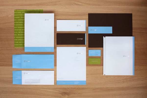
The author was inspired by a slogan of the company ‘Matching Talent with Success’. Thereby he has skillfully married up businesslike atmosphere and refined artistic vibe. The design has an ample open space and utilizes elegant typography. The color scheme is neutral and formal and greatly contributes to the general feeling.
With Postcards Email Builder you can create and edit email templates online without any coding skills! Includes more than 100 components to help you create custom emails templates faster than ever before.
Free Email BuilderFree Email TemplatesCorporate Identity Persona Optimus by True
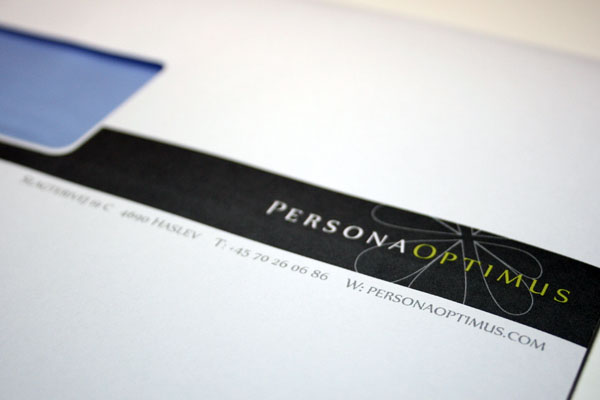
Corporate Identity Persona Optimus by True also has a tidy and slightly ornate design that is overfilled with plenty of fresh air. In such an environment the content always stays in focus, giving priority to the vital information. Nice touch of delicate vector flower that marks business cards and some other stationery items adds a beautiful note of naturalness.
Business Cards and Post Cards by Alan Murphy
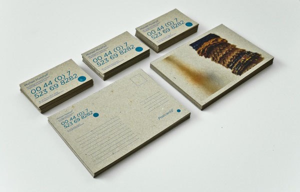
What catches the eye is a material used for printing. Rough and raw cardboard nicely plays with a gentle cyan color and simple typography. Although the copy in some cases is a bit seamless yet the overall design is harmonious and original and is easily scannable.
Jorge Gálvez Identidad Corporativa by Eddy Ortiz
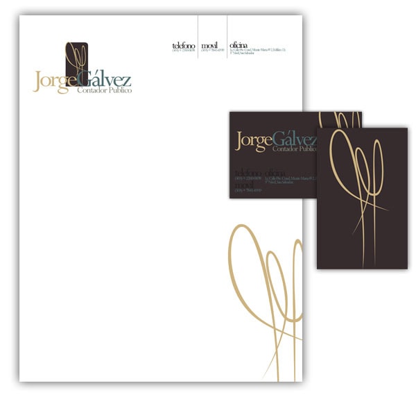
The artist leverages both black and white to deliver a pleasant impression. The classic color choice goes well with some elegant decorative elements and subtle typeface. The content is densely packed together so that every item of brand identity has a strong open feeling that unobtrusively focuses the attention on the key points.
Deformedia New style by Nazir Khasavov
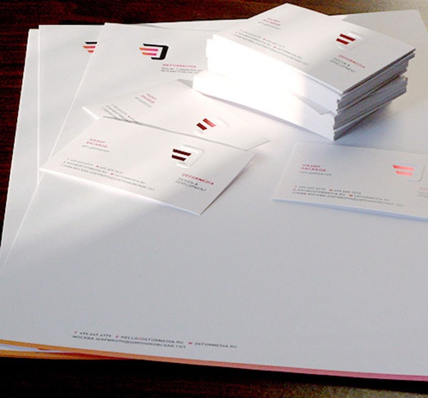
Deformedia New style by Nazir Khasavov is another project that prefers utilizing plenty of white space. It includes only vital information and logotype. Clean white backdrop exudes an image of perfection and completeness. The bright relatively huge stripe that dissects one of the sides of the booklet is a lovely twist that complies with the theme and links some mockups together.
With Pulsetic you’ll be instantly notified the moment your website, API, or server becomes unavailable. Monitor uptime from multiple global locations and respond to incidents before your users are affected.
Create beautiful status pages in minutes to keep customers informed during outages and build trust with transparent communication.
Start Monitoring for Freealtreforme by jekyll & hyde
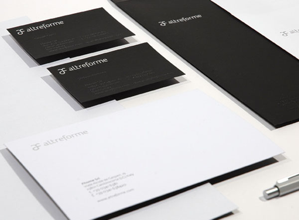
altreforme by jekyll & hyde is charged with high-tech and automotive vibes that harmoniously co-work together. By getting the most out of black and white color palette, the designer is managed to use contrast and a luxurious appeal to match the tone of a company. A considerable amount of white space strengthens the impact.
Various Branding Projects by Ebru Yildiz
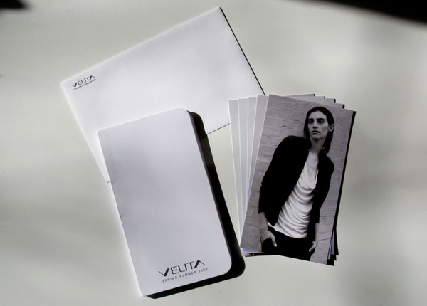
The author demonstrates several favorite projects. Here you can find monochrome solutions that rely on open feeling and carefully arranged content; a vibrant design that is based on bold coloring; examples with letterpress touch or photo background. All of them have a high quality and meticulous attention to details.
Salon Ziba Branding by Martin Fitzpatrick
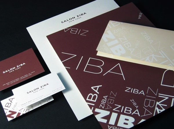
Here typography treatment steals the show. The artist skillfully utilizes several matching styles of the font to create an original and functional background. Although the project is targeted at a female audience, yet, there is no lavish decorations that can scare away. The primary color palette is also quite neutral and universal.
Select Miriello Identities by Miriello
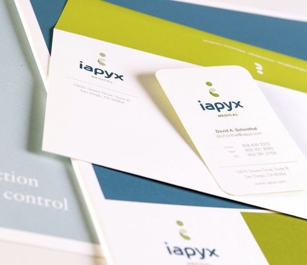
This is another selection of brand identity projects. From dynamic and vivid to elegant and sophisticated, the artist had an opportunity to work in various areas. Here, you will find some interesting solutions that can give you a spur. Some of them go for a modern and contemporary look while others prefer deriving benefits from the retro style.
B&R
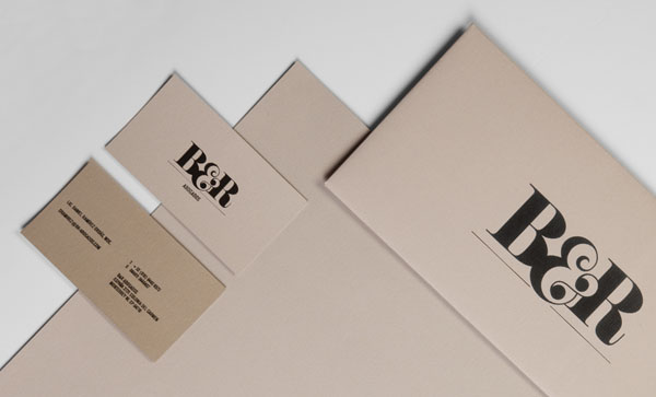
B&R is a professionally crafted corporate identity. It sheds the light on the company in a simple yet eye-pleasing way. Although the stationery items can’t boast of impressive appearance or gorgeous coloring, however namely minimalistic approach gives it a cutting-edge feel and separates it from the others. The author uses only vital elements such as logotype and contact information.
Norton sons by moving brands
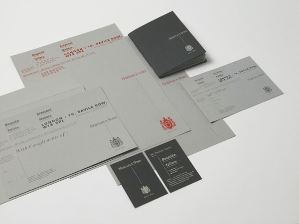
The design dishes up information in a clever and attractive way. Everything is neatly arranged and structurized. The team employs possibilities of typography to lay emphasis on required data without cluttering the design. Black, red and white are three main tones that are used to meet the company’s image and create an appropriate aesthetics.
ITI
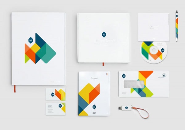
ITI is marked by a splash of bright colors that forms a visually-interesting intricate shape. Lots of white space, geometric vibe, and conventional arrangement let show freedom, variety and enormous potential inherent to a company. Each item looks friendly and a bit playful.
Moller/Holm by Jesse Mallon
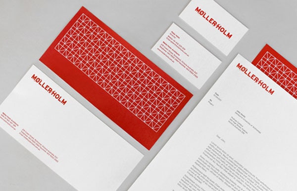
The two-tone coloring can do wonders, and Moller/Holm by Jesse Mallon is a vivid proof of that. The author demonstrates how to take advantage of challenging red and bored and overused white and create an outstanding brand identity design that reflects the heritage and has a touch of elegance.
Wallas by BÜRO UFHO
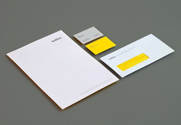
Wallas by BÜRO UFHO reaps benefits from the minimalist, including just vital elements, so as the name of the company and a small fragment of corporate information. Nevertheless, the solution creates enough aesthetics to compliment the brand identity and right feel for the potential clients. Yellow color adds extra freshness and energy.
Sam Tootal by Manual goes
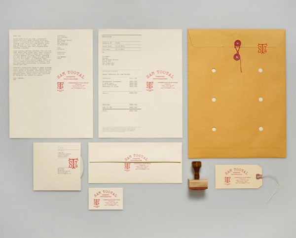
Sam Tootal by Manual goes for a subtle vintage feeling. Typography, an arrangement of the content and gorgeous logotype, together delivers the unforgettable first impression. Letterpress effect, natural materials, twine, stamp-like decor reinforce the effect.
Berg and Berg by Heydays
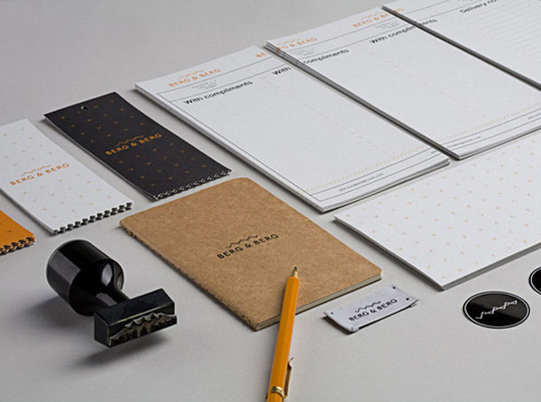
The team has done an excellent job of developing a full visual identity. Using handcrafted stamps, high-quality paper, and complementary natural materials, it is managed to create a top-notch project. Beautiful patterns, quite neutral color palette, well-thought-out amount of white space and modular system create a fantastic experience with personality and charm.
Perrine’s Wine Shop by Alvin Diec
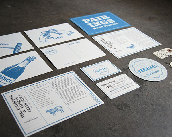
The project is filled with passion for food and wine. Although the color scheme is not characteristic for such type of companies since blue is usually associated with other spheres; however, it adds a certain zest. Moreover, it fits the vintage graphics, illustrations and black color used for displaying copy. The design has a structure and an artistic atmosphere.
Fast Eddie’s Barber Shop’s
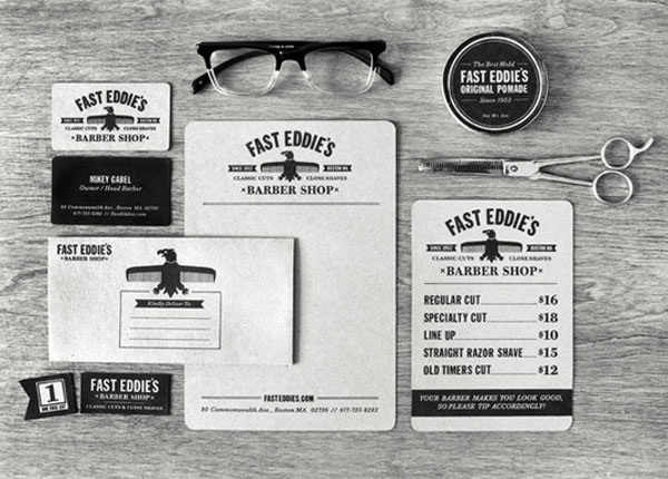
Fast Eddie’s Barber Shop’s brand identity has a distinct sense of hipster style and masculine spirit thereby producing marvelous and matchless general feeling. Inspired by traditional American barber shops, the project gets its beauty from Gothic typeface scanned from a book, iconic eagle illustration, black and white coloring, and robust layout.
Fruita Blanch by Atipus
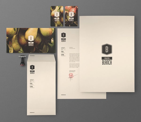
Fruita Blanch by Atipus imparts an impression of purity, naturalness, and professionalism. From logotype to typeface, the team has crafted every tiny detail. Photo background blends into the overall design, complementing the logotype and enriching the aesthetics. In some cases, mockups feature information that is neatly arranged in a column and placed on the left side, while in others there is only a blank paper with a logotype that identifies the company.
Frances May by The Official Manufacturing Co.
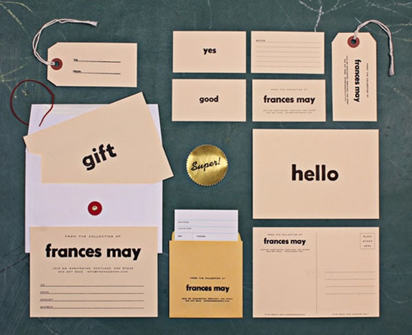
Bold, soft and huge typeface is a key feature of this design. Lettering that is made in it immediately strikes the eye. It was created to produce a wave of nostalgia and envelop clients with a pleasant and incredible old-timey feeling. It is realized with the help of natural materials, stamps, and other matching elements.
Academy by Academy
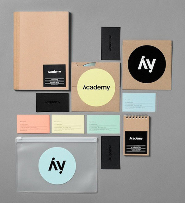
Academy by Academy has a certain level of personality. The artist opts for pastel colors, black tone, beautiful typography and rough material. As a result, the brand identity looks interesting and original though it evokes quite mixed feelings. While elegant dark b-card with an embossed logotype fits like a glove, the b-card made in pale yellow looks a bit ill-suited.
13th Street stationery of horror by Jacques Pense
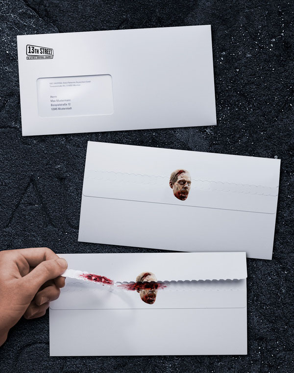
It stands out from the crowd. The artist employs photo realistic renderings of zombies to match the mood of the company and produce a stunning result. He puts an interesting twist on an envelope and makes printed media look frightening. As for the rest, the content is neatly laid out and easy to perceive.
Creavisa by anagrama
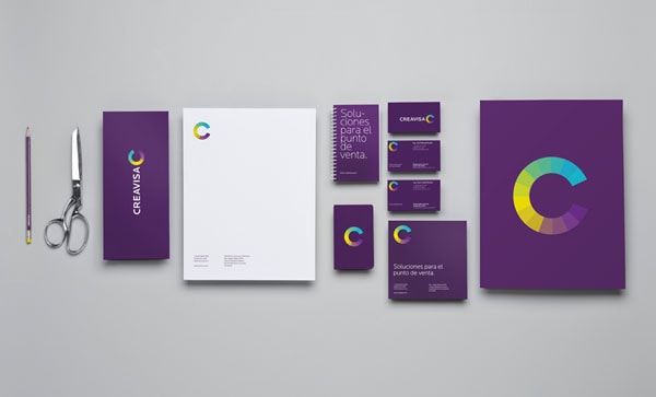
Creavisa by anagrama avoids overloading users with too much copy or too many decorative elements. Nevertheless, the project still looks overpowering because of rich violet used as a primary color. It marks every item of brand identity and charges the project with a subtle sense of dynamics. However, the logotype that is composed of a kaleidoscope of colors as well as white copy stands in contrast to it and draws the attention.
Bone Daddy’s by Matchbox
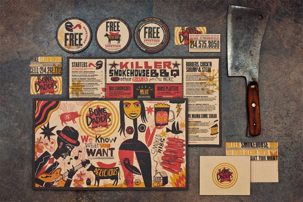
The team needs to express an atmosphere of Texas BBQ restaurant that is famous for its love to Southern folk art and funky vibe. By incorporating wood textures, hand-crafted elements, bold color palette, rough textures and exquisite illustrations, it is managed to achieve its goal, inject some fresh air into the company identity and save heritage and traditions.
Kultur Fest Valen
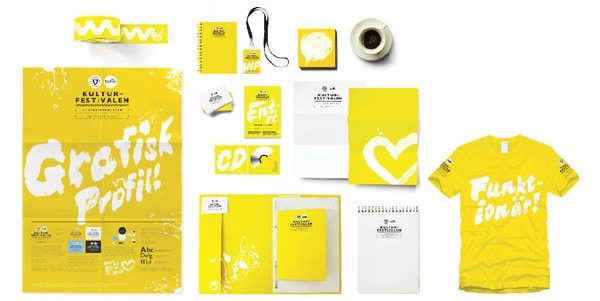
Kultur Fest Valen looks fresh, crisp and energetic. Bright yellow enriches the project with positive and makes it give off cheerfulness and fun. Graffiti style logotype and corresponding illustrations with grungy touch add urban appeal.
Deichmanske library
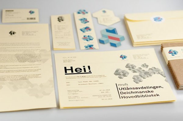
Revamped brand identity for Deichmanske library is aimed to reflect many sides of the institution. Its logotype is a complex multi-faceted 3D geometric shape that leverages few colors. There are several variants of this intricate polyhedron that are used to enrich designs of stationery items with meaning. Neatly structured content and clear titles go well with the idea.
BWG Brand Development by Mash Creative
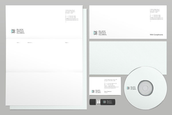
Here every detail has its place and context. The project exudes an image of reliability, seriousness, and potential. The team has adopted numerous interesting solutions to convert a 40-page booklet into an entertaining and enjoyable reading. There are typographic centerpieces, bright vigilantly crafted charts and graphs and much more.
Cous Cous by Gergana Le Coq
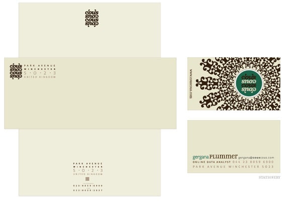
Cous Cous by Gergana Le Coq has an original and rich background with a twist. The artist utilizes decorative typeface with swashes not only to display titles but also to create a primary pattern for prettifying canvas. With such a lavish element, a generous amount of white space is simply vital to save viewers from confusions.
Black Umbrella Identity by MyORB, Felix von der Weppen, Lucie Kim
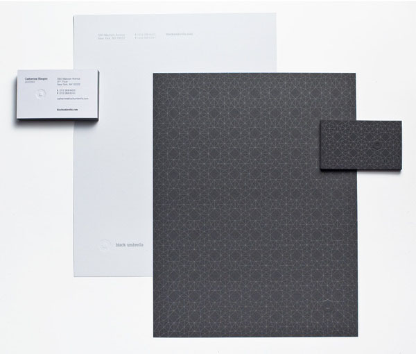
Much like the previous example, the intricate pattern that is used for background rules the roost. It creates the sophisticated aesthetics and establishes ornate and exquisite tone. It is an abstract visualization of the umbrella. Matching light coloring and traditional arrangement of a copy provide potential clients with a pleasant experience.
The Story Unfolds by The Story Unfolds
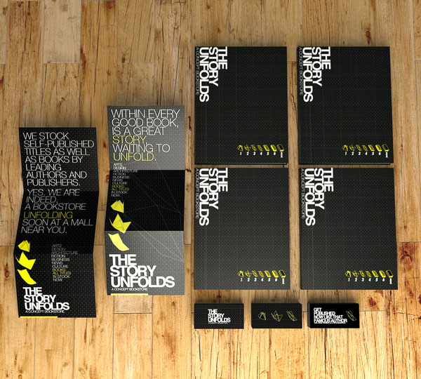
The team has got a spur from an entangled and fancy process of unfolding origami. The idea is brought to life with the help of geometric patterns that ideally blend in, typographic centerpieces that demonstrate slogans and data in an unconventional way, and gorgeous sketchy and realistic illustrations.
Luxembourg & Dayan by Watson & Company
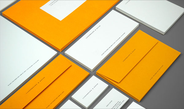
Almost microscopic lettering surrounded by a ton of white space is a characteristic trait of each mockup. It equips the project with a sense of refinement and exclusivity. The well-thought-out coloring, a distinctive typeface that looks legible in any size and minimal approach show the spirit of the corporation.
Valens Energy Drink by Maxime Quoilin
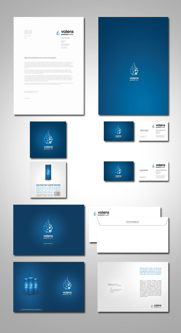
The brand identity of Valens Energy Drink by Maxime Quoilin is centered around water and droplet shape. So as you may have guessed the primary palette is based on shades of blue. White is used as a secondary color to add freshness. The artist has crafted all the integral elements from logotype to advertising posters that perfectly comply with the theme.
Gochisou Identity by Yaegerwerks
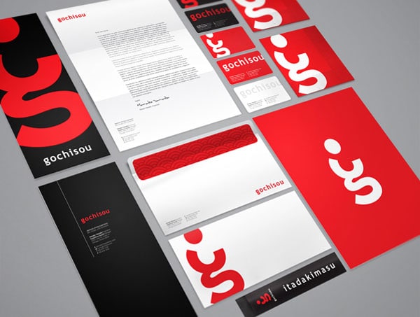
The author gets the basics of color psychology right. Since red is believed to develop an appetite, the design of a project dedicated to Japanese restaurant relies namely on this tone. The logotype is an interesting and smart interpretation of a client. Coloring, open feeling and type handle harmonious user experience.
RW Modern Corporate Identity by Reclameworks
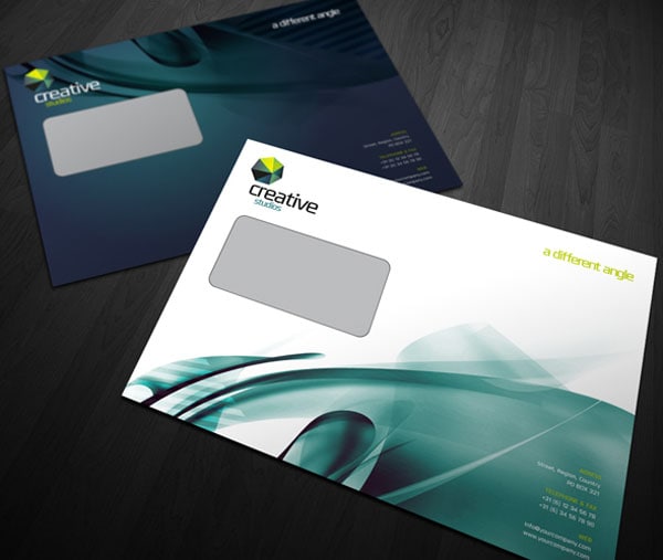
RW Modern Corporate Identity by Reclameworks was made with creative business in mind so that it has a sophisticated and intricate appearance to meet the targeted audience. Abstract backgrounds have a high-tech vibe and add to modernity. Green and blue express trust, growth, and balance as well as set up a friendly atmosphere.
Conclusion
The original design is able to promote the image of an organization, give an enormous boost to a start-up and make the business thrive. Professional corporate identity always elicits trust. The more things you mark with company’s logotype, brand coloring and slogan/motto, the more chances you will have to win over clients and develop healthy relationships.
