6 Benefits of Using a Copy-First Approach for Designers
A copy-first design approach is beneficial in helping design projects of all sizes. Whether it’s a stand-alone page, such as a landing page, or website redesign, a copy-first approach can make your project more efficient.
Personally, I’ve been using this approach for many years, including at my old corporate job, at a startup and in all my freelance projects.
In this post, I’m going to break down six benefits of using a content-first design approach. Let’s go!
1. Better Project Timeline and Deadline Planning
It doesn’t matter who is in charge of writing the content, whether it’s you, someone else on your team or the client. When you take time at the beginning of a project to write out all the copy along with a content plan (such as pictures or videos), it allows you to rethink the timeline and deadlines more accurately. No matter what tools you or your team use, it’s good to start off with a timeline that everyone can see.
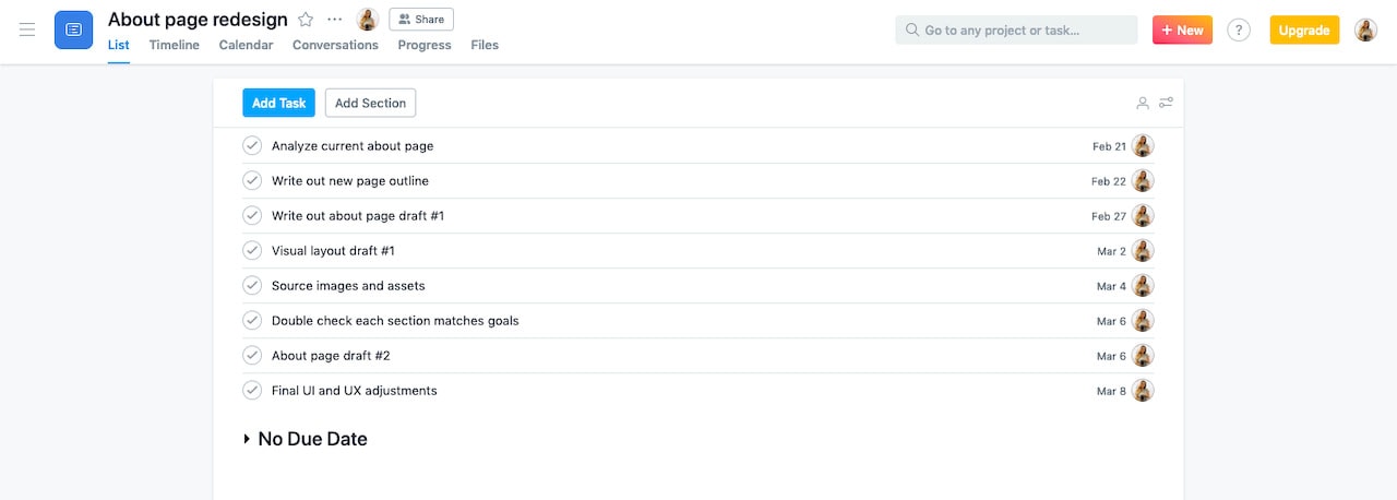
I’m working on updating a few pages of my own portfolio. As you can see in the above screenshot, I have high-level tasks outlined. Knowing deadlines and order of operations helps move this project along smoothly. It prevents me from jumping from idea to idea.
It’s an overlapping process
Depending on the size of the project, it will take some time to write out all your copy. A rough draft will do in the beginning. Additionally, it isn’t necessarily to create all the content assets either. A simple indication of where you want to use a photo, or description of it will suffice with an indication of when the photo shoot might take place in the project timeline is enough to start with.
With Postcards Email Builder you can create and edit email templates online without any coding skills! Includes more than 100 components to help you create custom emails templates faster than ever before.
Free Email BuilderFree Email Templates2. Help with Site Planning
This is a significant benefit for larger projects such full-blown corporate website redesigns. Writing the copy and content plan forces you (and your team) to plan the project and lets you see the overall strategy. It allows you to see how extensive the website and its different pages will be. Most importantly, it will show you different sales funnels or user journey.
For a small project, like a single page, seeing the copy and the content plan shows how extensive the page could be. Here, you can check the user flow wand see how it fits into the grand scheme of the existing website.
An example of site planning
Way back when I did a landing page project for Unwander, the founder wanted to test if people were interested in his app idea. We wrote out the landing page and mapped different links such as signup, terms and conditions, and contacts.
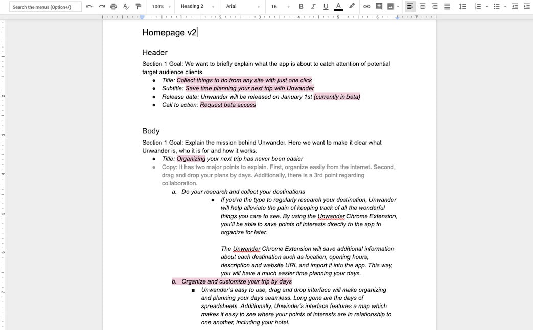
In the above document, we knew exactly what the header section and the first two body sections were going to be made of. We knew what kind of images we needed to source or create. We knew where the CTAs went and what they were going to say. Most importantly, we had an excellent plan for the page already.
Sitemap readily available
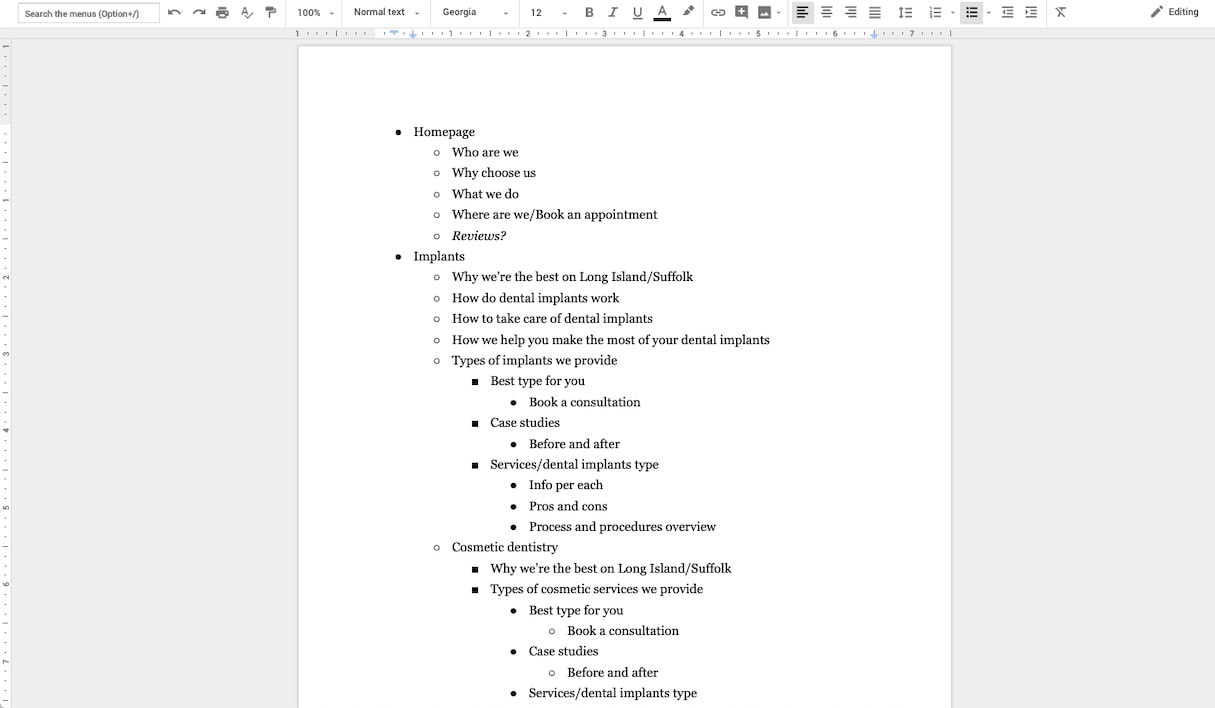
Having a site map early in the project is beneficial. It doesn’t matter how it’s documented – the important thing is that it’s there for everyone involved to access and see. Below is an image of the initial site map I created for Pride Dental last year.
A sitemap can be an excellent source to keep content organized and linked. This way you can see what’s missing, what needs more work and what’s ready to move on to the next stage.
3. Double Check Against Goals
As the project is moving along, you should also be checking the content against your goals. I’m talking about user goals and business goals. On the macro scale, you’d be checking to see if the overall content aligns with intended user and business goals. And, does each individual page align to the goals? On the micro level, does each individual section? Does each sentence?
If it the planned copy and content deviate drastically from those goals, it’s the right time to rewrite it. Even if the content strays just a little, this gives you an excellent opportunity to start optimizing it. Rewording copy and adjusting content assets to be more direct is a great way to strategize for higher conversion rates and lower bounce rates.
With Startup App and Slides App you can build unlimited websites using the online website editor which includes ready-made designed and coded elements, templates and themes.
Try Startup App Try Slides AppOther ProductsWhen the goals aren’t obvious, it shows
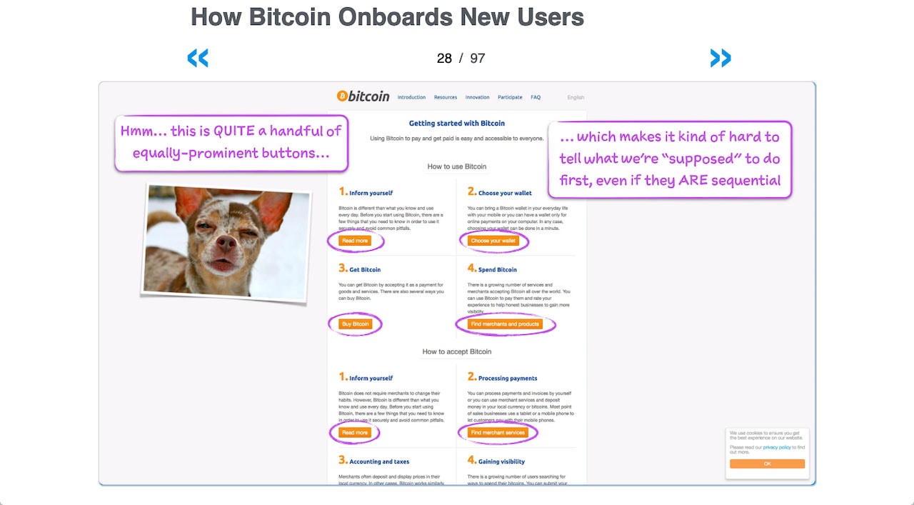
I’m a big fan of Samuel Hulick’s User Onboarding teardowns. Below is a screenshot of the onboarding process from when he tried to buy Bitcoins. The comments are funny, but they hold truth. This is an excellent example of a page that doesn’t have clear goals. There are way too many things going on!
4. Decluttering, Decluttering, Decluttering
There is a famous quote from the renowned user experience book ‘Don’t Make Me Think by Steve Krug: “Get rid of half the words on each page, then get rid of half of what’s left.”
We all know that lots of text isn’t great for user experience, usability, readability or site metrics. Yet, too often, a lot more copy ends up on a page then there ought to be.
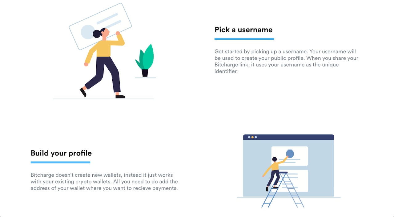
Cutting the copy and content by 75 percent is a strategic move. Bitcharge’s landing page is a wonderful example of short copy that’s to the point. All of their headings are only three words each.
On websites, less is more
As you’re decluttering, you’re improving your sales funnel, user flow, site map, navigation and more. Removing a whole section or whole pages is excellent if it makes the path to purchase more accessible.
Incomee’s landing page is an awesome example of when less is more. They keep copy to the absolute minimum while getting necessary points across.

5. Review for Branding
Now that the copy is optimized, it’s a good idea to check it against branding. I’m referring to tone and voice. Does it align with the tone the brand is aiming for? Does it align with the brand’s personality? Move on if yes. Rewrite if no.
6. Set Up the Visual Design
When I say that a copy-first approach helps set up the visual design, I mean that the sections of each and every page are clearly defined. This helps with a variety of design aspects, especially layout. Bringing back the landing page from Unwander, the structures were already well established. Now I just had to combine written with visual elements.
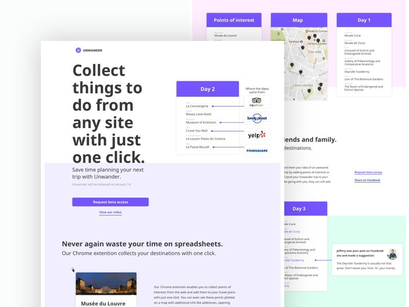
The copy-first approach is a highly collaborative process as well. When deciding on content, a designer will typically work with copywriters and marketers. Even developers provide opinions on what kind of concepts can be developed. The great thing is that these conversations start early in the project which allows for more successful collaborations.
Due to the collaborative nature of the copy-first approach, you’ve already started the visual design. For example, you know the landing page hero and footer have large images of a featured speaker. You know which sections incorporate a video as the background and so on.
Why does a copy-first approach work?
The biggest thing I can say about the copy-first approach is that because of its collaborative and planning nature, it helps remove revisions and solidify the UX. That’s because by the time the visual and UI design stage comes, all the pages – and their sections – have been already agreed upon by everybody involved. This makes scope creep almost impossible. It’s an effective way to lead future design projects!
