How to Create a Mail App Icon Using Adobe Illustrator
Difficulty: Intermediate / Advanced
Estimated completion time: 2-3 hours
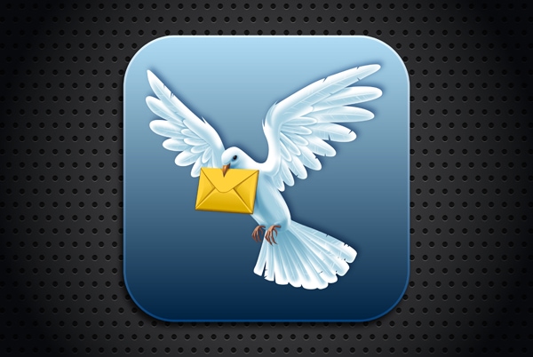
In this tutorial I’ll tell you how to create icons for iOS-applications, we will also talk about the technical requirements that are applied to this kind of products. In the process we will be using unique techniques that will allow you to create light and shade and soft play of colors. Let’s begin!
How to Create a Vintage Photo Camera icon for App Store in Adobe Illustrator
In this tutorial we will recreate the LEXXMT LTD logo. You can not sell or somehow get profit (commercial usage) for any materials copyrighted by LEXXMT LTD.
Step 1
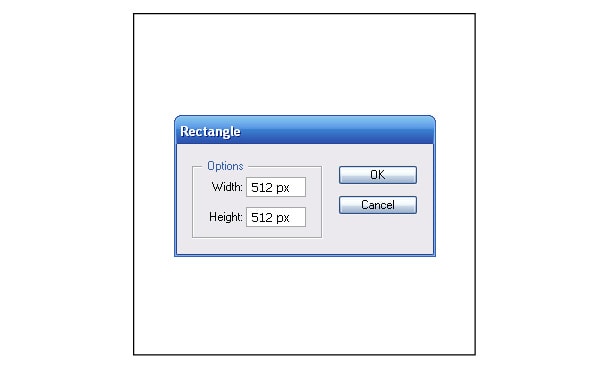
Before creating an icon for universal iOS-applications, you need to know the exact size of an icon that you are playing to create. If you are making a few icons, you will need to create a new drawing for each drawing. For each specific size it is required not only to reduce the large icon with a lot of details, but highlight the major (while discarding minor) elements, otherwise the final result will become a mess. Now we will create an icon 512 by 512 px in size, the other sizes and variations of the icons will be discussed in the concluding part of this tutorial. So, take the Rectangle Tool (M) and create a square 512 by 512 px, this way we limit the workspace of our icon.
With Postcards Email Builder you can create and edit email templates online without any coding skills! Includes more than 100 components to help you create custom emails templates faster than ever before.
Free Email BuilderFree Email TemplatesI want to draw your attention to the fact that no matter what shape you draw the icon, the frame with rounded edges will be automatically applied to it, so you do not have to think about it too much and can leave the original one square. But if you want to use some special graphics techniques, emphasizing borders of the icon, they will have to be created.
Step 2
Now we need an idea (in this tutorial I will be using the graphic of my friend, Valentine Sant, who kindly provided it for this tutorial). Most professional designers start everything with a working sketch.

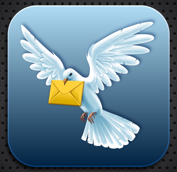
I think it’s a good idea to associate a carrier pigeon with mail app. Now we need to create a sketch that will serve as a prototype for the creation of vector objects.
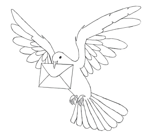
Paste this sketch in the workspace of Adobe Illustrator (File > Place …).
Step 3
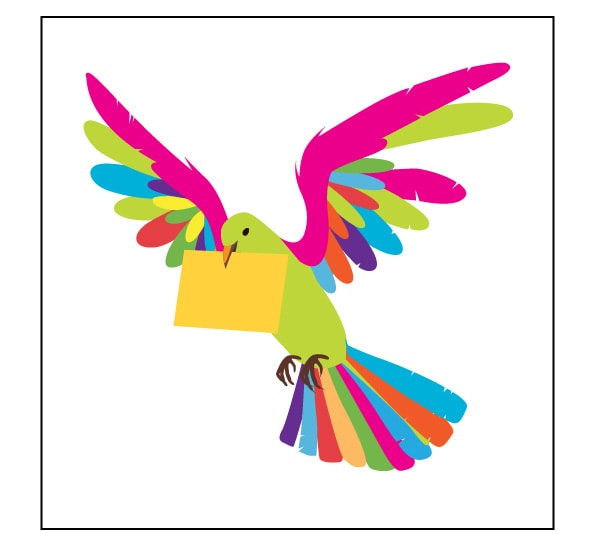
Based on a working sketch, create basic elements of our composition. In this artwork I’m using the Pen Tool (P) and filling objects with different colors in order to place them in the right sequence.
With Startup App and Slides App you can build unlimited websites using the online website editor which includes ready-made designed and coded elements, templates and themes.
Try Startup App Try Slides AppOther ProductsAs you can see, I immediately placed all the objects inside the frame which limits the size of icon.
Step 4
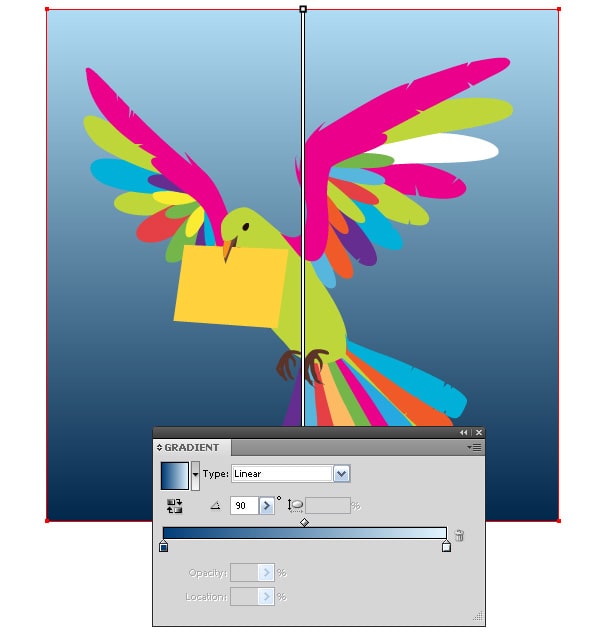
I always create a background before proceeding to vector objects coloring. Only in this case you will be able to pick right colors. Fill the square created in the first step with a vertical linear gradient from light-blue to blue.
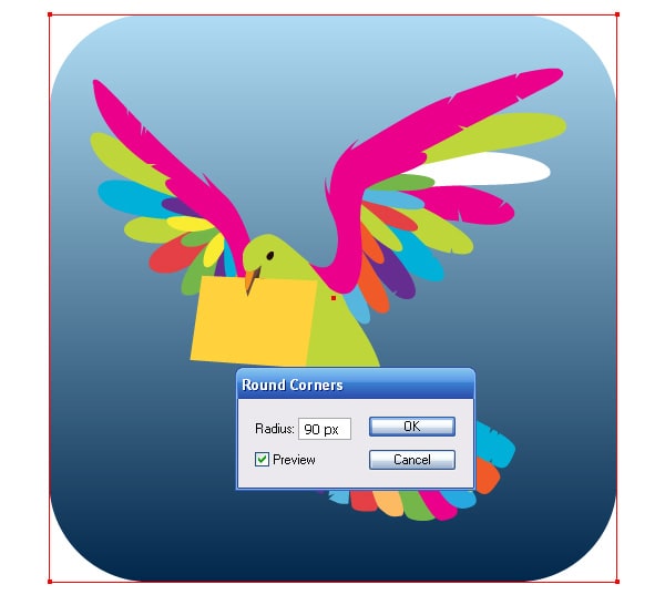
Let’s have the background of the icon done completely so we do not have to return to it again. To round the corners of the square go to Effect > Stylize > Round Corners … and set the radius of rounding in the dialog window.
Step 5
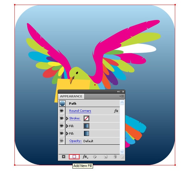
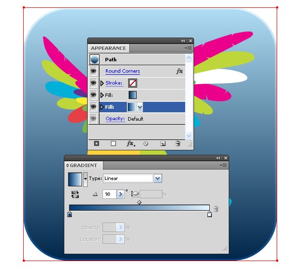
Create a frame around the icon. Open the Appearance panel and duplicate the fill by clicking on Add New Fill.
Now select the top fill in the Appearance panel and go to Effect > Path > Offset Path… and set the offset value in the dialog window. This value must be negative, otherwise icon size will exceed standard 512 px.
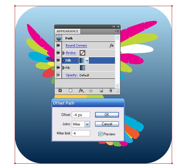
Select the bottom fill in the Appearance panel and replace the colors of its linear gradient with lighter shades of blue, so that its colors contrast with the background colors.
Step 6
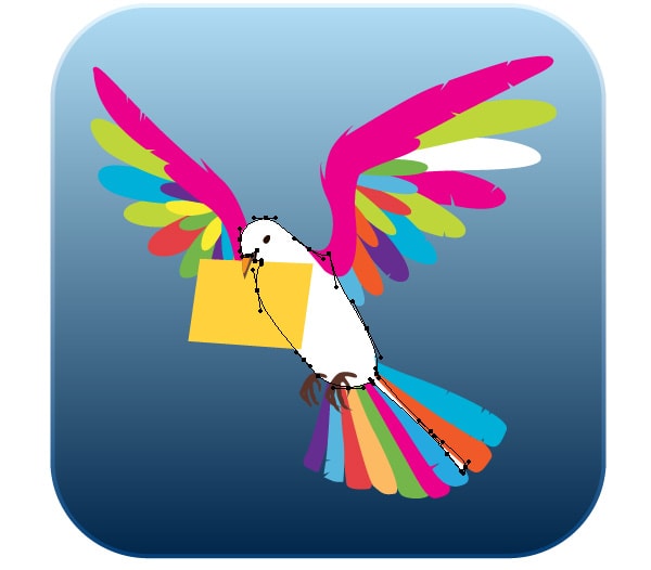
Now we can proceed to coloring the pigeon. On the example of the pigeon’s body check how to create complex lights and shadows and play of colors. Fill the shape of a body with white.
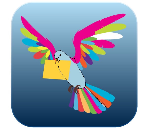
Copy this shape, paste it in front (Cmd / Ctrl + C, Cmd / Ctrl + F) and fill it with blue color.
Create a shape with white fill. I’m using the Pencil Tool (N) to create these shapes.
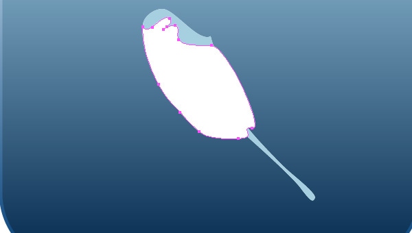
For clarity, I turned off the visibility of other objects so that nothing interferes with learning this technique.
Step 7
Keeping the shape selected, go to Effect > Blur > Gaussian Blur … and set the blurring radius in the dialog window.
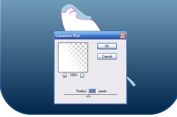
Create a new shape with the help of the Pen Tool (P) and fill it with black and white linear gradient as shown in the picture below.
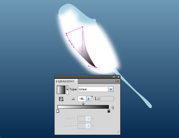
Also apply the Gaussian Blur effect to this shape.
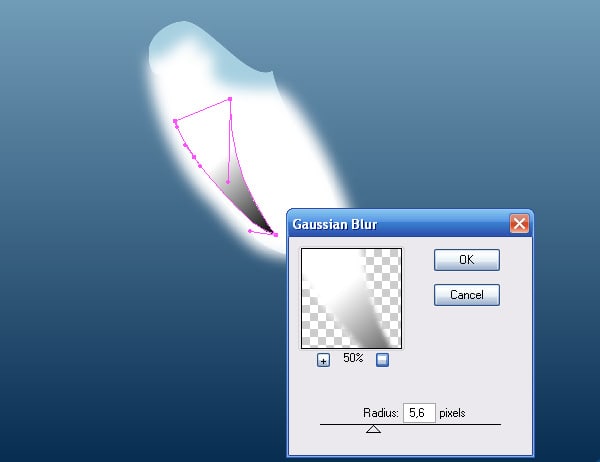
Using this technique, create two objects, one filled with black-and-white linear gradient fill and one filled with white color.
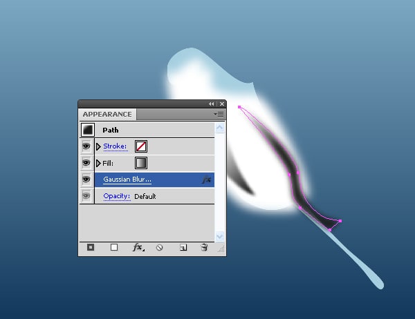
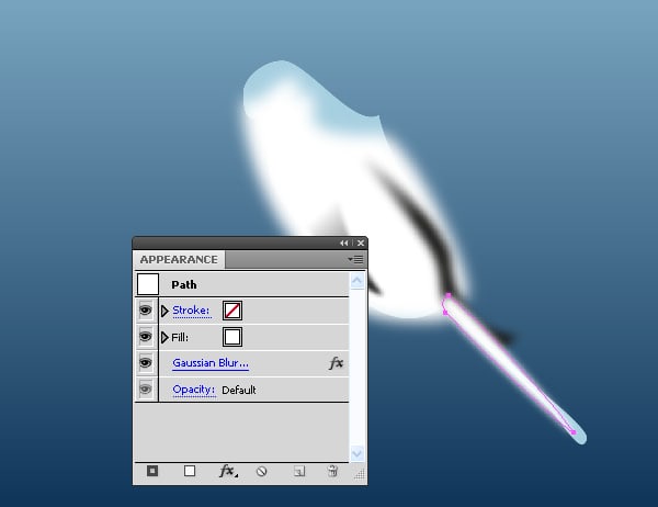
Step 8
Select and group up all the shapes to which the Gaussian Blur effect was applied (Cmd / Ctrl + G).
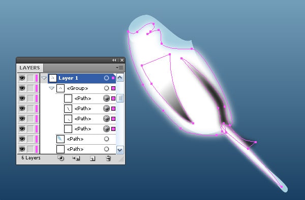
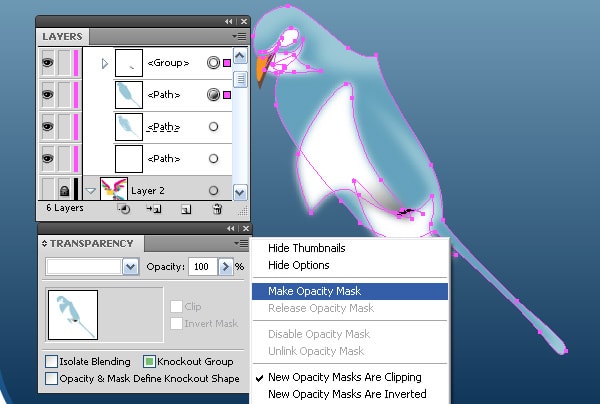
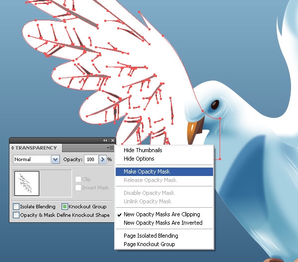
Now select this group, blue shape of the pigeon’s body and choose the Make Opacity Mask from the fly-out menu of the Transparency panel.
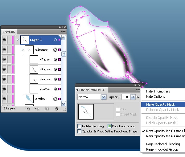
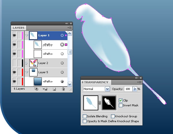
Step 9
Let’s take a look at what happened. In the areas where white shapes were located, the lower blue shape is completely visible. Outside the white shapes the lower blue shape is not visible. On the border of a white shape, we got a smooth transition due to the fact that that we applied the Gaussian Blur effect. Black color after applying the Opacity Mask becomes transparent. This technique may seem complicated, so we will take look at it again in this tutorial, but for now let’s see how to control this effect, because we cannot just get the right result the very first try. To get the access to all the objects that include the Opacity Mask, you will need to click on the right thumbnail in the Transparency panel.
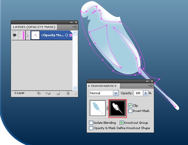
Now you can control the shape of the objects with the help of the Direct Selection Tool (A), and control the color and direction of the gradients using the Gradient Tool (G) and the Gradient panel. After editing the object, go to regular mode by clicking on the left thumbnail in the Transparency panel. You can also read about the usage of the Opacity Mask by clicking on the following link Use opacity masks to create transparency.
Step 10
Continue creating lights and shadows. Copy the white shape of the pigeon’s body, paste it in front and place upper Opacity Mask. Fill the new shape with blue color.
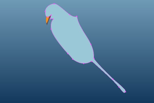
Set the Multiply Blending Mode for this shape in the Transparency panel.
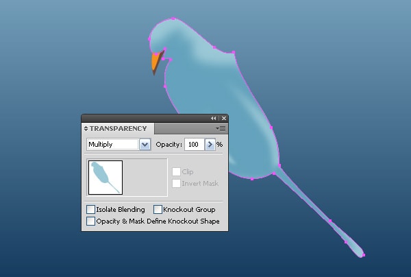
Step 11
As in the case with the first Opacity Mask create objects with white and gradient fill.

The shape of objects and their location must correspond with the shape and location of the shadows. Now apply the Gaussian Blur effect to the created objects.
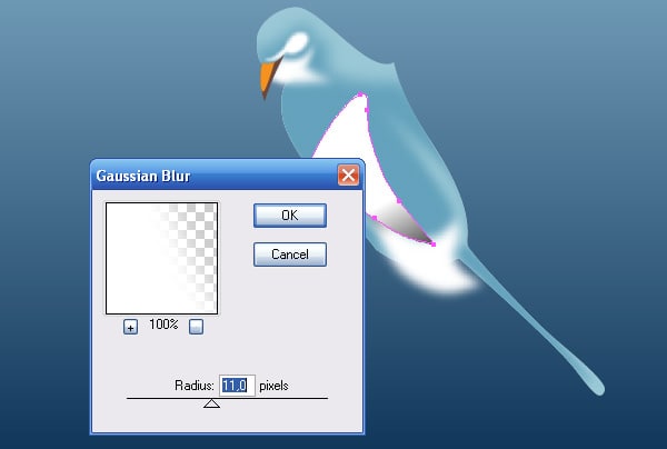
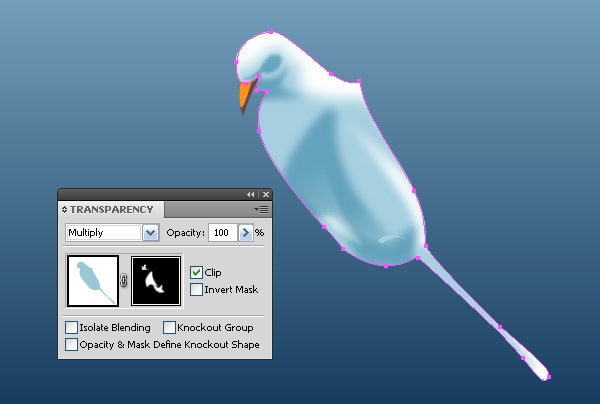
Blurring radius is different for each shape and depends on the smoothness of the transition from shadows to lights. Group up all the shapes that correspond to shadows, select the group and body shape to which the Multiply Blending Mode was applied. Keep these objects selected, apply the Opacity Mask to them.
Step 12
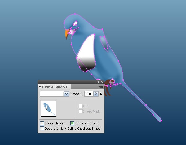
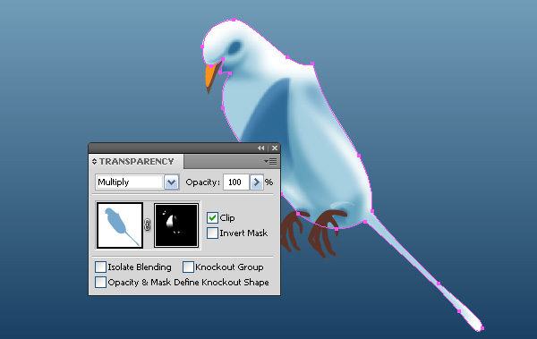
Now create deeper shadows. Copy the shape of the pigeon’s body again and place it above both of the opacity masks. Fill the shape with blue color and set the Multiply Blending Mode for it in the Transparency panel.
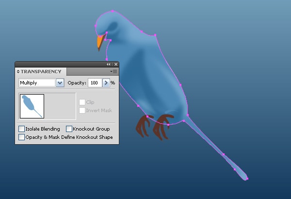
Using the technique described above, create shapes of deep shadows and apply the Gaussian Blur effect to them.
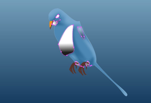
Group up all the shapes that make deep shadows, select this group and shape to which the Multiply Blending Mode was applied and create the Opacity Mask.
Step 13
Well, we created shadows with the help of the Opacity Masks moving from lights to deep shadows.
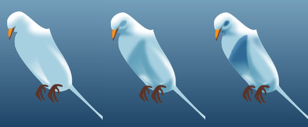
But it is rather a special case than the rule. The light source is located behind the pigeon, so the maximum illumination is on the body outline. In the case when the light source located in the front, we will have to move in the opposite direction, from the deepest shadows to the lights and glares.
Step 14
The last step in the creation of such artworks using this technique is to create a texture or in our case pigeon’s feather. Copy the bottom white shape of the pigeon’s body and paste it in front. Place this shape above the objects that were created in the previous steps.
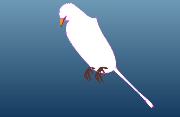
Now create the objects that will reproduce the play of light on the feathers of the pigeon.
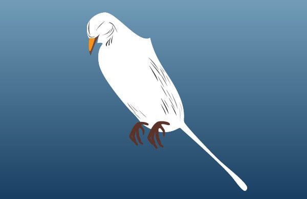
You can create the shape of such objects with the help of the Pen Tool (P) or Pencil Tool (N). Fill the objects with different shades of gray.
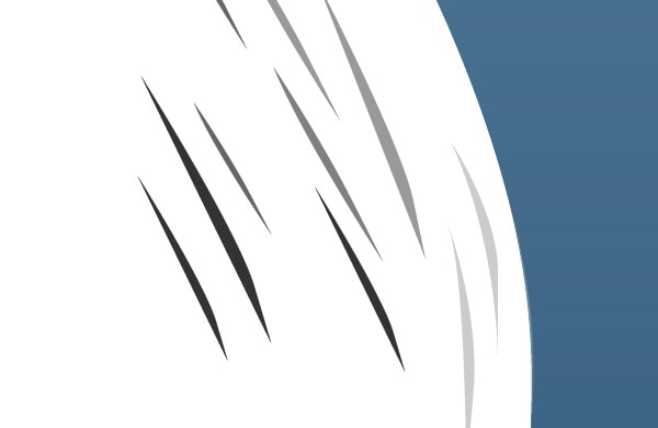
Group up all small objects, select the group and white shape, and then apply the Opacity Mask.
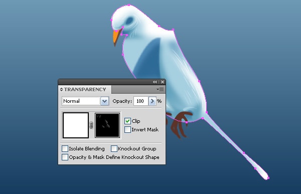
Now, I think you have mastered this technique to perfection.
Step 15
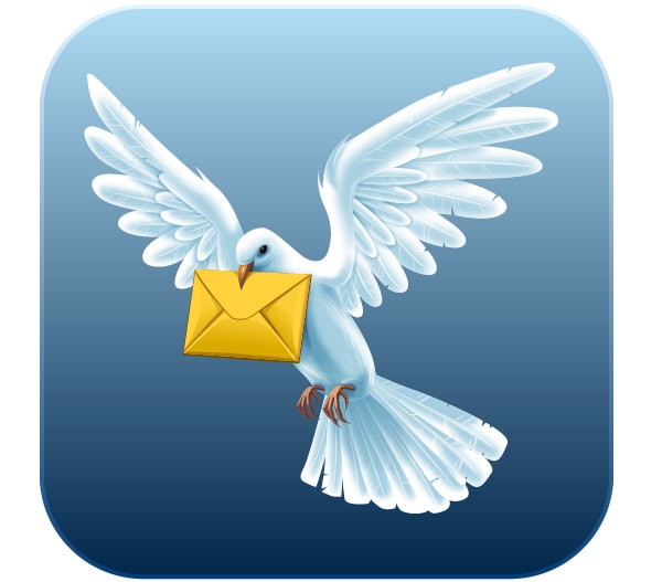
Do the play of light on all the elements of the pigeon and envelope with the help of the described techniques.
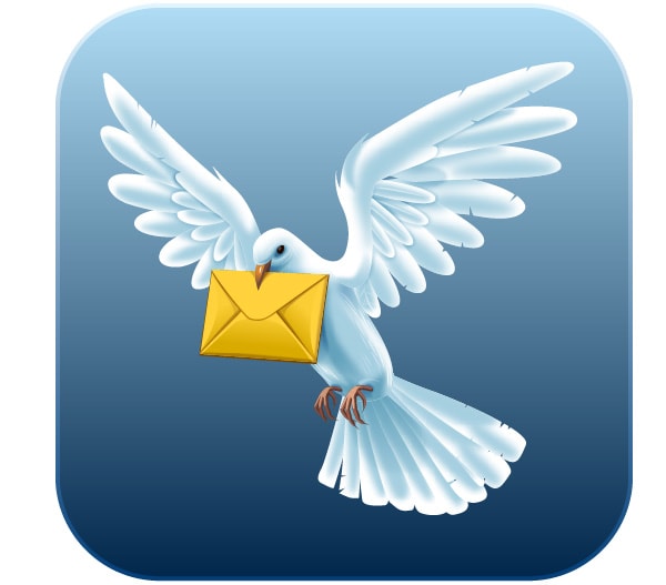
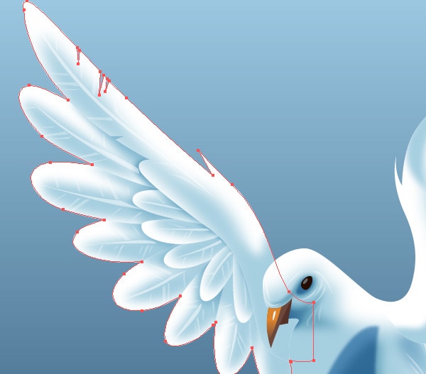
Create feather rachis on the wings of a pigeon using the same techniques that I have use with the feathers on the body.
Step 16
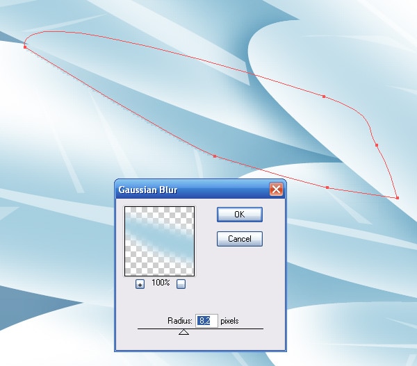
To add more volume to the wings, add falling shadows in some areas of feathers overlapping each other. Using the Pencil Tool (N), create a shape of shadow and apply the Gaussian Blur effect to the object (Effect > Blur > Gaussian Blur …).
Step 17
Now that all the elements of a pigeon are ready, group them up, and keeping the group selected, go to Effect > Stylize > Drop Shadow … and set the parameters indicated in the picture below.
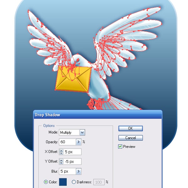
Icon 512 by 512 px is ready.
Step 18
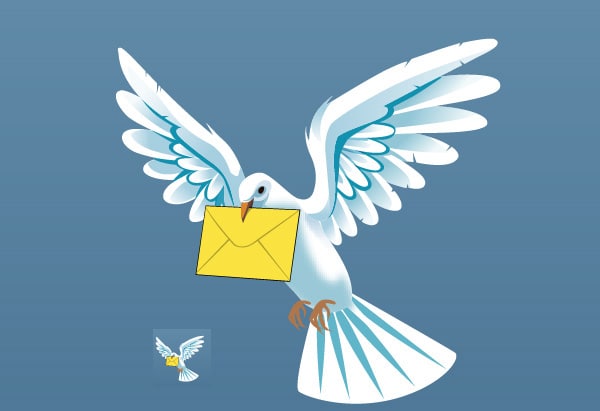
For other versions of this icon we will have, as I have already told at the beginning of this tutorial, create other visual images. But first, let’s see, what size the icons can be for iOS-applications.
- 29 by 29 px – for settings application on iPhone and iPad, as well as for the Spotlight on the iPhone. Despite its small size, they are very important.
- 48 by 48 px – for Spotlight on iPad. There is a tiny nuance: the information for developers on the Apple’s website says that the size of icons is 50 px, but in fact, the final size is 48 x 48 pixels. iOS just cuts off one pixel on each side and adds shadow. Strange decision, but it should be considered when drawing an icon.
- 57 by 57 px – for iPhone and iPod touch with regular display;
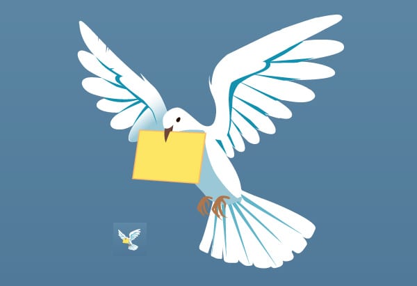
- 58 by 58 px – for settings application and Spotlight in iPhone 4. That’s right, you have to make two almost equal-sized icons.
- 64 by 64 px for the document icon. For those who do not know, mobile applications in iOS can provide a document icon.
- 72 by 72 px – for iPad;
- 114 by 114 px – for iPhone 4;
- 512 by 512 px – this size is used for displaying in iTunes, including the CoverFlow and App Store where it decreases by almost 3 times up to 175 px;
That is all the variety, my friends.
Step 19
The pictures below show how the same icons look like for the size 58 by 58 px and 48 px by 48 with an increase and in true size.
Step 20
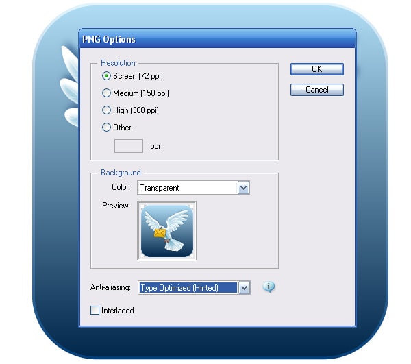
Once all the sizes of icons are ready, save them in the PNG format, for this go to File > Export … and select the desired format and set the parameters indicated in the picture below.
Conclusion
I think Adobe Illustrator or other vector graphics editor is perfect for creating icons, because you can use already created shapes for the creation of different versions of an icon, reducing or increasing them without losing quality. Besides, you can reproduce quite sophisticated effects, as you have already made sure on the example of Mail App Icon. Don’t forget to leave some feedback in the comments and subscribe us.
