Creating Home Screen Icons for iOS and Android Devices
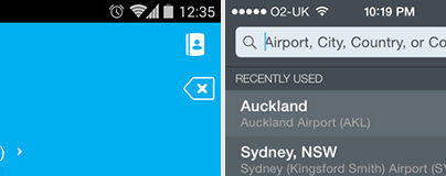
Many websites out there use favicons for bookmarks in a browser. What about when they are bookmarked on an iPhone’s home screen? Favicons can be used to set the icons for when your website or web app is saved onto someone’s home screen.
Let’s go over how you can set up favicons for the various iOS devices and Android ones in this short tutorial.
iOS Icon sizes
Different Apple devices have different resolutions, which means that the icons too will need to be differently sized. Ideally, you’d want to have a different size icon to accommodate for the different sizes. Let’s go over them now.
![]()
If you noticed that the retina icons are twice the size of the non-retina counterparts. This is because retina screens have double the density of pixels, which means that in order to fill in the same amount of space such as 57px by 57px it needs to have double the pixels hence the size of 114px by 114px.
Here is a helpful tip: a thing to keep in mind with these icons is the amount of detail should depend on the icon size. The smaller the icon, the less detail you should strive for as it will be less visible. There is a positive aspect of having various icons sizes as you can customize the smaller and bigger ones to accommodate the quality.
With Postcards Email Builder you can create and edit email templates online without any coding skills! Includes more than 100 components to help you create custom emails templates faster than ever before.
Free Email BuilderFree Email TemplatesLinking the icons
Have you previously added a regular favicon to your website? It’s actually quite simple, you just add a single line of code to the header of your HTML page that links the .ico or .png image.
<link rel="icon" href="favicon.ico" type="image/x-icon"/>
To add the iOS icons it is almost the same, just different syntax. Of course, each icon will require their own link so let’s go over them now.
For an iOS device to recognize that the icon is, in fact, a favicon two things need to happen. First, the rel should be set as apple-touch-icon and second, the size needs to be defined like 57×57. Below are the links for all the four different iOS icons.
<link rel="apple-touch-icon" sizes="57x57" href="apple-icon-57x57.png" />
<link rel="apple-touch-icon" sizes="72x72" href="apple-icon-72x72.png" />
<link rel="apple-touch-icon" sizes="114x114" href="apple-icon-114x114.png" />
<link rel="apple-touch-icon" sizes="144x144" href="apple-icon-144x144.png" />
Special Effects
I’m sure you have noticed that all iOS cons have rounded corners, drop shadow and some have reflective shine on them. All that is done by Apple automatically; you don’t have to worry about adding those in. Make your icons square and let Apple take care of the rounded corners. This will make for better quality icons. You can however, opt out of the shine if you choose to.
In order to strip the iOS styling you need to add -precomposed into the rel of your icons as such:
<link rel="apple-touch-icon-precomposed" sizes="114x114" href="apple-icon-114x114-precomposed.png" />
Android and other devices
The Apple favicons work on other devices such as Blackbettery v6.0 and higher, as well as Android 2.2 and higher. I’d like to think that is a very good thing as it would be quiet annoying to have to spell out different icons for different devices; especially because there are so many other Android phone, Blackberries and so on. It would be quiet a headache to have to worry about all of them.
Design tips
To recap a few things I have noted through this post, there are some design tips to keep in mind while designing favicons. First and foremost, let Apple add all of the effects they do – the shadows, the rounded corners and the glare – as it will have a higher quality look to it; plus, it is easier for them to do it automatically then doing it yourself.
Because you will be designing icons in various sizes, it would be a good idea to create the icons in vector form so that it is easier for you to scaled the icons down – just saying. Additionally, you should start working from the biggest size down; this ways it is actually easier to size them down than size up.
With Pulsetic you’ll be instantly notified the moment your website, API, or server becomes unavailable. Monitor uptime from multiple global locations and respond to incidents before your users are affected.
Create beautiful status pages in minutes to keep customers informed during outages and build trust with transparent communication.
Start Monitoring for FreeAs I mentioned previously, you should also try to customize the details for the differently sized icons. It is a small size difference but it still could affect the overall quality when there is a lot of small details in the smaller icons. I think you should, however, explore a little bit with the bigger icons – especially on retina displays – as they will look so good on the crisp displays.
Icons for inspiration
To round off this tutorial I wanted to show off some cool icons I found on Dribbble to spike your creative juices. I hope that these inspire you to create pretty cool favicons yourself.
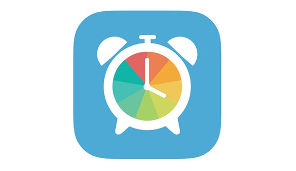
I really like the various colours used in the clock; they go very well with the flat design of this icon.
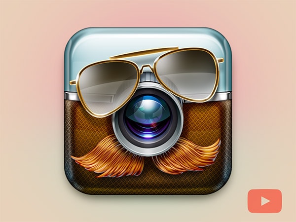
Talk about personality, this icon is very fun and funny. It is not a typical flat icon you see all over the place today but it still looks so good.
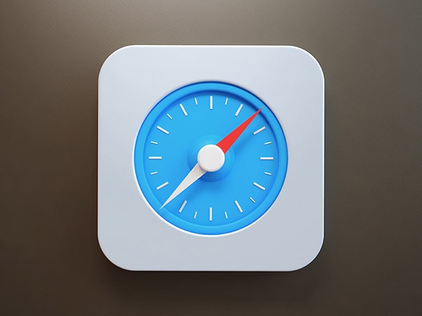
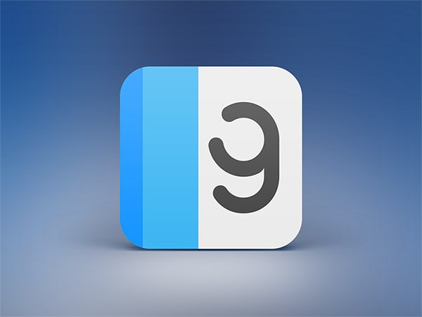
One thing I cannot get over is the use of subtle shadows in this icon. It is just so well done. The pale gray was a very nice choice against the light but vibrant blue.
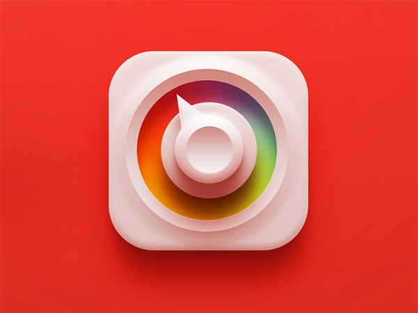
Once again an icon with gorgeous shadows; the blended rainbow of colours looks especially great. The subtle shadows and gradients again look very good in this design.
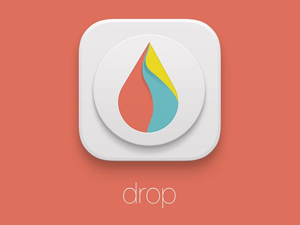
Here we have another non-flat icon where gradients and shadows are used very well in small amounts. If you haven’t noticed, I really enjoy the less is more approach towards shadows and gradients with these icons.
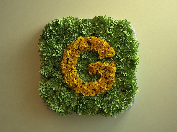
Talk about over the top embellishment. However, this icon is not only extraordinary it is simply amazing. The grass and flowers are very realistic and make this icon design feel grand.
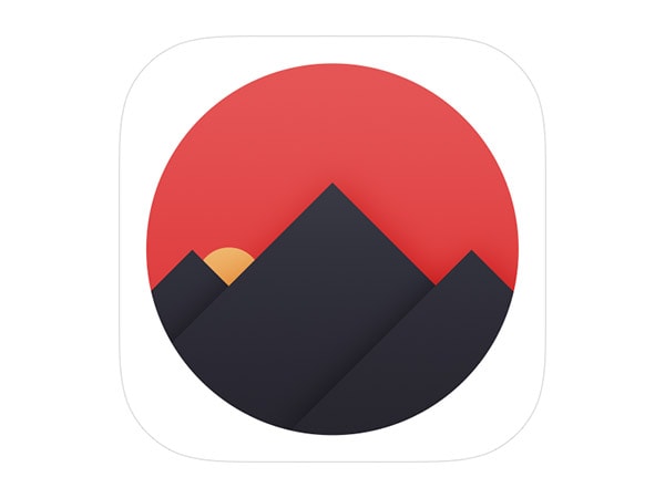
The colours chosen here are fantastic – you rarely see black and red in a design together. I also love how the mountains look like a real paper cut out. Talk about taking skeuomorphism to the next level.
What I enjoy about this icon is that it is quant; it doesn’t follow any specific trend and it is not obnoxiously asking for your attention. It’s subtle as it is not entirely flat thanks to the slight use of gradients; I like it.
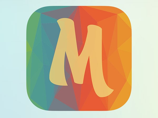
Once more an icon with amazing colour choices and execution. I like that it is not another gradient; the icons has the low-poly style to it and it is working very well in its favor.
Lastly we have an iOS7 style icon just without the odd and crazy gradients and with the simple white symbols inside it. I really like how the gradient is starting from the bottom and not the center of the icon.