How to Easily Create a Responsive Vertical Rhythm with CSS
Maintaining grid systems across a website can be a challenge. Implementing a CSS grid has become standard practice, whereas implementing horizontal grids – aka vertical rhythm – can be too. However, there is added complexity thanks to responsive design and responsive typography. Though, it’s actually quite easy to create a responsive vertical rhythm that is flexible to responsive design and responsive typography.
Responsive vertical rhythm allows the design to be consistent and visually appealing no matter the font or screen sizes used. Additionally, both horizontal and vertical grids are a staple asset of any design system, which allows both designers and developers to work more efficiently.
What makes responsive vertical rhythm an important implementation?
For the best results (and the best use of any vertical rhythm), there has to be a consistent pattern. From the visual design perspective, vertical rhythm is there to balance out the different content, typography, and design elements. The more consistent the pattern, the better the design can lead the viewer’s eye around the content without interruptions. A consistent and responsive vertical rhythm pattern makes a design more appealing. Utilizing responsive typography improves user experiences and can improve accessibility and usability too.
From the development perspective, it makes coding the website easier because you’re no longer crunching numbers or guessing what the different spacings should be. Instead, you can now reuse the patterns with ease thanks to the various reference points already predefined within the responsive vertical rhythm.
Coding a vertical rhythm isn’t too tricky if you’ve never done it. The process can be broken down into several steps – 5 steps exactly, as outlined in this tutorial.
- Creating Interactive, Highly Optimized AMP Emails
- Create a Beautiful and Responsive HTML Email Template with Postcards
- Create a Product Page with Interactive Colors in HTML, CSS3 & jQuery
- Create a Minimalist Website Design using Slides Framework
Vertical rhythm basics
Most vertical rhythms are based on a line-height, usually aligned to the text’s baseline. Although typography is a core component of vertical rhythm, it’s simply where the spacing measurements are taken from. It’s also used for all the other design elements such as images, input forms, and so on.
With Postcards Email Builder you can create and edit email templates online without any coding skills! Includes more than 100 components to help you create custom emails templates faster than ever before.
Free Email BuilderFree Email TemplatesWhich CSS properties do vertical rhythms use?
- Line-height
- Top and bottom offset
- Height, min-height, max-height
- Padding-top, padding-bottom, margin-top, margin-bottom.
What makes a vertical rhythm responsive?
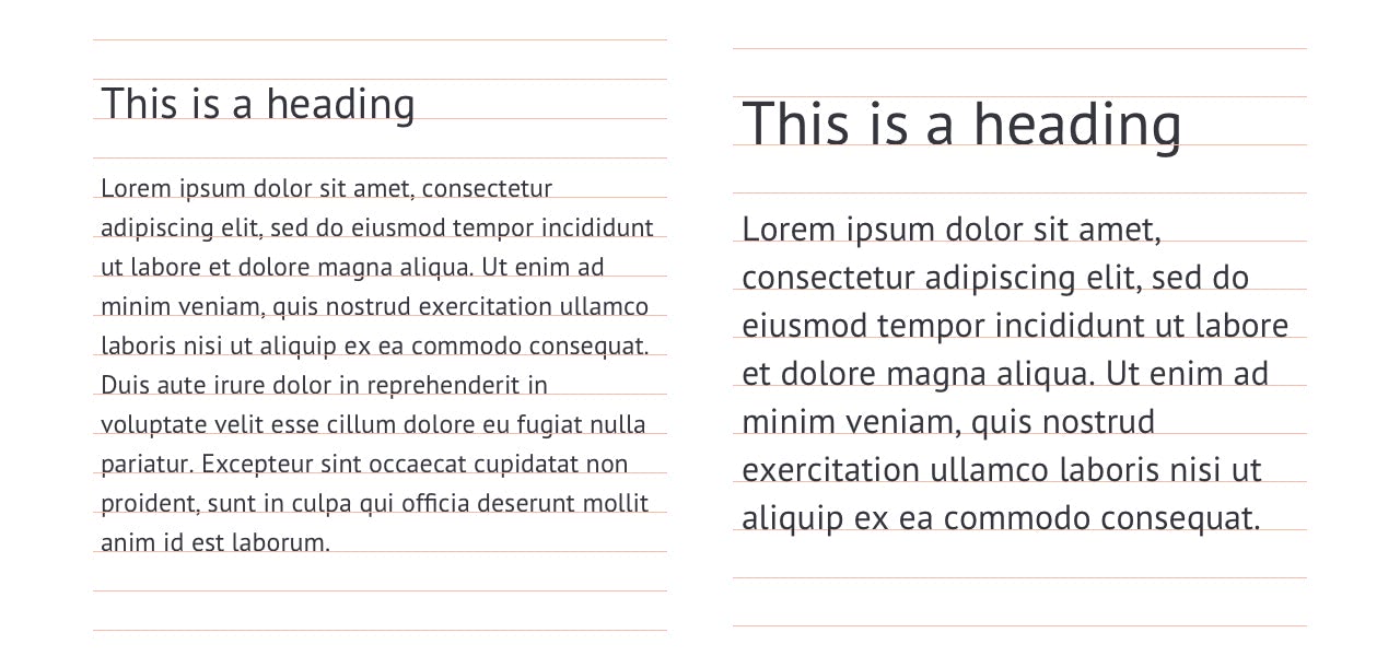
As you will see shortly, creating a responsive vertical rhythm depends on two things. You identify the different font-sizes, line heights and spacings dependant on specific screen sizes. Basically, you will be recreating the various vertical rhythm patterns in different media queries. The overall process is the same for each new screen size.
1. Setting up the basic CSS pattern
The very first thing you’ll want to do is define the default font size on either the HTML tag or the body tag. The default font-size and line-height should be the same as the body paragraph’s.
If you’re dealing with responsive typography, which font size do you want to choose as your default base? My recommendation is to create all responsive vertical rhythm through progressive enhancement. And, that’s what we’ll do in this tutorial. So, start with typography from the smallest screens.
body {
 /* Set default font size for mobile only */
    font-size: 12px;
    /* Set base line-height for mobile only */
    line-height: 1.5; /* 18px */
}
With these two declarations, you’ve created a vertical rhythm spacing of 18px: 12 x 1.5 = 18.
2. Adding the spacing
With the default vertical rhythm established, the spacing is next. If the margins above and below the paragraphs are the same, the math is straight forward.
By default, web browsers insert a top and bottom margin of 1em to paragraphs. We’ll simply have to redefine it for them to match our vertical rhythm.
p {
 margin-top: 1.5em; /* 18px */
 margin-bottom: 1.5em; /* 18px */

 /* !Font-size and line-height for reference only! */
 /* font-size: 1em; */ /* 14px */
 /* line-height: 1em; */ /* 18px */
}
The spacing will be different for other elements such as headers that use a different font-size and line-height but more on that later. We’re also tackling different spacing multipliers later too.
With Pulsetic you’ll be instantly notified the moment your website, API, or server becomes unavailable. Monitor uptime from multiple global locations and respond to incidents before your users are affected.
Create beautiful status pages in minutes to keep customers informed during outages and build trust with transparent communication.
Start Monitoring for Free3. Variations in font-sizes
It’s expected for a design to use multiple font-sizes, especially in headings. However, this can also include things like blockquotes, figure captions, and so on. Not to mention, it can get a bit complicated if you’re also using responsive typography for each of these too.
Below we’re setting up the line-height and margins for an H1 that has a font-size of 20px from the vertical rhythm base of 18px.
h1 {
 font-size: 1.6667em; /* 20px; */
 line-height: 1.8000em; /* 36px */
 margin-top: 0.9em; /* 18px */
 margin-bottom: 0.9em; /* 18px */
}
How did we get these numbers?
- To calculate the heading’s font-size divide the desired font’s pixel size (20px) by the default font-size (12px): 20/12 = 1.6667
- To calculate the new line-height, first, double the line height (because of the larger font size), then divide the new line-height (36px) by the heading’s font size (20px): (18*2) = 36, 36/20 = 1.8
- To calculate the margins, divide the default line-height (18pxm) by the heading’s font size (20px): 18/20: 0.9
Can the new line-height be different? Yes, of course. The design determines the line heights. It could be 2.5, for instance. This example assumes the H1’s line-height is double for simplicity.
What if you wanted to have larger margins than the default 18px line-height? That’s where the multipliers come in!
4. Generating spacing multipliers
In the example so far, the spacing between the H1 and a paragraph would be exactly the same as the spacing between multiple paragraphs. That’s where the multipliers come in. We can create them in plain CSS, but using variables with LESS or SASS will make the math more accurate and easier to handle too.
Adding multipliers to your CSS system is a great way to have additional classes for the different numbers of vertical rhythm units, such as x1, x2, and so on. You can then use these classes as additional padding and spacing around elements.
You will be able to reuse the spacing as needed instead of hard coding them into a specific element. This way, the code can easily be customized if you want to add 3x spacing below an H1 and a paragraph or 2x spacing between an H1 and H2. This method also makes responsive vertical rhythm easier too. That’s because all you have to do is update the reusable multipliers instead of a slew of CSS dependencies. Yes, you can use this padding on other elements too like images or sections.
.vertical-spacing-bottom-1x {
 padding-bottom: 1.5em; /* 18px */
}

.vertical-spacing-bottom-2x {
 padding-bottom: 3em; /* 36px */
}

.vertical-spacing-bottom-3x {
 padding-bottom: 4.5em; /* 54px */
}
The math here is nothing complicated (18*X)/12 = #em. Naturally, to create you follow the same process for padding-top multipliers too.
.vertical-spacing-top-1x {
 padding-bottom: 1.5em; /* 18px */
}

.vertical-spacing-top-2x {
 padding-bottom: 3em; /* 36px */
}

.vertical-spacing-top-3x {
 padding-bottom: 4.5em; /* 54px */
}
5. Creating a responsive vertical rhythm
Responsive typography is a design practice of using different font sizes and spacing on different devices. It’s a great idea for improved user experiences on various devices.
What we’ve done up until this point will work for a website with no responsive typography. As already mentioned, progressive enhancement is a great method for creating a responsive vertical rhythm. It will be the default vertical rhythm and one for mobile devices. Next, we can focus on creating a new vertical rhythm for desktops.
- Responsive Web Design: 50 Examples and Best Practices
- Retina Ready Images and Responsive Web Design
- How To Manage White Space in Mobile Responsive Layouts
What about tablet sizes?
The design you’re coding might have multiple typography requirements for a variety of screen sizes. With progressive enhancement, you’d first define the vertical rhythm from the smallest device to the largest. To keep this tutorial short and sweet, we’ll only concern ourselves with a mobile and desktop.
Setting up the desktop vertical rhythm with media queries
The first thing we’ll set up is a media query for the minimum device width we want our new desktop vertical rhythm to take effect on. Then, we can copy and paste what we’ve already done and replace the numbers accordingly.
It’s really that simple. Although, it can be tedious and redundant. That’s why using LESS or SASS is recommended because they allow for use of variables.
@media only screen and (min-width: 600px) {
@media only screen and (min-width: 600px) {
body {
 /* Set default font size for desktop only */
 font-size: 16px;
 /* Set base line-height for desktop only */
 line-height: 1.375; /* 22px */
}
Next, we need to set the default margins for a p tag and adjust all the numbers surrounding the H1.
p {
margin-top: 1.375em; /* 22px */
margin-bottom: 1.375em; /* 22px */

/* !Font-size and line-height for reference only! */
/* font-size: 1em; */ /* 16px */
/* line-height: 1em; */ /* 22px */
}
h1 {
font-size: 1.75em; /* 28px; */
line-height: 1.5714em; /* 33px (1.5*22px) */
margin-top: 0.7857em; /* 18px */
margin-bottom: 0.7857em; /* 18px */
}
Lastly, we’ll have to adjust the multiplier classes.
.vertical-spacing-bottom-1x {
padding-bottom: 1.375; /* 22px */
}

.vertical-spacing-bottom-2x {
padding-bottom: 2.75em; /* 44px */
}

.vertical-spacing-bottom-3x {
padding-bottom: 4.125em; /* 66px */
}
.vertical-spacing-top-1x {
padding-bottom: 1.375; /* 22px */
}

.vertical-spacing-top-2x {
padding-bottom: 2.75em; /* 44px */
}

.vertical-spacing-top-3x {
 padding-bottom: 4.125em; /* 66px */
}
}/* End @media only screen and (min-width: 600px) */
Conclusion
As you can see, it only takes five small steps to create a flexible and responsive vertical rhythm with plain CSS. You can customize the vertical rhythm to fit your specific design requirements as needed and use the above tutorial as your basic set up.
If you need to, you can add media queries for tablets, medium-size devices like netbooks or small laptops, typical desktop sizes, and extra-large desktop monitors. All you have to do is define the right media query and repeat this process for each.


