How to Add an Email Background Image in Your Newsletter
Use of multimedia in an email newsletter is not something new. Almost every other message in our inbox is packed with images, icons, and even gifs and videos. Rich multimedia is an integral part of the web sphere and designers and developers of email newsletters are not willing to make exceptions. Even though there are lots of limitations, yet still, we, regular subscribers, are enjoying HTML email templates that look much like any standard web page. They have the same structure and even use the same decorative tricks. We can see beautiful call-to-action buttons that beckon us, custom fonts that enrich the messages with emotions, trendy graphics that add diversity to the experience and of course gorgeous background images that make every section shine.
Note: Check out our new email template builder – Postcards. Try it for free!
Speaking of which, use of background images is a quite controversial topic. Many designers prefer to avoid them in email newsletters. There are a couple of reasons for that.
- It is still tricky to make the background image work as you wish since you need to balance between various screen sizes. Finding the sweet spot is always an issue whether you create a website or newsletter.
- Not all mail user agents support them, so you need to make sure your email letter still looks good even without them.
- It may take some time before you find the ideal background image.
How to Use Background Images in Email Templates
So it is much easier to avoid them at all and opt in favor of a simple, pure white canvas. However, let’s be honest without background images email newsletters lose. Just take a look at Happy fall greetings from ASU. It is the most primitive example of using background imagery; nevertheless, it saves the day here.
Not only does it enrich the design but it also strengthens the overall message, makes a strong impression and even ignites our interest, prompting us to read at least the first paragraph. You must agree: without this autumn-inspired pattern and beautiful yellow and orange coloring the newsletter would look banal, and boring, and would undoubtedly end up in the trash folder of your inbox in several seconds. But, with this backdrop, it’s a different story.
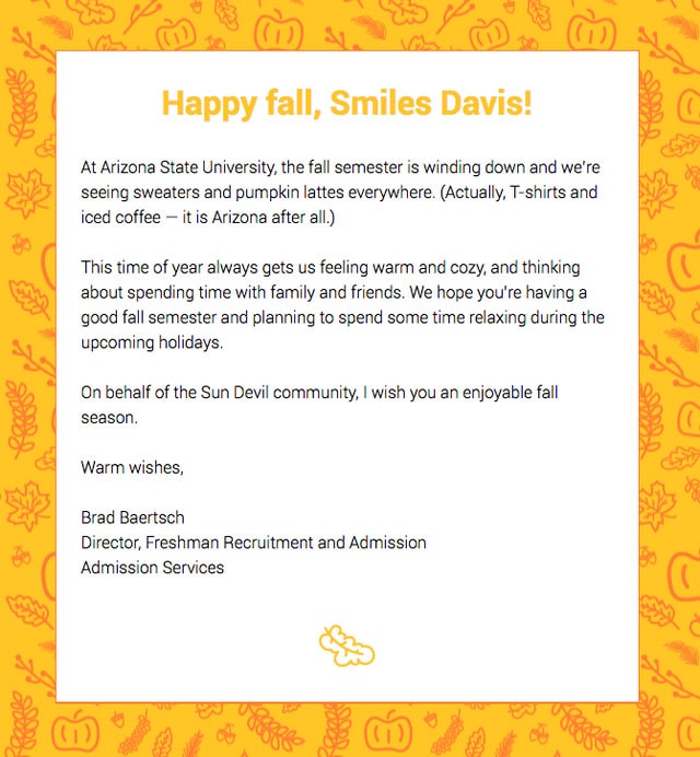
Happy fall greetings from ASU
With Postcards Email Builder you can create and edit email templates online without any coding skills! Includes more than 100 components to help you create custom emails templates faster than ever before.
Free Email BuilderFree Email TemplatesThere are some other fantastic newsletter designs in which the image backgrounds change the game. For example, From 12,481 ft. above to 800 ft. below.
The email from the Natural Retreats feels adventurous and highly alluring. It is a skilfully styled infographic that is based on various geographical facts. The illustrative approach runs the show here. Without a background image, it would certainly lose its charm and a powerful natural appeal.
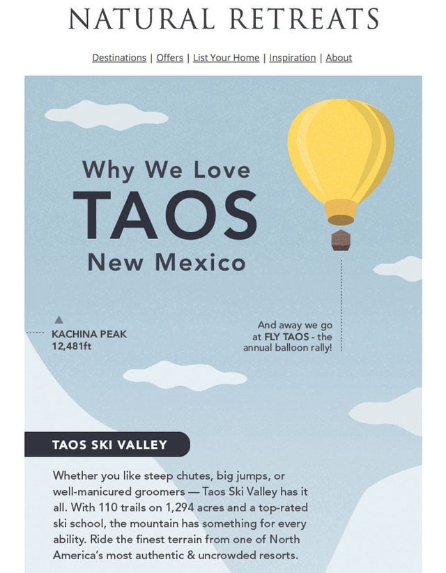
From 12,481 ft. above to 800 ft. below

Do you think of widening new horizons?
Much like the previous example, the email newsletter from Justforex is also made with the illustrative approach in mind to produce the powerful first impression. The hero area is marked by a beautiful picture that goes perfectly well with all those fancy icons scattered throughout the design. Here, the image backdrop makes the design complete.
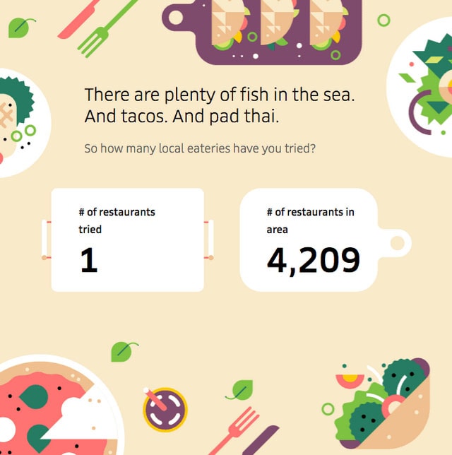
Discover what’s new to eat near you
Although the designers behind the email newsletter from Uber Eats mostly rely on images featuring delicious dishes; still the yummy illustration that is used as a background for one of the sections easily whets the appetite.
Another example from the team of Uber Eats. Here they show how to make the newsletter correspond with the current festive. Using an excellent illustration as a background they add to the letter a feeling of celebratory mood and at the same time give way to the message. Killing two birds with one stone, isn’t it?
With Pulsetic you’ll be instantly notified the moment your website, API, or server becomes unavailable. Monitor uptime from multiple global locations and respond to incidents before your users are affected.
Create beautiful status pages in minutes to keep customers informed during outages and build trust with transparent communication.
Start Monitoring for Free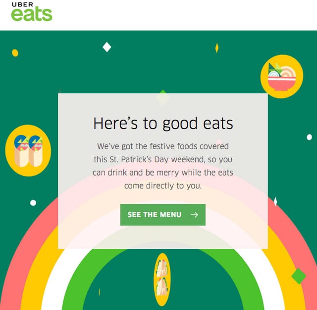
Celebrate St. Paddy’s Day with Uber Eats
Thanks to simple background images, the primitive thank you letter is transformed into a lovely artwork. It can easily make your day, not only with its generous offer but also with its adorable appearance.

Just a thank you note
From fancy illustrations to realistic images that make any email newsletter to look like a regular landing page. Consider Periodic from Studio Science that feels like a basic minimal one-page website with a one-column structure.
The newsletter has a neat appearance. It does not include many sections, so a compelling image background that makes the hero area an eye-catcher is a main visual driving force here. It favorably highlights the message and enhances the first impression.
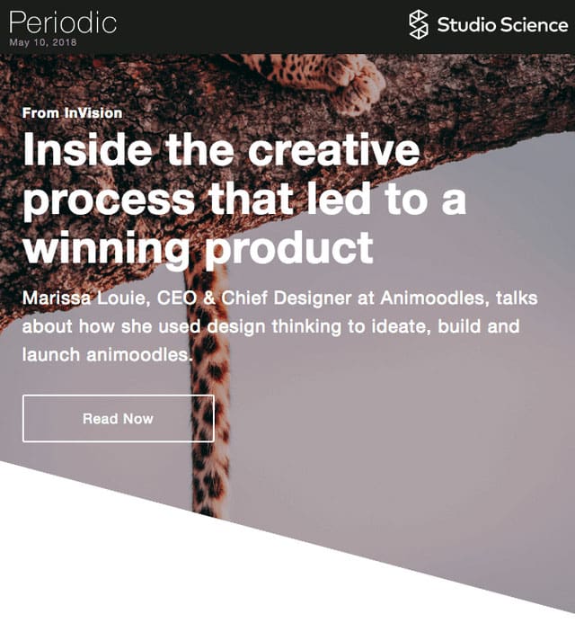
Periodic from Studio Science
The email newsletter by team Sattva resembles a standard promo page for mobile applications. We have seen a ton of them in the wild. Now it can be found in our inbox as well. The image backdrop that shows an app enclosed in white iPhone is a thing that sets the proper atmosphere here. With its vibrant appearance, it makes the design look positive and inviting as well as demonstrating the product in the best possible light.
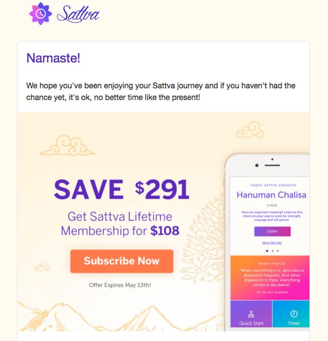
Get Sattva Lifetime Membership for $108
Speaking of happy mood, the email newsletter sent by the Starbucks team looks joyful and delightful. It is so alluring that you want to grab this cup of coffee right away. Its fancy background that was inspired by geometric trends, plays a vital role in all this. It stands behind the cheerful atmosphere as well as giving a lovely zest to the general aesthetics.
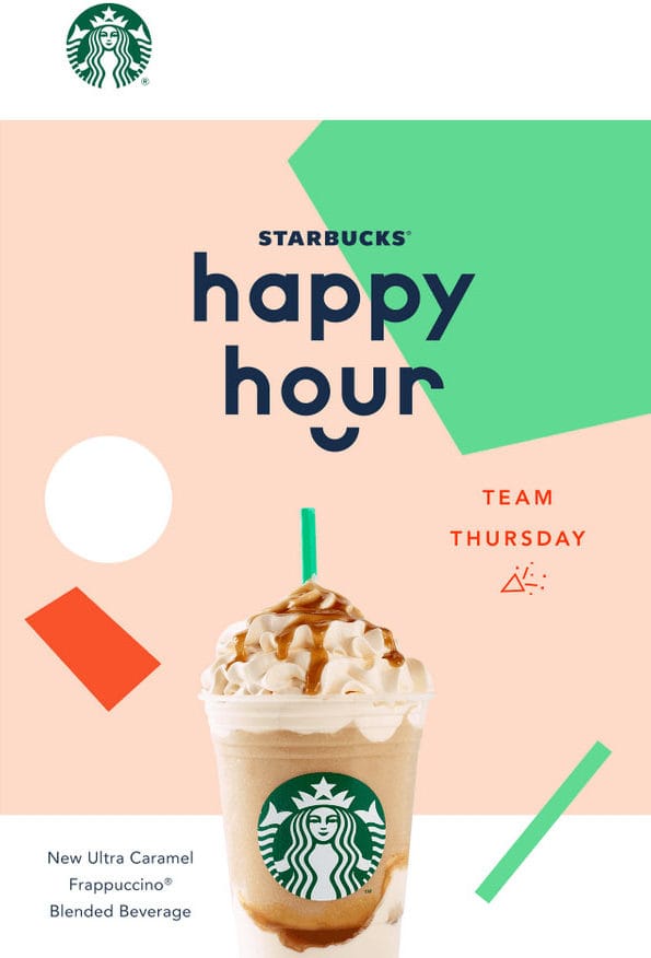
See you at Starbucks Happy Hour
Here the team uses background images everywhere. They can be seen in the header, footer, and just regular sections. They help to transform the email newsletter into a regular landing page. As a result, it looks stylish, sophisticated and up-to-date.
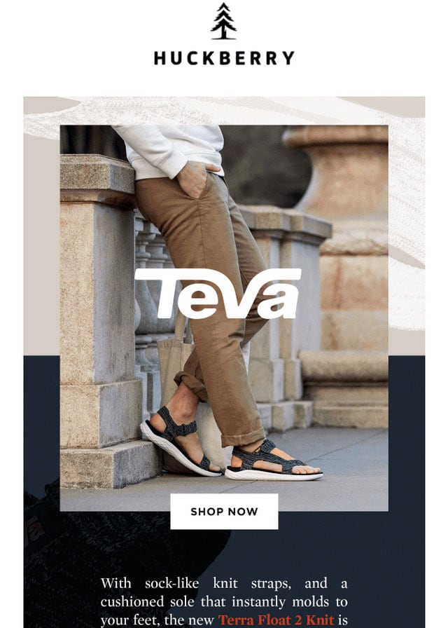
Tevas From The Future
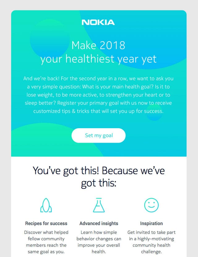
Make your goal a reality
The newsletter from Nokia team features an abstract background instead of a realistic photo. It unobtrusively directs the attention towards the message and at the same time enhances it with its artistic nature. It looks minimal, neat and clean.
Importance of Email Backgrounds
Despite all concerns, the importance of email backgrounds is paramount. Do you know it might affect the reader’s perception of the message? Many studies have shown that the color of the backdrop unobtrusively influences viewers’ assessment, behavior, reactions, motivations, and memory. This means your choice of email background might play a decisive role in your brand message delivery efficacy.
As email background accounts for the lion’s share of the digital newsletter, it often stands behind overall visual impact, directly enhancing engagement and communication effectiveness. This plays a crucial role in marketing, advertising, and branding, which benefit most from a positive, meaningful, and memorable visual perception of the company’s message.
With humans, who process information by primarily accessing the visual cortex of their brains first, an email background gives a preliminary look at what the email, message, brand, communication, and user experience are about in just several seconds. Not only is it the first thing they notice and perceive, but it is also the main source of information for subscribers who prefer to scan their digital correspondence rather than read it even when they have time.
The email background is never one to miss. It is so powerful that it influences elements on the front, providing them a secure foundation to achieve their goals. It might easily elevate the design, enrich a story, stress out the offer, and add huge value to the brand’s message.
An email background can also be quite effective in creating a mood. From joy and serenity to tension and melancholy, it may generate a powerful gamut of emotions and establish an atmosphere in the communication by allowing the viewer to place themselves in the moment that naturally stirs up an emotional reaction.
Used as the main part of the message, it can elicit the emotions needed to influence customer behavior and trigger purchasing decisions. For example, warm colors evoke happiness, optimism, and energy; therefore, backdrops enriched with yellow, orange, and gold tones are great for establishing a positive ambiance and amplifying email marketing efforts in welcome messages or re-engagement campaigns.
As one of the most popular assertions of perceptual psychology claims, attractive things work better. The more appealing the email background is, the more likely it will draw customers’ attention, ignite their interest, and leave a memorable, lasting impression.
There is more. Email background is not only about aesthetics but also practicality. Nothing can beat a clean white email backdrop in providing a great reading experience and meeting high accessibility standards. It hits all the essentials necessary to create an optimal user experience in a small space like a digital newsletter. Plus, associated with brightness, cleanliness, and neutrality, it is the best at leaving a professional and unconstrained feel in communication.
To sum up, designers can take many different roads when it comes to the background. They can go for clean white canvases or intense and dramatic photos. However, one thing is certain: whether they want to establish urgency or vice versa, creating a relaxed and soothing atmosphere, it will be the first tool to achieve that.
Professional Tips for Email Backgrounds
The success of email background largely depends on the brand’s identity and image, industry, product, target audience, campaign, and even the customer’s taste. Different website backgrounds offer unique advantages, allowing email designers to exercise creativity. However, some standards might still be met to ensure a great user experience. Here are some tips you can use to find the best option for your next email marketing campaign.
Use Captivating Email Background
As perceptual psychology claims, beauty makes us look twice. It draws our attention, retains it, and even makes us crave more. The more an email background has qualities or features that arouse interest or appeal to the audience, the more chances it will captivate and compel them to follow the lead.
Appealing email backgrounds are increasingly effective in achieving various marketing, advertising, and branding goals. They are perfect for drawing and retaining attention, leaving long-lasting impressions, drumming up curiosity, and driving engagement.
However, what are captivating email backgrounds? Beauty could be different. When it comes to email marketing, the target audience’s preferences, demographics, cultural aspects, and behavioral factors may give you clues about what to choose to make the background of your email look beautiful to them. Try to experiment with different options to catch the general mood of your clients and tug their heartstrings.
Do Not Send Mixed Feelings
As we have already pointed out, email background can generate a gamut of emotions. Like coloring, it has the psychological potential to influence people’s perceptions. It sets expectations, establishes a general atmosphere, and intensifies emotional context. Therefore, it is important to take it seriously to avoid sending mixed feelings that often result in subscribers’ confusion and overwhelm.
While you have limited control over how others interpret your photos, you can still take steps to prevent them from going off the beaten track.
First and foremost, arrange several A/B tests. They may define what works best for a certain audience segment and give you real-time insight on where to move next with your choice.
Second, follow the established brand’s visual identity guide, which promotes consistency in visual impact and brand perception.
Third, align the email background with the message. This is perhaps one of the critical tasks, as the dissonance between visual and textual information is the first thing that confuses readers. Ensure the background supports the email campaign’s main idea and key message.
Finally, stay away from forced emotional content. There are many ways to express emotions in email backgrounds, but some might look trite, forced, and cheap. When in doubt, it is better to go neutral rather than intimidate your recipients.
Use Unique Email Background
Authenticity holds a truly unique position when it comes to creating effective email backgrounds for campaigns. It has huge potential to achieve multiple objectives, from reinforcing the key message to compelling subscribers to return for a repeat purchase. It is more than just a tool; it is a promise of a brand to be sincere and reinforce the company’s values and purpose in every outreach.
Genuine email background can resonate with the target audience on a deeper level, especially when aligned with the brand personality and the audience’s profile. It naturally cultivates trust, increases the company’s credibility, and fosters loyal customer relationships.
According to Forbes, modern consumers prefer ‘real and organic’ brands over ‘perfect and well-packaged’ ones. Therefore, ditching generic backgrounds and going for authentic and original ones is highly recommended. Use custom photography, images, or illustrations. Choose solutions representing the company’s personality, vision, and mission. Although it could be difficult to create email backgrounds that honestly portray the company’s ethos, it is still worth investing your time and money in that as it brings numerous long-standing benefits.
When In Doubt Always Go Simple
Do you know that one of the biggest mistakes in email marketing campaigns lies in distracting subscribers’ attention from the lead or the next step they should take? This usually happens due to the intense visual impact of dramatic email backgrounds or supporting visual material. Well, with simple solutions, you can minimize that.
People like simplicity, as it does not require much brain power. Therefore, they naturally prefer it over other more complicated or tricky options. From a marketing point of view, simple email backgrounds allow the company to focus the user’s attention on the core elements of the email message, which could be an offer, discount, call-to-action, or link.
The best part is that it might work for every type of campaign. Promos, which largely depend on visual impact to emerge victorious, may also benefit from simplicity as it is the best way to highlight offers and direct attention to the key details, avoiding informational overload.
You do not necessarily have to use only a clean white canvas to achieve simplicity in your email background. Many stylistic options look simple yet visually appealing. For instance, you may try basic shapes, clear lines, smooth curves, and symmetry, or just avoid putting many objects in one place.
Consider The Best Practices for Email Backgrounds
Although email channels have their requirements and limitations regarding backgrounds, companies may still benefit from time-proven solutions shared by digital gurus who have mastered website backgrounds. After all, website and email backgrounds have many things in common, especially when achieving marketing goals through visual impact.
Here are some time-proven practices that you can follow to perfect your email background.
- Always consider contrast. Whether you use the email background as the sole player contributing to convincing the game or not, you must always ensure an optimal contrast ratio.
- Take into account color theory and psychology, as it might unobtrusively influence a customer’s perception.
- Use appropriate formats. If you need a simple white canvas, use CSS styles. If you need a transparent image background, stick to PNG. If you need to demonstrate the depth of colors, use JPEG.
- Optimize image backgrounds for the web via professional software.
- Ensure email background degrades gracefully across screen sizes.
- When creating email backgrounds for mobile-targeted campaigns, ditch tiny details, clutter, and busy scenes.
- Match the email background and typeface to create a harmonious visual impact.
- Use highlights to focus the viewer’s attention on key details unobtrusively.
- Follow trends to get a refreshing and modern look, though never contradict the brand’s personality.
- Balance beauty with usability to ensure a positive user experience.
- Use the same background style choices, including color, patterns, and ideas throughout the email campaign series to create a unified look and feel.
Finally, correctly code and validate your email backgrounds. This is perhaps one of the best and most critical recommendations for email marketers. Notoriously, mailbox providers have varied support for image backgrounds, with Outlook refusing to handle it correctly in the traditional sense even today.
Therefore, it is important to eliminate all possible faux pas in the code to ensure the background renders correctly. The best way to do this is to use a professional email template builder, Postcards email builder. It knows all the ins and outs of mailbox vendors, creating clean and valid code structures for every rendering machine.
Examples of Email Backgrounds
In theory, email backgrounds are extremely powerful in what they can do in the right hands; however, what about the practice? We have collected a dozen fantastic examples from real-life email campaigns and popular email templates that effectively deliver brand messages and convert subscribers into leads so you can see how they transform the user experience on your own.
Promotional campaigns are perhaps one of the most popular areas where email background may show off their true potential in convincing readers to act, interact, and follow the lead. As the main tool to produce visual impact, including an imperative first impression, it helps marketers achieve their goals by capitalizing on positive momentum.
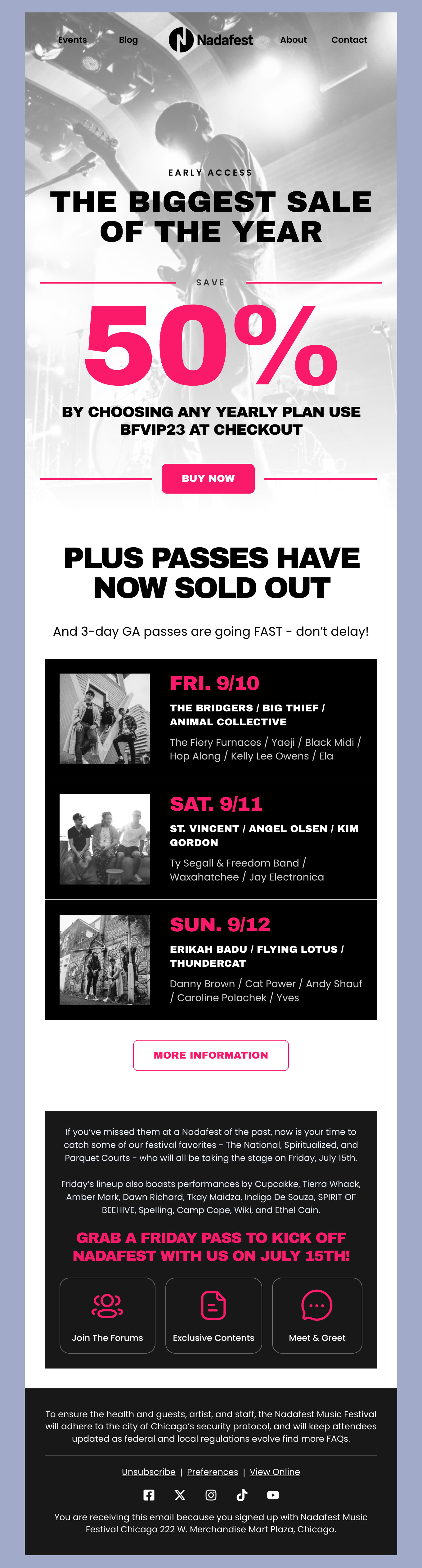
Consider how an email background does its job perfectly in Nadafest, a high-converting email template by Postcards. Staying on the back, it is managed to do several important things. First, it sets the right mood and creates proper anticipation for the offer. Second, it underlies a solid foundation for details on the front and strengthens message delivery by ensuring optimal contrast. Finally, it makes an email and campaign look professional with its smooth changes of stylistic options.
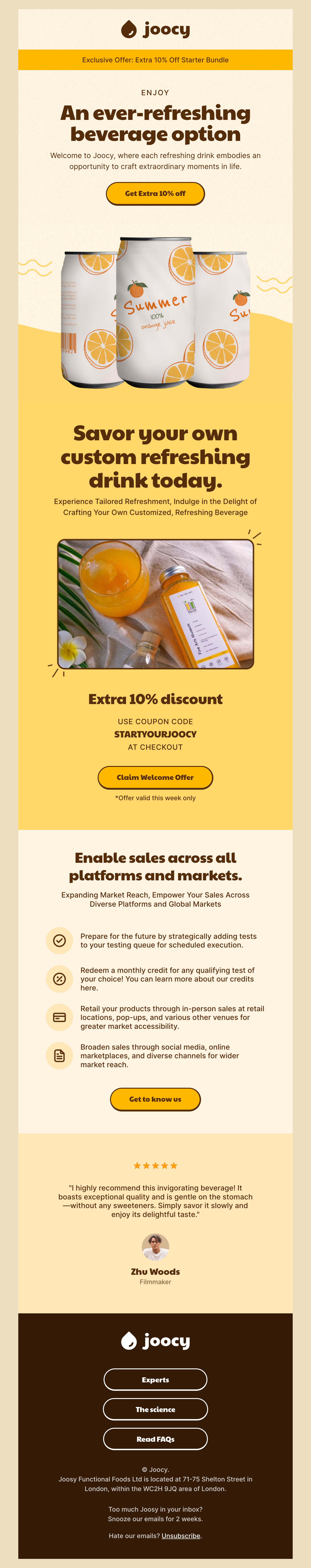
If you need more proof that email background and promotional email are a match made in heaven, you should look at Joosy. Here, the talented Postcards team of designers has brought to life the inverted pyramid principle, a popular tactic in advertising to draw and maintain customers’ attention to the offer.
In a nutshell, they place the most fundamental information above the fold, stressing the offer with a big typeface. Then, they arrange the remaining details to lead subscribers to the next thing unobtrusively.
Here, the email background serves as a powerful finishing touch. It makes message delivery less sales-oriented and more customer-centric. Strategically placed under the promo block, it builds on the momentum that has already raised subscribers’ curiosity.
The best part is that this solution may work alone in compact one-screen digital newsletters or as part of a huge informative email, so you may easily adapt it to your upcoming campaign.
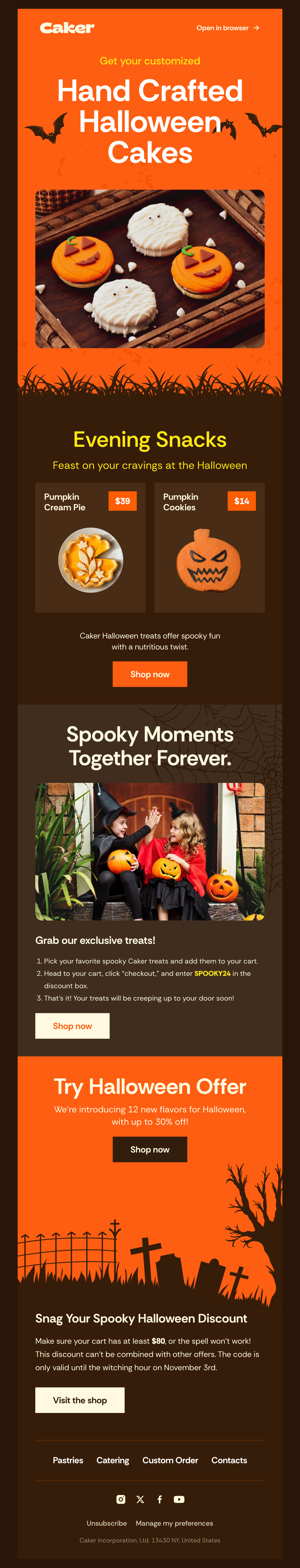
Another Postcard template where the email background largely contributes to the convincing game is Caker. Created to help companies celebrate one of the beloved autumn holidays, Halloween, it exudes authentic spooking vibes on all fronts, dragging subscribers into a magical atmosphere of Allhallows Eve from the first seconds.
Unlike many traditional holiday emails, Caker does not scream festivities that might be intimidating for some customers. Instead, it plays it smart by accurately highlighting the theme. It uses traditional colors set in clean, solid blocks and authentic graphics. You might see this stylistic option applied to the email backdrop in the hero area and the content block and footer, which makes the email template feel complete.
This universal solution is great for companies that want to capitalize on this event without scaring away their customers with too much “makeup.”
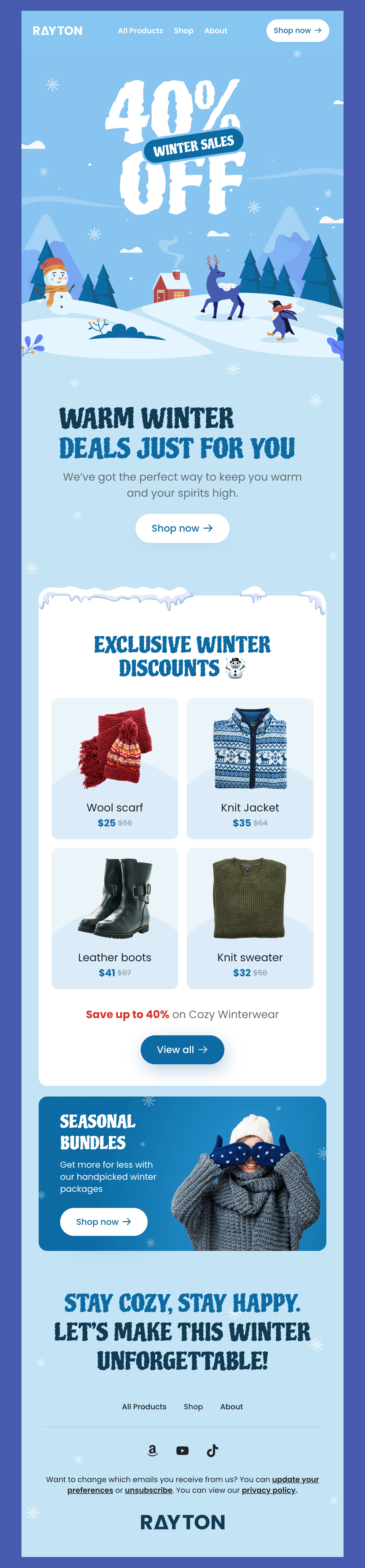
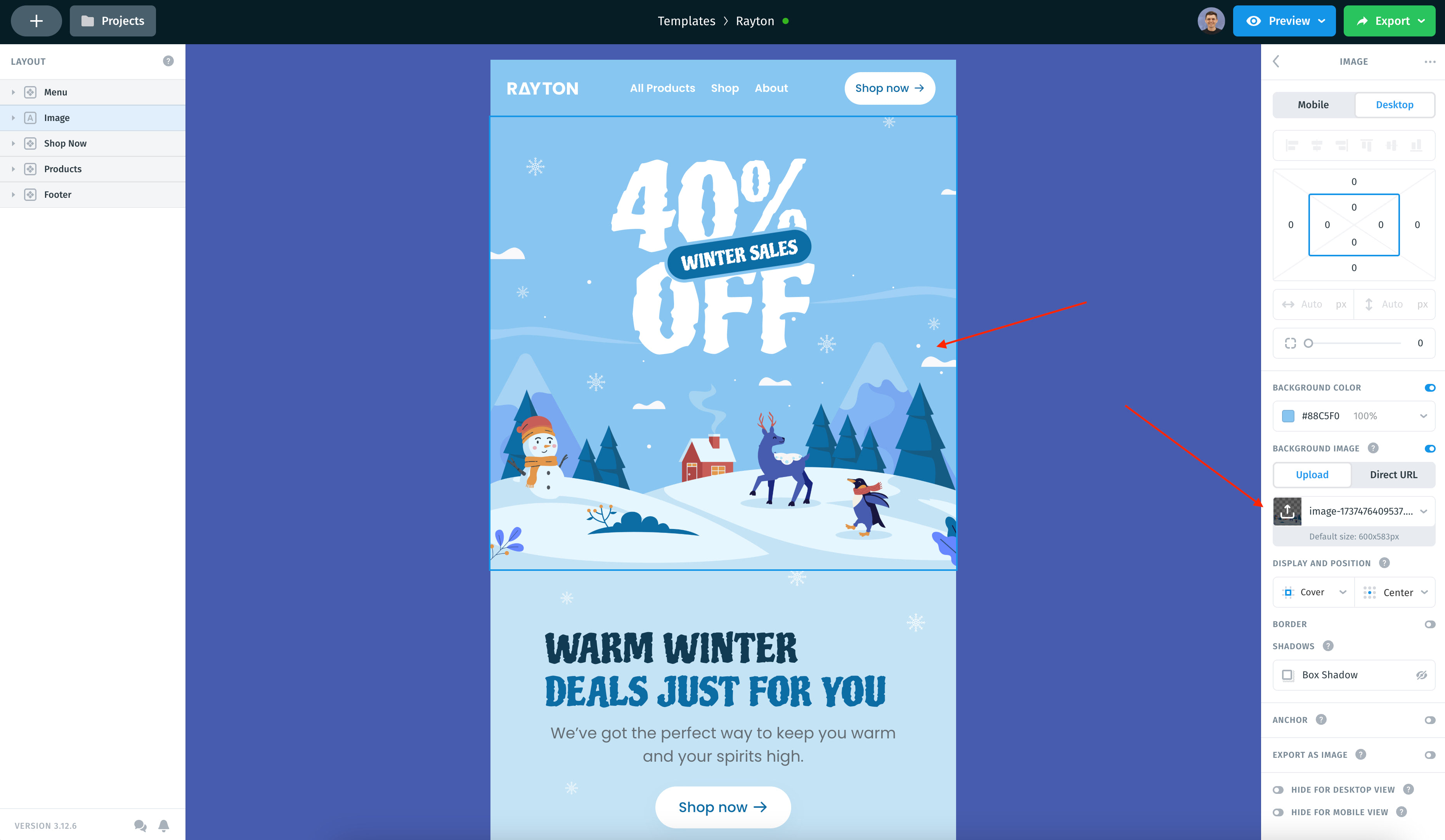
There are more examples of bold and eye-catching email backgrounds assisting email marketers in generating engagement and conversions without implementing an inverted pyramid principle. Consider Rayton, a promotional email template from Postcards that brightens up even the coldest and most gloomy winter day and compels readers to treat them with something special.
The designers’ team has unlocked the true potential of an illustrative approach that plays on customers’ imagination and naturally transports them from the boring daily routine into a magical Winter wonderland.
Here, a beautiful scene on the back creates a general atmosphere, enriches the user experience, and reinforces the overall impression. It underlies everything and plays along with every newsletter detail: the hero area, products, and even typography, making the email feel complete.
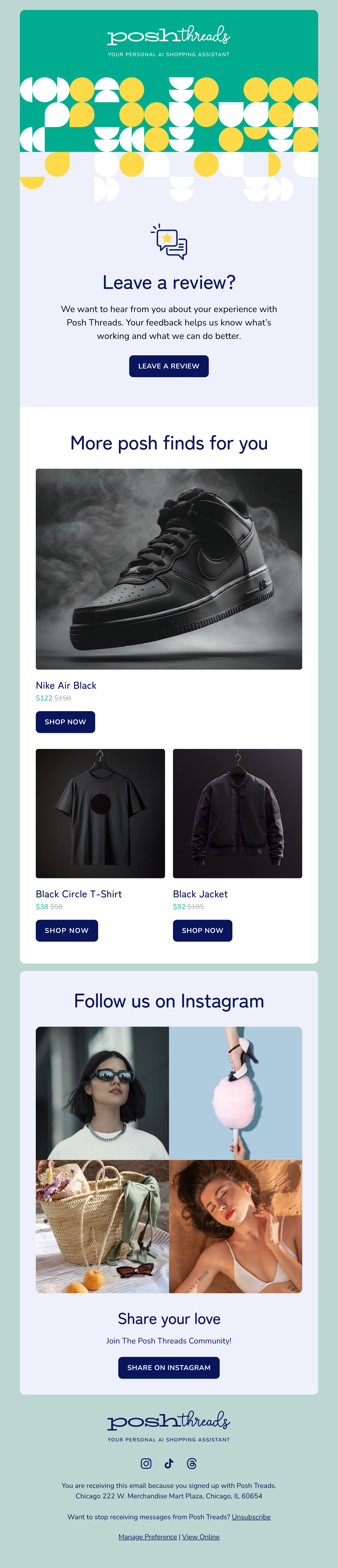
Posh Threads is another great example of using email background to enrich user experience and drive engagement even in non-promotional communication. Developed to assist companies in creating meaningful and memorable follow-ups, it takes this experience to the next level.
At the core, the template provides companies with everything they need to ask their clients to leave a review after purchase or any other important interaction with the brand. Here, the email background performs several critical tasks.
First, it creates a strong first impression with an eye-catching hero backdrop. Second, it naturally directs the user’s attention toward appeal in the middle of the newsletter. Third, it reinforces information structure and reading experience.
Note how a simple yet creative combination of geometric shapes and patterns on a solid canvas achieves all that.
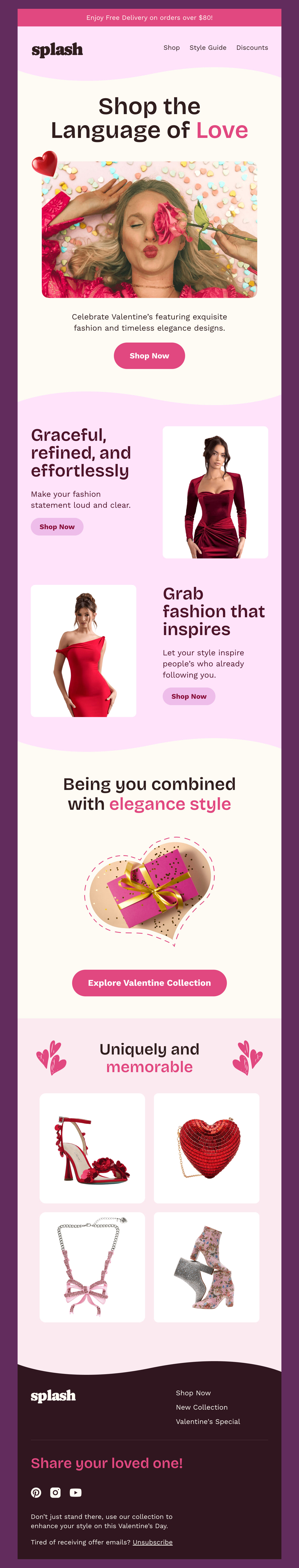
Illustrative approaches and photography can be too much for many email campaigns, especially those that prioritize the informative part of the outreach. Consider Splash, which demonstrates playing safe using a color-solid email background.
The template is not boring as the team creatively approaches monotone canvases. Instead of using one color for the entire email, they assigned different tones to each section, creating visual interest. They have also ditched straight lines and abrupt divisions, opting for curve shapes and lines, making the email backdrop look elegant, delicate, and exquisite – exactly what is needed to support Valentine’s theme.
Solid email backgrounds come in handy in multiple email marketing campaigns. It is the most popular choice for personal letters from the CEO, follow-up transactional letters, and abandoned cart reminders. A clean, monotonous canvas perfectly blends into the text-only blasts, supporting the message and making the delivery of key points feel organic and authentic.
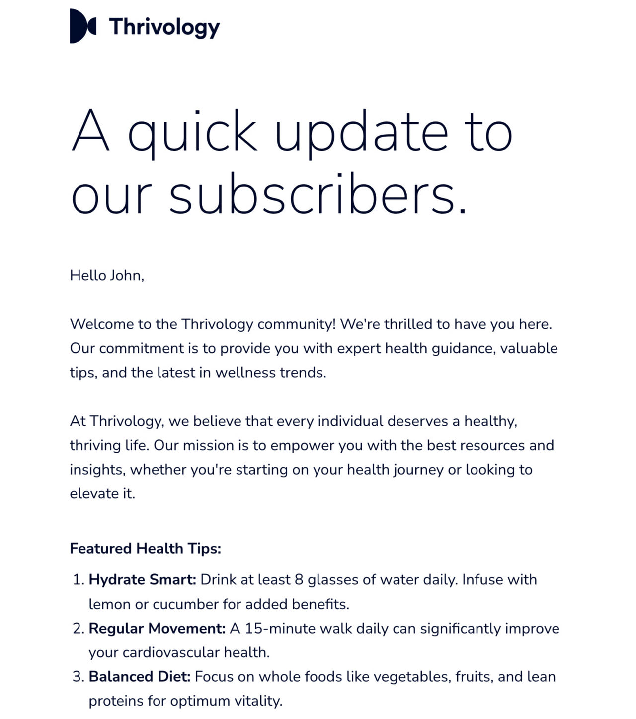
Thrivology Subscriber Update is a great case in point. Designed to help companies notify their customers about crucial updates in their communication, it does its job perfectly. Here, the email backdrop delivers the message, highlights key points, ensures optimal reading experience, and makes communication feel professional.
If the white canvas is not your thing, you can try another side of the spectrum – the black one. Dark mode has been popular for several years in a row; it still excites the minds of digital designers. You might see it regularly in multiple email marketing campaigns. There are some good reasons for that.
First, it is great for accommodating various sensitivities to light. It is the perfect choice if your target audience prefers reading your correspondence in the evening.
Second, it benefits accessibility by providing a more visually balanced and comfortable environment. For instance, when used in tandem with a white typeface, it creates an optimal contrast ratio.
Third, it has an aesthetic appeal that arouses curiosity and drives engagement due to its mysterious nature.
Finally, it directs attention toward the content and places it on the center stage.
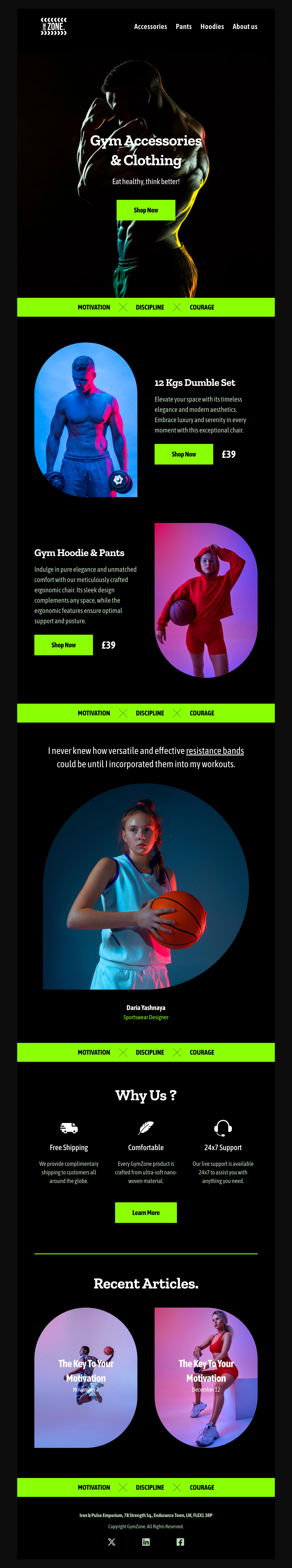
Consider Gymzone, an elegant dark Postcards email template in which black takes the lead. It demonstrates the beauty hidden in dark mode and a solid black email background. All accents are naturally highlighted here, making key details speak for themselves.
Let’s move from email templates to real-life examples of famous brands that capitalize on email background potential, using its power to reinforce message delivery.
How to Add an Email Background Image
Using background images can be challenging and tricky; nevertheless, anything is possible. If you have the right instruments at your disposal, it is not just easy but also enjoyable. One such tool is Postcards. Being a popular online HTML email newsletter builder with an intuitive drag-and-drop interface, it efficiently handles numerous issues, letting you create a newsletter of your dreams without much hassle.
Add an Email Background Image with Postcards Email Builder
You can add background images wherever you want. And it won’t require extra time, special skills or even writing code. What’s more, it has a bundle of pre-made blocks, custom fonts, pixel-perfect graphics, gorgeous color schemes and a neat modular layout that works great everywhere. Whether you are a tech-savvy person or not, you have an opportunity to please your subscribers with a true masterpiece.
With Postcards, you will be able to use background images wherever you need. For example, you can use it to make:
- the header to set the tone for the email newsletter from the first seconds like in case of Mother’s Day offer. From the get-go, it becomes obvious what event is honored here.
- the hero area to become a real eye-catcher like in case of PremiumBeat Email Updates. Here the welcome section does not differ from those alike that are used on regular websites. It is just impressive.
- the footer to look like a perfect finishing touch that will add to general aesthetics much like any other detail of the design. Welcome To Trade Coffee is a perfect example of that. Here the footer plays not only informative but also a decorative role.
- the regular section to stand out from the content flow like in case of Let’s do this. It is here where an area with search input gets an extra visual weight thanks to the proper background image.
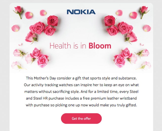
Mother’s Day offer

PremiumBeat Email Updates
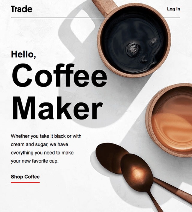
Welcome To Trade Coffee
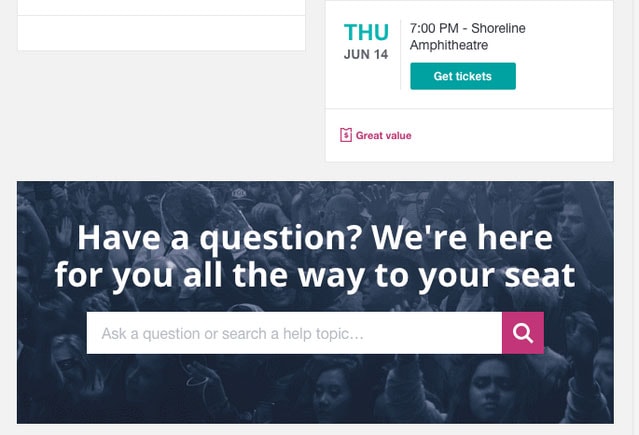
Let’s do this
Conclusion
We tend to compare email newsletters and regular web pages all the time. Sometimes they look so alike that it seems there is no difference between them. However, that’s not exactly true. If you take email marketing seriously, then you are probably aware of all the stumbling blocks that wait for you in your path of creating the ideal email newsletter. And even though HTML and CSS stand behind every email newsletter, except for the plain text versions of course, still due to various limitations, you can’t enjoy all the perks that are provided by these two popular technologies.
Remember: Try free email template builder – Postcards!
It is here where you need to balance between the graphical and textual part in order not to ruin everything. It is here where you need to take care of literally dozens of tiny things starting with a careful choice of custom fonts and ending with an adaptation of the layout for all the popular screen sizes. And it is here where you need to strike the harmony with all the favorite email clients. In one word create a perfect email newsletter where background images play an integral role in the design much like in websites can be a challenging task. However, with the right instruments like Postcards, this task turns into a child’s game where the only concern is what content to choose.