Speeding Up Development Process with Bootstrap 5
Bootstrap is one of the most used frameworks for building web apps. It consists of HTML and CSS components for typography, forms, buttons, navigation, slider and other user interfaces that you can think of which makes the development process easier and faster.
You can repeatedly use the same layout pattern across the web app using premade classes and themes right out of the box. Because of this, you can speed up your development while maintaining the coherence of each element.
Even so, you can be the best developer in the world and at the same time you can have the best tools a developer can have but you won’t have all the time to develop a project. Time in the development process is very important and a major concern in this industry. The faster you develop, the faster you deploy.
My goal in this tutorial is to guide you on some ways to speed up not only your web development process using the Bootstrap 5 framework but also help you create a fast and efficient website or application without missing the front-end framework’s features and capabilities. This will enable you as a developer to carefully plan your project setup without spending too much time in the development process.
In particular, we’re going to discuss the following topics:
- Utilize Task runner, Preprocessor, and Synchronizing Tool when developing with Bootstrap
- Customize Bootstrap 5 Build via Sass
- Learn Scaffolding
- Use Bootstrap 5 UI Kits and Themes
- Build your website with Bootstrap 5 Page Builders
Utilize Task runner, Preprocessor, and Synchronizing Tool when developing with Bootstrap
If you’ve been developing Bootstrap-based websites or applications for quite a while, you are very likely to come across the concept of a preprocessor like Sass. Combine it with a task runner such as Gulp JS or Grunt JS, your workflow will surely improve and can fasten up the development process. In addition, adding BrowserSync JS at the top of these tools will definitely save you a lot of time with synchronized browser testing.
With Postcards Email Builder you can create and edit email templates online without any coding skills! Includes more than 100 components to help you create custom emails templates faster than ever before.
Free Email BuilderFree Email TemplatesWhat is a Task Runner?
A task runner is exactly what it sounds like, it runs tasks. You can choose which tasks you want a task runner to run, and it will automate all the work for you such as compiling your code from Sass to CSS or even Typescript to JavaScript.
Typical usage is when you configure a task that runs every time a particular file is modified, you don’t have to unambiguously recompile every time or restart the server to do so. Task runners are also often being used in copying files from one directory to another directory, minifying file size, concatenating files and serving files on local computer ports.
The two most popular task runners in the modern web development world are Gulp JS and Grunt JS. Both do the same thing and are good in creating their own automation scripts but differ mainly in how the automation of a process is implemented. Gulp JS is based on the JavaScript platform Node.js while Grunt JS works heavily with its templating environment. I won’t go deep with the difference since this is not the primary goal of this article but at the time of this writing Gulp JS offers a more standardized process compared to Grunt JS and is the most preferred task runner by most developers. In fact, it has already gained 32,179 stars in GitHub and in terms of Google trends, Gulp JS is also taking the lead.
Gulp is a command-line task runner that is primarily based on the Node.js module stream. It automates tasks through the memory and writes files instantly resulting in a much faster build since there is no need to read and write the output files within the computer’s drive.Just by simply creating a small file of instructions, gulp can perform just about any development task you want it to do. Gulp uses the package.json configuration file and the gulpfile.js to modify and process your project files. These tools help gulp implement and organize all of the wonderful things that it empowers developers to do.
Sass or Syntactically Awesome Style Sheets is a preprocessor scripting language that is compiled into Cascading Style Sheets which helps developers create better stylesheets with less effort. Sass frees developers from repetition by extending CSS through different methods such as variables, inline imports, nested maps and more. With this, implementing changes is much faster and you are free to take risks and focus more in your designs. Sass focuses on how to create efficient stylesheets, not what goes into them that makes your stylesheets more organized in a certain way.
BrowserSync JS
With Pulsetic you’ll be instantly notified the moment your website, API, or server becomes unavailable. Monitor uptime from multiple global locations and respond to incidents before your users are affected.
Create beautiful status pages in minutes to keep customers informed during outages and build trust with transparent communication.
Start Monitoring for FreeBrowsersync JS is Node.js based tool that synchronizes browser testing by performing like the middle-man between the server and the browser. With this tool, you don’t have to hit the browser’s refresh button over and over again whenever you are editing your code just to see the changes as it supports live reloading and interaction synchronization. This means that all your activities are being depicted across every browser. The most revolutionary feature of this tool is that it simulates slower internet connection which gives users with slow internet an advantage by throttling website connection speed.
Improving workflow with Bootstrap 5, Gulp JS, Sass and BrowserSync JS
After introducing what these tools are, let’s now see them in action and grasp how these tools can improve our development process especially when working with the Bootstrap framework.
Note: Since most of these tools rely on Node.js, you need to have it installed on your computer in order to proceed on this quick guide.
Step 1: Install Gulp CLI
In your terminal, run the following command to install Gulp CLI globally:
npm install --global gulp-cli
Optionally, you can also install BrowserSync globally:
npm install -g browser-sync
In your terminal, run the following command to create a directory for your project and navigate to it:
mkdir my-project && cd my-project
Step 3: Create a package.json file (use defaults via -y flag command)
npm init -y
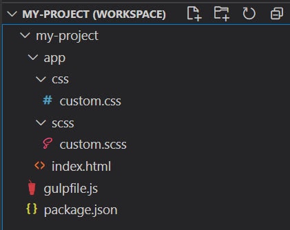
For our demo, we’ll have the following file structure. Create the following folders and files in advance:
Step 4: Install Bootstrap 5, Gulp JS and BrowserSync JS
Using the commands below, let’s install all of the required development dependencies for this project via NPM on our terminal. We will use –save flag to save all of these packages as development dependencies.
npm install browser-sync gulp gulp-sass --save-dev
Step 5: Create a local server to automatically watch for Sass file changes and run BrowserSync JS server
Inside the gulpfile.js, we need to add the following commands in order to not only watch for changes for Sass files but also to compile them into regular CSS. We will also allow BrowserSync JS to serve the output of our files via a local server address.
const gulp = require("gulp");
const sass = require("gulp-sass");
const browserSync = require("browser-sync").create();

// Compile .scss to .css file
function compileCSS() {
  return gulp
    .src("app/scss/*.scss")
    .pipe(sass())
    .pipe(gulp.dest("app/css"))
    .pipe(browserSync.stream());
}

// Watch for changes
function watchChanges() {
  browserSync.init({
    server: "./app/",
    index: "./index.html",
  });

  gulp.watch("app/scss/*.scss", compileCSS);
  gulp.watch("./*.html").on("change", browserSync.reload);
  gulp.watch("./js/*.js").on("change", browserSync.reload);
}

exports.compileCSS = compileCSS;
exports.watchChanges = watchChanges;
exports.default = watch;
Let’s take a closer look at our code above. On the first few lines of our codes, we required gulp, sass, and browserSync package to our code.
Next, we called out two functions: compileCSS and watchChanges. The compileCSS function handles all compilation of all .scss files inside the app/scss folder into .css files which are mapped inside the app/css folder.
The watchChanges function handles all synchronization (using BrowserSync JS) with the browser and monitoring of changes inside the /app folder through the index.html file.
The last few lines of our code with the gulp.watch() API allows watching globs and running all function tasks when a “change” occurs. If the task doesn’t signal Async Completion, it will never be run a second time. This API provides built-in delay and queueing based on the defaults.
Step 6: Install and import Bootstrap 5
The next thing we need to do is to install Bootstrap 5 and import it inside our custom.scss file. Using the following command, let’s install Bootstrap 5 via npm:
npm i bootstrap@5.0.0-alpha3 --save
Again, we will use –save flag to save it as development dependency.
Now we just have to import Bootstrap 5 inside the custom.scss file using the following import statement:
@import '../../node_modules/bootstrap/scss/bootstrap.scss';
Step 7: Add the necessary markup to the index.html file
Inside the index.html, we need to include the link to the custom.css file in order for our styles to work. Additionally, for demonstration purposes, let’s add a basic Bootstrap 5 form element just to confirm that our Bootstrap CSS is working.
Our markup should look like this:
<!DOCTYPE html>
<html>
   <head>
      <meta charset="UTF-8">
      <meta content="width=device-width, initial-scale=1.0" name="viewport">
      <title>Improving workflow with Bootstrap 5, Gulp JS, Sass and BrowserSync JS</title>
      <link href="css/custom.css" rel="stylesheet">
   </head>
   <body>
      <div class="container">
         <div class="row">
            <div class="col-lg-4 offset-md-8 mx-auto">
               <form>
                  <div class="mb-3">
                     <label class="form-label" for="exampleInputEmail1">Email address</label> <input aria-describedby="emailHelp" class="form-control" id="exampleInputEmail1" type="email">
                  </div>
                  <div class="mb-3">
                     <label class="form-label" for="exampleInputPassword1">Password</label> <input class="form-control" id="exampleInputPassword1" type="password">
                  </div>
                  <div class="mb-3 form-check">
                     <input class="form-check-input" id="exampleCheck1" type="checkbox"> <label class="form-check-label" for="exampleCheck1">Check me out</label>
                  </div>
                  <button class="btn btn-primary" type="submit">Submit</button>
               </form>
            </div>
         </div>
      </div>
   </body>
</html>
Step 8: Automate local server using BrowserSync JS and Gulp JS
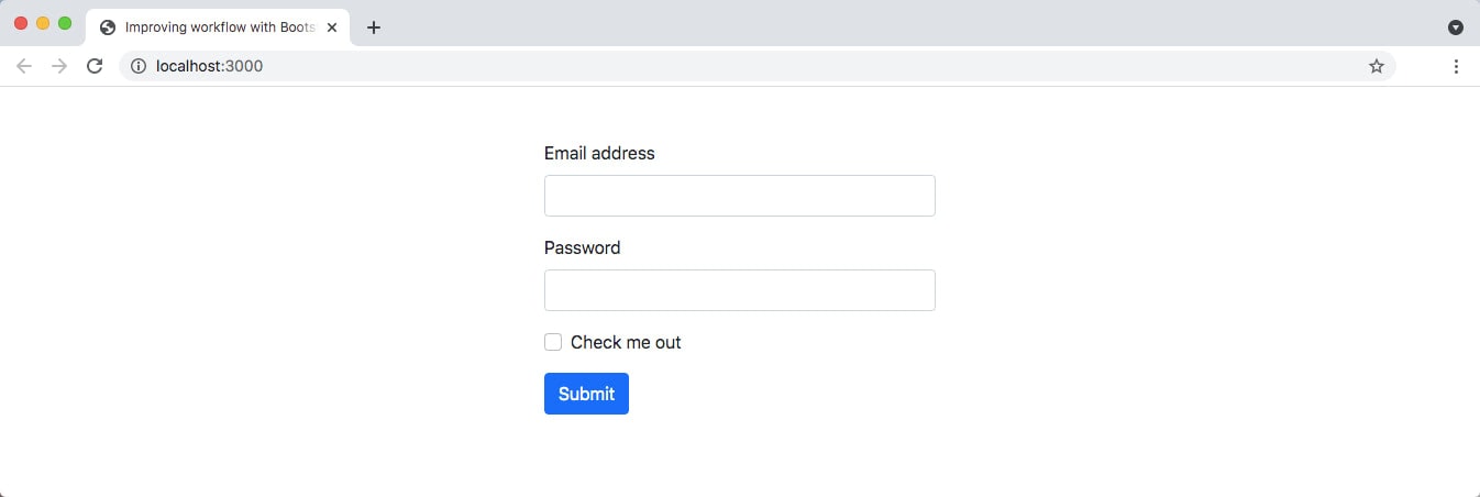
To assure that our set up is all working we need to run gulp command on our terminal. It should open a new tab to your default browser with the http://localhost:3000/ local server address.
By this time, you should see our markup and Bootstrap form element showing on the browser screen.
On your terminal you should be seeing something like this:
yourusername@users ~/my-project > gulp
[11:19:31] Using gulpfile ~/my-project/gulpfile.js
[11:19:32] Starting 'default'...
[Browsersync] Access URLs:
 ---------------------------------------
       Local: http://localhost:3000
    External:
 ---------------------------------------
          UI: http://localhost:3001
 UI External: http://localhost:3001
 ---------------------------------------
[Browsersync] Serving files from: ./app/
This is just a confirmation that Gulp JS is running the tasks inside the gulpfile.js file and BrowserSync JS is serving the output via index.html file.
From here, you can now start adding your own Sass code or overwrite default Bootstrap 5 Sass variables inside the custom.scss file. You will see that it will automatically compile your Sass files to CSS files and synchronize with the browser output.
Optionally, you might also want to include a _variable.scss file to organize your variables. This all depends on the size and complexity of your project.
Customize Bootstrap 5 Build via Sass
While there’s nothing wrong with including all of the Bootstrap 5 features and components on your project, sometimes you only use a handful of the classes and features it provides such as the grid system.
As an example, if you’re loading 152 KB of Bootstrap 5 CSS minified source file, still that sounds like a lot. Remember that CSS is a very important part of a website or application since it is being loaded in the head and it serves as a render blocking resource, which means that the browser won’t render any processed content until the CSS is loaded.
Bootstrap 5 offers some utilization options via Sass and makes use of the variables, maps, mixins, and functions to help you build faster and customize your project and also drops some file size to make your website or application even faster. Additionally, you are basically doing one of the best CSS practices by including only what you need as you develop since you don’t want to build a bloated code package that is full of unused codes.
In order to do this with Sass, you can either include any of the following Bootstrap 5 components and features according to your need inside your custom Sass file where you want to build your CSS files on your project.
// 1. Include functions first (so you can manipulate colors, SVGs, calc, etc)
@import "../node_modules/bootstrap/scss/functions";

// 2. Include any default variable overrides here

// 3. Include remainder of required Bootstrap stylesheets
@import "../node_modules/bootstrap/scss/variables";
@import "../node_modules/bootstrap/scss/mixins";

// 4. Include any optional Bootstrap components as you like
@import "../node_modules/bootstrap/scss/root";
@import "../node_modules/bootstrap/scss/reboot";
@import "../node_modules/bootstrap/scss/type";
@import "../node_modules/bootstrap/scss/images";
@import "../node_modules/bootstrap/scss/containers";
@import "../node_modules/bootstrap/scss/grid";

// 5. Add additional custom code here
With this setup, you can modify any of the Sass variables and maps in your custom Sass file. Also, you can add additional custom code at the bottom of the added Bootstrap 5 components and features and make it your starting file.
Learn Scaffolding
From the beginning, the basis of the Bootstrap front-end framework relies on its grid system packed with various components and features that enables designers and developers to structure modern responsive grid layout.
Because of its grid system, it’s so easy to scaffold almost every responsive layout that you have in mind even before you do the coding. In this way, you are one step ahead of the coding process and it will be much easier to put the content for each section since you already have the grid structure of your layout design. As an example, if we have a simple layout with one big header section at the top followed by a sidebar section on the left and an article section on the right which also has a subsequent footer section.
Consider the layout design below:
Bootstrap grid system is so flexible that it lets you define a set of rows with twelve columns each that you can divide according to each of your sections. The best part is that each column can have different sizes to perfectly fit your template and will automatically adjust the content for any viewport size or screen resolution.
Using the same example above, let’s try to do a scaffold of the given layout design.
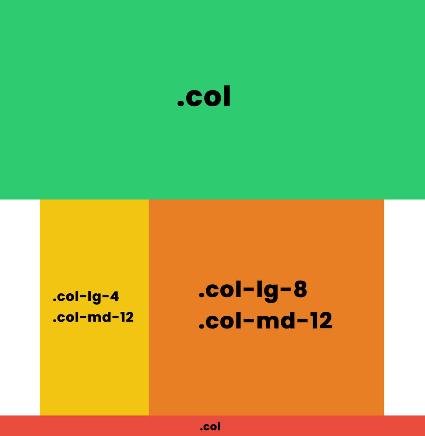
As seen in the image above, the header section can be represented with a one-row and twelve-column layout. On the same row, the sidebar section takes a four-column layout while the article section takes an eight-column layout. Finally, the footer section also can be represented with one row and a twelve-column layout.
With this in mind, we can set up our Bootstrap code structure like this:
<div class="container-fluid">
   <div class="row">
      <div class="col">
         <!--- Header Content Here --->
      </div>
   </div>
</div>
<div class="container">
   <div class="row">
      <div class="col-lg-4 col-md-12">
         <!--- Sidebar Content Here --->
      </div>
      <div class="col-lg-8 col-md-12">
         <!--- Article Content Here --->
      </div>
   </div>
</div>
<div class="container-fluid">
   <div class="row">
      <div class="col">
         <!--- Footer Content Here --->
      </div>
   </div>
</div>
Note: We’re being explicit on our Bootstrap code above. There are other ways to do this grid structure. Nevertheless, this is a great demonstration of how scaffolding works.
Use Bootstrap 5 UI Kits and Themes
Developing websites and applications with Bootstrap doesn’t require too much effort since it provides lots of key features and components right out of the box that you can also customize either through custom CSS or CSS preprocessor.
Taking this a step further, you can even use Bootstrap UI kits and themes to speed up your development process even more.
What is a Bootstrap UI kit?
People often confuse Bootstrap UI kits with Bootstrap themes. While these two have similarities at some given point, a Bootstrap UI kit is a user interface kit that consists of a collection of beautiful, flexible and easy-to-use Bootstrap-based UI components and assets of a website that you can quickly plug-in and customize according to your desired design output. Some examples of the Bootstrap UI components that are regularly seen are testimonials, input forms, widgets, and navigation menus.
Designing a website or application takes time and using tools and resources at your disposal will have a comprehensive impact on the speed of your development while achieving consistency in a design. By simply choosing the Bootstrap UI kit component or asset you are interested in, you can quickly copy the code and resources to customize the styles based on your theme design.
Excellent Bootstrap 5 UI Kit Examples
There are plenty of great Bootstrap 5 UI kits available on the internet that you can use from simple, structural kits to comprehensive, all-inclusive kits.
Below are some of the known Bootstrap 5 UI kits that you can use on your projects:
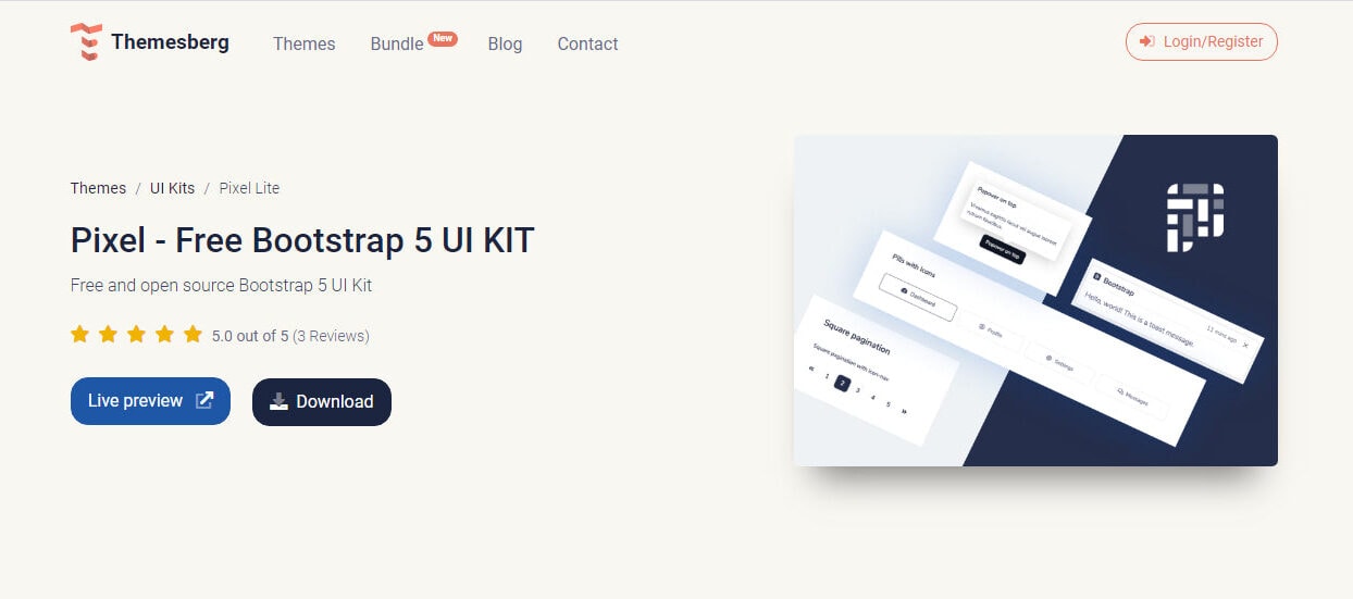
Pixel – Free Bootstrap 5 UI KIT
Pixel is a free, lightweight and open-source Bootstrap 5 UI kit with over 80 fully coded UI components and example pages that will help you prototype and build a website that you can use on your projects.
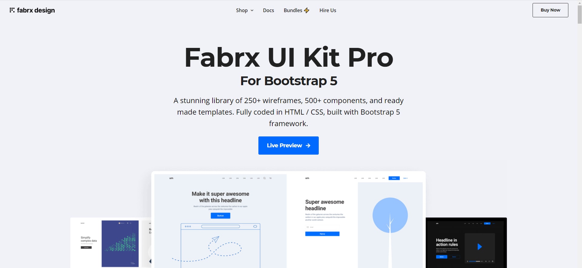
Fabrx is a comprehensive Bootstrap 5 based UI kit with a stunning library of 250+ wireframes, 500+ responsive components and a ready-made template, seamlessly coded with HTML, CSS and Bootstrap 5.
Material Design for Bootstrap 5 & Vanilla JavaScript
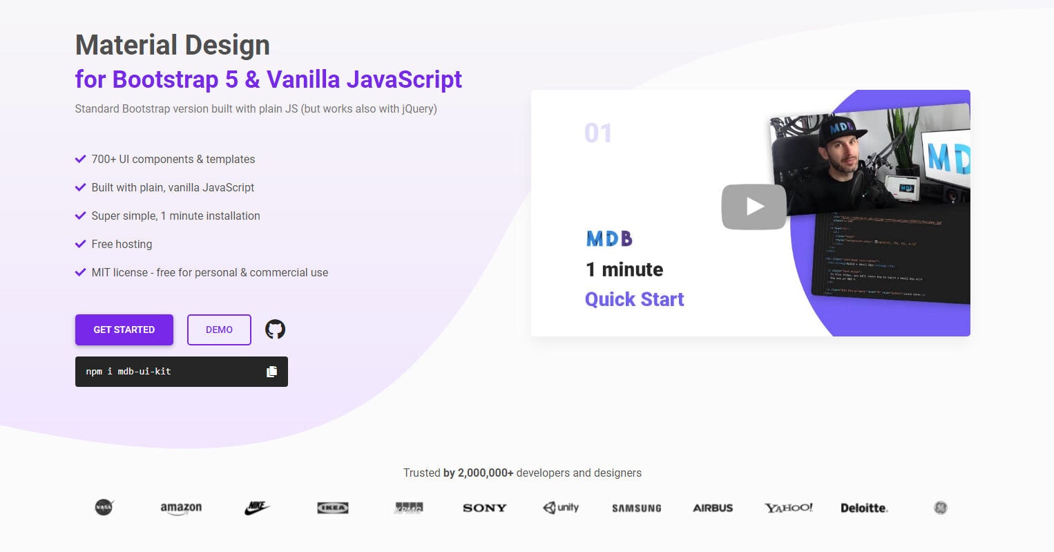
Material Design is one of the most popular open-source UI kits based on Bootstrap 5 for developing Material Design based components with HTML, CSS, and plain JS but also works with jQuery. It has over 700+ UI components and templates with a super simple installation process.
What is a Bootstrap Theme?
A Bootstrap theme is a complete ready to use bundled HTML, CSS and JavaScript code that consists of stylings, UI components and page layouts which are often used for a specific niche or type of website and application. With Bootstrap theme, everything is already created, if not most of the design resolve are already made in advance for you, so you can just simply modify it with your own resources and content before publishing.
The difference between a Bootstrap theme and a Bootstrap UI kit relies on its use. Bootstrap themes are often being used in a packaged manner, meaning you will simply modify some contents, resources and styles and voila! Your website or application is ready for publishing. While Bootstrap UI kits are often being used piece by piece, meaning you will only pick a specific component or resource you need as required by your design.
Recommended Bootstrap 5 UI Kit Examples
Just like Bootstrap UI kits, there are lots of Bootstrap 5 themes that you can use and quickly modify according to your project requirement.
Below are some of my recommended Bootstrap 5 UI themes that you can use on your next project:
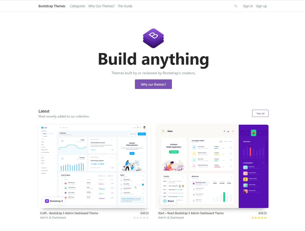
Bootstrap 5 Themes by Offical Bootstrap Marketplace
Bootstrap 5 creators themselves are offering their own component-based framework themes which are built by the best Bootstrap creators in the world. Each theme is architected as an extension of Bootstrap, built for a specific set of niches. This means not only extending the base components of Bootstrap, but also adding completely new components, utilities, and plugins.

Space is a free Bootstrap 5 multipurpose theme that comes with a clean, creative, and high-quality design with three different homepage variations, 20+ Business Pages, 100+ UI elements, and a fully modern responsive layout.
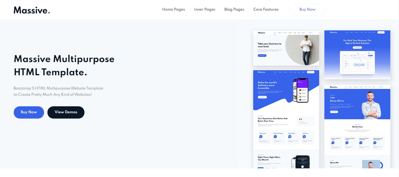
Massive is a multipurpose HTML, CSS and JavaScript theme that has a trendy, unique and creative design fully built with Bootstrap 5 and Sass. It is crafted for almost any kind of websites such as business, corporate, mobile app, web app, and personal portfolio websites.
Build your website with Bootstrap 5 Page Builders
While you can code your Bootstrap website or application from scratch, there is also a fast alternative way to build a modern responsive layout with zero coding using Bootstrap page builders. This will turn designing from a hard-coding configuration into a more visual procedure. A page builder can be a desktop app or online app that can be used for designing and prototyping your website or application.
Usually, page builders come with several key features including drag-and-drop functionality for Bootstrap-based grid structure, content and component creation. Some components that you can quickly add to your canvas in a Bootstrap page builder are slider, navigation, header and more.
There are a couple of page builders on the web that support Bootstrap 5 at the moment. Below we’ll take a closer look at the best-known Bootstrap page builders that support the latest version of the Bootstrap framework that you can utilize on your next project.
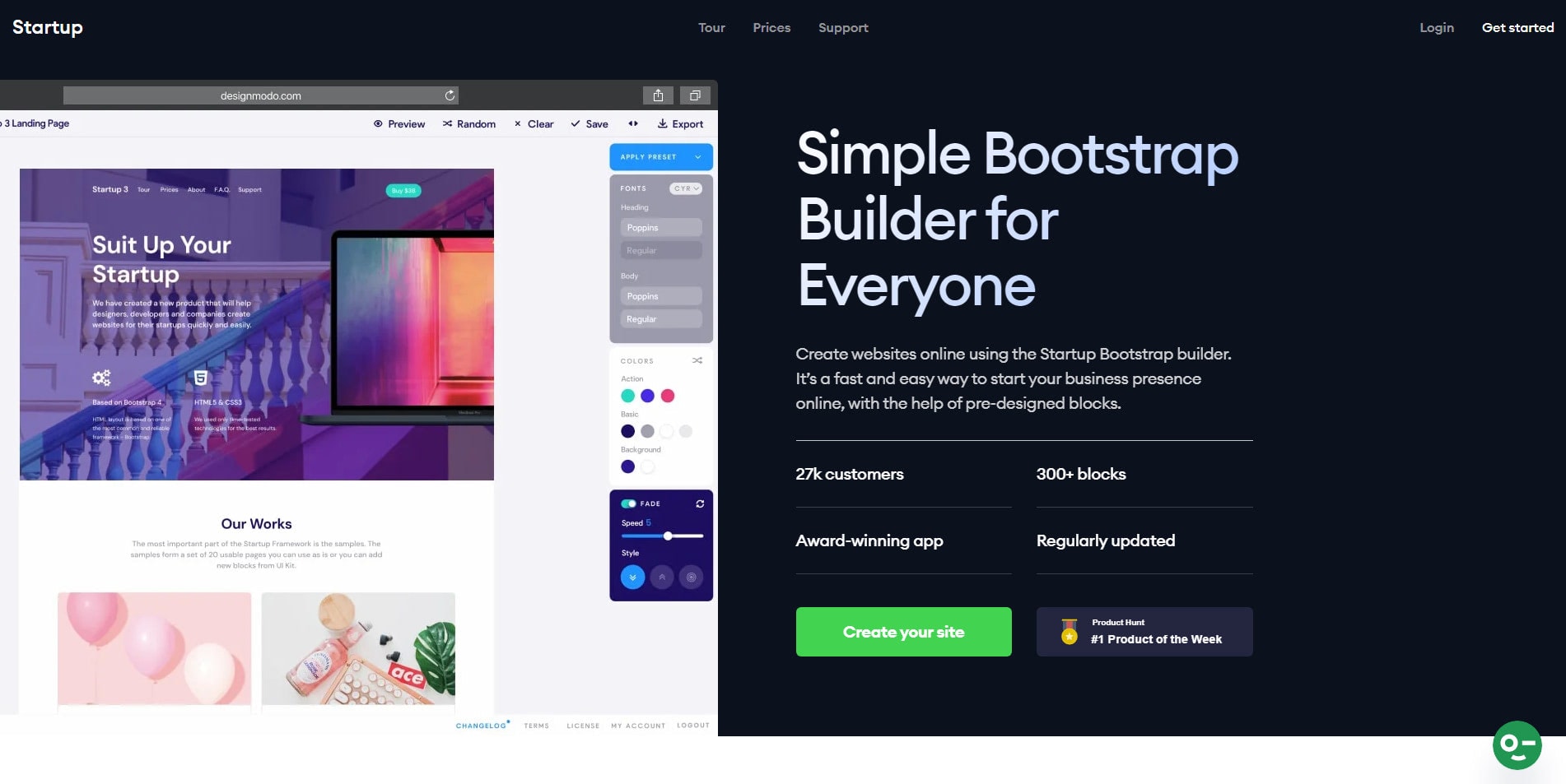
Startup Bootstrap page builder is a simple bootstrap-based builder that allows designers and developers to quickly prototype and design websites, landing pages and applications. It’s a fast and easy-to-use browser-based drag and drop Bootstrap 5 theme builder with awesome functionalities to create web pages for your personal and business needs. The best part of it is that it’s compatible with all Retina devices and supports easy exporting to have clean HTML, CSS and JavaScript files, ready for publishing.
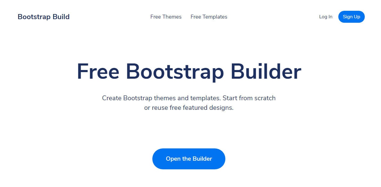
Bootstrap Build is a simple yet powerful bootstrap-based application for designing and prototyping Bootstrap themes and templates. This bootstrap builder tool offers many advanced Bootstrap theming capabilities, such as live preview, variable search, color picker, size adjuster and more. You can also browse hundreds of free Bootstrap themes and fork them for further customization.
Stay Up-to-Date
No matter how much you know about the framework, it is very important you stay up-to-date with the latest release and new features of Bootstrap.
Always, visit the Bootstrap 5 official website, take some time to read the documentation, and spend some time playing with the framework’s component to get a better sense of it. It will also help you in the long run if you will learn the best practices, things to avoid and helpful tricks to speed up your workflow. You will gain an advantage if your knowledge in this type of technology is up-to-date.
Summary
Bootstrap is the most popular front-end framework available out there that offers lots of awesome features for responsive modern website development with cross-browser compatibility.
While it takes away most of the tedious tasks when prototyping a website or application, there are some more ways to even take it a step further by utilizing the things I’ve discussed above. When developing a website or application, it is very important to anticipate the growing complexities and do everything to improve your workflows so that you can build efficient projects without spending too much time on the development process and deliver your project on time.
Learn to utilize good resources in a practical way to handle optimizations and always automate as you go along with your workflow steps.