Emotional Intelligence and the Uncomfortable Side of Design
In March 2016, Twitter celebrated its 10th birthday. It was a day filled with pride for the company and many of its followers. In order to make the day amazing for its users, Twitter released a delightful like/heart button animation.

It was awesome, but as soon as the day was over the animation was gone too. Some people don’t care and some didn’t even notice but those who did were left with a void. I’m not exaggerating; hear me out. The heart explodes with confetti, it bounces and is jolly and colorful. Overall, it makes the mundane tasks of liking or favoriting a tweet much more interesting and fun. When you take that away it’s a little sad and underwhelming.
Since it’s birthday, Twitter did update the heart animation to be a little but more than just a color change but it’s still nothing compared to the confetti explosion. All in all, this is a silly complaint yet people are disappointed enough to blog about it on The Next Web. It actually bummed people out, which is rude and awful.
Taking a Step Back
Let’s also talk about the aspect of hearts versus stars. If you recall, late 2015, Twitter changed its UI from stars to hearts. “The heart is a universal symbol, it’s a much more inclusive symbol,” said Casey Newton. Check out Twitter’s gif for what the new heart UI is all about. (No, it’s not the same as the confetti explosion from their birthday.)

With Postcards Email Builder you can create and edit email templates online without any coding skills! Includes more than 100 components to help you create custom emails templates faster than ever before.
Free Email BuilderFree Email TemplatesThe decision was business oriented because Twitter was excited for increased interactivity due to the change. Again, that’s all fine and dandy but what happens when you have a negative thoughts. How is a heart at all an appropriate response for a negative remark? It’s not, it’s insensitive and unhelpful. A star is also unhelpful, for what it’s worth.
It’s Not Just Twitter’s Problem
I am not picking on Twitter. It happens to be a great source of examples. What if there is breaking news of a terrible incident?

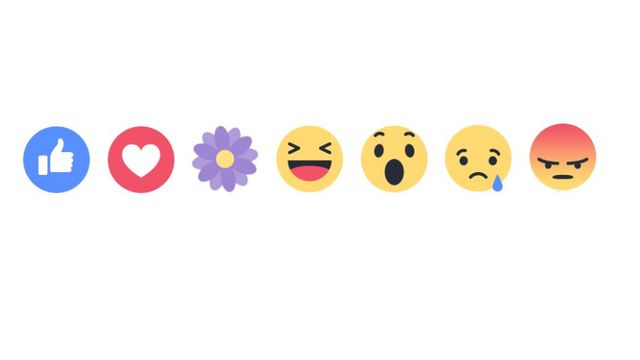
Facebook already deals with this dilemma somewhat by creating more response types. It’s still pretty hard for a social network to provide emotionally intelligent responses but Facebook’s adoption of various responses is a step forward.
While we are on such awful topics, Siri doesn’t know how to deal with this either. There are numerous articles about Siri not providing practical help in serious situations. However, through a software update in April 2016, Apple did provide helpful responses and actions for rape victims and questions regarding suicide.
Emotional Intelligence and Design
Beth Dean wrote an amazing post on Medium about painful experiences brought up unintentionally by technology. The blog post was inspired by a website trying to verify her identity asked her if she knew her deceased mother. (It’s absolutely nothing in comparison to having a silly animation disappear.) In her post, she talks about designing with emotional intelligence. She identified emotional intelligence as having five traits: self-awareness, self-regulation, motivation, empathy and people skills.
Self-Awareness and Self-Regulation
A great example of self-awareness is Facebook asking a user if they want to see ads based on their behavior. Not only does it create a better experience it is more relevant to the user.
With Startup App and Slides App you can build unlimited websites using the online website editor which includes ready-made designed and coded elements, templates and themes.
Try Startup App Try Slides AppOther Products
Dean describes self-regulation as being smart about numbers. Just because analytics go up doesn’t mean it’s a good thing. The example she used was a website spamming a user’s contacts in order to increase engagement. Of course, the engagement went up, but trust in the company went down as soon as the user found out they reached out to her contacts unwillingly. That’s why when you log into somewhere via a social network like Facebook, Google or Twitter you see the message “we will not post on your behalf.”
Motivation, Empathy, and People Skills
Motivation is a bit tricky to explain but it boils down to the experience of users and their unique backgrounds. It’s all about trying to be understanding toward all of your target audience and not being rude to those who are not. You don’t want anyone to feel rejected by your app. When it comes to empathy a little humility can go a long way. Is your website asking someone about their deceased relative?
That leaves us with people skills. What an interesting term to talk about when dealing with software, don’t you think? People skills refer to the overall tone the product is using and the vibe it’s giving out. It’s about good, but also appropriate content. You wouldn’t tell a friend they had a great year while they were in a terrible car accident. A product shouldn’t do that to its users either.
All New Ground
All of those were pretty horrible examples. People lose their jobs, people feel ashamed, it happens. Software is becoming amazing so I do understand we cannot know it all. But we need to be aware of these things so that we can build programs and products and code with a more human experience.

Empathy and emotional intelligence can be seen when a software is obviously trying to be inclusive. In her post, Dean explains that she is pretty used to “software personalities” by now and understands that software is made for the majority group. Therefore, the most amazing software will be made to be inclusive of as many scenarios as possible.
Moving Forward
Personally, I’d love to see more cases like these be taken care of within design. I’d love to see more discussion from makers about the uncomfortable things, about odd but painful scenarios. It’s the only way that we can make smarter products.
